




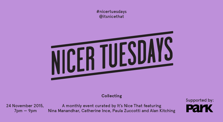
Join us for our collecting-themed Nicer Tuesdays!
We’re back with our penultimate Nicer Tuesdays of the year. This month’s event is on the subject of collecting, bringing together four talks from an amazing bunch of people.
Joining us is Nina Manandhar, a photographer and artist who is inspired by the everyday city life and the vibrancy of youth culture. Nina will be talking us through her online and printed archive What We Wore, a platform that celebrates the history of British fashion styles.
We also welcome Catherine Ince, the superior curator of The World of Charles and Ray Eames exhibition at The Barbican and Paula Zuccotti will talk us through her most recent project, Everything We Touch. Paula travelled around the world to speak to people from an array of backgrounds, asking them to document every object they touched within 24 hours.
Our fourth speaker, recently added to the line-up is world-renowned typographer and designer Alan Kitching who will be joining us to present his impressive letterpress and print collection, whilst discussing the fundamentals of typography.
As always, the beer and popcorn will be on us!
Location:
Protein Ltd
31 New Inn Yard
EC2A 3EY
United Kingdom
Park Communications
Founded in 1991, Park Communications is considered by many to be London’s preeminent printer. With a roster of both corporate and cultural clients, Park is a one-stop-shop to translate, artwork, print and bind literature of many different kinds, from the finest coffee table books and catalogues, through FTSE annual reports, to niche market magazines and brochures. Working closely with clients to develop bespoke creative solutions, Park’s reputation is built on the highest quality, reliability and flexibility.
They have brought their professionalism to both our Printed Pages magazine and the It’s Nice That Annual 2014, and we look forward to working with them in 2015 and beyond. To contact Park, email Alison ata.branch@parkcom.co.uk or via the website www.parkcom.co.uk.
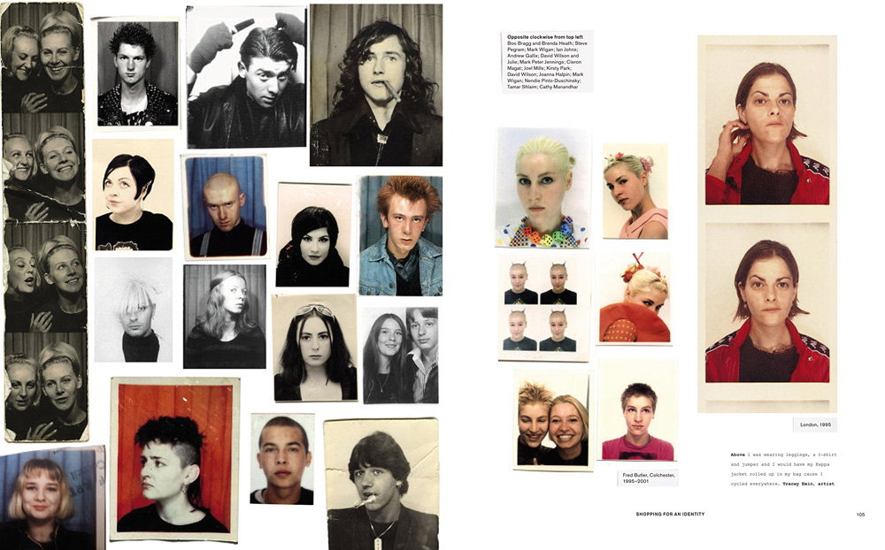
Nina Manandhar: What We Wore
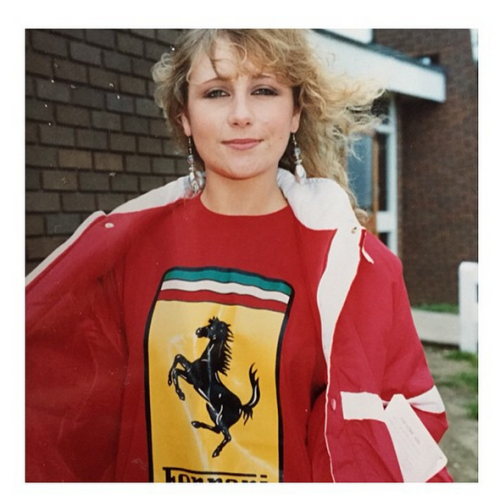
Nina Manandhar: What We Wore
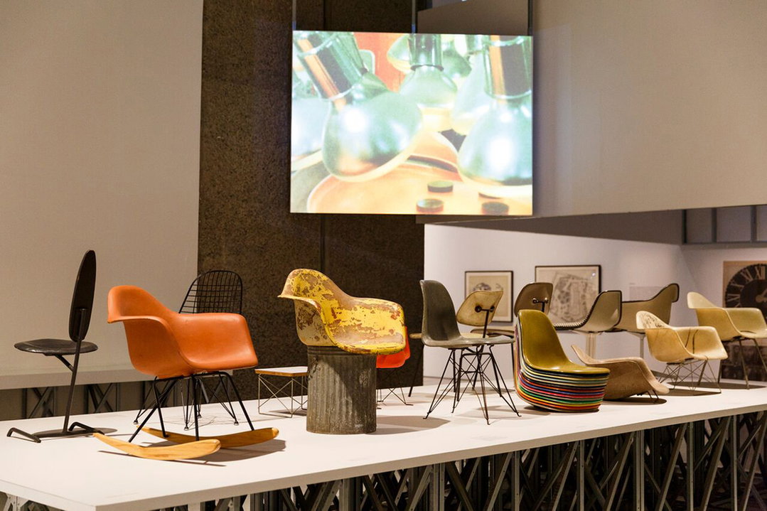
The World of Charles and Ray Eames at The Barbican
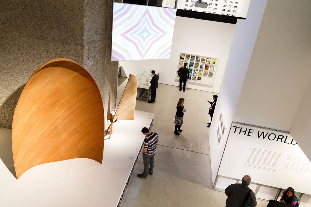
The World of Charles and Ray Eames at The Barbican
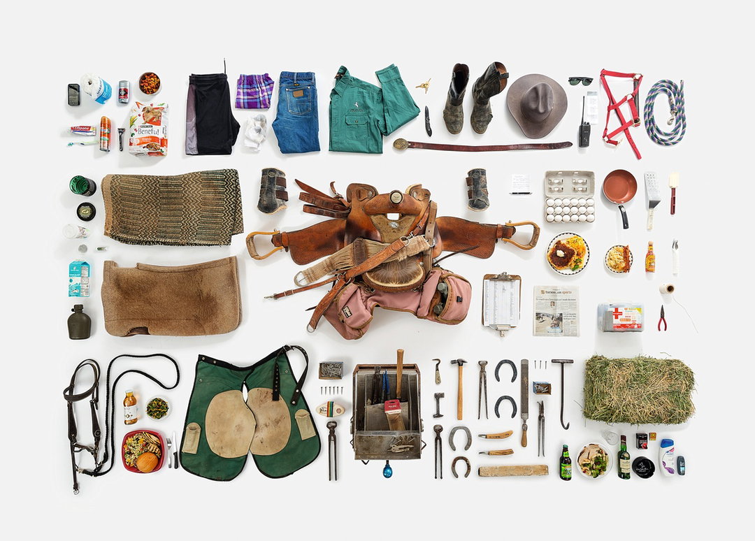
Paula Zuccotti: Everything We Touch
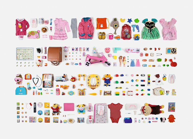
Paula Zuccotti: Everything We Touch
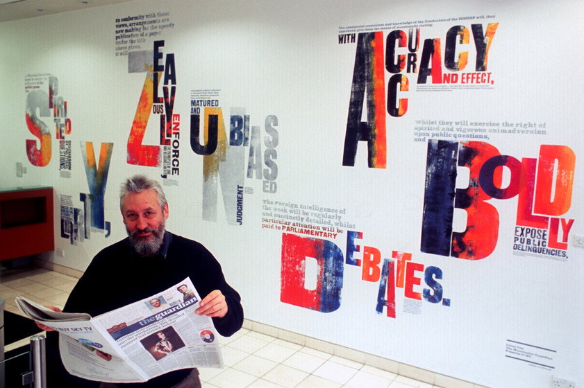
Alan Kitching
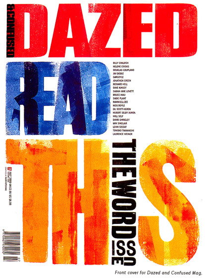
Alan Kitching
Share Article
Further Info
About the Author
—
This article was written by the It’s Nice That team. To find our editors and writers, please head over to our Contact page.


