




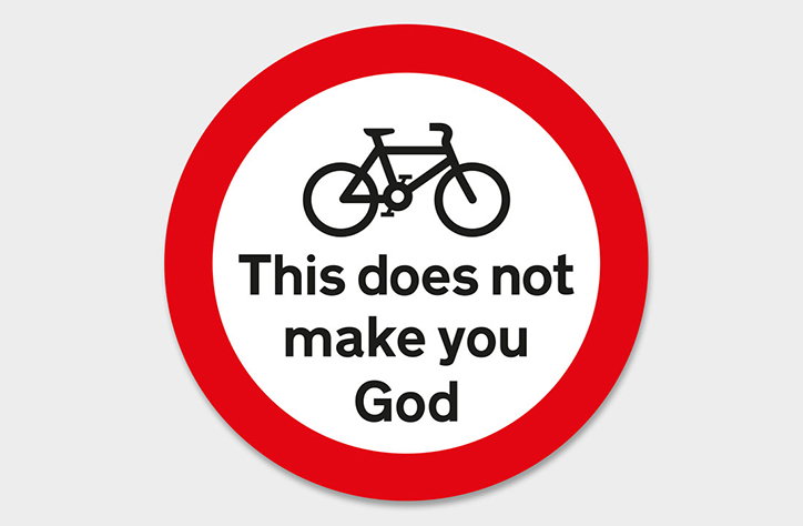
Made North celebrates the 50th anniversary of the British road sign
The humble road sign turns 50 this year and to celebrate Made North has gathered leading artists and designers to transform the triangle, circle and square signs so many of us encounter on a daily basis.
The British road sign was initially conceived by designers Jock Kinnier and Margaret Calvert. The pair created many of the signs we still see today and also devised two new typefaces: Transport and Motorway. Curated by Made North director Patrick Murphy, new signs have been conceived by big names including – Sir Peter Blake, Graphic Thought Facility, Quentin Newark, Jeremy Leslie, Mark Bonner at GBH and many more.
The anniversary signs are more disruptive than their instructive counterparts. The familiar colours and type are there but their messages force us to stop and think about design and the environment they exist in. The most successful signs are those that are a bit more tongue-in-cheek and cleverly play on familiar sayings and roadside complaints. Signs tell us to “read it later”, that it’s “my way or the highway” and to “smile” at the camera and it’s this renewed sass that makes these signs and the project as a whole so interesting.
The show has already appeared at Sheffield Design Week, and as a way to join the north with the south, the exhibition will also be showing at the Design Museum as part of London Design Festival from Saturday 19 September.
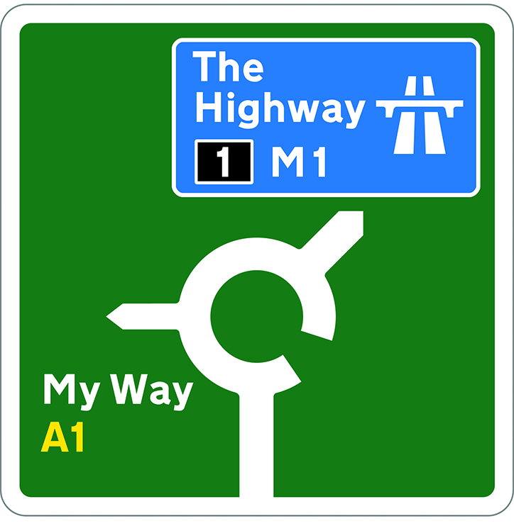
Mark Bonner, GBH: 50th Anniversary of the British Road Sign
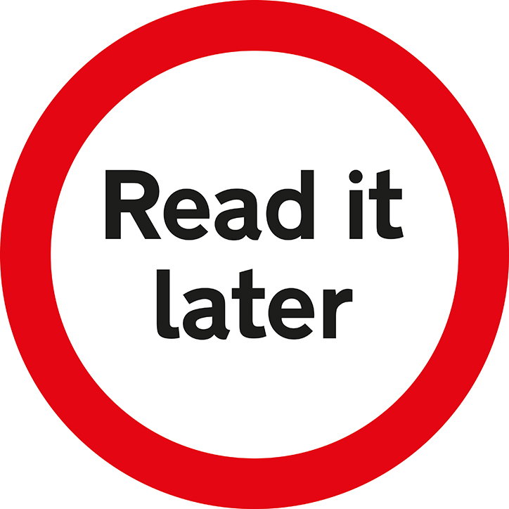
Quentin Newark: 50th Anniversary of the British Road Sign

Graphic Thought Facility: 50th Anniversary of the British Road Sign
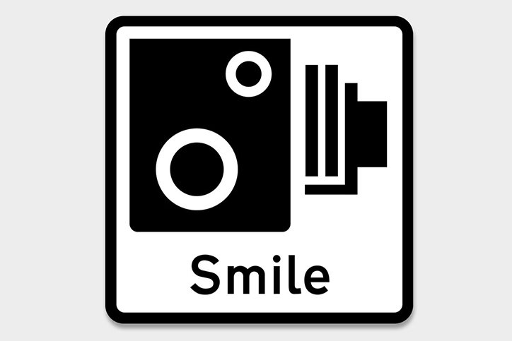
Mike Dempsey: 50th Anniversary of the British Road Sign
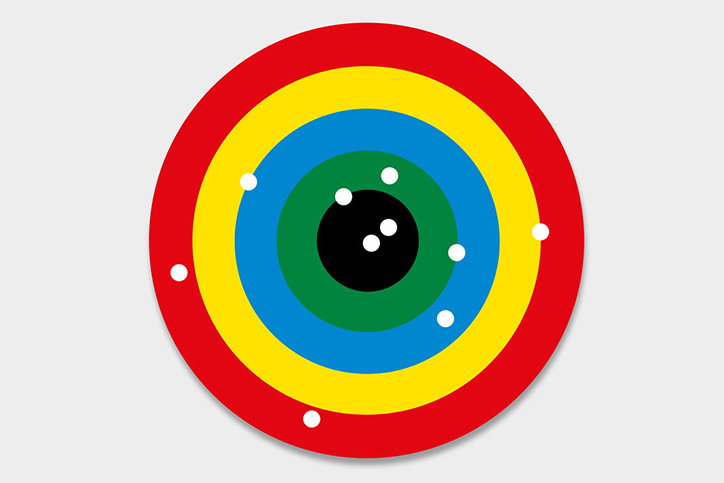
Mike Dempsey: 50th Anniversary of the British Road Sign
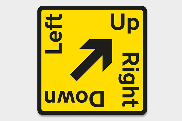
Henrik Kubel: 50th Anniversary of the British Road Sign
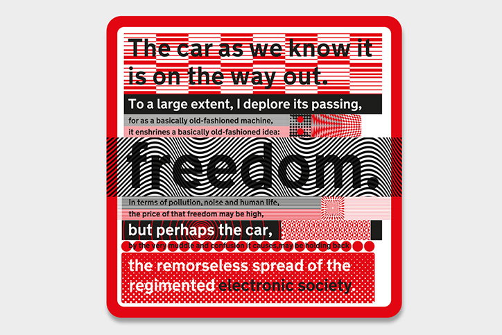
Jonathan Barnbrook: 50th Anniversary of the British Road Sign
Share Article
Further Info
About the Author
—
Rebecca Fulleylove is a freelance writer and editor specialising in art, design and culture. She is also senior writer at Creative Review, having previously worked at Elephant, Google Arts & Culture, and It’s Nice That.



