Launch Recite Me assistive technology
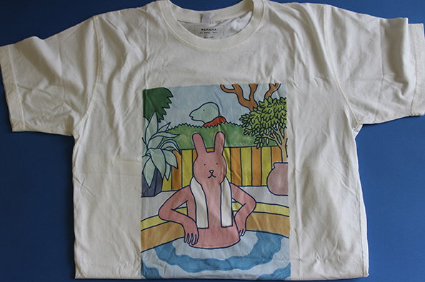
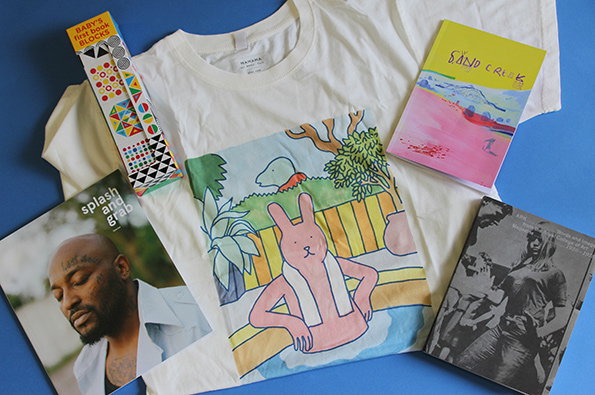
A white T-shirt is laid flat on a blue surface, featuring an illustration of a pink rabbit sitting on a yellow bench. Surrounding the shirt are a colourful patterned box, a pink and yellow booklet titled “Sand Creek”, a black and white book, and a magazine featuring a portrait and the text “splash and grab”.

Meet one rabbit chilling in a jacuzzi plus some cowboys and indians

—
Date
1 August 2014

Put on your shoes, pick up your knapsack and follow me; we’re going on an adventure. First we’re headed to the mountains of Wyoming, where the devious US cavalry are scheming, planning an attack on the Cheyenne Indians. Next we’re travelling back in time to London in the 1950s, to see what some enterprising art students were writing about, before flying east to watch a bull fight in Lisbon and meet a photographer in Tehran. If you’re well behaved, I’ll even let you wear a fun new t-shirt with a pink rabbit hanging on in a jacuzzi on it.

Sound like fun? It sure is.
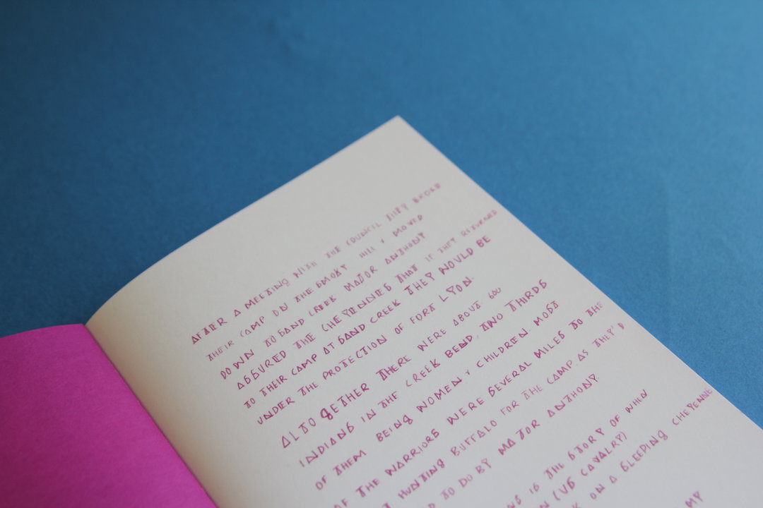
An open book with handwritten text in pink ink on white pages. The book is set against a solid blue background with a bright pink cover visible on the left.
Above

Jess Nash: Sand Creek

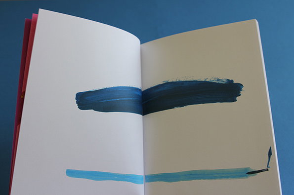
An open book shows two thick, horizontal brushstrokes of blue paint spanning across the pages. A darker navy stroke sits above a lighter cyan one against a plain white and cream background.
Above

Jess Nash: Sand Creek

An illustration across two open book pages shows small, gestural figures in red and blue. The figures are scattered across a white background among simple sketches of huts.
Above

Jess Nash: Sand Creek

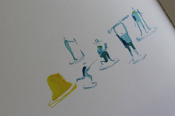
An illustration of five stylised figures in blue, arranged in a sequence across a white page. A single yellow hat sits in the foreground, while the figures appear to be in various states of movement or posing.
Above

Jess Nash: Sand Creek

Jess Nash: Sand Creek
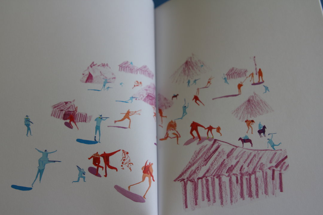
“After a meeting with the council they broke their camp on the smoky hill and moved down to Sand Creek.” So begins Jess Nash’s trip back to the Wild West, a beautifully illustrated story of Chivington’s men’s attack on a Cheyenne camp. This is a tale which doesn’t need words; Jess’ little cavalrymen and Cheyennes move through a colourful, abstract landscape, looking a bit like figurines or toy soldiers. Something about the delicacy and detail of her drawings is just gorgeous, and reminds me of all the ridiculously imaginative adventures that my toys went on up hill and down dale, over the mountainous sofa and along the carpeted valley of my parents’ living room.
www.jessnash.co.uk
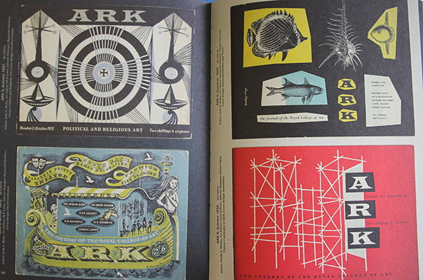
Two open pages of a publication showing four different cover designs for the journal “Ark”. The covers feature a mix of geometric patterns, fish illustrations, and abstract line work in black, white, red, and yellow.
Above

ARK: Words and Images from the Royal College of Art Magazine 1950-1978
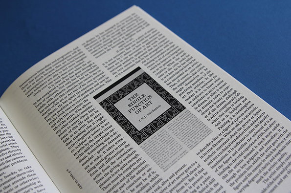
An open book lies against a blue background. A small, square illustration is embedded in the text, featuring a bold border and the title “THE SINGLE FUNCTION OF ART”.
Above

ARK: Words and Images from the Royal College of Art Magazine 1950-1978

An open book rests against a bright blue background. A yellow page features a grainy, black and white image topped with red text that reads “ARK 28 journal of the Royal College of Art 3 shillings or 75 cents”.
Above

ARK: Words and Images from the Royal College of Art Magazine 1950-1978

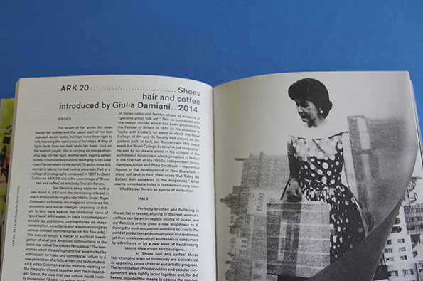
An open magazine displays a black and white photograph of a person in profile, wearing a dark dress and a pearl necklace. Opposite the image, a page of text is titled “hair and coffee” and “Shoes”, introduced by Giulia Damiani in 2014.
Above

ARK: Words and Images from the Royal College of Art Magazine 1950-1978

ARK: Words and Images from the Royal College of Art Magazine 1950-1978
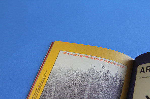
This is quite simply a really interesting anthology which does what it says on the tin. Opening the cover, on one side you can flick back in time through all 54 covers of the RCA’s art and design magazine, whilst on the other current students introduce articles from the archive. These prefaces, written by students on the Critical Writing in Art and Design MA, offer an insight on the contemporary context of the pieces. From advertising to coffee, shoes to space, these topics document the changing preoccupations, ideas and interests of the art student.
www.rca.ac.uk
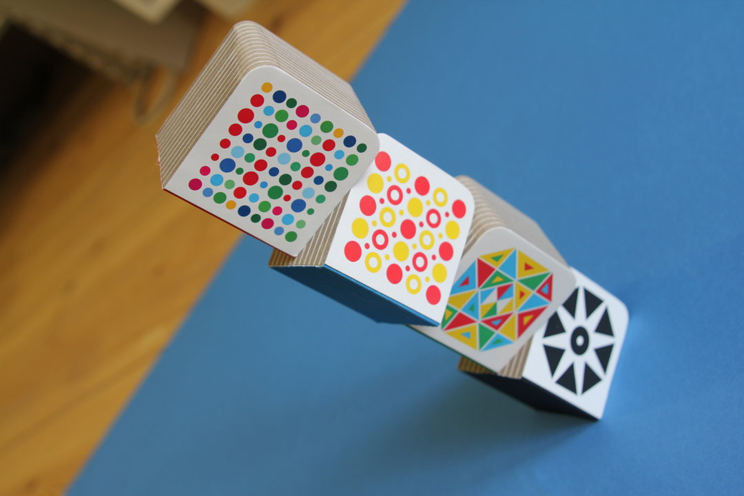
Four small, square blocks are balanced in a diagonal row on a blue surface. Each block features a different geometric pattern in bold colours, including dots and triangles.
Above

Dan Stiles: Baby’s First Book Blocks

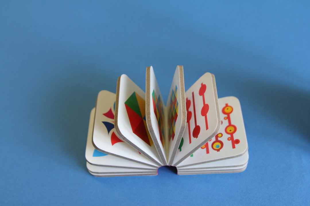
A small, accordion-folded book sits open on a blue background. Each page features a different abstract geometric composition in red, blue, yellow and green.
Above

Dan Stiles: Baby’s First Book Blocks

A series of white cards with colourful geometric patterns are fanned out on a blue surface. The designs include abstract shapes, stars and dots in red, yellow, green and blue.
Above

Dan Stiles: Baby’s First Book Blocks

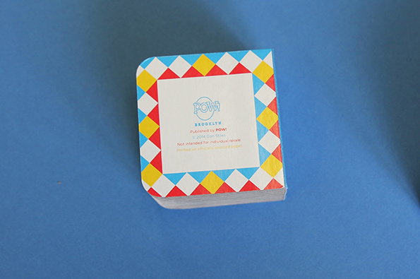
A square stack of cards sits against a plain blue background. The top card features a colourful diamond border surrounding a white centre with the “POW!” logo and the word “BROOKLYN”.
Above

Dan Stiles: Baby’s First Book Blocks

Dan Stiles: Baby’s First Book Blocks
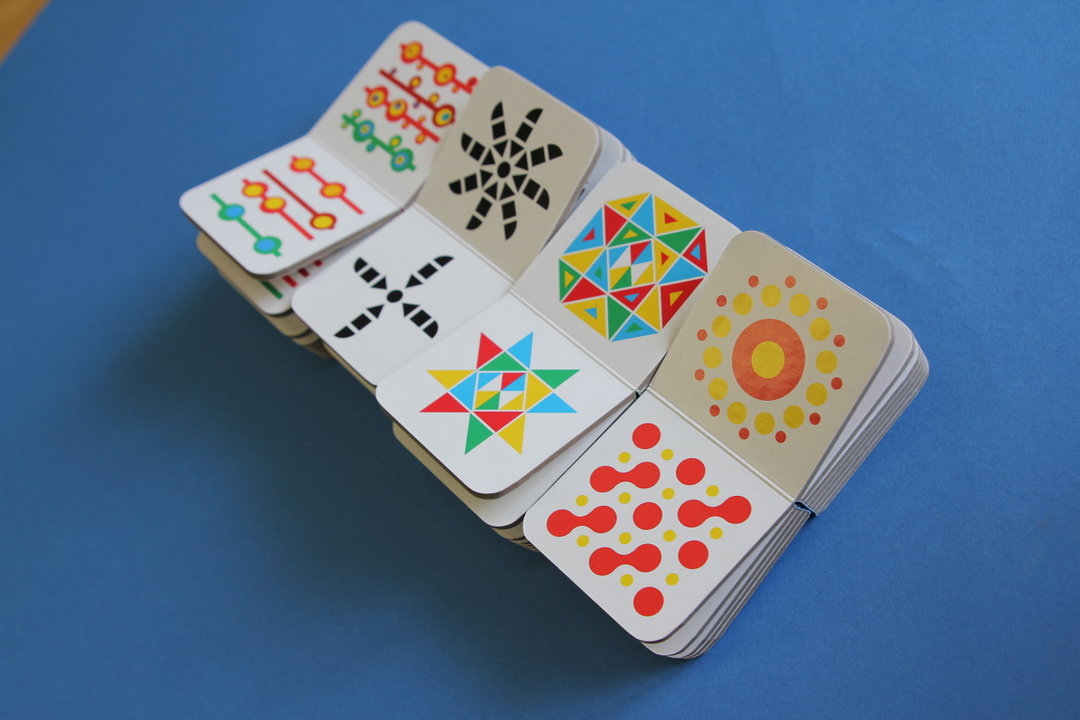
It isn’t often that we get sent in toys (no naughty thoughts now) to the office, so we thought it’d make a nice change to add these building blocks by illustrator Dan Stiles to this week’s Things. They’re blocks that double up as books (ooo), full of pretty geometric pictures and made from that type of board that kids just love to chew. Fun shapes and colourful patterns are supposed to be great for children’s visual development; they also frequently convince us to feature an illustrator’s work on the site. Children clearly have good taste. Or we just never grew up.
www.danstiles.com
A photograph in a magazine shows three people wearing ornate, gold-patterned jackets. One person in the foreground looks off-camera with their hand to their chin.
Above

Splash and Grab: Issue #1

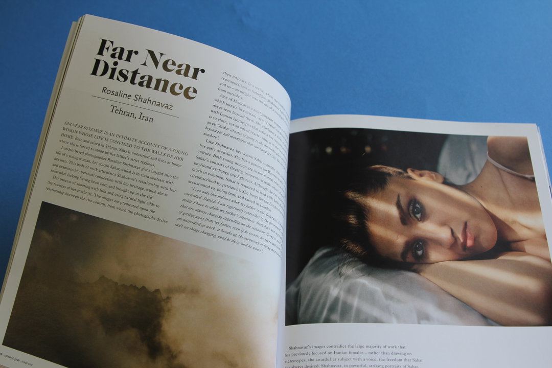
An open book shows a spread from a photography project titled “Far Near Distance” by Rosaline Shahnavaz. The right page features a close-up portrait of a person resting their head on a surface, looking calmly at the camera.
Above

Splash and Grab: Issue #1

The cover of a magazine titled “splash and grab” in white lowercase type. Below the title, it reads “issue one”. A close-up of a person with their eyes closed is shown, with text tattooed across their forehead.
Above

Splash and Grab: Issue #1

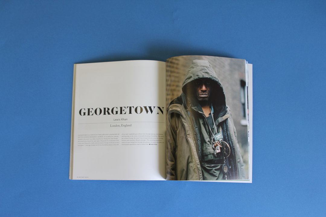
An open book shows a portrait of a person wearing a hooded jacket, looking directly at the camera. The opposite page features the title “GEORGETOWN” above the name “Lewis Khan” and the location “London, England”.
Above

Splash and Grab: Issue #1

Splash and Grab: Issue #1
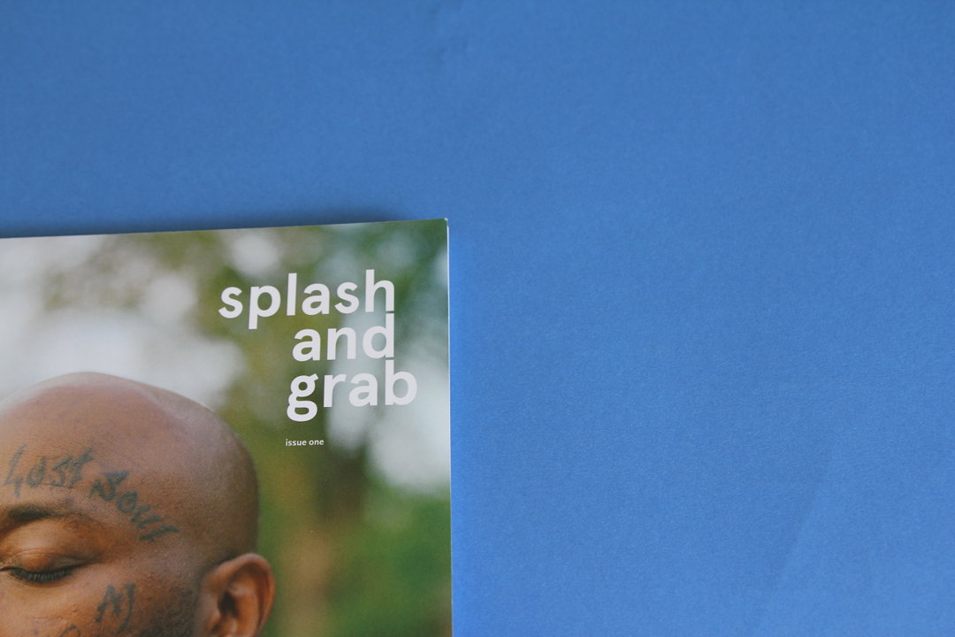
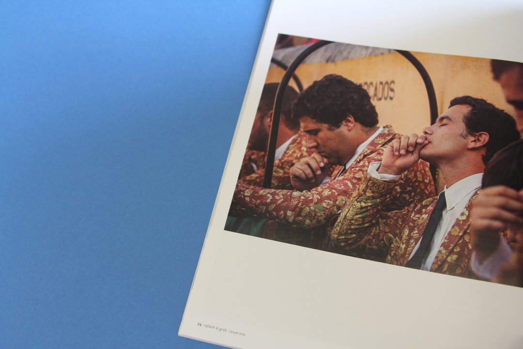
Not only does this new biannual photography magazine feature some fab underexposed photographers, there’s also a pun and a half in their tag line. Taking submissions from all over the world for their blog, they print only the best of the lot along with several interviews. Eduardo Leal’s series of matadors in Lisbon is stunning, and they’ve also selected Luke Casey’s “Portholes” which we spotted for It’s Nice That last year. The magazine is edited by a group of UWE photography graduates and funded by a Kickstarter campaign; we’re excited to see more.
www.splashandgrab.co.uk
An illustration on a white T-shirt shows a pink rabbit-like figure wearing a white garment. The character is set against a background of yellow stripes and green foliage.
Above

Onsen T-Shirt: MAMAMA

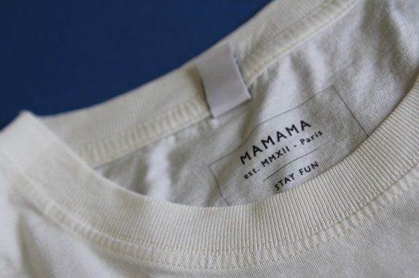
A close-up of the neckline of a white T-shirt. A label on the inside reads “MAMAMA”, “est. MMXII - Paris” and “STAY FUN”.
Above

Onsen T-Shirt: MAMAMA

A close-up of a printed T-shirt featuring a simple illustration of a green creature with a red collar. The figure is set against a light blue background with a brown branch above.
Above

Onsen T-Shirt: MAMAMA

A white T-shirt featuring a central illustration of a pink rabbit sitting in a blue pool. The rabbit has a white towel draped around its neck and is surrounded by green plants.
Above

Onsen T-Shirt: MAMAMA

Onsen T-Shirt: MAMAMA
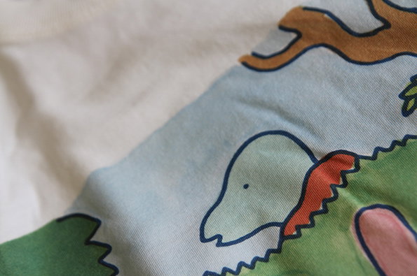
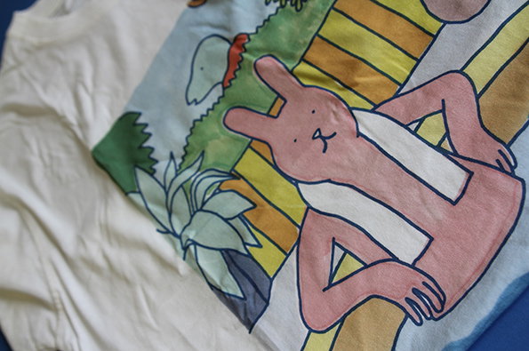
When something arrives in the post accompanied by a business card which has a dolphin hatching out of a banana skin on the back of it, Things can only get better. French clothing brand MAMAMA says that it “sees clothes as a basis to express creativity” and “views a blank t-shirt as a painter would consider his blank canvas, and tries to make each design a bona fide artistic work.” Browsing their website, I’d say they’ve managed that and some.


www.mamama.tictail.com

Share Article

Further Info

About the Author

Amy Lewin

—

It's Nice That Newsletters

Fancy a bit of It's Nice That in your inbox? Sign up to our newsletters and we'll keep you in the loop with everything good going on in the creative world.