New York studio OCD rebrand the USA with Stars and Stripes typeface
I have heard it said that the New York graphic design scene is more splintered and less cohesive than its London counterpart, but the Image of The Studio initiative we covered last year was a fascinating way of bringing together more than 75 NYC studios to compare and contrast the way they each work. It also became a great resource to discover designers we didn’t know that much about, and with each studio commissioned to create something original that reflected their philosophy and aesthetic, it provided a great way into the New York scene.
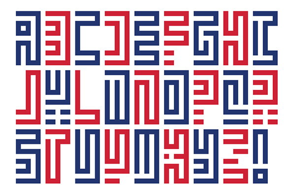
The Original Champions of Design went all out and created a new Stars and Stripes typeface to celebrate the way small businesses like design studios represent a contemporary version of America’s core principles. “All heart and guts and grit, we find a way to do what we love, our way, every day,” they said, and the typeface is a successful manifestation of an ambitious idea.
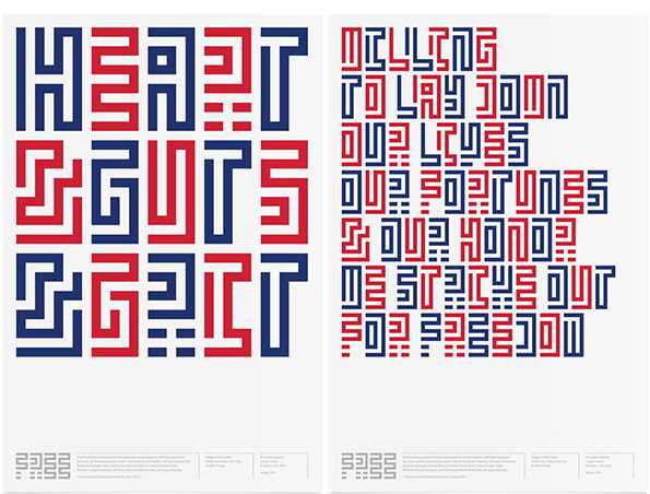
OCD: Revolutionary Posters Type Specimens
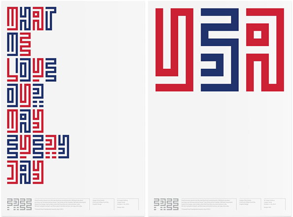
OCD: Revolutionary Posters Type Specimens
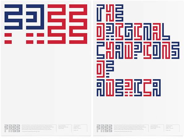
OCD: Revolutionary Posters Type Specimens
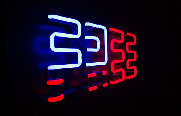
OCD: Type Specimens
Share Article
Further Info
About the Author
—
Rob Alderson is a freelance writer, editor and strategist. He was previously editor-in-chief of It’s Nice That and WePresent, and editor of Design Week. He publishes the newsletter Undo, which tries to make sense of how AI is changing design work, the design process and the design industry.