Launch Recite Me assistive technology
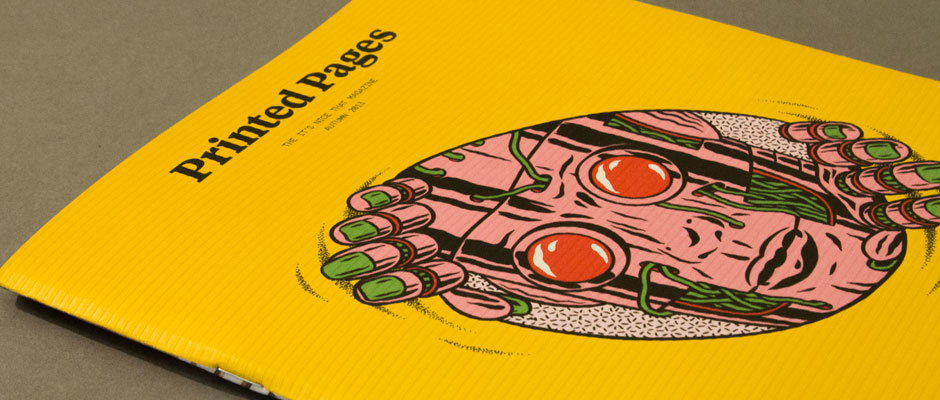
A yellow magazine cover features a pink, robotic face with large orange eyes and green accents. Bold black text in the top left reads “Printed Pages”, with smaller text below identifying it as “The It’s Nice That Magazine” from “Autumn 2013”.

Publication: Look out kids, the Printed Pages Autumn edition has landed!

—
Date
16 September 2013

Now that summer’s done and dusted you probably need something to look forward that’s not Christmas. While we can’t offer you a beach break in the Antibes or a North American road trip, we do have the next best thing; the Autumn issue of Printed Pages! Actually, you don’t need to put a date in the diary either because it’s arrived this very minute and you can buy it in shops RIGHT NOW. We’re pretty excited about this little guy, not just because of the delicious cover stock and exemplary choice of spot colours within, but because of the brilliant people we got to work with and speak to while we were putting it together.

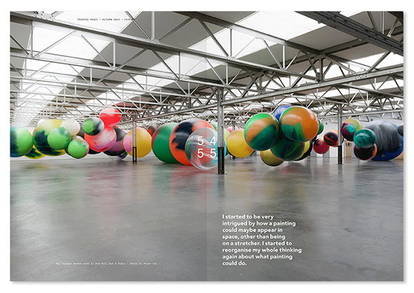
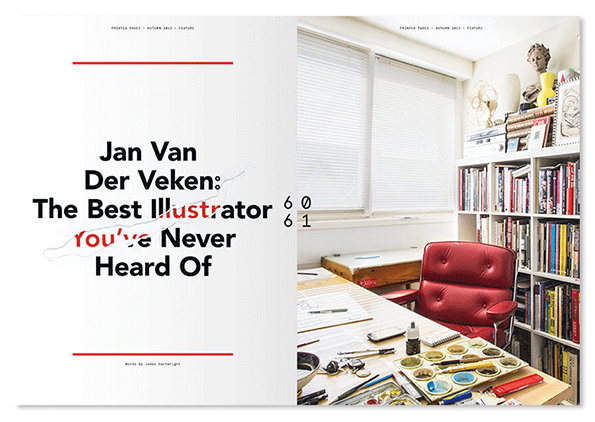
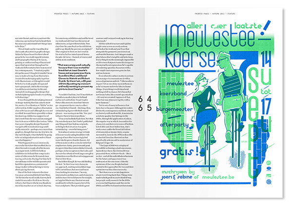
The new issue features interviews with legendary graphic designer Seymour Chwast on his years of experience and lesser-known Belgian illustrator Jan Van Der Veken, looking at the unstoppable rise of his career over the past decade. We tracked down a whole host of Brazilian creatives to find out what makes it such an exciting place for designers, musicians and advertisers alike and pinned down the elusive Katharina Grosse to talk about her unconventional painting practice.

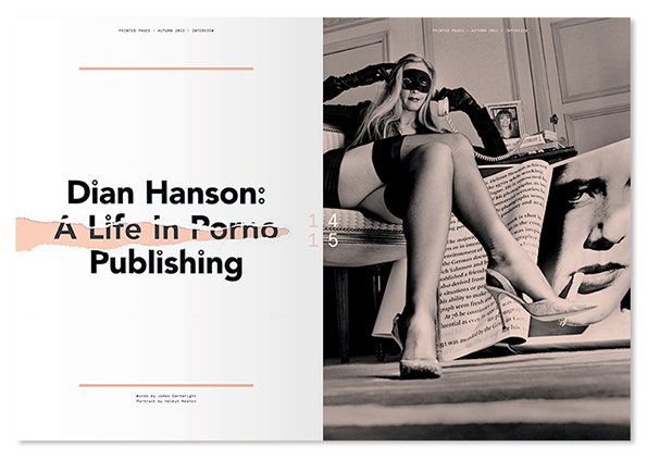
TASCHEN’s sexy books editor Dian Hanson bared all in an in-depth interview about her life in porno publishing, Brecht Vandenbroucke produced an original set of hilarious comics and we watched some seriously dubious films to find out what Hollywood makes of the creative industries.

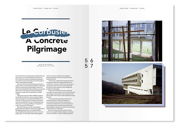
Artist Michael Crowe tries to punch Robin Thicke in the face in the name of being nice, photographer Giles Duley waxes lyrical on the subject of his alarm clock, an object he contends is the ugliest thing he loves, and Justine Bell comes to terms with the reality of fulfilling a design fantasy.

The price is still a mere £4, meaning you can own three months of our blood, sweat and tears (of joy) for the same price as a pint of tepid, gassy lager. We know which one we’d choose.

You can order Printed Pages from our Company of Parrots shop or pick it up in UK stores today.
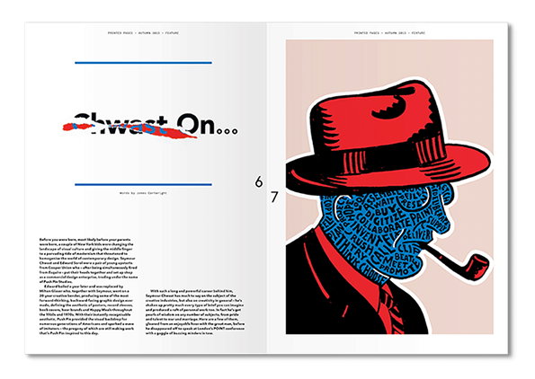
An open magazine spread featuring a profile illustration of a person wearing a red hat and smoking a pipe. Their face is composed of blue typographic patterns with words including “collaborate”, “buy” and “beat streets”. The opposite page features the headline “Chest On...” and a column of introductory text.
Above

Printed Pages Autumn 2013

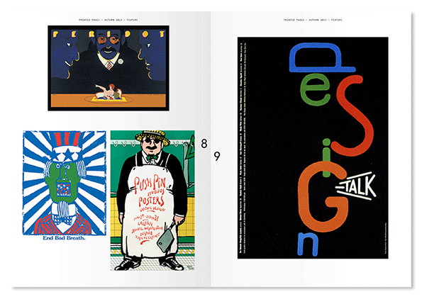
A two-page magazine spread featuring a collection of graphic works. On the left, three illustrations include a surreal scene of a figure at a table and a poster that reads “End Bad Breath.” The right page shows a bold typographic poster with the word “design” stacked vertically in colourful letters, followed by “–talk”.
Above

Printed Pages Autumn 2013

A double-page magazine spread featuring a black and white photograph of a person wearing a mask, black gloves, and stockings. They sit in a chair next to a large portrait and a page of text. The opposite page reads “Dian Hanson: A Life in Porno Publishing”.
Above

Printed Pages Autumn 2013

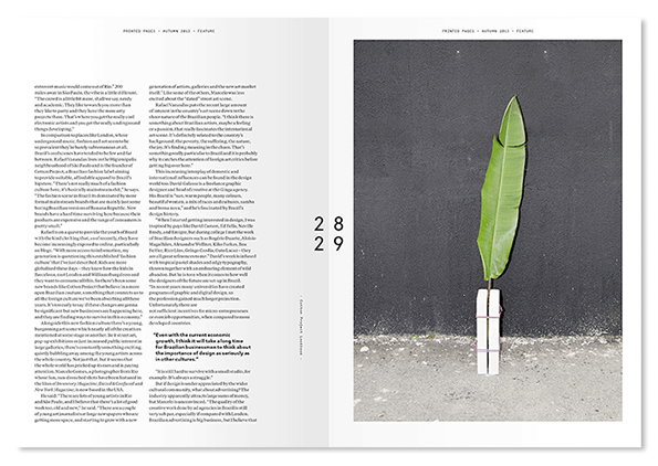
An open magazine spread featuring a two-page article. The left page contains columns of text, while the right page shows a photograph of a single green leaf standing upright against a grey wall.
Above

Printed Pages Autumn 2013

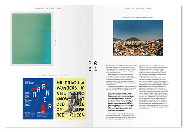
An open magazine spread featuring a mix of photography and graphic design. One page shows a green gradient image and a bold typographic layout with the text “MR DRACULA WONDERS IF NEIL YOUNG KNOWS THAT OLD TALE OF THE RED QUEEN”.
Above

Printed Pages Autumn 2013

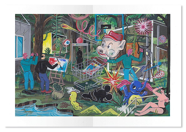
A surreal painting of a cluttered outdoor scene featuring a mix of figures and objects. A person paints on an easel while another takes a photo, nearby a figure wears a giant pig head.
Above

Printed Pages Autumn 2013

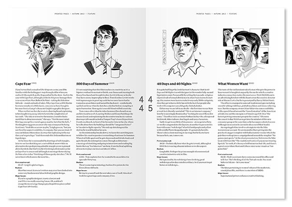
A two-page magazine spread featuring four black and white character sketches. Each illustration is paired with a column of text and a title: “Cape Fear”, “500 Days of Summer”, “40 Days and 40 Nights” and “What Women Want”.
Above

Printed Pages Autumn 2013

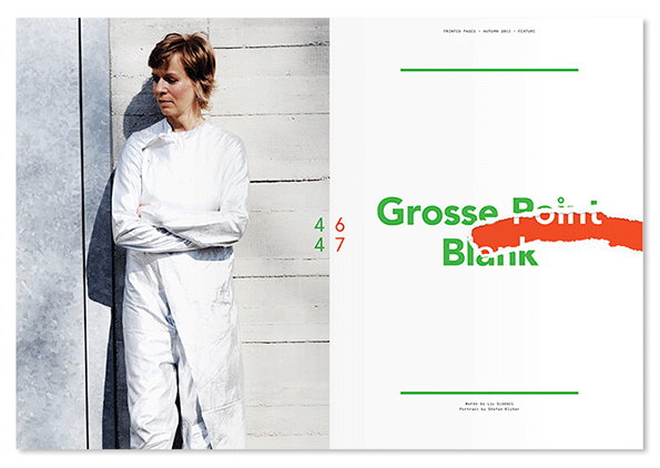
A person in a white jumpsuit stands with arms folded against a pale, textured wall. Beside them, a white page features the green text “Grosse Point Blank”, with the word “Point” partially obscured by a red brushstroke.
Above

Printed Pages Autumn 2013

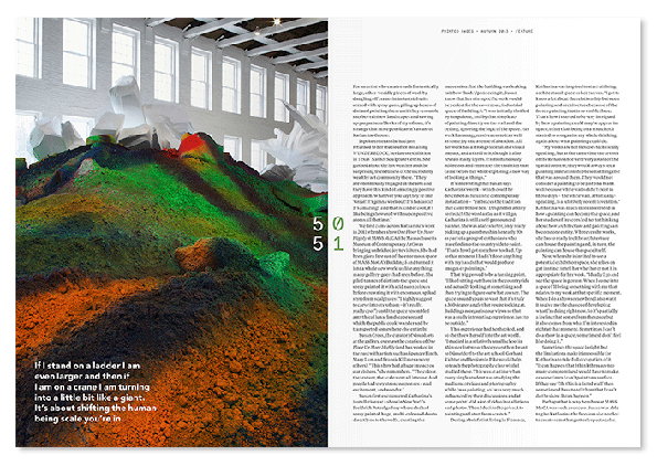
A double-page magazine spread featuring a large-scale installation of colourful, undulating fabric draped across a white gallery space. The left page includes a quote in bold white text that reads “If I stand on a ladder I am even larger and then if I am on a crane I am turning into a little bit like a giant.”
Above

Printed Pages Autumn 2013

A large industrial space filled with dozens of oversized, colourful painted spheres. The spheres float at varying heights across the room, featuring swirls of green, orange, blue and red. A block of text in the foreground reads, “I started to be very intrigued by how a painting could maybe appear in space”.
Above

Printed Pages Autumn 2013

A two-page magazine spread featuring an article titled “Le Corbusier: A Concrete Pilgrimage”. The right page shows two photographs of a brutalist concrete building, one focusing on a window frame and another showing the building's exterior.
Above

Printed Pages Autumn 2013

A double-page magazine spread featuring a profile of an artist. The left page is white with bold black text that reads “Jan Van Der Veken: The Best Illustrator you’ve Never Heard Of”. The right page shows a bright studio with a red leather chair and a desk covered in paints and brushes. A tall bookshelf filled with books and sculptures stands against the wall.
Above

Printed Pages Autumn 2013

A two-page magazine spread featuring a long editorial text on the left and a bold illustration on the right. The artwork shows two figures on bicycles in a bright blue and green palette, accompanied by large, stylised text that reads “Meulestee Koerse”.
Above

Printed Pages Autumn 2013

Share Article

About the Author

It's Nice That

—

This article was written by the It’s Nice That team. To find our editors and writers, please head over to our Contact page.

It's Nice That Newsletters

Fancy a bit of It's Nice That in your inbox? Sign up to our newsletters and we'll keep you in the loop with everything good going on in the creative world.