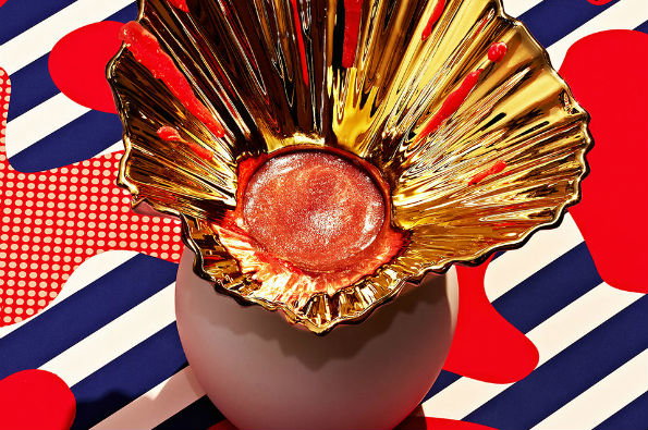
Photography: Stills and Strokes' images of smoothies are beautifully garish
Smoothies. Just the word alone sounds fun doesn’t it? But they do have an air of healthy superiority to them sometimes. I love how they dress themselves up as something mildly nutritious when really they’re just a jacked-up milkshake with green bits thrown in for extra super food points.
Luckily for us photography agency Stills and Strokes have decided to capture smoothies at their most garish and loud in this project for SLEEK Magazine by teaming up with porcelain and glassware brand, Rosenthal. Clashing colours, prints, textures and glassware all collide together to make something so in-your-face it’s actually quite beautiful. These images are the definition of jazzy and I love the contrast between the natural and synthetic created here by using hard light, it’s a great play on our usual expectations of how we view the smoothie trend.
Stills and Strokes creativity doesn’t stop with this series though with their other projects being as equally bold and exciting so take a look if your senses need a bit of a waking up.
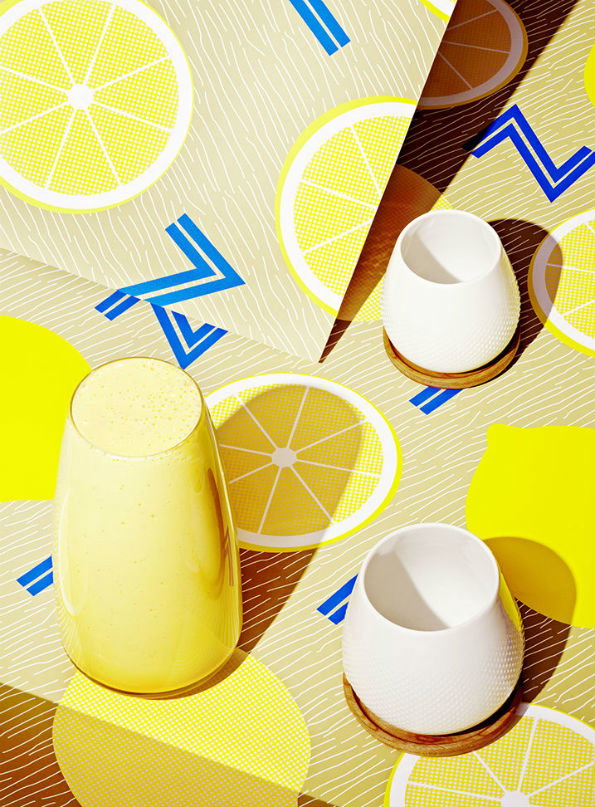
Stills and Strokes: SLEEK Magazine
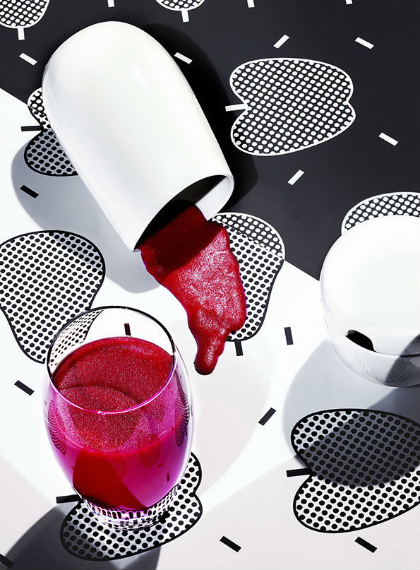
Stills and Strokes: SLEEK Magazine
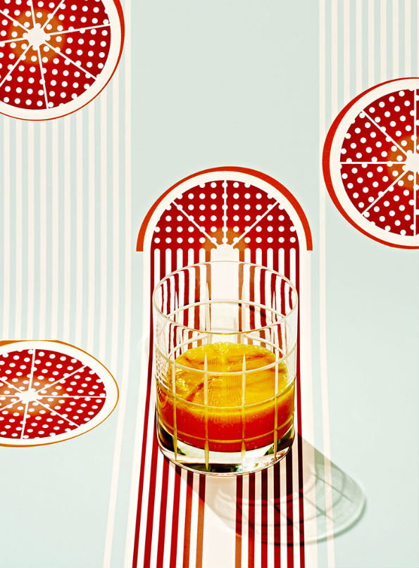
Stills and Strokes: SLEEK Magazine
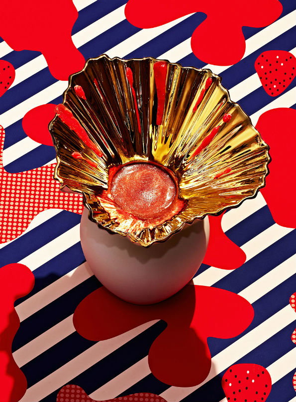
Stills and Strokes: SLEEK Magazine
Share Article
Further Info
About the Author
—
Rebecca Fulleylove is a freelance writer and editor specialising in art, design and culture. She is also senior writer at Creative Review, having previously worked at Elephant, Google Arts & Culture, and It’s Nice That.