Launch Recite Me assistive technology
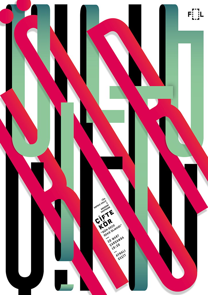
A graphic poster featuring bold, overlapping typographic elements in red and green gradients. A white rectangular block contains the text “ÇİFTE KÖR”, followed by “DÜN GECE SEKS OLMADI”, the date “30 MART ÇARŞAMBA 18:30” and the location “AYNALI GEÇİT”.

Nicely designed and varied cinema posters from Turkish agency Studio Sarp Sozdinler

—
Date
22 June 2016

Studio Sarp Sozdinler first caught our eye back in 2014 for a series of what we dubbed “strong, communicative and often powerful” poster designs. Since then, Turkish designer Sarp, the studio founder, hasn’t slowed down, having spent time in New York working with Sagmeister & Walsh, and now boasting a beautiful portfolio of work across print design, branding, website creation and typography. Today though we’re back to Sarp’s posters, focusing on a new series created for Instanbul-based experimental film group Fol Cinema Society. Sarp has so far designed more than 30 posters for the organisation, each with a unique approach to layout, style and typography. Merging warped text, found imagery and geometric patterns, they work both beautifully as a set and individually.

Sarp says: “In the beginning of my working relationship with Fol, we decided to bring forth the content of events on each poster instead of broadcasting a strict identity other than putting their logo on them. The main approach is obviously typographical, which is deliberate, taking the idea of building its core by transferring emotion through the power of letters and typography instead of the speculative power of imagery.”
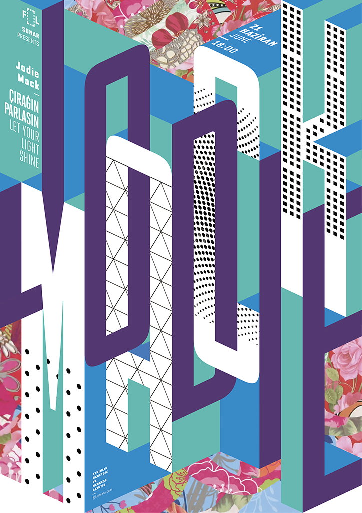
A bold typographic poster featuring the name “Jodie Mack” in large, 3D block letters. The letters are filled with various patterns, including dots, grids and floral imagery, set against a blue and white background.
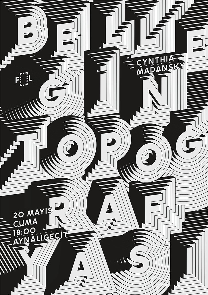
A black and white typographic poster featuring bold, 3D letters with a layered, ribbed effect. The text reads “Belle Gin Topografyasi” and “Cynthia Madansky”. Smaller text in the bottom left corner lists the date “20 Mayis Cuma” and the time “18:00” at “Aynaligecit”.
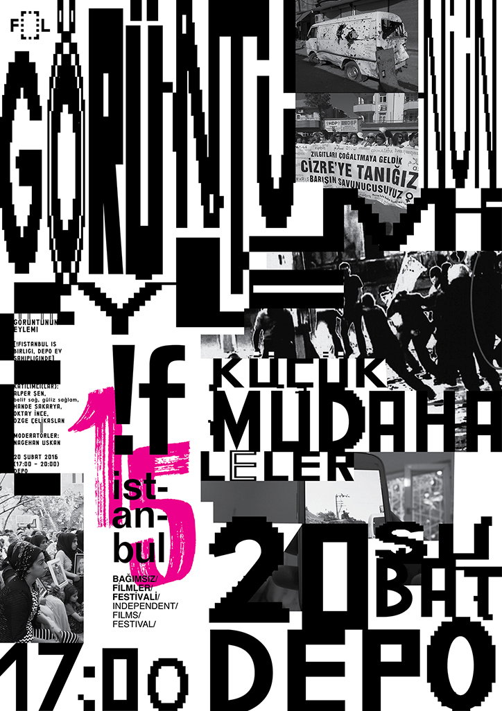
A black and white collage poster featuring fragmented typography and gritty documentary photographs. Images show a damaged van, people holding a banner, and a group of figures in a street confrontation. Large, bold text includes the words “GÖRÜNTÜNÜN EYLEMİ”, “MÜDAHALELER” and “DEPO”, with the date “20 SUBAT” and the time “17:00” prominently displayed.
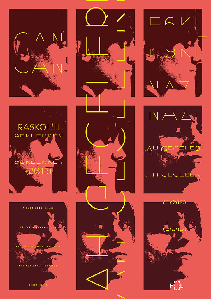
A graphic poster featuring a high-contrast portrait of a person, split across a grid of nine red and yellow panels. Stylised, abstract yellow typography is layered over the image, including the text “Raskol’lu” and “2013”.
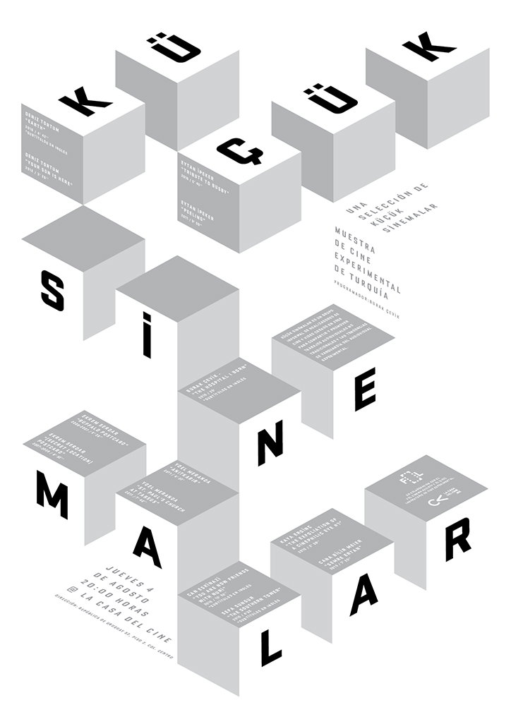
A 3D typographic composition in grey and white forms the words “KÜCÜK SİNEMALAR”. The letters are constructed as blocks, with smaller text and names listed across their surfaces. The layout includes the phrase “Una selección de Küçük Sinemalar” and “Muestra de cine experimental de Turquía”. Event details at the bottom read “Jueves 4 de agosto 20:00 horas La Casa del Cine”.
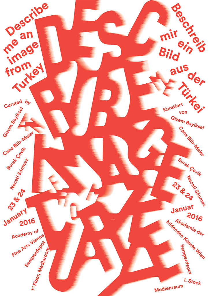
A red and white typographic poster featuring the word “Describe” distorted into a large, abstract central shape. Text around the edges reads “Describe me an image from Turkey” in English and “Beschreib mir ein Bild aus der Türkei” in German. The poster lists the curators Gizem Bayiksel and Cana Bilir-Meier, alongside artists Burak Çevik and Necati Sönmez. It details an event on 23 and 24 January 2016 at the Academy of Fine Arts Vienna.
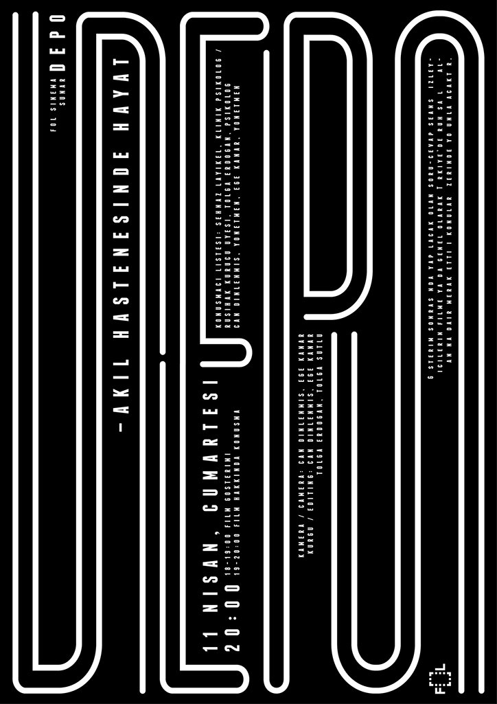
A black and white poster featuring a bold, abstract graphic of interlocking white lines. Vertical text reads “Akıl Hastanesinde Hayat” alongside the date “11 Nisan, Cumartesi” and the time “20:00”.
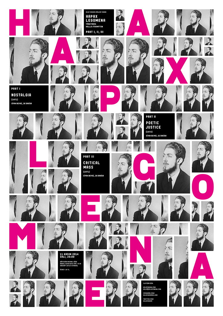
A black and white typographic poster featuring a grid of portraits of a person in a suit and tie. Large pink letters spell out “Hapax Legomena” across the composition. Smaller text blocks identify three parts: “Nostalgia”, “Poetic Justice” and “Critical Mass”.

Share Article

About the Author

Emily Gosling

—

Emily joined It’s Nice That as Online Editor in the summer of 2014 after four years at Design Week. She is particularly interested in graphic design, branding and music. After working It's Nice That as both Online Editor and Deputy Editor, Emily left the company in 2016.

It's Nice That Newsletters

Fancy a bit of It's Nice That in your inbox? Sign up to our newsletters and we'll keep you in the loop with everything good going on in the creative world.