Things is here – lounging with hip LA kids, learning how to make beer and loving new YCN mag
The weather this week has been a frenzy of unpredictability; now and then it looks like summer’s going to make a reappearance, and then the rain comes pouring down, slamming on the glass windows at the top of our studio and leaving a mountain of soaked umbrellas by the door. But at least – thanks to our wonderful contributors – we can always rely on Things to brighten up our day! Today, we’re looking at all sorts of publications showcasing beautiful illustrations, rom-com stills, the cool kids of Los Angeles, supercool layouts, aaaaaaand lessons on how to make our own beer and soap!
YCN: Ideas Illustrated
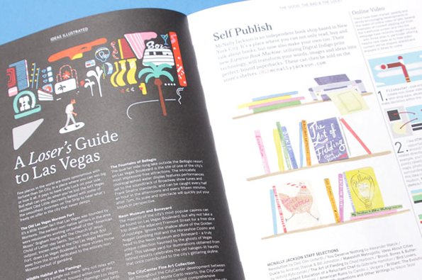
YCN: Ideas Illustrated
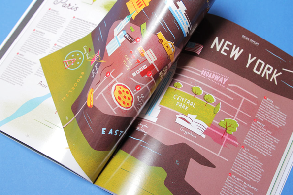
YCN: Ideas Illustrated
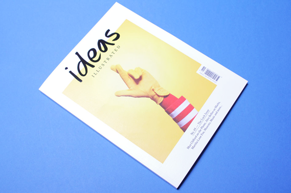
Ideas Illustrated: No. 05 – The Luck Issue
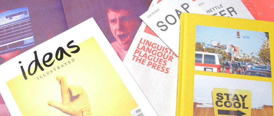
What it says on the tin. An awesome tin packed with amazing images – varied, beautiful, and illustrating all manner of subject material, from women’s sport and the British penal system, to mathematics and a piece entitled, A Loser’s Guide to Las Vegas. YCN have rung the changes with their publication and there’s a lot of wonderfully presented representational material, with lovely abstract pieces by Andrew Clarke. There’s also a little booklet called My Week with Woody by Thomas J. Hughes, wherein the writer and illustrator depicts an imaginative week with the director – which, amusingly, fails to live up to expectations.
www.ideas-illustrated.com
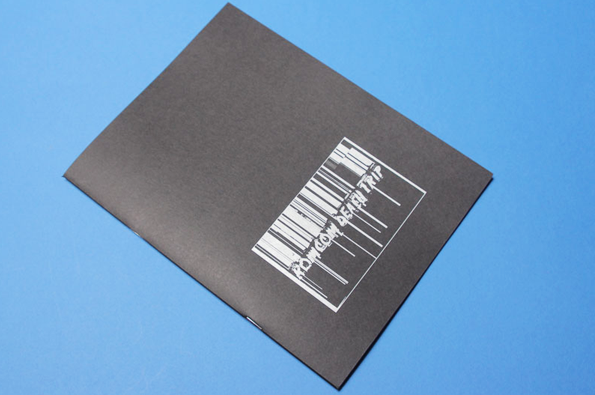
Charlie Behrens: Romcom Death Trip
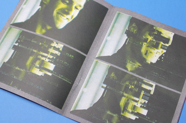
Charlie Behrens: Romcom Death Trip
Charlie Behrens: Romcom Death Trip
Charlie Behrens: Romcom Death Trip
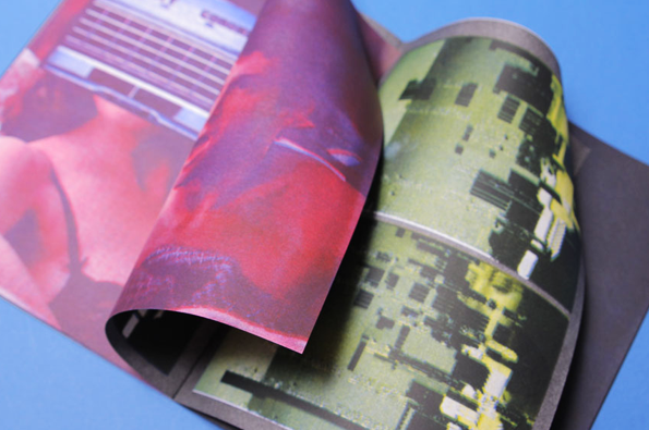
Next up is former Student of the Month Charlie Behrens. Behrens this week dropped in his new book, Romcom Death Trip, which meditates on the similar levels of predictability involved in the viewing of both romantic comedies and slasher flicks. The result, with its grainy mash-up of film stills in a variety of colours and layouts, is an intriguing re-representation of source images. The silver barcode-style title on the front cover is also beautifully done.
www.plethoralondon.wordpress.com
RJ Shaughnessy: Stay Cool
RJ Shaughnessy: Stay Cool
RJ Shaughnessy: Stay Cool
RJ Shaughnessy: Stay Cool
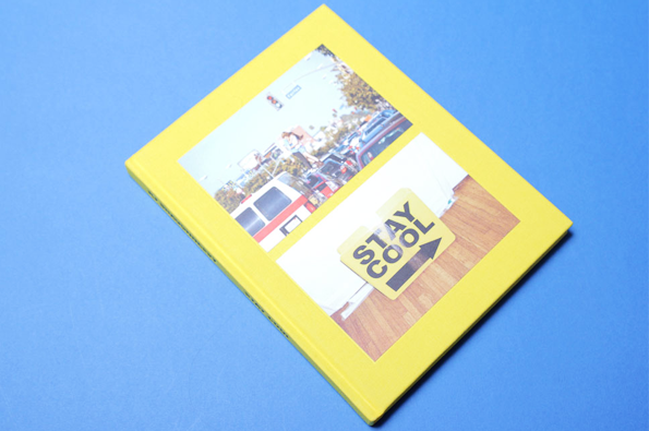
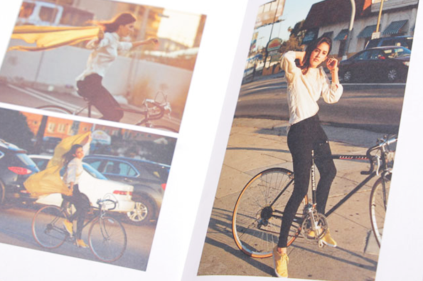
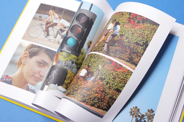
Nothing like a bright burst of Los Angeles to warm up a rainy London day. LA-based photographer RJ Shaugnessy sent us this book, a compilation of images of youngsters taken out and about on the freeways, boulevards, and avenues of the much warmer city. Flowers, palm trees, street-signs, wire fencing, and blue skies all feature in these sunny compositions; there’s a keen sense of place, youth, and whimsy – it makes you want to run off and do nothing but scale traffic lights, lounge around on skateboards, and splash about in fountains. Oh to be young, oh LA!
www.rjshaughnessy.com
Joe Baker: The Makers Project
Joe Baker: The Makers Project
Joe Baker: The Makers Project
Joe Baker: The Makers Project
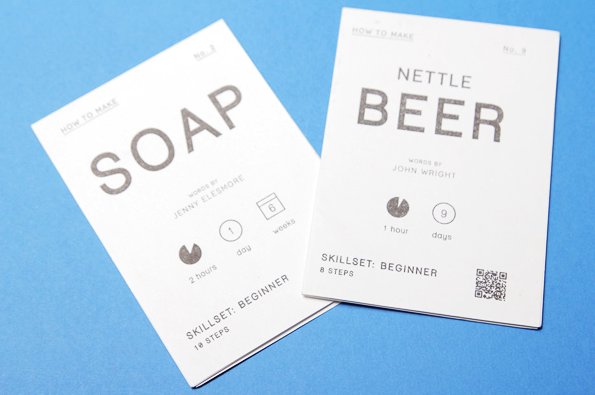
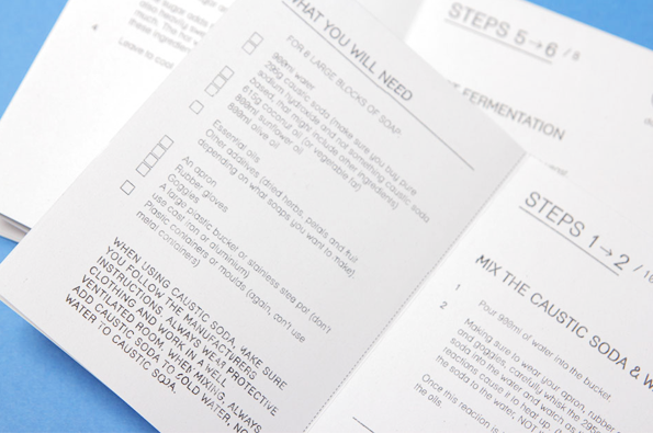
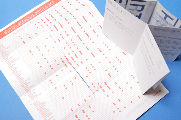
We were delighted to receive these little guidebooks on how to make soap and beer _ we hadn’t really given their manufacture a thought before, but are very much looking forward to trying it out! Especially as it’s nettle beer (which the booklet guarantees doesn’t sting…). Very beautifully composed and executed, they have the style of old-fashioned manuals but very sophisticated layout and symbolic considerations. Joe Baker made them as part of his self-initiated The Makers Project, which emphasises the importance of actually knowing how to make stuff. The physical element to the work is also very important, as it’s interactive – you open it up and on the reverse side is a poster!
The soap booklet has a lovely poster about shirt patterns, and the beer booklet features a beautiful and extremely useful chart that shows you which fruits and vegetables are in season at any given time of the year. The orange print also contrasts fantastically with the black soy-ink printed recipes. Love it!
www.joehenrybaker.co.uk
Simon Rogers: Linguistic Langour Plagues the Press
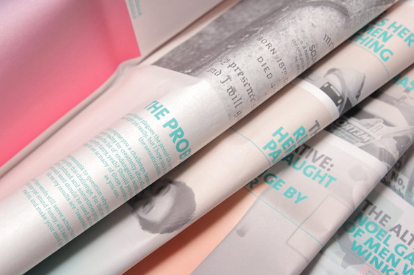
Simon Rogers: Linguistic Langour Plagues the Press
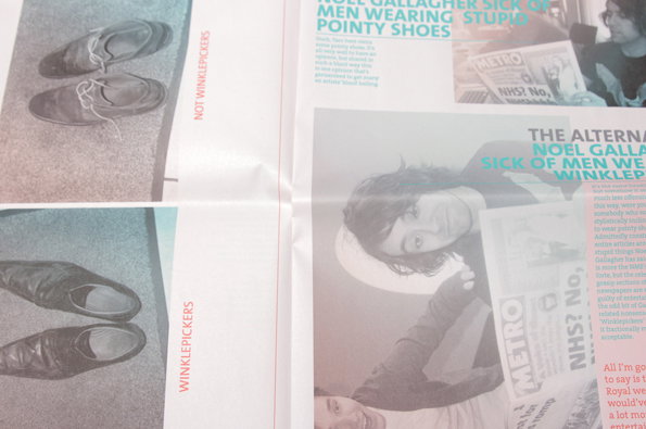
Simon Rogers: Linguistic Langour Plagues the Press
Simon Rogers: Linguistic Langour Plagues the Press
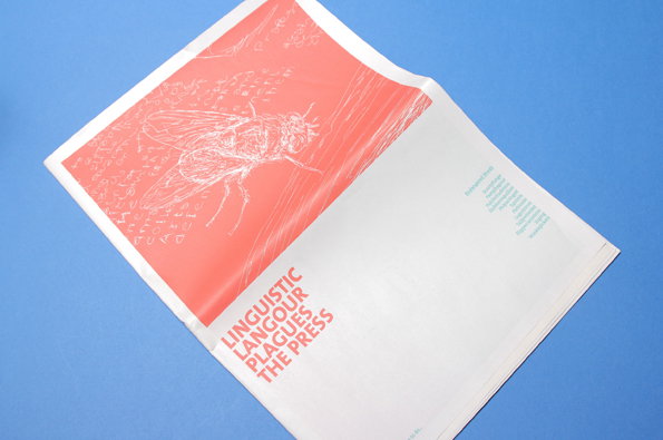
Here in London the Leveson Inquiry has been going on for what feels like about five years now – and despite its avowed aim to restore journalism standards in the UK, it seems mainly preoccupied with funny text messages and horses (don’t ask). Luckily Simon Rogers is cutting to the chase and writing to members of the press and challenging us to help save some endangered words such as scurryfunge, slubberdegullion and jirging. A neat concept executed in an engaging and interesting way, this is thought-provoking done very well. Take that Lord Justice Leveson!
www.sixfootfour.co.uk