Launch Recite Me assistive technology
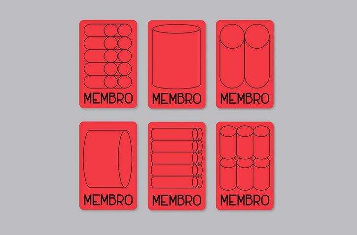
Six red cards arranged in two rows of three. Each card features a different black line drawing of cylindrical shapes and the word “Membro” at the bottom.

The Yarza Twins design playful branding for an abandoned bread factory

—
Date
1 April 2016

In 2011, the Yarza Twins AKA designers Eva and Marta Yarza, petitioned for Panificadora, an old bread factory in Vigo, Spain to be saved from demolition. Their campaign saw them collect over 5,000 signatures and pushed the mayor to protect the building, which was declared a site of cultural interest soon after. Several years later though, it still sits in ruins despite the landmark status it gained. While the site still waits to be converted, the Yarza Twins recently imagined the branding for Panificadora, were it to become a centre for arts, culture and youth as they hope it eventually will be. 

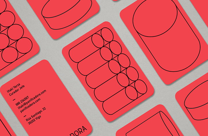
Using the silos of the factory, the most distinctive part of the building, the designers have graphically interpreted the cylinders to use throughout the identity. These black outlined tubes work well with the crisp red and white used everywhere else. This fresh aesthetic provides a blank canvas for the fictional programme of events to play out across. The typeface has been designed using the original type found on the entrance gates of Panificadora, giving it a last nod to its past. 
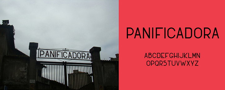
A split image showing a weathered sign and a modern typeface. On the left, a metal sign reading “PANIFICADORA” sits atop a gated entrance to a derelict building. On the right, the same word and the full alphabet are rendered in a clean, sans-serif font against a red background.
Above

Yaza Twins: Panificadora

A collection of red business cards with black line illustrations of cylinders. One card displays contact details for “Iñaki Yarza, Curador Jefe”, including an email and a Vigo address.
Above

Yaza Twins: Panificadora

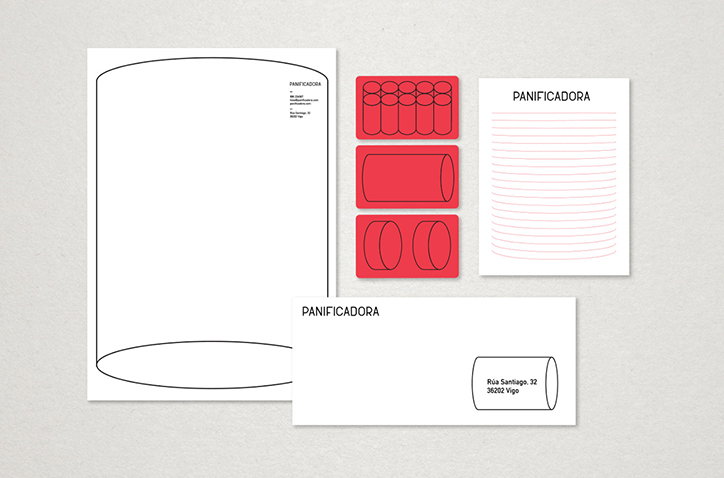
A branding identity for “Panificadora” featuring a white envelope, notepad, and a large white sheet with a cylinder outline. Three red cards show simplified diagrams of bread loaves and a cylinder.
Above

Yaza Twins: Panificadora

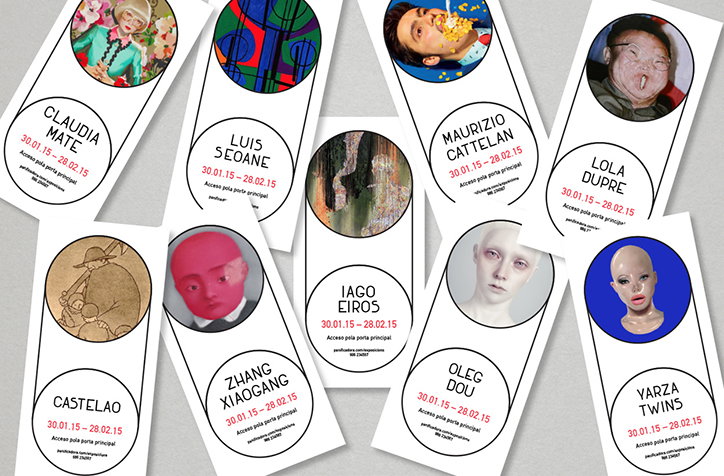
A collection of oval artist passes scattered across a grey surface. Each pass features a circular portrait at the top, a name in bold capitals, and the dates “30.01.15 – 28.02.15”.
Above

Yaza Twins: Panificadora

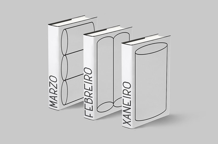
Three white books stand side by side against a grey background. Each cover features a black line drawing of a cylinder and a month written vertically: “MARZO”, “FEBREIRO” and “XANEIRO”.
Above

Yaza Twins: Panificadora

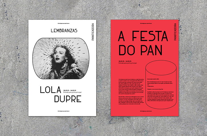
Two posters side by side on a grey concrete surface. The first is white with a black and white portrait of a person and the text “Lembranzas” and “Lola Dupre”. The second is red with bold black typography that reads “A Festa Do Pan”.
Above

Yaza Twins: Panificadora

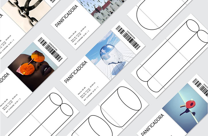
A collection of tickets and cards scattered across a light grey surface. Some feature photographs and the word “Panificadora”, while others show simple black line drawings of cylinders.
Above

Yaza Twins: Panificadora

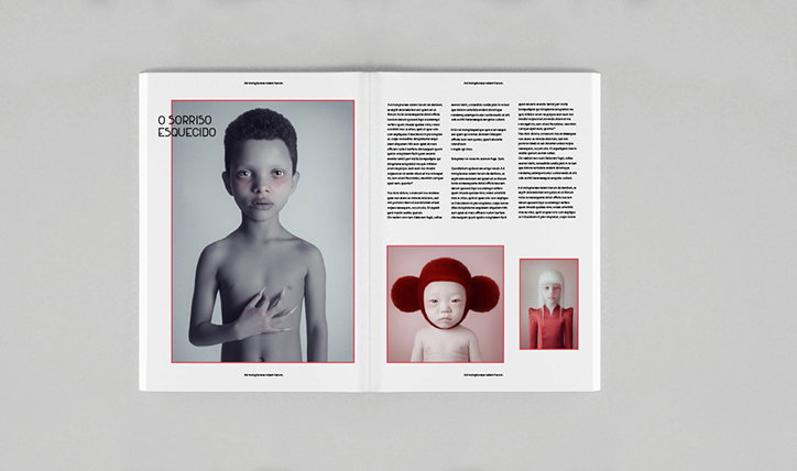
An open book shows a spread featuring a black and white portrait of a person and two smaller colour images. The left page includes the title “O SORRISO ESQUECIDO” beside the portrait.
Above

Yaza Twins: Panificadora

Share Article

Further Info

About the Author

Rebecca Fulleylove

—

Rebecca Fulleylove is a freelance writer and editor specialising in art, design and culture. She is also senior writer at Creative Review, having previously worked at Elephant, Google Arts & Culture, and It’s Nice That.


It's Nice That Newsletters

Fancy a bit of It's Nice That in your inbox? Sign up to our newsletters and we'll keep you in the loop with everything good going on in the creative world.