



Launch Recite Me assistive technology
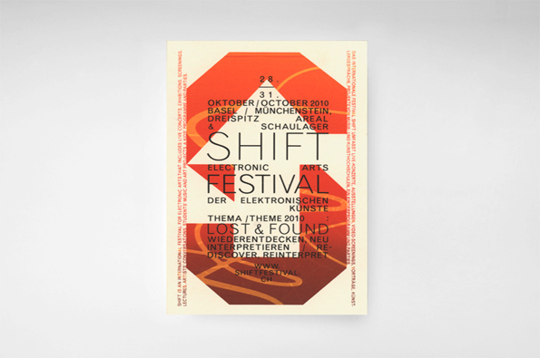
A typographic poster for the “Shift Electronic Arts Festival” in orange, red and cream. The text includes the dates “28. 31. Oktober/October 2010” and the theme “Lost & Found”.

Sweet Swiss studio Claudiabasel have a deliciously diverse portfolio

—
Date
23 April 2012

Not only are the Swiss good at producing luxury time-tellers but they’re also very good at graphic design. Claudiabasel, a small studio of designers who met while studying at the HGK Basel, have been producing an impressive amount of work that differs from contemporary layouts and strong images to more traditional looking design with strong type and flat colours. It’s their diverse range of locally-based clients, like architecture schools, theatres and fashion designers, that have allowed them to continually experiment visually and try different forms. Even though not in my (very limiting) mother tongue, it’s all so striking that becomes completely irrelevant.
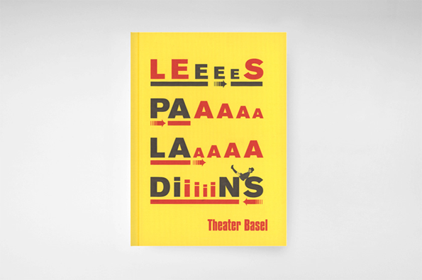
A yellow book cover featuring bold, distorted red and black typography. The text reads “LEEEES”, “PAAAAA”, “LAAAAA” and “DiiiiiN’S”, with the words “Theater Basel” printed in smaller red type at the bottom.
Above

Claudiabasel: Theater Basel play booklet, 2006
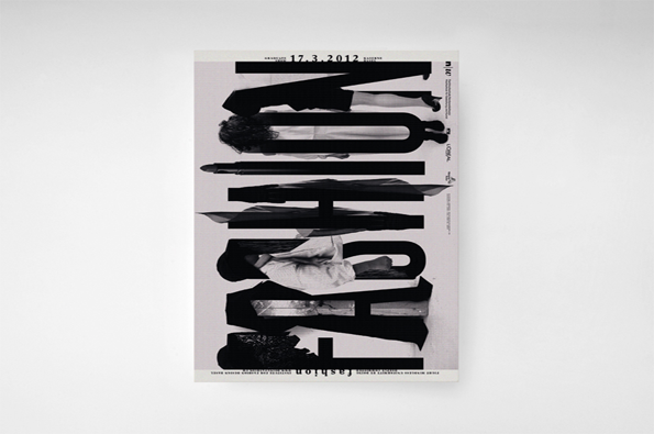
A typographic poster featuring the word “FASHION” in large, bold, black letters. The text is layered over a black and white image of a person, creating a fragmented, mirrored effect.
Above

Claudiabasel: Academy of Art and Design HGK Basel Graduate Show, 2012
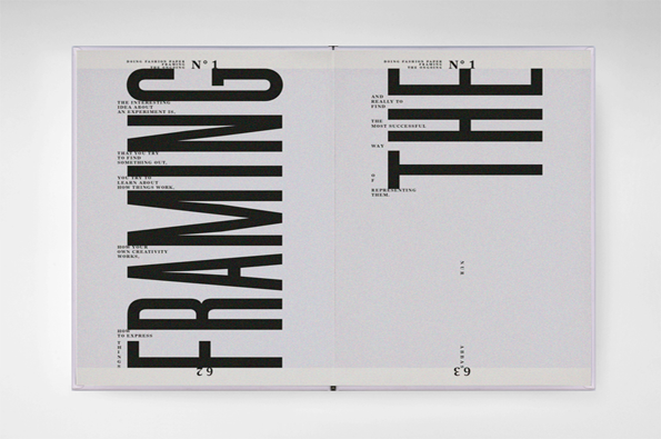
An open magazine spread features bold, black typography on a pale grey background. The word “FRAMING” runs vertically on the left page, while “THE” is printed in a large, mirrored font on the right.
Above

Claudiabasel: Academy of Art and Design HGK Basel Graduate Show, 2012
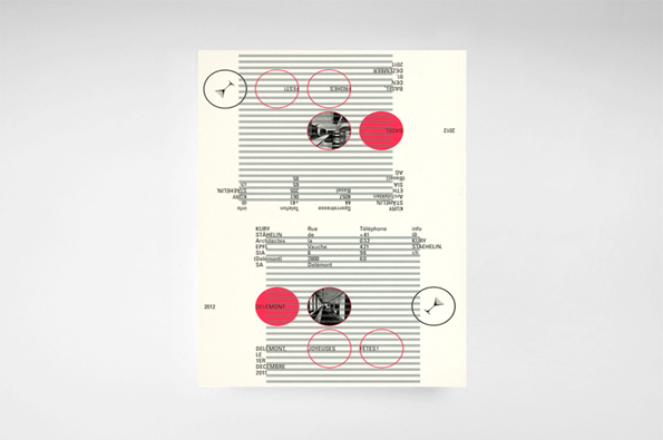
A graphic design layout featuring horizontal grey lines and red circular elements. Text is arranged in a mirrored, architectural style, including the words “JOYEUSES FETES!” and “BASEL”.
Above

Claudiabasel: Kury Stahelin Architectes SA stationary, 2011
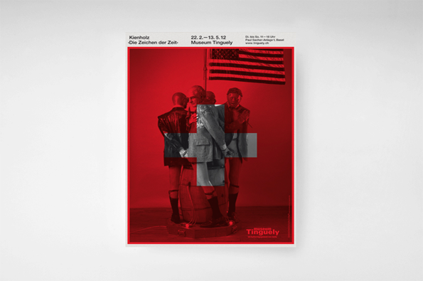
A poster for an exhibition at Museum Tinguely featuring a red-tinted photograph of three figures standing together. A large, semi-transparent white cross is laid over the centre of the image. Text at the top reads “Kienholz”, “Die Zeichen der Zeit” and “Museum Tinguely”.
Above

Claudiabasel: Keinholz: The Signs of the Times exhibition at Museum Tinguely, 2012
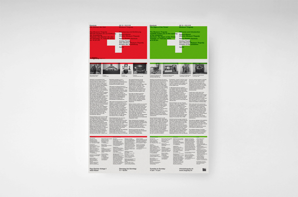
Two side-by-side posters for the Museum Tinguely, one in red and one in green. Each features a large white cross and the title “The Sign of the Times” above columns of detailed event text.
Above

Claudiabasel: Keinholz: The Signs of the Times exhibition at Museum Tinguely, 2012

Share Article

About the Author

Rebecca Fulleylove

—

Rebecca Fulleylove is a freelance writer and editor specialising in art, design and culture. She is also senior writer at Creative Review, having previously worked at Elephant, Google Arts & Culture, and It’s Nice That.


It's Nice That Newsletters

Fancy a bit of It's Nice That in your inbox? Sign up to our newsletters and we'll keep you in the loop with everything good going on in the creative world.
