Time to relish Things in the sunshine-a London map, a mag that wrestles itself and some pictures not of a man's wife
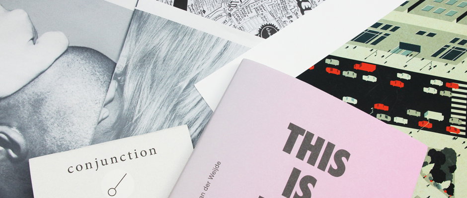
The sun casts a mysterious shadow on this week’s Things as colour-wise it’s not so much a tropical parrot, more a curious magpie. Fear not though because Things has become the lens to a wonderful, insightful camera with visuals reigning supreme and text taking a mini-break – it’s far too hot to actually read anyway. We’ve got photography, a lovely print, a compact little zine and even a map of our fine capital, so point and click at this beautiful array of Things. And if your eyes have had enough, give your ears a treat by downloading the third Studio Audience podcast.
Tom Boswell: City
Tom Boswell: City
Tom Boswell: City
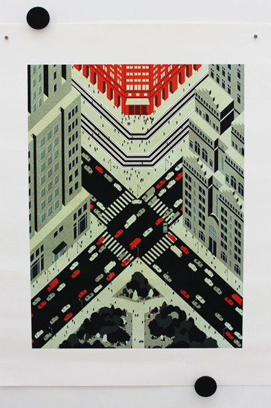
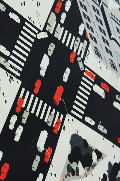
There’s something so orderly and symmetrical about Tom Boswell’s illustration, City that it conjures other orderly things in my head like a well-knotted tie, a tidy desk with unlimited supply of post-its and neatly packed lunchbox all of which relate to the metropolis many of us live in. This particular piece was to celebrate Tom’s new website and what a well organised site it is with some great screen prints thick with colour and slick composition.
www.thomasboswell.co.uk
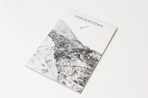
Nick Wood: Conjunction Issue #1 Waiting
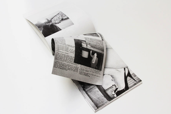
Nick Wood: Conjunction Issue #1 Waiting
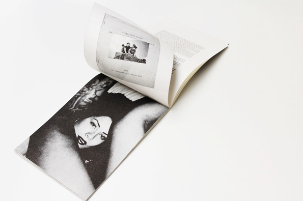
Nick Wood: Conjunction Issue #1 Waiting
Nick Wood: Conjunction Issue #1 Waiting
With my sketchbooks at uni, often I loved them more than the outcome because it was all the first ideas and experiments (yes ok a lot of them were bad but sometimes there was a glimmer of something good). This is the ethos behind, Conjunction , a zine that is a “home for impurities, error and chaos” and a “celebration of exploration and deviance.” A range of writing, photography, drawings and other creative ventures feature printed in black and white which works really well with the material. What I also really like is how the publication opens upwards like a jotter notebook. It’s a nice touch to a carefully considered zine and with a great poster designed by Catherine Chialton included as well, you can’t go wrong really.
www.conjunctionzine.co.uk
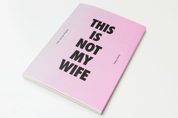
Erik van der Weijde: This Is Not My Wife
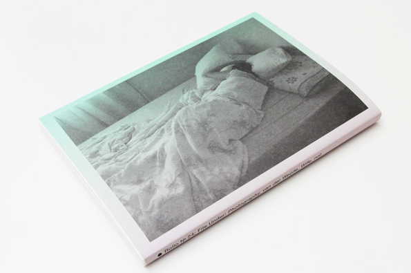
Erik van der Weijde: This Is Not My Wife
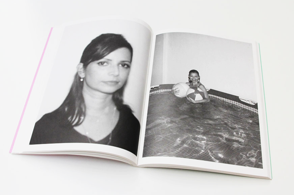
Erik van der Weijde: This Is Not My Wife
Erik van der Weijde: This Is Not My Wife
The 1990s went mad for the ‘not joke’ and so did I. In fact I still partake in the whimsy and falseness of these jokes, “your hair looks great – NOT!” is still a classic. So of course I was intrigued by Dutch photographer Erik van der Weijde’s newest venture entitiled This Is Not My Wife because he’s flipped this joke on its head Magritte style as all the images in this book are of his wife. Crazy right? It’s a fascinating insight into the changes to the subject/photographer relationship when the pair is husband and wife. Full of candid, intimate images this snapshot into family life is a voyueuristic treat and presented to us in a strong, no frills approach.
www.erikvanderweijde.com
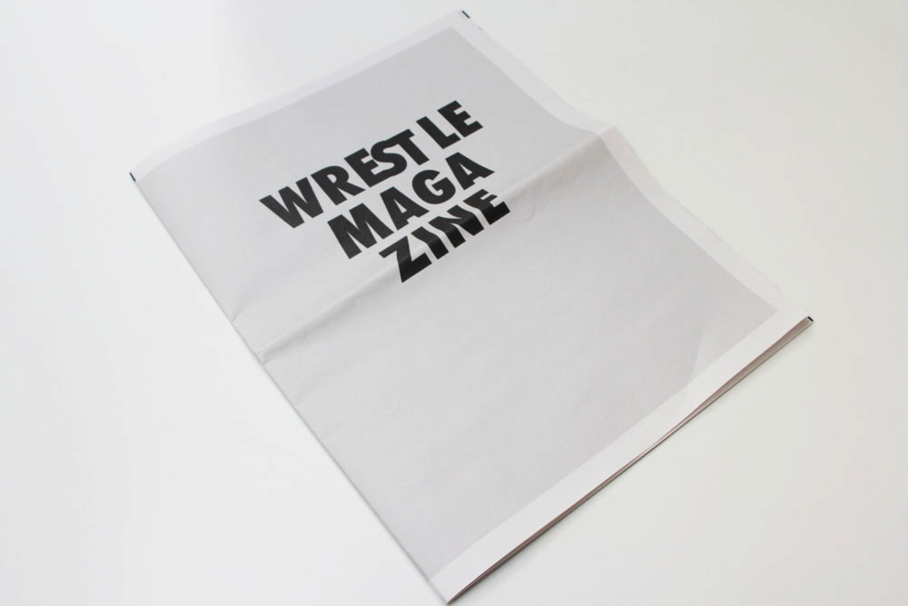
Mr. Boonstra: Wrestle Magazine
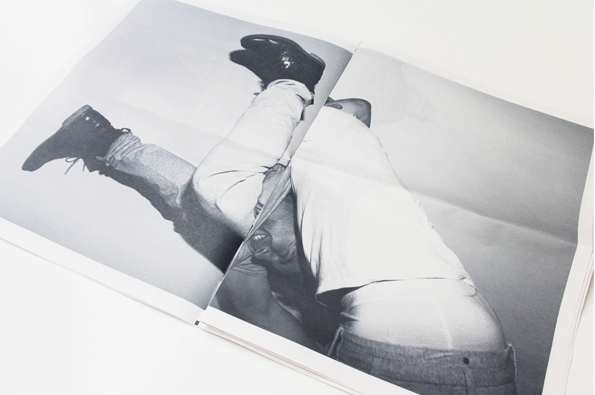
Mr. Boonstra: Wrestle Magazine
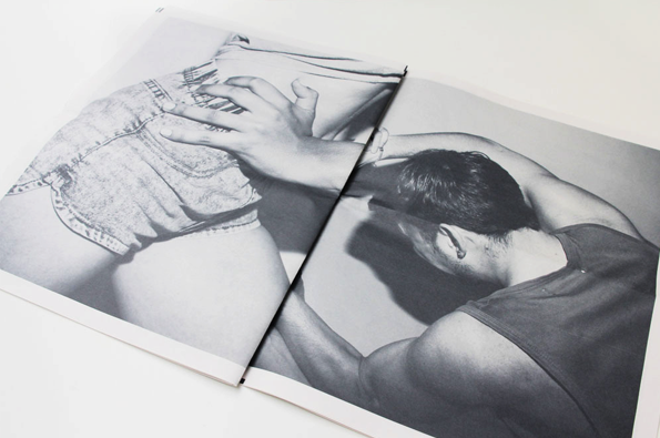
Mr. Boonstra: Wrestle Magazine
Mr. Boonstra: Wrestle Magazine
Wrestle Magazine is one of those really simple, and simply-executed ideas that draws me in very easily. As a magazine that “wrestles itself” it does just that, with full page photographs printed in the ever-useful newspaper format, giving it this temporary, disposable structure. The crops of the images are wonderful and with each spread having contrasting movements and different intensities of the act of ‘wrestling’, and there’s some excellent pairings that would be just as great on their own. As a creative director, art director, designer and even film director it’s clear that Mr. Boonstra has a strong vision and real style.
www.thisisabrowserwindow.com
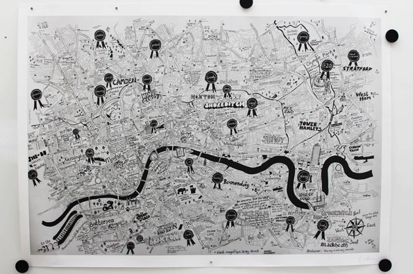
Jojo Oldham: We Love You London
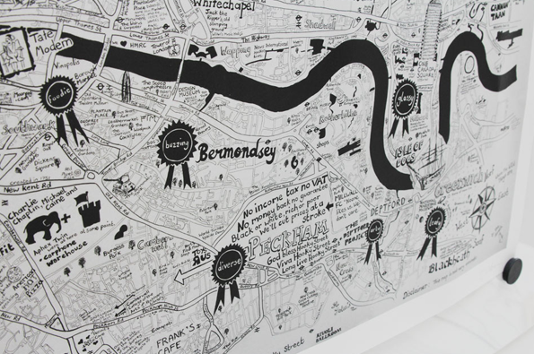
Jojo Oldham: We Love You London
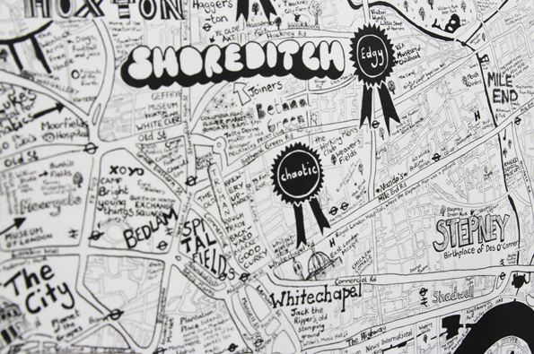
Jojo Oldham: We Love You London
Jojo Oldham: We Love You London
I’m not very good at reading maps, especially ones that aren’t on a screen and don’t have the word Google attached to them. They’re lovely to look at but I can’t help but feel lost when it’s required I use one. There’s hope though, for Jojo Oldham who makes prints, cards and t-shirts as well as her day job as copywriter at Innocent Drinks, has made a brilliant, large-scale map of London that makes me feel as though I can dive straight into it. Showing both the best and worst London has to offer, she’s characterised the various areas of the city adding bold titles, humorous musings and doodles to make it come alive. It’s impressive and something I could easily spend my lunchtime poring over.
www.lovelyjojos.com
Share Article
Further Info
About the Author
—
Rebecca Fulleylove is a freelance writer and editor specialising in art, design and culture. She is also senior writer at Creative Review, having previously worked at Elephant, Google Arts & Culture, and It’s Nice That.