An interview with Marcroy Smith about the success of Print Isn't Dead
The thriving independent publishing sector is a constant fillip in the well-worn discussion over the future of print, but one new title is more direct than most in articulating its belief in a bright future for tangible reading material. Over recent months we watched with interest as Marcroy Smith of People of Print, announced, crowd-funded and launched Print Isn’t Dead and the response has been extremely positive. Conceived as “a showcase of outstanding illustration and design work demonstrating and pushing the boundaries of print in all forms” the Kickstarter campaign pulled in nearly £7,000 from an initial target of £4,520. This is, as you’d expect, a print lover’s dream, taking unashamedly “geekish delight in printing equipment” as MagCulture’s Jeremy Leslie put it.
Ironically the production of Print Isn’t Dead was delayed after the initial printers Tanner & Dennis went into administration during the planning phase, but this is a story of print refusing to be killed off (as the name suggests).
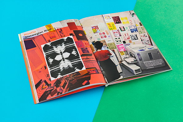
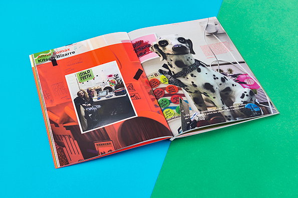
Through profiles, interviews and essays the magazine puts those working with print front and centre – like Anna Lomax, Colophon, Nicole Martens and Risotto – so the inspiration comes from the people at the sharp end of the creative industry rather than through abstract academic treatises on print’s future role. As the mania around the launch subsides a little, we caught up with Marcroy to find out a little more.
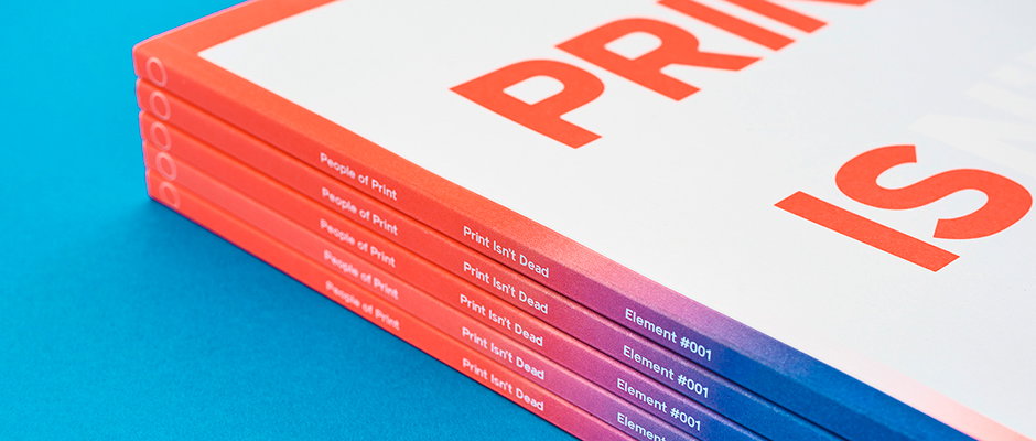
People of Print: Print Isn’t Dead Issue 1
Where did the idea for Print Isn’t Dead first come from?
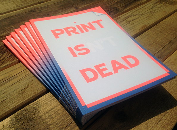
Print Isn’t Dead stemmed out of the idea of self publishing our own magazine featuring all of the print-based work that we admire, rather than dealing with a publisher. We are currently working with Thames & Hudson to create a book titled People of Print and there are so many holes that you have to jump through, which can stunt your creativity slightly in order to save costs and abide by their traditions and rules so that it will be a “sellable book.” Our magazine is here to show off the different elements and effects that you can achieve through print. Issue 1 is very simple, we printed CMYK with pantone 805c and it didn’t really need anything else because the colour is so vibrant.
How did you find the Kickstarter process? What did you learn doing that?
Kickstarter was very stressful to begin with because you don’t know how your project will be perceived. We learnt that we were very lucky to have the trust of lots of people who admire what we do to allow the magazine to be produced.
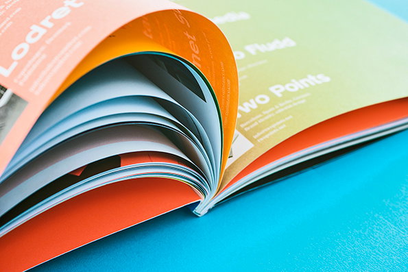
People of Print: Print Isn’t Dead Issue 1
How did you select the content for the first issue?
The first issue happened very quickly and we already had a whole bank of amazing content that we were yet to put into a magazine. It’s a huge mash-up of everything that we love. There was a heavy focus on getting a lot of information out there, showcasing a wide selection of how print can be used, rather than having a theme and longer articles. This is something we will move towards as we find our feet in the publishing world.
Design was always going to be really important for a magazine all about design – what were the inspirations and how would you characterise the design approach?
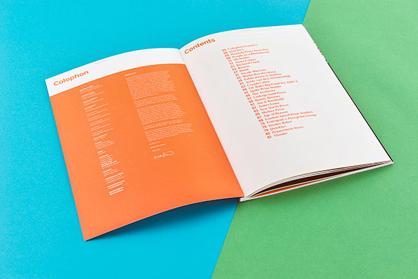
The design of the magazine was influenced by the typefaces that we were using supplied by Colophon Foundry (Archive and Reader). We worked to a six column grid and set everything to quite a tight baseline grid with very wide margins to allow for maximum content. We even used the inside front cover for the colophon and the first page as the contents to maximise this idea of fitting in as much content into the pages that we had budgeted for production. The design was obviously influenced by the introduction of Pantone 805 when we reached our stretch goal – we applied the fluoro colour in a clever way, showing how it overlays, reads as type and works a big solid colour on the Fedrigoni Arcoprint paper.
What advice would you give to anyone looking to launch a new magazine?
- Budget correctly then add 50% to be sure.
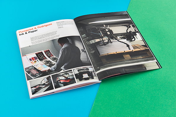
- Find a printer that will work with your project and get involved on a creative level.
- Make sure that you love what you’re doing, because it takes more time than you think and you need to care about it.
- Find a way to make it happen.
People of Print: Print Isn’t Dead Issue 1
People of Print: Print Isn’t Dead Issue 1
People of Print: Print Isn’t Dead Issue 1
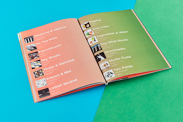
People of Print: Print Isn’t Dead Issue 1
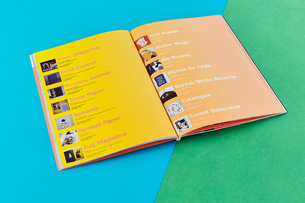
People of Print: Print Isn’t Dead Issue 1
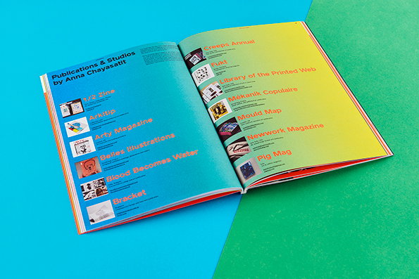
People of Print: Print Isn’t Dead Issue 1
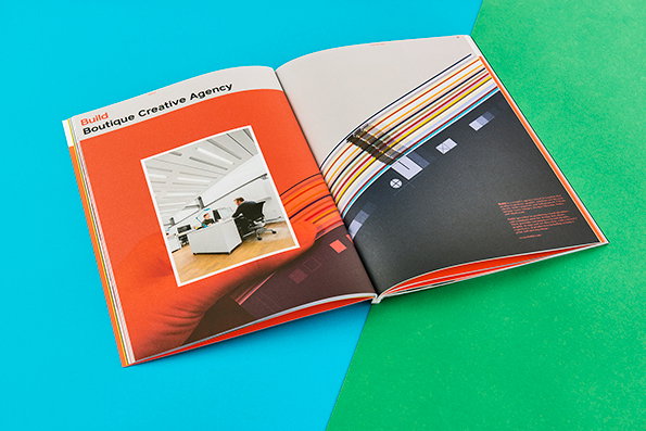
People of Print: Print Isn’t Dead Issue 1
People of Print: Print Isn’t Dead Issue 1
People of Print: Print Isn’t Dead Issue 1
People of Print: Print Isn’t Dead Issue 1
Share Article
Further Info
About the Author
—
Rob Alderson is a freelance writer, editor and strategist. He was previously editor-in-chief of It’s Nice That and WePresent, and editor of Design Week. He publishes the newsletter Undo, which tries to make sense of how AI is changing design work, the design process and the design industry.