The Weekender: Handbags in the middle, lipstick up nice and bright – it's The Weekender!
You might’ve just crawled out of your office, wiped a week’s worth of coffee remnants and a bit of old saliva from your chin with the back of your hand, you might even be trying to decide whether or not to go home and shower before you proceed to get absolutely out of your tree with your budgie Terence, but no matter how gross you are, the Weekender is here for YOU. Its morals may well be dubious, and it might not be held responsible for its actions, but friends, it has a trolley-load of loosely art and design-related fun for you and it ain’t ashamed to flaunt it.

6. An art installation that’ll probably blow your mind
Yayoi Kusama’s new installation replicates a never-ending space with mirrors and lights. Cool, huh?
5. A lesson in perfectionism from a man who sharpens pencils
Because there ain’t nothing wrong with being able to do something properly.
4. Frighteningly realistic TINY scale models of artists’ studios
BUT HOW DOES HE MAKE THE PAINTBRUSHES SO SMALL?
3. Shantell Martin is one cooooooool lady
As this film from the New Yorker shows. Check out her studio in all of its monochromatic splendour!
2. A book about British design studios with a refreshingly funny twist
Because it looks like a 64GB memory card, and it contains…do you get it? Do you get the joke?
1. Brilliantly weird illustration from Masha Krasnova-Shabaeva
Imagine if you had an owl instead of a foof! Strange stuff. Obviously we can’t get enough.

Woo! What a treat we have for you this week as Stephen Bass, co-owner of record label Moshi Moshi, has contributed by far the coolest mixtape we’ver had yet. In Stephen’s words, Moshi Moshi is “an independent record label and management company which has been swimming against the tide and trying to bang square pegs into round holes for 15 years this winter, balancing art and commerce and trying to enjoy it.” His mix of cellos, jazz and electronic dream music has been compiled today with a Friday afternoon in mind. So, without further ado, here he is.
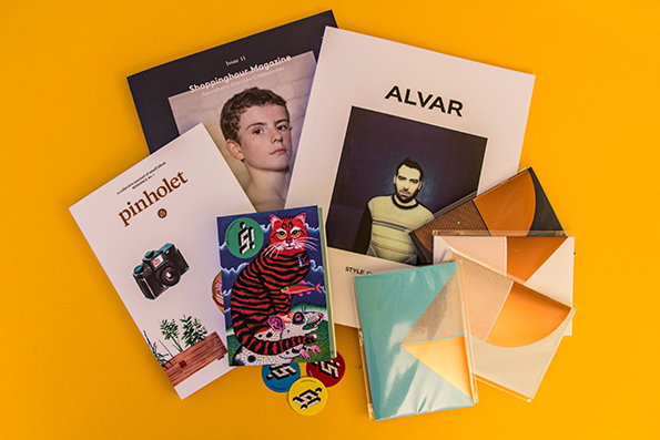
Remember when you were little and you’d dangle upside down over the side of your bed with the blood rushing to your head for a solid 20 minutes before getting up, just to see what forgotten treasure you might rediscover in its depths? Things is like the collection of stuff you might recover from that trove, if under your bed was a well of exciting new creative matter just waiting to be cracked open rather than just old fluffy Lego bits and half a forgotten Penguin bar. Onwards.
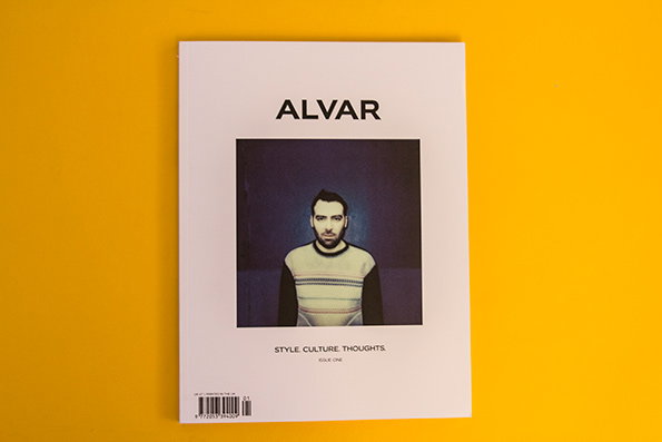
Alvar magazine: Issue #1
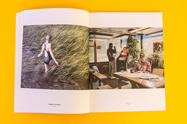
Alvar magazine: Issue #1
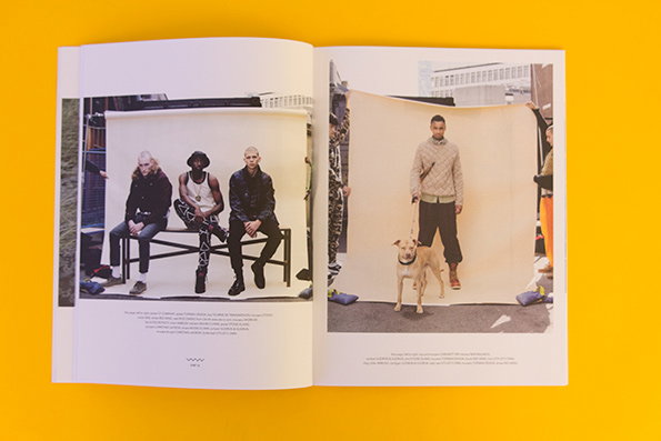
Alvar magazine: Issue #1
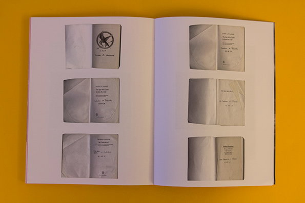
Alvar magazine: Issue #1
Alvar magazine: Issue #1
Alvar magazine have nailed exactly the first issue that every new publication dreams of when first starting out, but then with a stellar cast including photographers James Medcraft and Polly Brown, fashion editor Seetal Solanki and a host of excellent illustrators, writers and designers on its masthead there’s no wondering how. They’ve got photography, styling and empty space down to a tee, with curiously lovely fashion editorials and super interesting content hung in perfect balance.
www.alvarmagazine.com
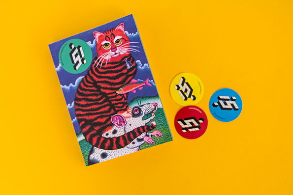
Comics: Kuš!
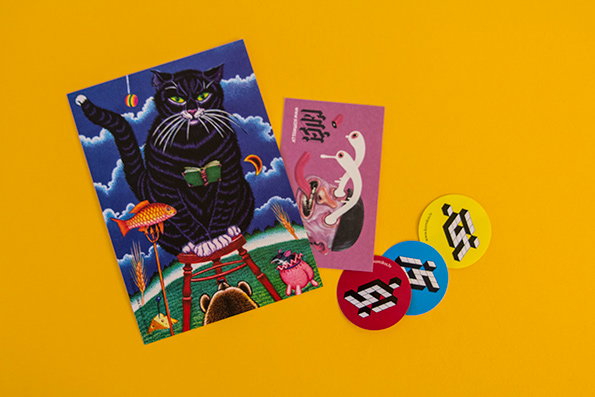
Comics: Kuš!
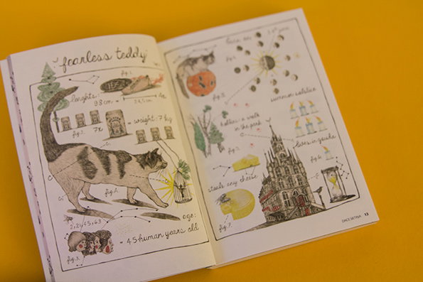
Comics: Kuš!
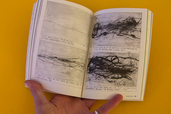
Comics: Kuš!
Comics: Kuš!
Kuš!, pronounced “koosh!” is an international comics anthology based in Riga, Latvia, whose creatives are super keen to get their message out there. Every issue has a different theme, and all include comics by both international and Latvian artists, in order to popularise their own offerings, and the collective also organises exhibitions, workshops, jams and other events to “spread the Latvian comics fever.” Issue #15 is all about cats, and includes work by a huge variety of illustrators. Excellent stuff.
www.komikss.lv
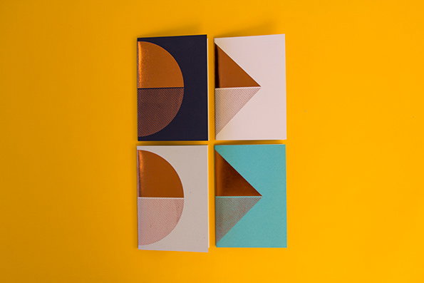
Lovely Pigeon: Notebooks
Lovely Pigeon: Notebooks
Lovely Pigeon: Notebooks
Lovely Pigeon: Notebooks
Lovely Pigeon: Notebooks
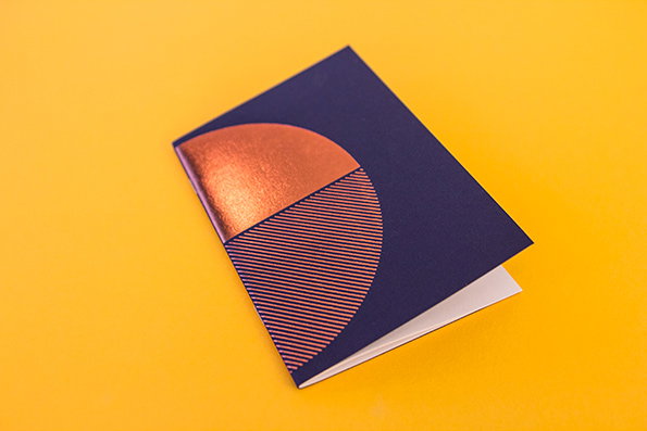
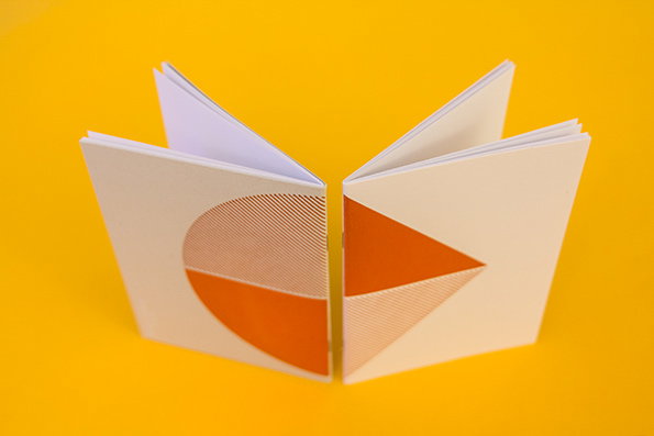
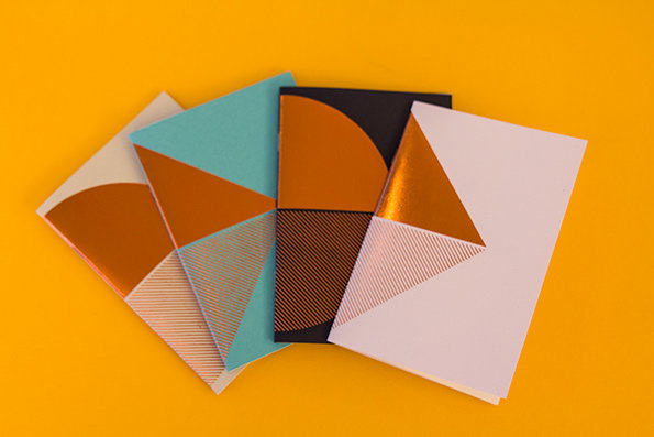
Corrr, stationery, what’s not to like, eh? With Christmas coming up and us desperately attempting to do all of our shopping online so as to avoid the sheer misery of getting mangled in the crowds of the British high street in December (not really! It’s joyous) we decided we’d best share these with you so that you can follow suit. Lovely Pigeon have these and a whole load of other gems available in their online store, alongside jewellery, homewards and prints, so come along, shop shop.
www.lovelypigeon.com
Pinholet magazine: Issue #1
Pinholet magazine: Issue #1
Pinholet magazine: Issue #1
Pinholet magazine: Issue #1
Pinholet magazine: Issue #1
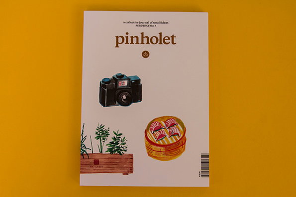
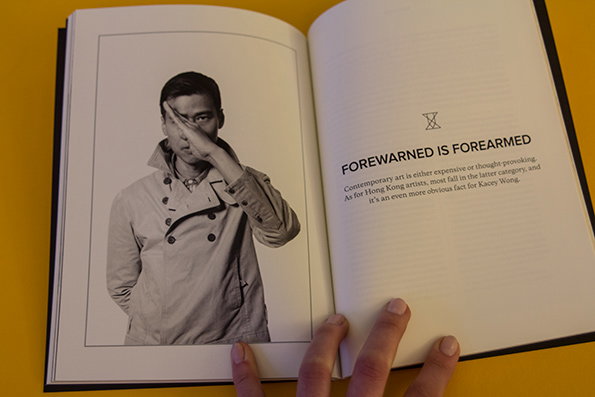
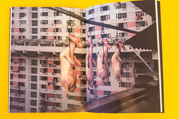
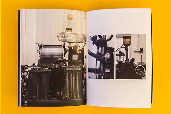
Pinholet is a very lovely new magazine. This first issue is based on Hong Kong, offering a beautifully designed, well photographed and coherent perspective on a whole collection of different creative elements of the city-state, from letterpress printing and art to photography and soap-making. Yes, soap-making, because why not? Don’t miss Michael Wolf’s “photographic dissection of Hong Kong’s anatomy” – it’s great. What’s more, the magazine is a full 120 pages long and does not contain a single advert! A rare gem.
www.pinholet.com
Shoppinghour Magazine_: Issue #11

Shoppinghour Magazine_: Issue #11
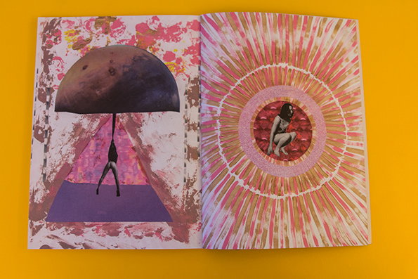
Shoppinghour Magazine_: Issue #11
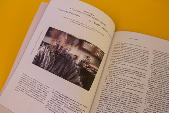
Shoppinghour Magazine: Issue #11
Shoppinghour Magazine: Issue #11
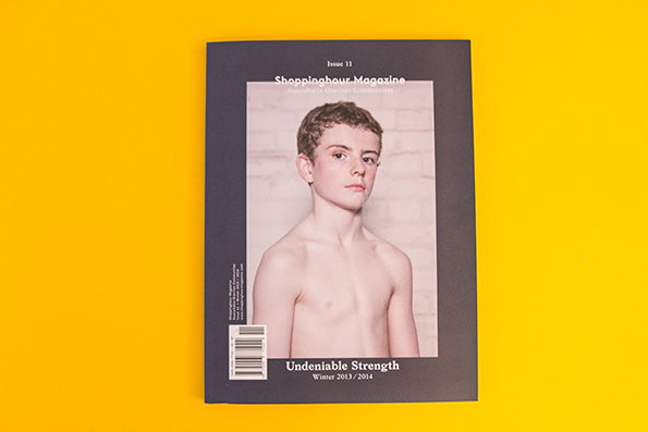
Shoppinghour wins the prize for best issue title this week, with theirs called Undeniable Strength. The publication is a “combination of critical theory, philosophy, poetry and art” and while that may sound a bit high-brow it’s a lovely read. As the creators explain, “it is neither a magazine nor a book, neither an object nor an idea; instead, it is a marriage of these, intended to take life in the hands and mind of the reader.” Right. Enjoy!
www.shoppinghourmagazine.com
Hilarious Taylor Swift parody of the week
Apparently the goldern-haired lady is an unstoppable Tinder fan. Who knew?
Vegetable nativity of the week
In which Mary is played by a butternut squash and Joseph is a courgette. Inspired.
Beauty tip from a bro of the week
Because leatherman is no fan of that liquid gold.
Home Alone reenacted by pugs of the week
Need I say more? I don’t think so.
12 gifs of cartoon food looking better than real food of the week
Seriously though, Papa Johns will never be able to trump Teenage Mutant Hero Turtles’ pizza.
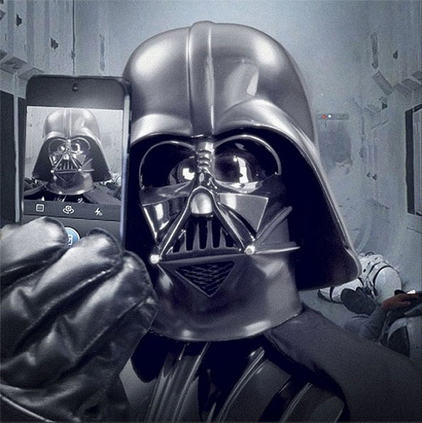
Starwars selfie of the week
Because this was the week that Star Wars got Instagram and we could not be happier about it. Neither, it seems, could Darth Vader.
S’laters!
Share Article
Further Info
About the Author
—
This article was written by the It’s Nice That team. To find our editors and writers, please head over to our Contact page.