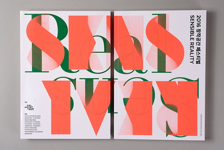
Seoul studio Everyday Practice talks about its collaborative approach to design
Seoul-based graphic design studio Everyday Practice was founded by Kwon Joonho, Kim Kyung-chul and Kim Eojin, and aims to address “the role of design and how design acts in reality” through its projects. “When we first started our studio, a particular graphic style similar to Dutch and Swiss design was in vogue in Korea, but we have tried to set up our own style,” says the studio. “Each member of Everyday Practice has different design methods and we try to mix and modify them to create a new design practice.”
The studio enjoys working with non-profit organisations and cultural institutes creating identities, posters and exhibition catalogues. One recent project is X: Korean Art in the Ninties, a book created for a large-scale exhibition with many artists involved. “As a result we had to accept many opinions from various people including the artists, curator and gallery. For instance we originally proposed a poster designed with 3D animated type, but the client wanted to show the 90s in a more direct way,” explains the studio.
Other projects include a multicoloured, intricately weaved poster for Seoul’s International Handmade Fair, a black and white poster and pamphlet for a show at the city’s Museum of Art, and a richly-coloured exhibition catalogue that sensitively uses typography to work with the imagery in the book.
When working on new projects, the studio has a very democratic approach to briefs. “We have a casual talk and instead of approaching it in too much of an academic way, we try to listen to the individual’s thoughts on the subject,” says Everyday Practice. “We try to avoid sticking to a certain look and research new typefaces, colours and layouts of each new project.”
As well as delivering work for various Seoul-based clients, Everyday Practice has been working hard to establish itself in the flurry of small studios that have started to appear in the city in recent years, by working on personal projects. “We think design is a way of movement. We think our role as designers is to create effective visual languages to convey both the client and our voice in order to make a meaningful change in the industry.”
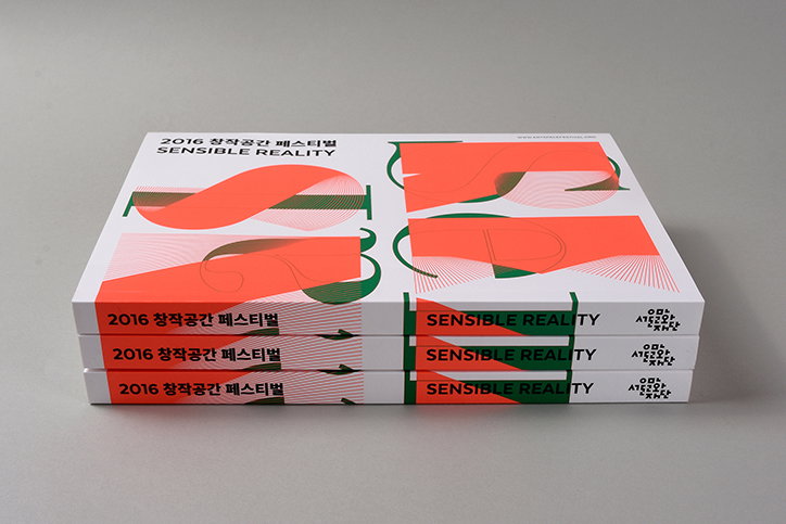
Everyday Practice: Sensible Reality
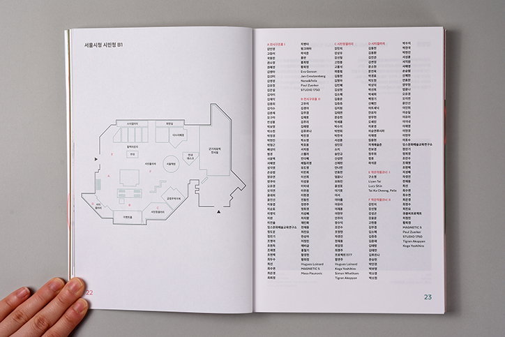
Everyday Practice: Sensible Reality
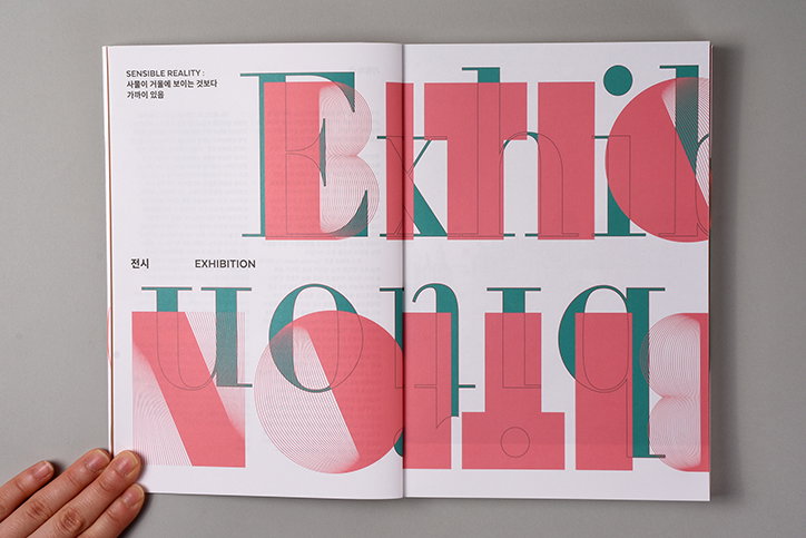
Everyday Practice: Sensible Reality
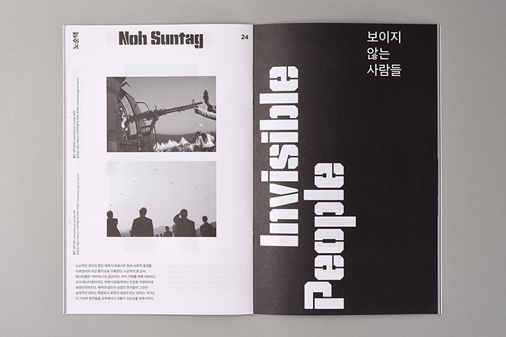
Everyday Practice: City and the People
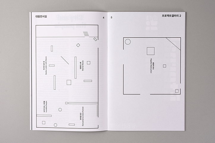
Everyday Practice: City and the People
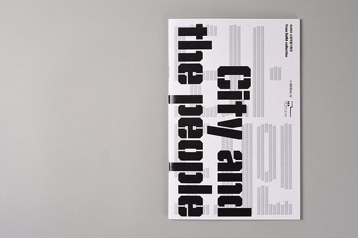
Everyday Practice: City and the People
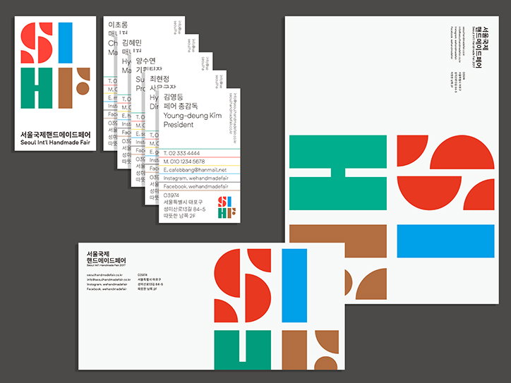
Everyday Practice: Seoul’s International Handmade Fair 2017
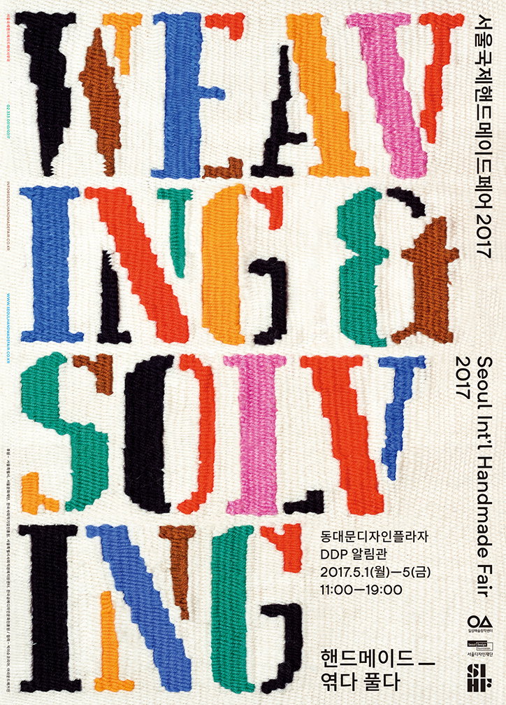
Everyday Practice: Seoul’s International Handmade Fair 2017
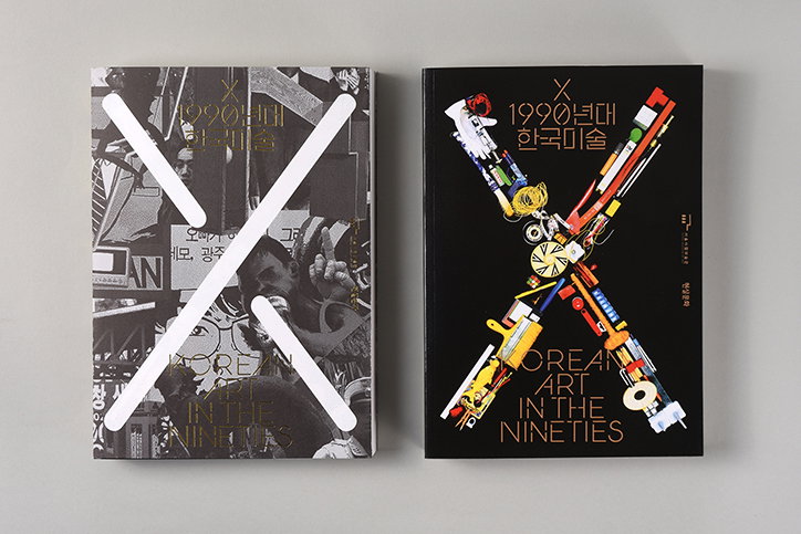
Everyday Practice: X:Korean Art in the Nineties
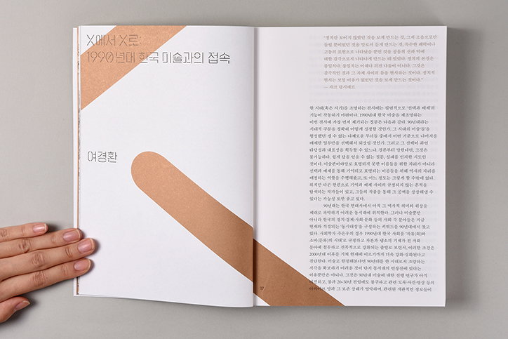
Everyday Practice: X:Korean Art in the Nineties
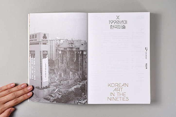
Everyday Practice: X:Korean Art in the Nineties
Share Article
Further Info
About the Author
—
Rebecca Fulleylove is a freelance writer and editor specialising in art, design and culture. She is also senior writer at Creative Review, having previously worked at Elephant, Google Arts & Culture, and It’s Nice That.