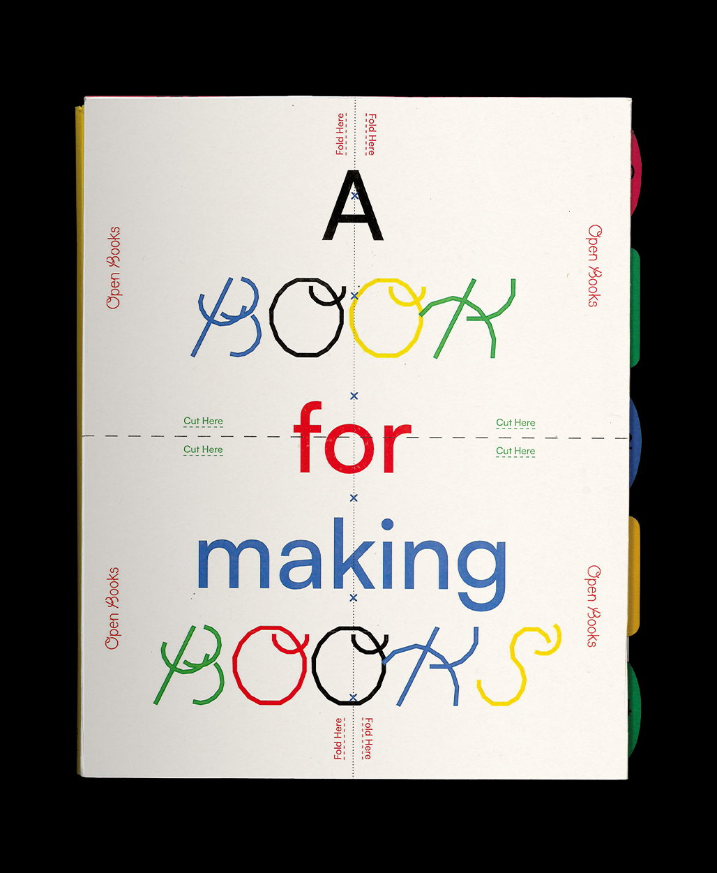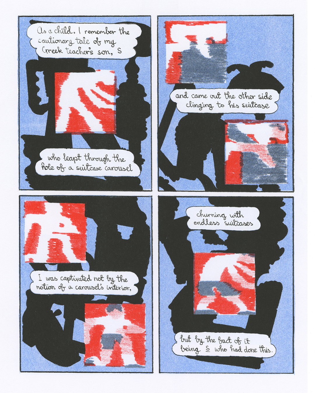
Corinne Ang uses bold typography and free flowing visuals in her eclectic projects
Talking us through two of her recent projects, the designer tells us about her busy post-graduation practice and how she’s been dealing with the pressures of adulthood creatively.
When we last caught up with Corinne Ang in our 2021 Next Generation series, she had just graduated from Rhode Island School of Design (RISD). It's safe to say that, since then, Corinne has been busy. From visa applications, working her first proper design job and figuring out how to freelance sustainably, the designer has also had a number of pretty big gigs. “If you asked me a year ago I definitely wouldn’t have thought that I would have worked on exhibition identities, environmental design, EP cover art or cannabis packaging,” Corinne says.
When viewing Corinne’s loud and hectic work, you may expect her personality to match her creative output. However, the designer tells us that she is in fact “a rather quiet and reserved person”. This, Corinne continues, has often led to her being talked over, or having misconceived assumptions being made about her. “It’s amplified as a woman of colour (WOC) existing in multiple western institutional spaces where there’s way less space for me – and fellow WOC – to explore and vocalise.” It was this that led Corinne to “subconsciously start looking for ways to allow flexibility within my designs to allow entry points for others", she details.
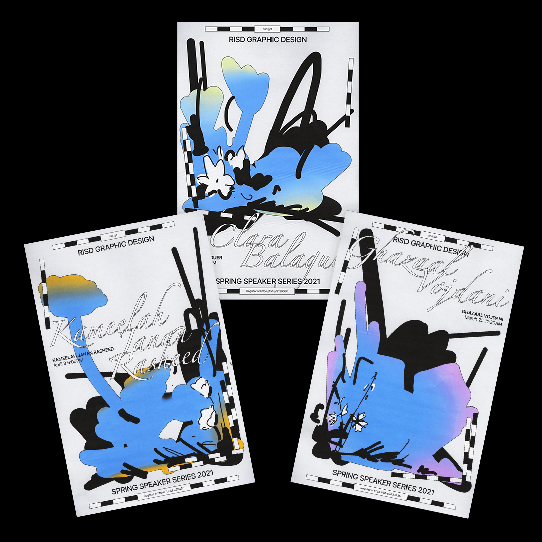
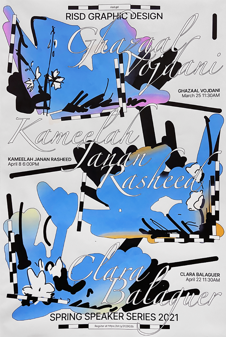
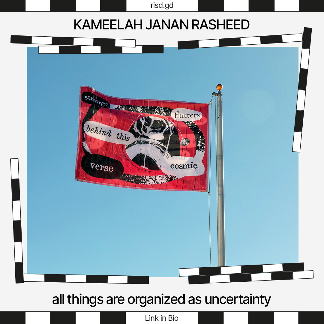
Corinne Ang: RISD Spring Speaker Series (Copyright © Corinne Ang, 2021)
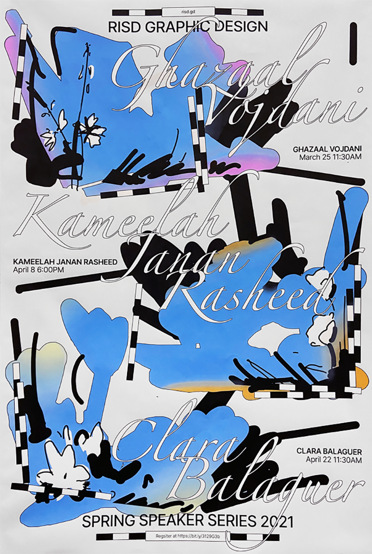
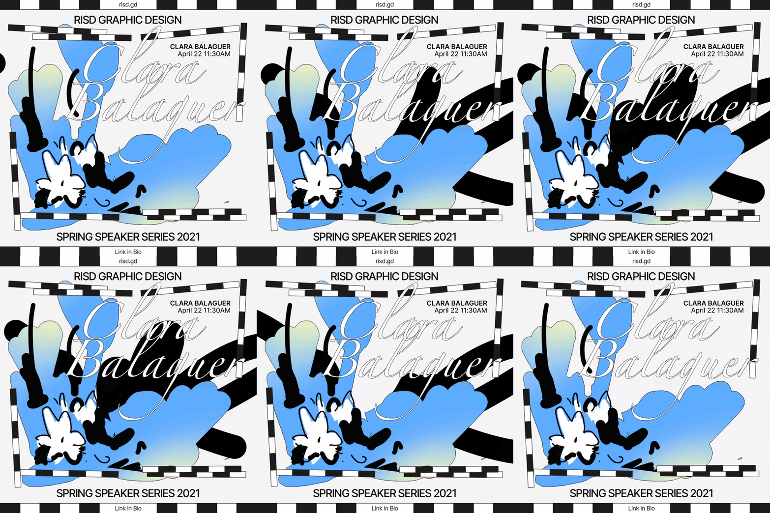
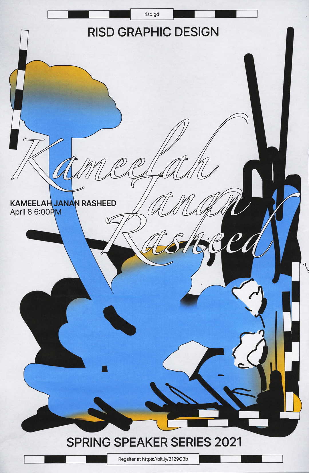
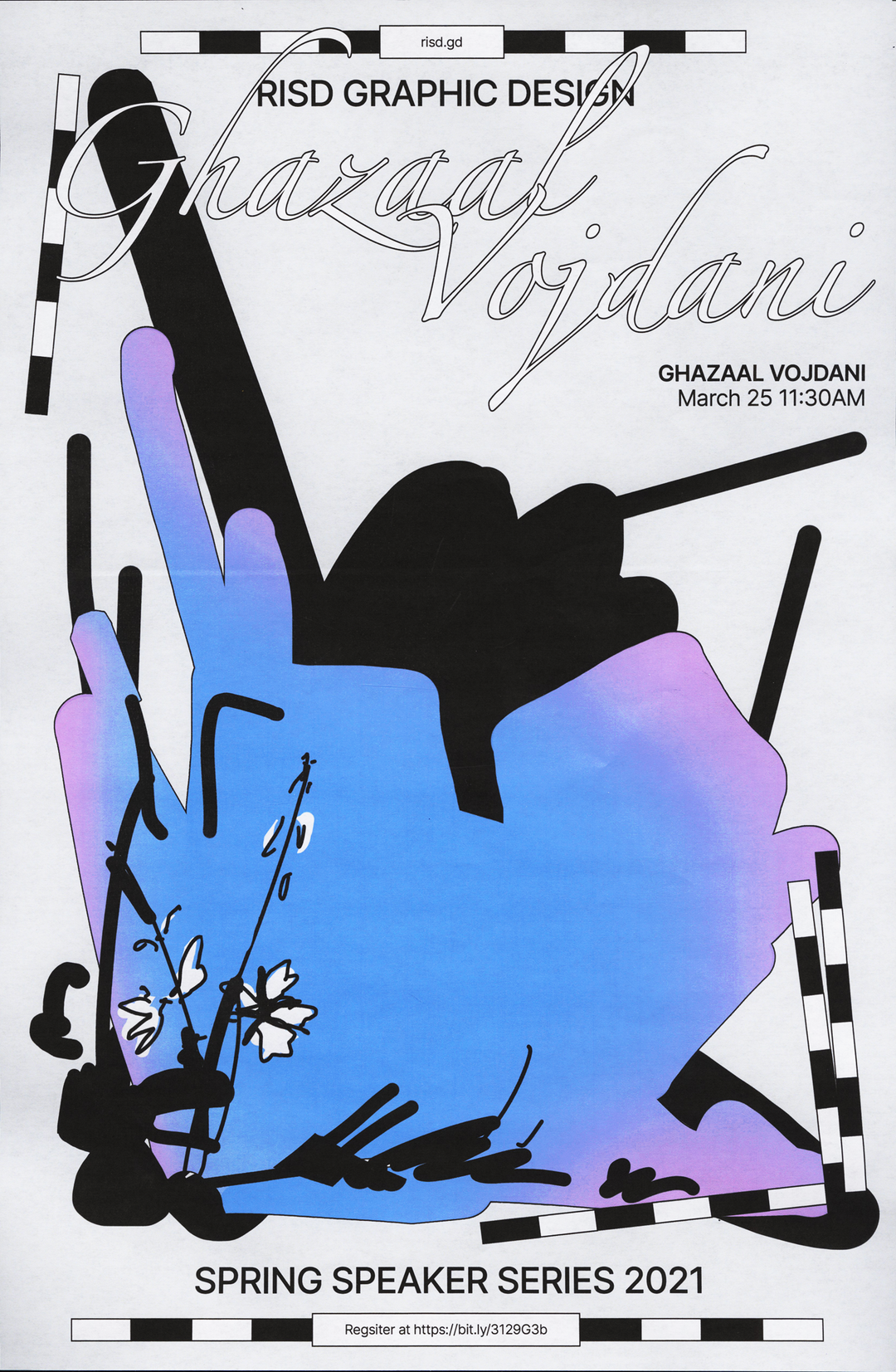
It was upon receiving the “beautifully simple” brief for the RISD Spring Speaker Series 2021 that Corinne found herself pleasantly surprised. “I personally found the event striking because it consisted solely of women of colour living around the world,” she says. “An all WOC line up is something seldom seen in the design industry.” And so, being so inspired by the people featured, Corinne chose to incorporate their stories into her designs, making a space for them as individuals.
On top of this, the project took place in spring while a lot of Corinne’s friends were discussing their flowering plants – “so I had this association of this season with the caring hands that tend to the growth of the flowers blooming during spring.” Corinne therefore decided to feature a specific flower for each speaker, such as the national flower of the places they come from or where they were currently living. She wanted to emulate the idea of visible “process” as this was the lens the talk’s were being delivered through. So, she kept the illustrations “loose, unravelled, and sketch-like”. This final identity, and the contradiction created between the regal type and the expressive, blue-toned visuals is truly striking.
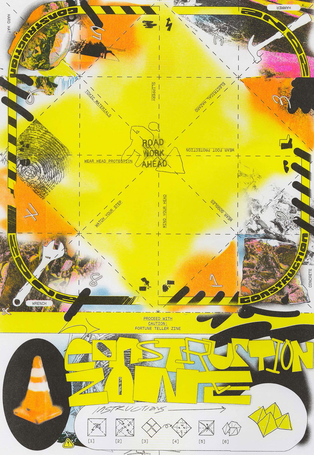
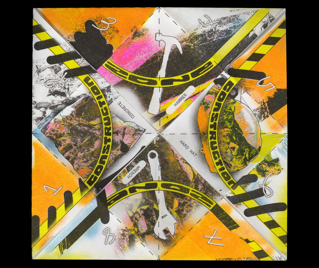
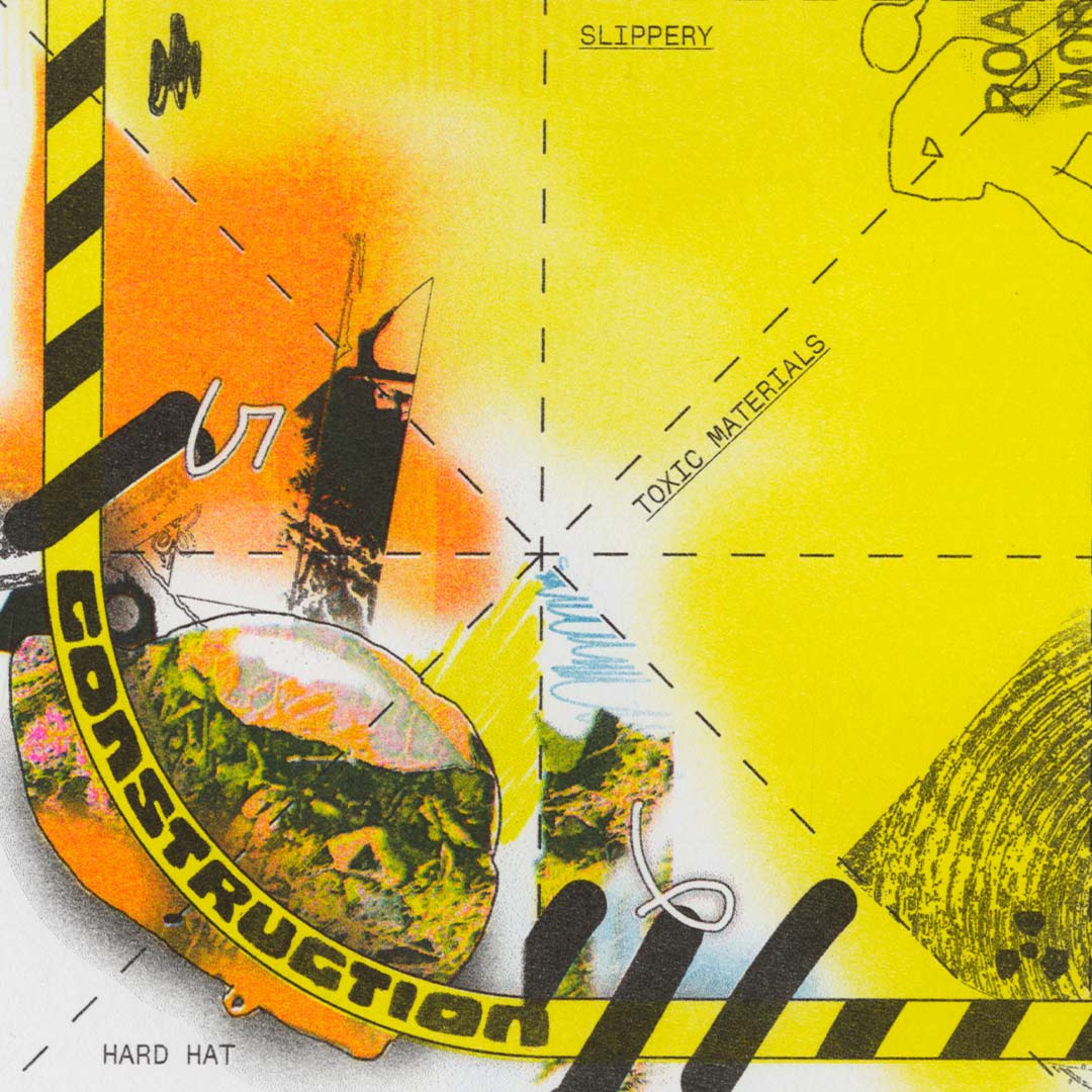
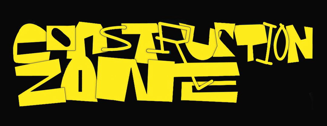
While working on so many commissioned projects, Corinne has found it important to maintain the more personal. One such zine, Construction Zone, came as a result of a “work-induced quarter life crisis”. The zine, therefore, aims to release some of the pressures faced by young people who feel they need to have “absolute control” over their futures. Corinne made the zine so it could double up as an origami fortune teller, riffing off the current pop culture obsession with horoscopes; she wanted it to be something that would instigate play and reference strong childhood memories.
Visually, Corinne uses symbols, aesthetics and patterns associated with road works to heighten the sense of “danger” and “incompletion” young people often feel in relation to their future.This includes the traffic cones, ‘caution’ tape, the texture of rubble and the impression of breakage. Corinne had to go to some lengths to achieve realism and, for the rubble, she ended up taking to the streets, photographing the texture before digitally collaging them. Finishing it off with a blocky, neon yellow, graffiti-esque type that wouldn’t go amiss on a noughties CBBC programme, the zine is a welcomed nostalgic remedy to the stress of young adulthood. Whether it’s a large scale commission or a fun, lighthearted personal side project, you can be sure Corinne’s going to put in her all.
GalleryCorinne Ang: RISD Spring Speaker Series (Copyright © Corinne Ang, 2021)
GalleryCorinne Ang: Construction Zone Zine (Copyright © Corinne Ang, 2022)
Hero Header
Corinne Ang: RISD Spring Speaker Series (Copyright © Corinne Ang, 2021)
Share Article
Further Info
About the Author
—
Olivia (she/her) is associate editor of the website, overseeing the day-to-day editorial projects as well as Nicer Tuesdays events. She joined the It’s Nice That team in 2021. [email protected]
To submit your work to be featured on the site, see our Submissions Guide.