




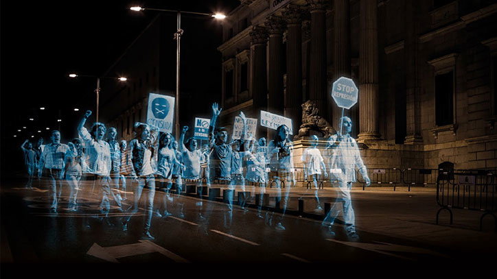
More than a placard: GraphicDesign&’s Lucienne Roberts on the aesthetics of protest
From holographic groups to human billboards, protest can take on many forms. This is something GraphicDesign&’s Lucienne Roberts, the designer behind the Design Museum’s current exhibition Hope to Nope: Graphics and Politics 2008-18, learned quickly when putting together the Protest section of the show.
At first, she explains, the styles of the campaigns and projects fell into two sections: the mass approach or the festival approach. “The Women’s March is the example of the first,” Lucienne explains. “People felt free to express their anger in their own way, it was diverse and highly personal. Whereas the Neda or Je Suis Charlie protests almost took on the rules of corporate identity – there was uniformity to it, used as a mark of solidarity, a way of aligning yourself with others. Both are graphically full of impact.”
Soon, though, Lucienne’s research slipped beyond the lines of these two camps. “How we interpret protest can be very broad, and it doesn’t have to be on the streets, especially when you think about design-initiated forms of protest,” Lucienne continues. She refers to Richard Sluijs’ book The Complete Lexicon of Crisis Related Suicides, 2008-2013, which charts the impact of the economic crisis, telling the stories of some of the 10,000 people in North America and Europe who have committed suicide as a result of the crash. This book, Lucienne says, is also a form of protest.
Other protests do take to the streets but in unexpected ways. When the Spanish government passed a law banning protestors convening outside government buildings, protest group Holograms for Freedom projected the first virtual political demonstration, featuring filmed footage of thousands of protestors in holographic form.
Another group in China found a similarly savvy way around the system for the I’m A Billboard campaign. When the feminist group was stopped from running a campaign on the public transport system about sexual harassment, they produced the posters and asked people to walk onto the subway network and hold them up. “This is one of the stories I find most compelling,” Lucienne says. “It was a risky thing to do – one woman was asked to leave her home city as a result of taking part. There’s a enormous bravery behind these actions.”
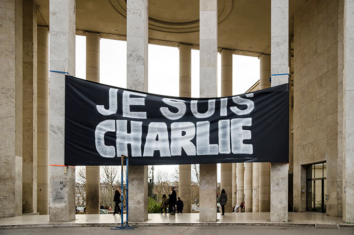
Je Suis Charlie banner outside Palais de Tokyo. Photo: Paul SKG
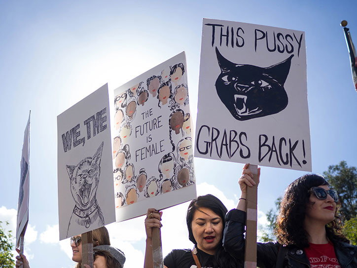
Women’s March. Photo: Lindsey Lawrence
I ask Lucienne if, with hindsight, there are any learnings from working on the show that might permeate her own work as a designer, and she explains it has totally changed her views of social media and the growing importance of print. “In the end, as designers, we’re trained to help messages travel,” she says. "And yes, people are savvier as to what creates an impact because of social media, but there’s always the risk of saturation. We’re in such turbulent times and looking at the past ten years, we’re in new territory, politically and in terms of how images are disseminated because of technology. We have no idea how that’s going to play out.
“At the start of working on the show, we were focusing on social media as a method by which protestors, or those who feel passionately about a political cause, can gather together and communicate and spread messages more effectively. Then by the time the show opened, we were much more focused on surveillance and social media as a way of monitoring activity and controlling people – and brainwashing people. Now, I wonder if protest will revert to paper. We’ve got one story in here which is a report for the UN by the design agency Templo, and they worked offline the whole time because they couldn’t risk anybody intercepting, all meetings were face to face, no telephone calls. I buy a newspaper sometimes just because no one will know what I’m reading. So I think print might start to be perceived differently – it’s more covert in some way.”
Looking back at the show, Lucienne says she found it all “very humbling, but also quite depressing. The potency of the work in this show is made very real when you realise people are trying to stop it.” Ultimately, though, there is hope. “I’ve been politically engaged for years and talked about graphics’ relation to politics for years, but everyone gets it now, it’s just sad that’s the result of such extreme things. But if it galvanises people, that’s the point, isn’t it?”
Hope to Nope: Graphics and Politics 2008-18 is on at London’s Design Museum until 12 August 2018. A book to accompany the show has also been published, exploring the campaigns and featuring interviews with the likes of Milton Glaser, Shepard Fairey.
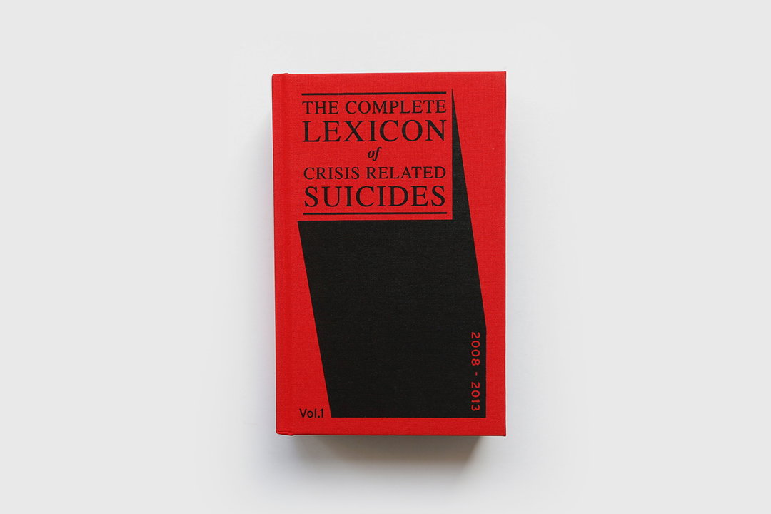
Richard Sluijs: The Complete Lexicon of Crisis Related Suicides
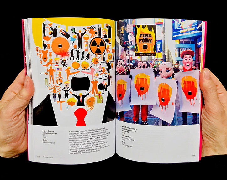
Design Museum and GraphicDesign&: Hope to Nope: Graphics and Politics 2008-18
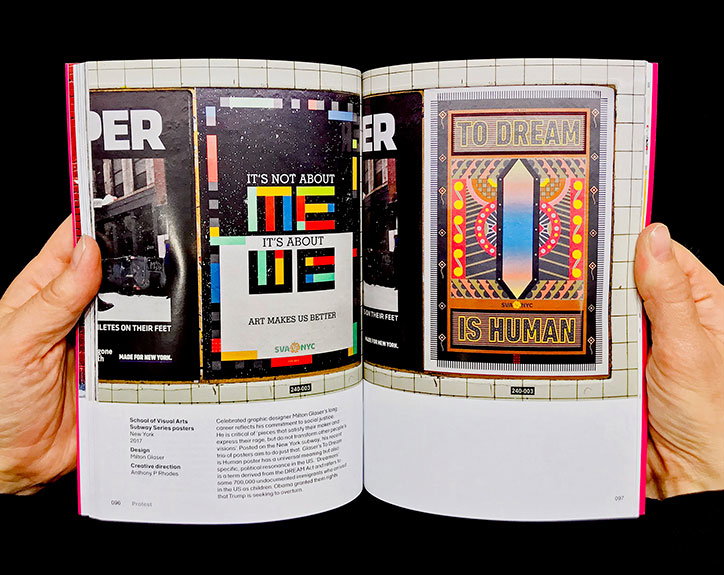
Design Museum and GraphicDesign&: Hope to Nope: Graphics and Politics 2008-18
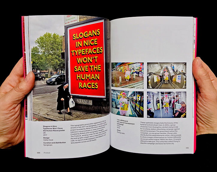
Design Museum and GraphicDesign&: Hope to Nope: Graphics and Politics 2008-18
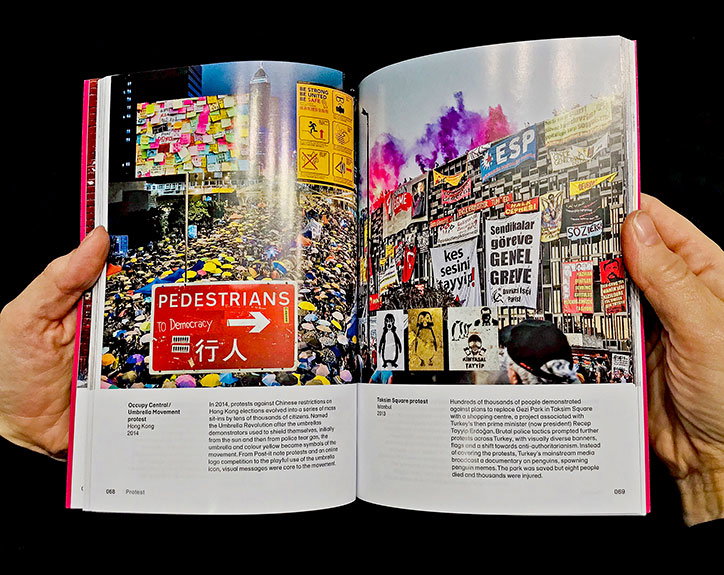
Design Museum and GraphicDesign&: Hope to Nope: Graphics and Politics 2008-18
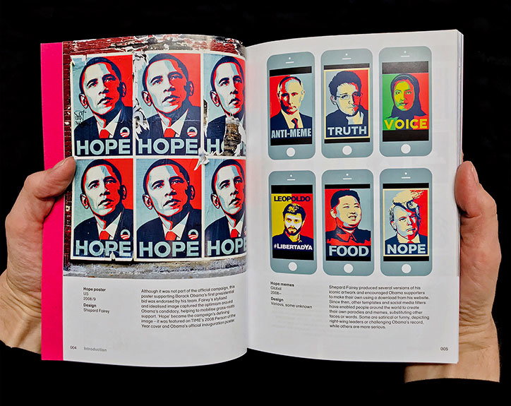
Design Museum and GraphicDesign&: Hope to Nope: Graphics and Politics 2008-18
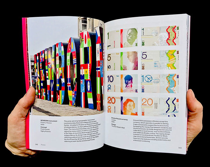
Design Museum and GraphicDesign&: Hope to Nope: Graphics and Politics 2008-18
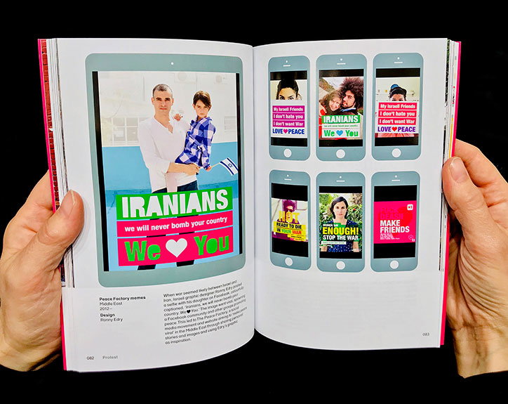
Design Museum and GraphicDesign&: Hope to Nope: Graphics and Politics 2008-18
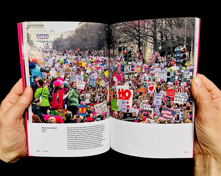
Design Museum and GraphicDesign&: Hope to Nope: Graphics and Politics 2008-18
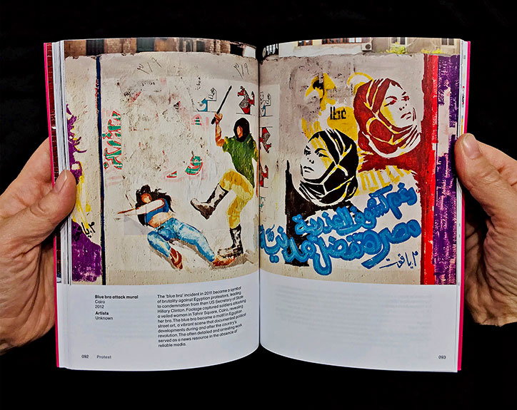
Design Museum and GraphicDesign&: Hope to Nope: Graphics and Politics 2008-18
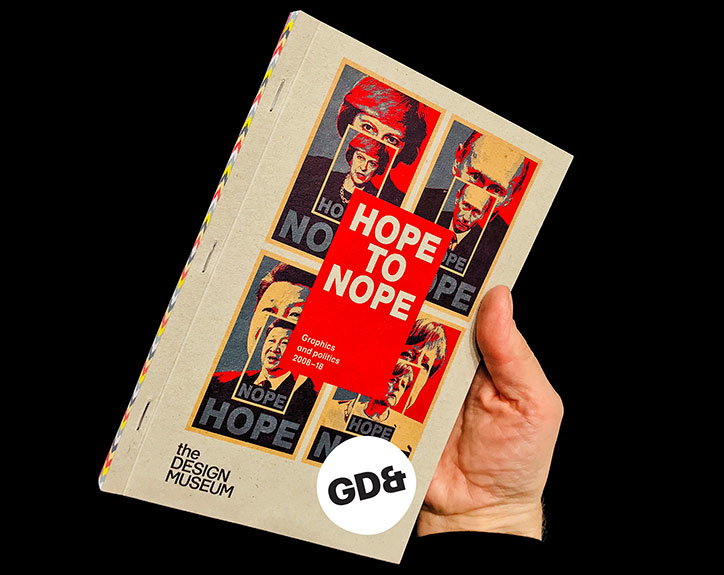
Design Museum and GraphicDesign&: Hope to Nope: Graphics and Politics 2008-18
Share Article
Further Info
About the Author
—
Jenny oversees editorial output across It’s Nice That. Get in touch with writing pitches for features or opinion pieces, big creative story tips, or questions about all things editorial. jb@itsnicethat.com
To submit your work to be featured on the site, please see our Submissions Guide.



