




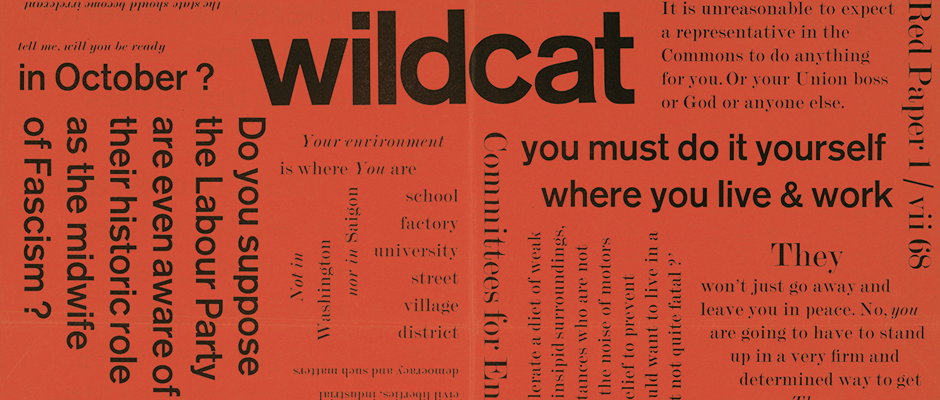
Desmond Jeffery, letterpress maestro of the 1950s and 60s, celebrated in new exhibition
“If Desmond’s letterpress typography is worth making a fuss about (which he himself did not), it must be for both truthfulness of purpose and his vital, true eye for type and space. He picked up a 500 year-old technology in its very last working years, just before it vanished into antiquarianism, and put new life into it. At the time of his death he was looking for what might come next.”
So wrote Desmond Jeffery’s wife Sally in 2009 and we can think of no finer tribute to this letterpress and typography teacher who pushed the limits of hand-set type in the 1950s and 1960s.
A show opening next week at Bristol’s Spike Island will help spread the word about this little-known talent and hopefully help secure his position as a designer today’s practitioners know and appreciate. Desmond started off printing posters, invitations and menus on a Heidelburg Platen before going on to work with galleries, orchestras, architects and political groups who were queuing up for his innovative, eye-catching layouts.
With his wife Sally part of the curation team, the Spike Island show brings together some of his most important works and will seek to explain how and why Desmond became such a significant figure in the graphic design community.
Desmond Jeffery: Type and Space runs from October 20 to 28 as part of Spike Island’s Book and Zine Fair.
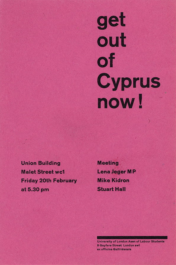
Desmond Jeffery: Political flyer, 1959 (Image courtesy Sally Jeffery)
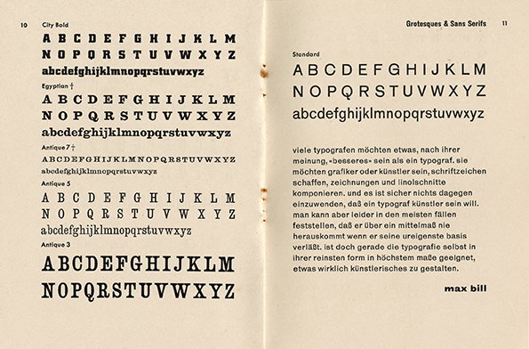
Desmond Jeffery: The small letter, type specimen book, 1956 ( Image courtesy Sally Jeffery)
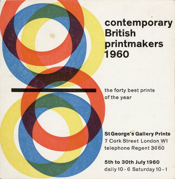
Desmond Jeffery: Gallery card, 1960 ( Image courtesy Sally Jeffery)
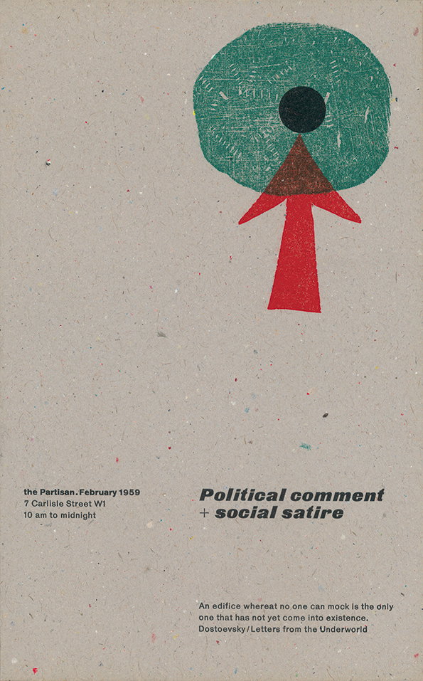
Desmond Jeffery: Exhibition catalogue, Partisan coffee house, 1959 ( Image courtesy Sally Jeffery)
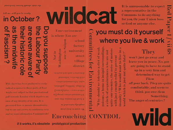
Desmond Jeffery: Red Paper, broadsheet, 1968 ( Image courtesy Sally Jeffery)
Share Article
Further Info
About the Author
—
Rob Alderson is a freelance writer, editor and strategist. He was previously editor-in-chief of It’s Nice That and WePresent, and editor of Design Week. He publishes the newsletter Undo, which tries to make sense of how AI is changing design work, the design process and the design industry.



