




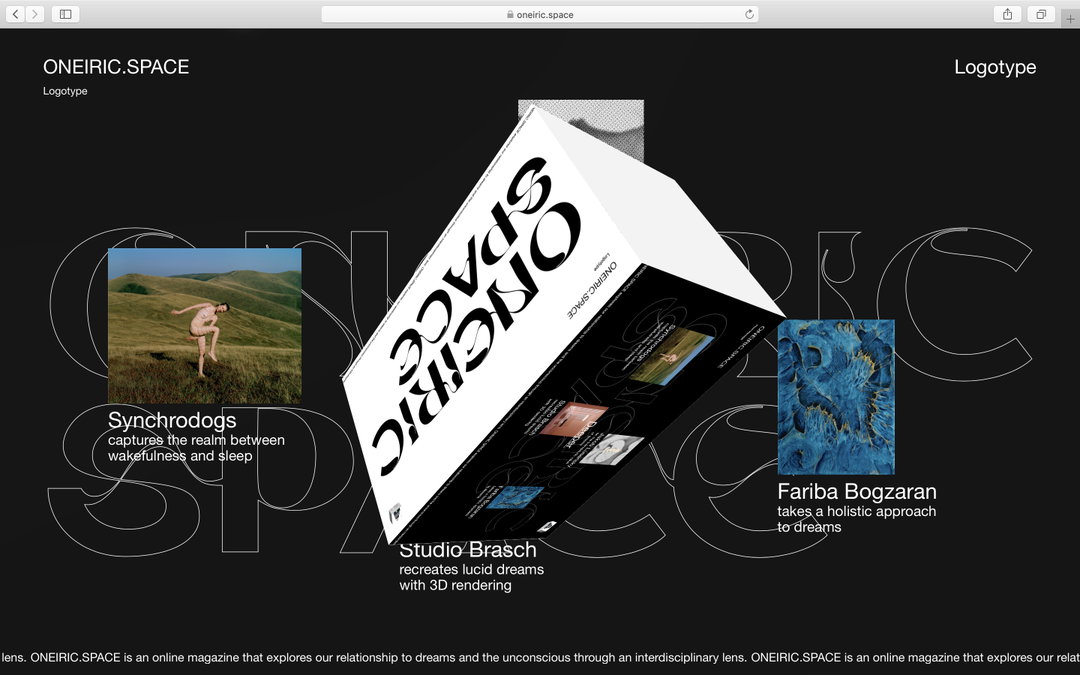
Emilie Vizcano’s multidisciplinary work is centred around typography
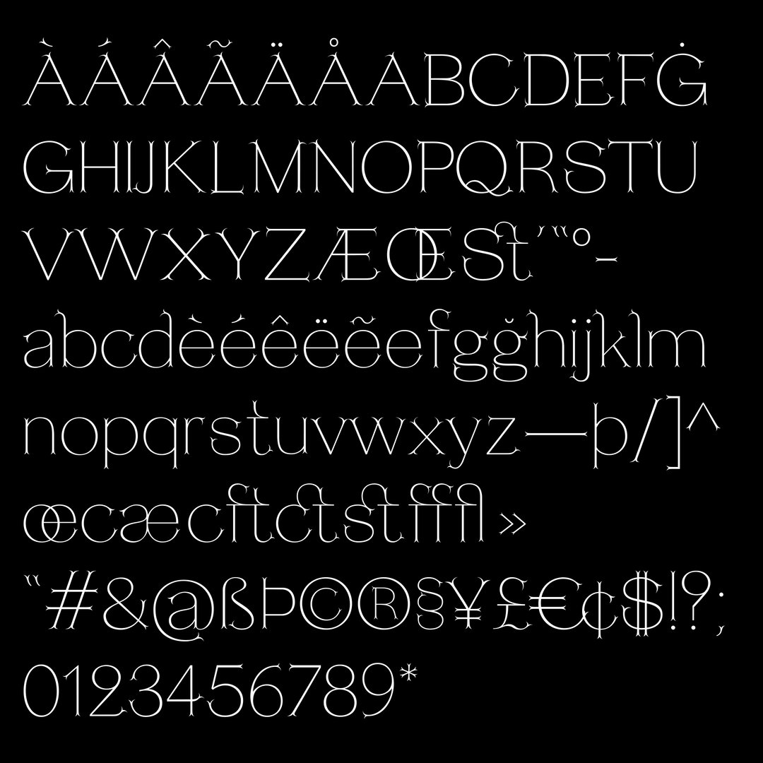
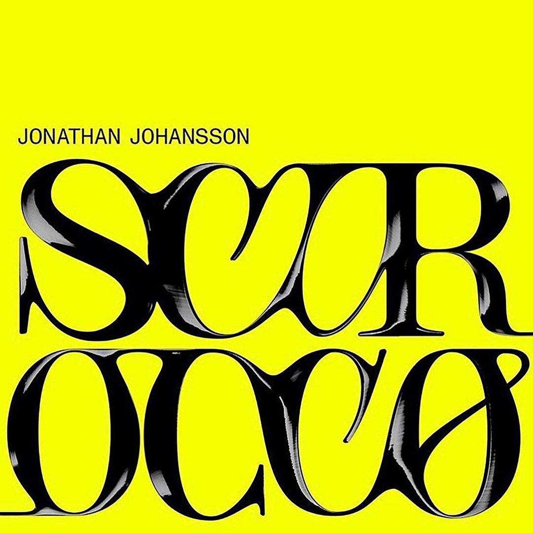
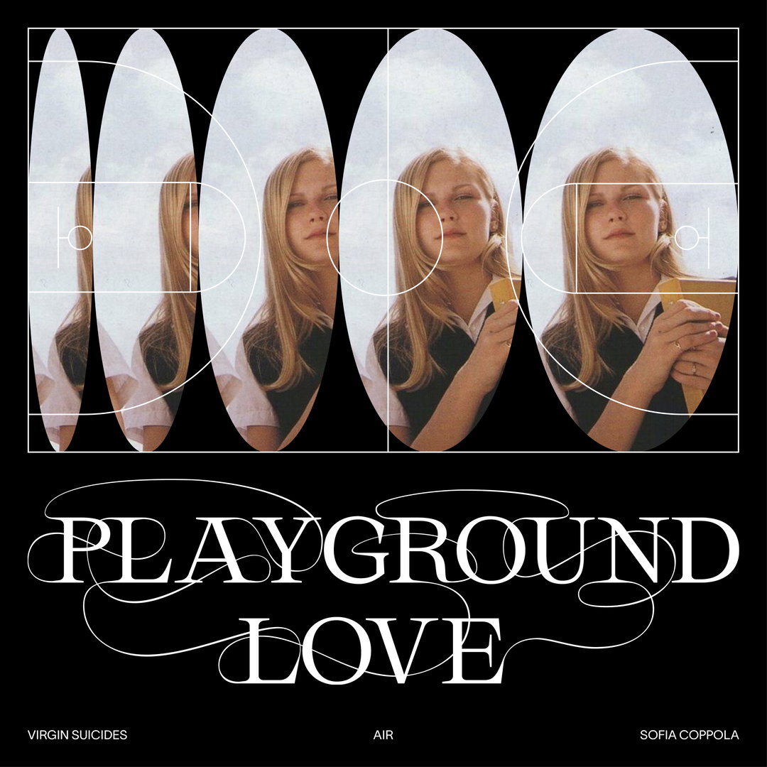
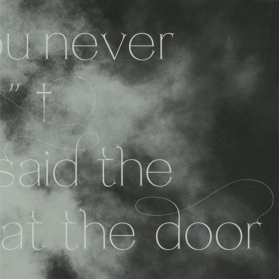
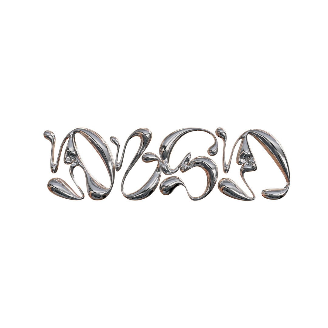
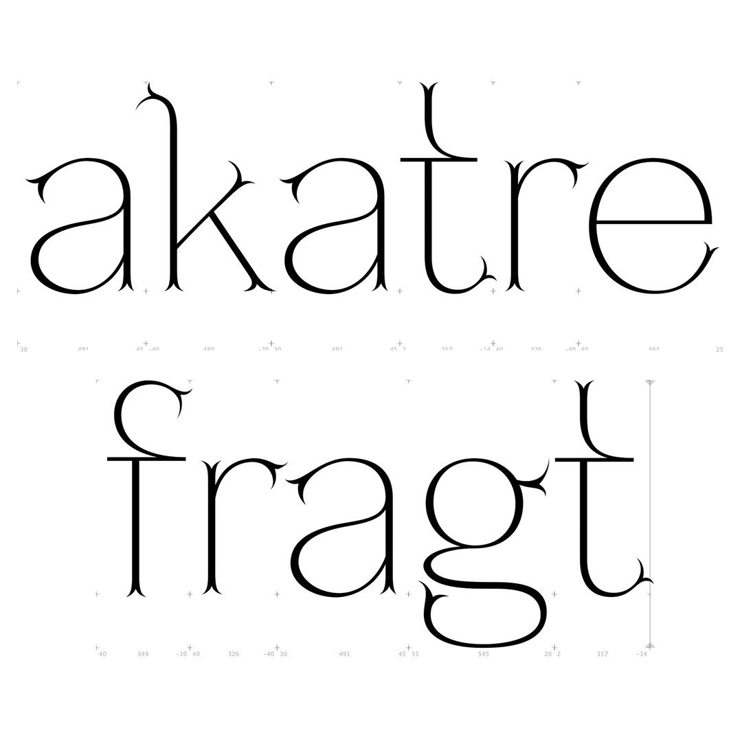
Ligatures feature heavily in her typefaces used across print, editorial and web design.
Share
Graphic Design is a medium that spans almost every field of work. From finance to fine art, there will always be visual content designed to promote, support and complement it.
For Emilie Vizcano, co-founder of Studio Push, this attribute of the medium is what drew her to the graphic design in the first place. “Graphic design is everywhere, and for everyone. Everybody is touched by it, even when they buy something in the supermarket with simple packaging,” she tells It’s Nice That. “I think it's super exciting to know that a lot of people can see your work, because the public exposure of graphic design is really large.”
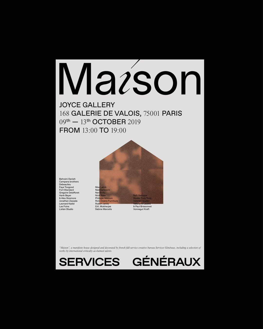
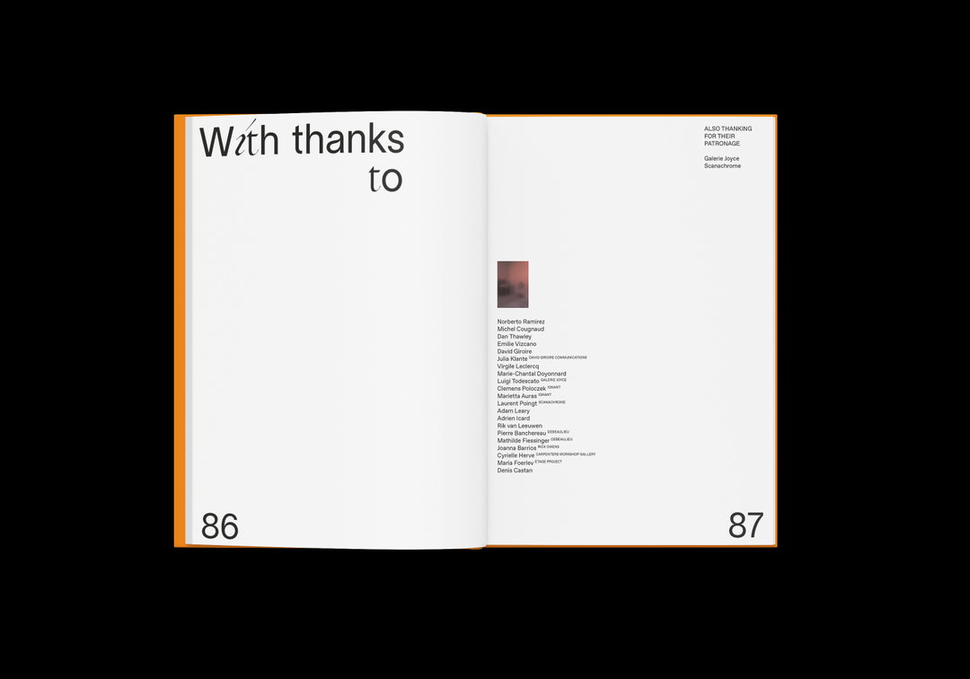
With her work at Studio Push, Emilie pushes this appreciation of graphic design, working as a multidisciplinary studio combining graphic and type design with aspects of creative coding and digital. Emilie looks after the visual identities and editorial design, whilst her co-founder Pierre Monge looks after the coding and web design aspects.
Emilie’s primary interests lie in print, fashion and photography, which stem from her bachelors degree in design. “I always wanted to do an artistic job because I loved drawing, so it was natural for me to go to graphic design school,” she explains. “With this school, I tried a lot of creative media, such as motion design, game design or photography. I think I prefer the creative process of graphic design, for me it's more free and creative – and also because I'm really bad at motion!”
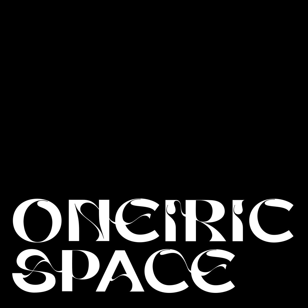
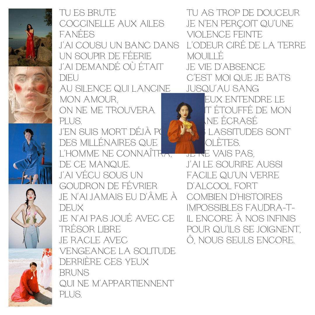
Aligning with her interests, Emilie’s work is often typography-led, which can sometimes involve her creating new typefaces, but can also mean integrating a typography-heavy approach into her designs – the Studio Push website for oneiric.space is a perfect example of this.
“I think I am multidisciplinary. When I have a project, I like doing everything, says Emilie. “As I am also a typographer, it's really nice to make a custom type for a brand for example. With Studio Push we can do the branding, we can do the website of the project etc. When I can combine every field I like, they are my favourite kind of projects.”
Emilie Vizcano
Emilie has also managed to build up a strong client base across the world, which complements and feeds into her work as part of Studio Push. Working across a number of disciplines, it is not easy to pin down a signature visual language in her work. However, she does cite her usage of ligatures as a fairly constant theme, and one of her primary interests: “For me it's one of the most interesting tricks in typography. I like linking letters in order to make a beautiful logotype. I think the way that letters merge with each other is powerful and have more impact.”
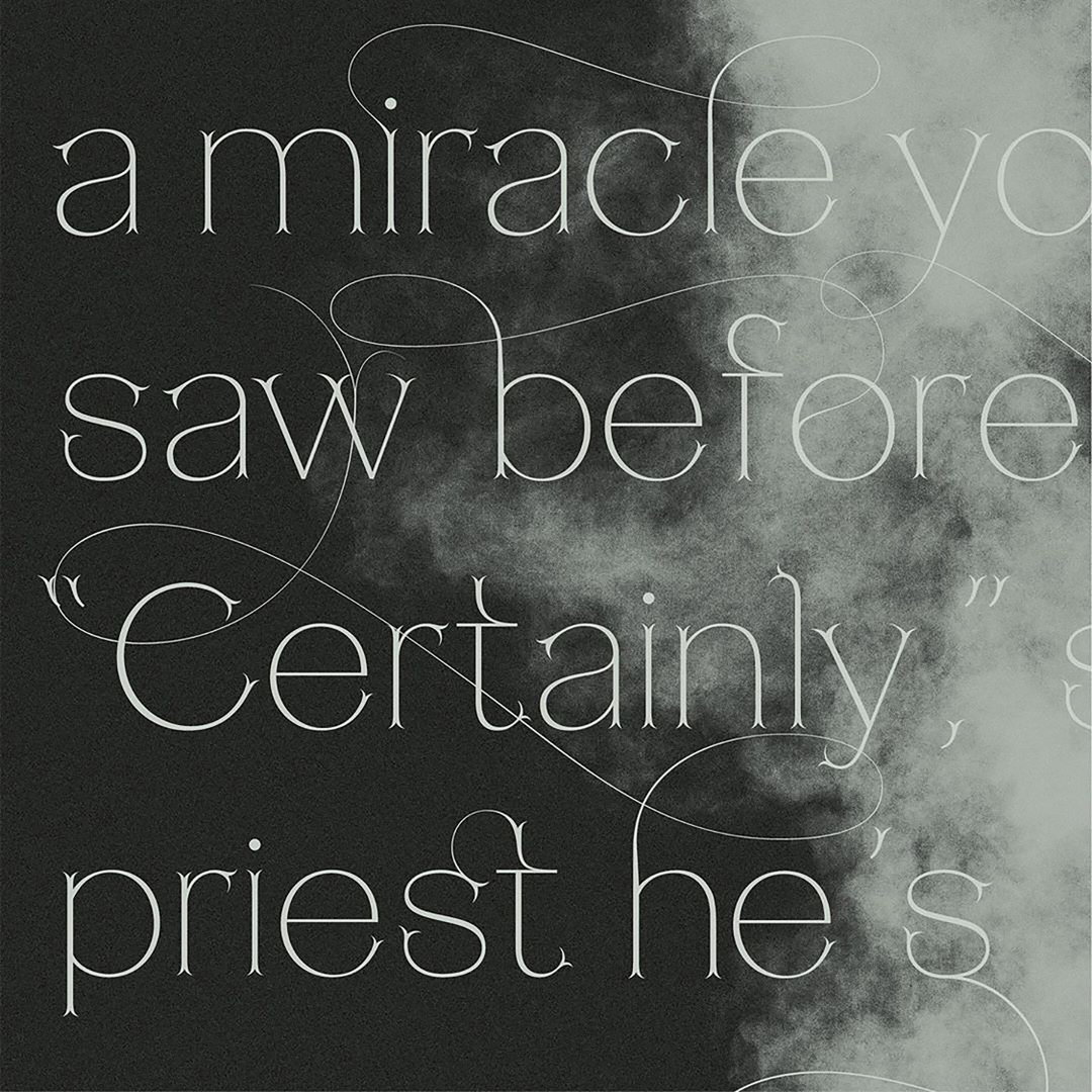
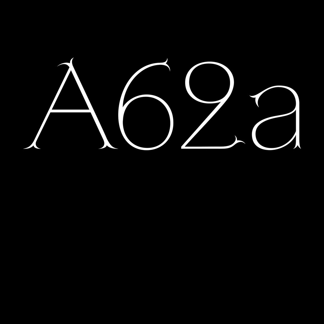
Much of her recent work revolves around her Lapicide-Light typeface, which she actually initially created as a personal project, but has since evolved into something more. “It's a type inspired by stone engraving in Roman times. It takes its name from the word ‘Lapicide,’ which means a stone engraver in French,” says Emilie. “Its serifs come from the visual effect of the engraved stone. I also had the chance to work with Lapicide for a commercial project called Mercuria Magazine which focuses on science and the arts. For this project, I had to make custom ligatures on words on different pages, with the overall purpose being to make it a little bit more 'dramatic'."
As Studio Push continues to grow, it's clear that Emilie has not lost any of her enthusiasm for her work, and the diversity that graphic design can provide. “You can work in culture, brands, music, fashion – there are so many possibilities…” she says. “Working across different fields is so fulfilling!”
GalleryEmilie Vizcano
Hero Header
Emilie Vizcano
Share Article
Further Info
About the Author
—
Charlie joined It’s Nice That as an editorial assistant in December 2019. He has previously worked at Monocle 24, and The Times following an MA in International Journalism at City University. If you have any ideas for stories and work to be featured then get in touch.


