A logo becomes a floorplan in great new Freytag Anderson work
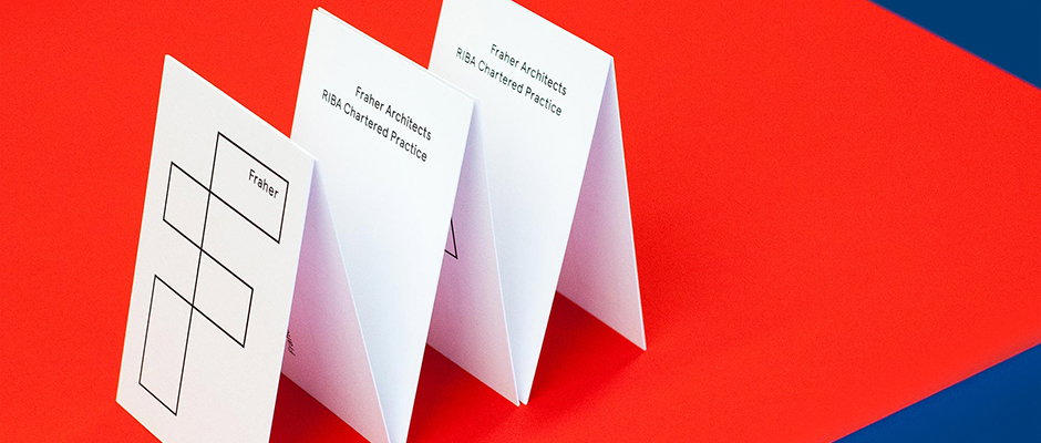
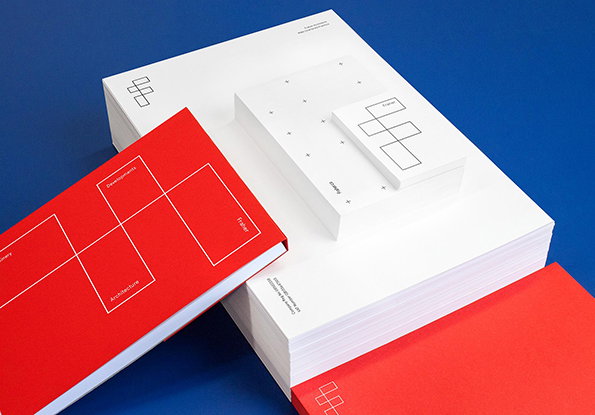
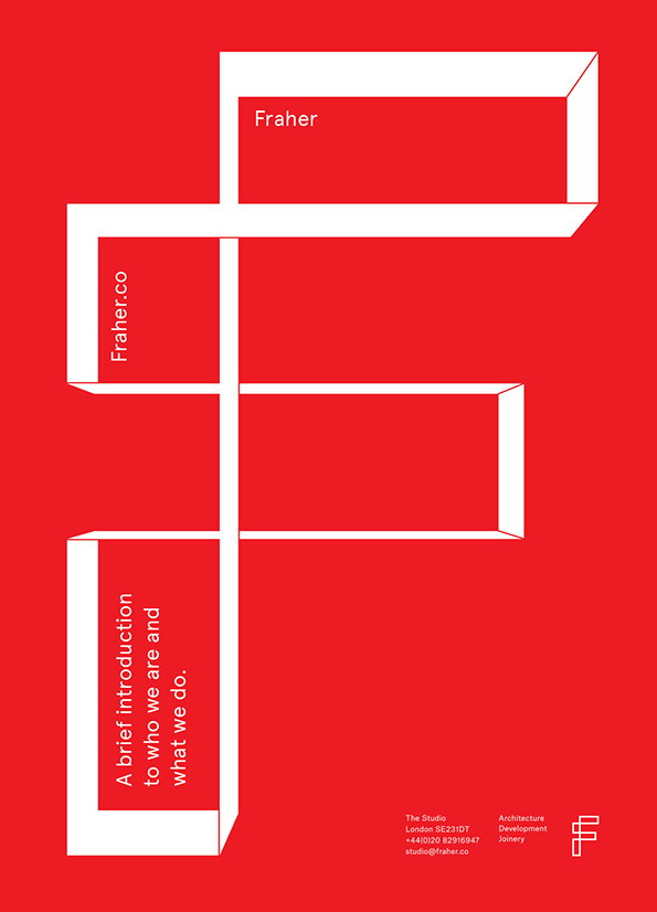
Often the most interesting branding work hinges on a simple twist, and such is the case in this work by Freytag Anderson for Fraher architects. The Scottish studio’s concept revolves around the neat idea of the “F” in the logo doubling up as an architectural floorpan.
“The intersecting compartments or rooms create a simple graphic device for containing text, images and texture,” the designers say. “A vibrant red accent colour supports the minimal yet functional aesthetic.” Rolled out across stationery, a soon-to-be-launched website and internal presentation documents, it’s a really impressive idea executed to perfection.
Freytag Anderson: Fraher
Freytag Anderson: Fraher
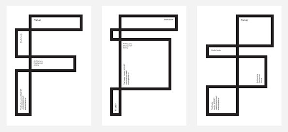
Freytag Anderson: Fraher
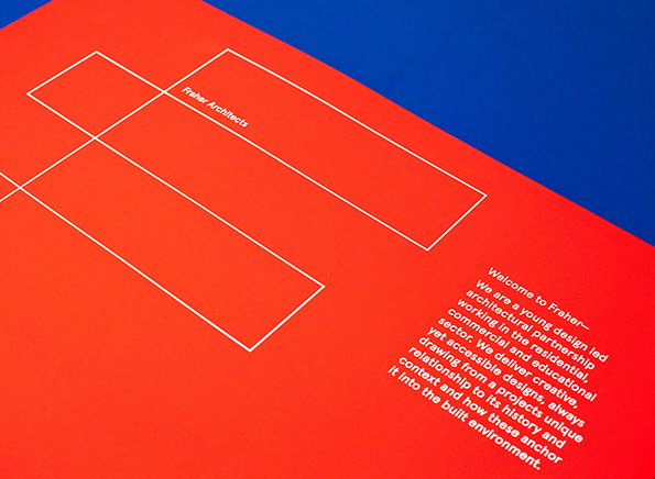
Freytag Anderson: Fraher
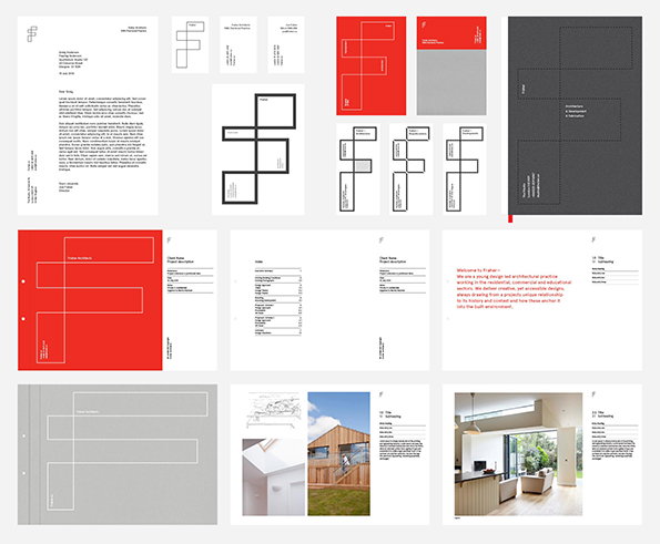
Freytag Anderson: Fraher
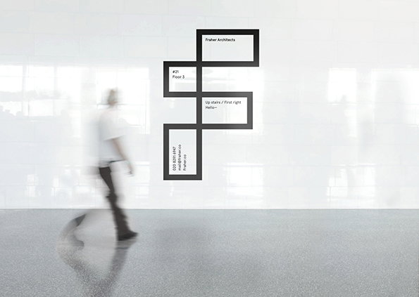
Freytag Anderson: Fraher
Share Article
Further Info
About the Author
—
Rob Alderson is a freelance writer, editor and strategist. He was previously editor-in-chief of It’s Nice That and WePresent, and editor of Design Week. He publishes the newsletter Undo, which tries to make sense of how AI is changing design work, the design process and the design industry.