Jo Minor's “soft, squishy, weird, goofy, gooey and vibrant” illustrations
“I have always been interested in illustration, although for most of my life it was something kind of tertiary – in the back of my mind with music in the foreground,” begins Chicago-based illustrator Jo Minor. “A few of my family members were and are professional artists – I was always very fascinated with their ability to quickly create something beautiful in only a few minutes with just a pencil or some watercolours.” Coupled with his interest in picture books and cartoons, Jo aspired at a young age to follow in the footsteps of his relatives. However, lacking confidence in his artistic abilities it wasn’t until college, where he found himself excelling in drawing and woodblock printing classes, that he realised there was a future in illustration.
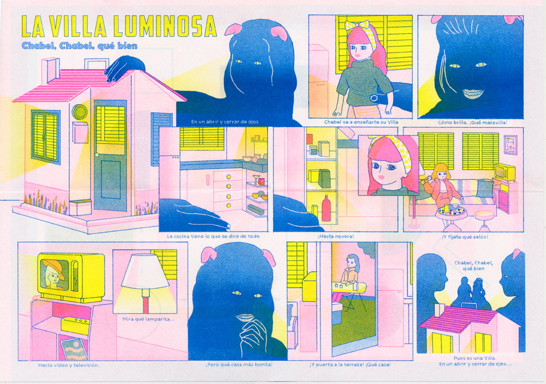
“Then, when I moved to Berlin, I took a risograph printing workshop with Johanna Maierski and Paul Paetzel at Johanna’s printing and publishing house, Colorama. I made this little comic there and used photoshop to illustrate for the first time. Johanna liked what I made and asked me to return to participate in one of her Clubhouse publications,” he explains. “Johanna and the work she does at Colorama is something I had followed and fanboyed over for a good while at that point, so getting encouragement from someone whose sensibilities I trusted and looked up to was really very big for me. Out of any single event, that more than anything is what got me into illustration.”
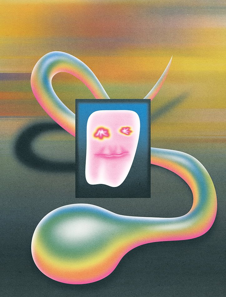
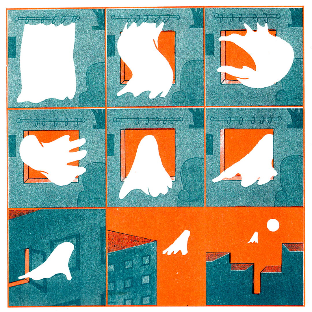
Jo Minor: Tooth and the Paste-Snake
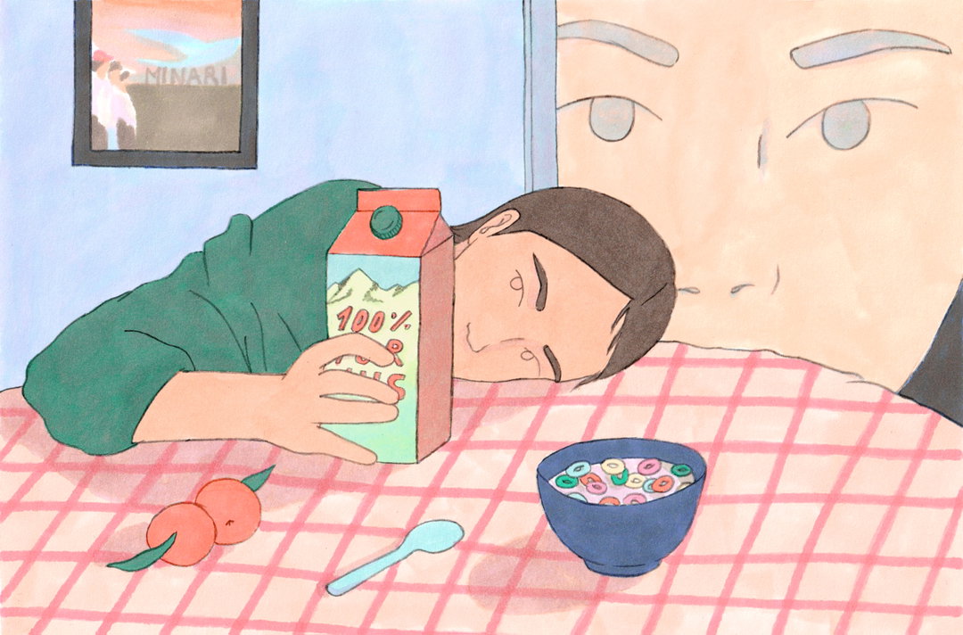
Having since moved back from Europe to Chicago, Jo’s practice is rapidly progressing. A beautiful collection of what he describes as “soft, squishy, weird, goofy, gooey and vibrant” illustrations showcase his skills in composition and colouring. Speaking on the latter, he says “I use only pantones for risograph ink colours and blends of those pantones. On rare occasions, I’ll use filters to totally change a piece’s colours at the end, but generally the colours are slowly layered as they would be in a non-digital painting or drawing.”
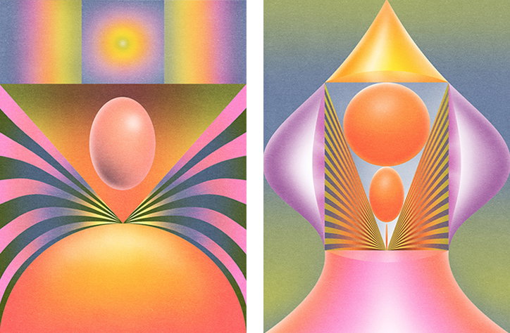
This capacity to create digital works with an analogue feel was brought to his attention after discovering esteemed artist Robert Beatty’s book, Floodgate Companion, at the comic store, Floating World, in Portland. Blown away by the capability and versatility of Beatty’s process, he says: “I remember asking the person behind the counter if they knew the medium he was working with and I was kind of shocked to hear it was through digital means. So learning that you could make airbrush-type art digitally was very big for me.”
It was also a particularly poignant moment for Jo because he had always valued art and illustration that created space to subvert and abstract the laws of nature, just as Beatty’s creations were doing. “Obsessed” with visual art that has a lot of (physical) depth, but is still able to warp how light and shadow interplay in the real world, he says it’s that “sort of sense of uncanniness” that he tries to achieve in his own work. But, he concedes, that his motives aren’t entirely complex; he also treats art as amusement: “I’m just playing with colours, shapes, and textures and making things that are nice, weird, and/or funny for me and hopefully others to look at.”
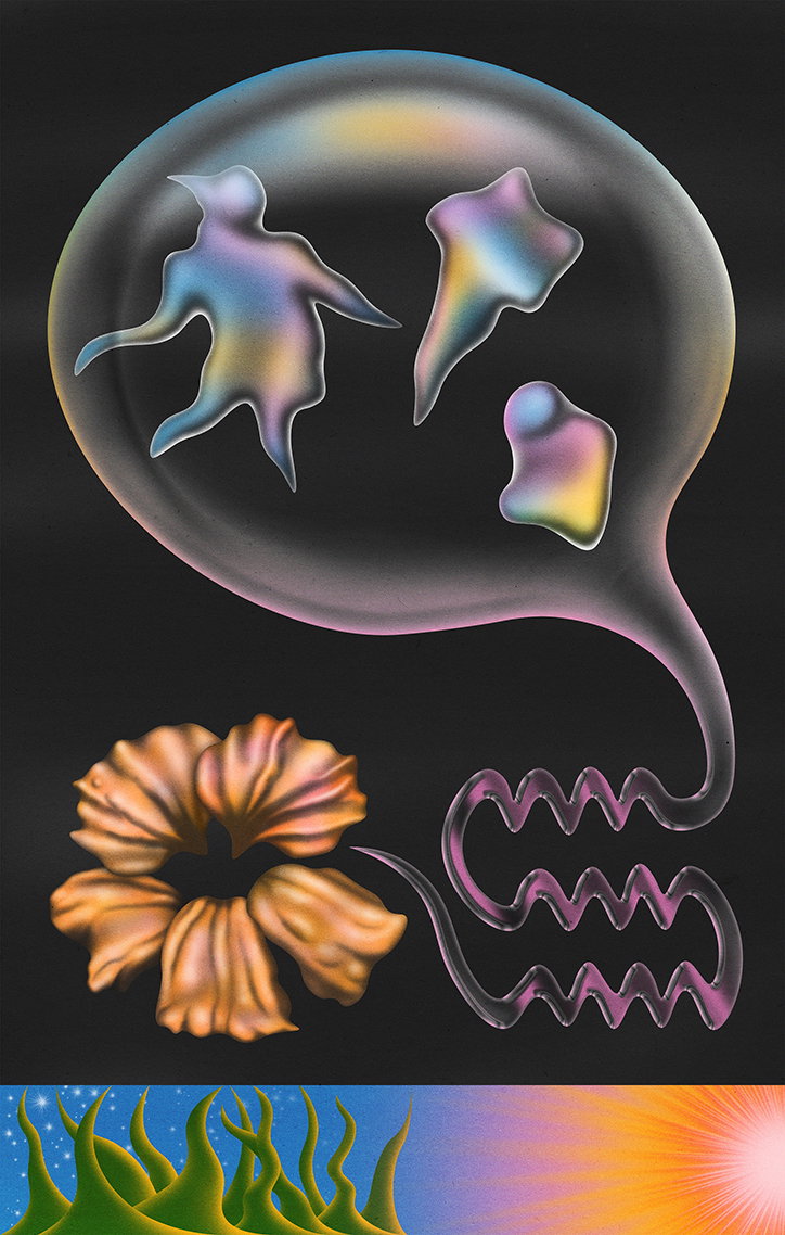
Jo Minor: Flower’s Song
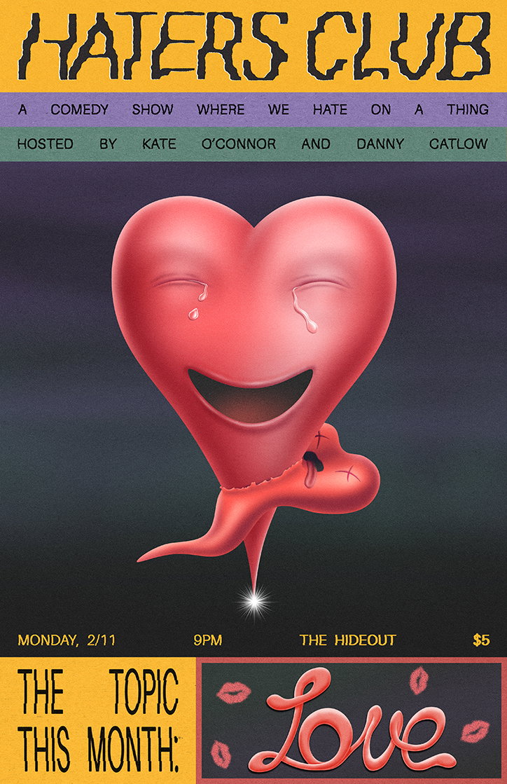
Jo Minor: Haters Club February
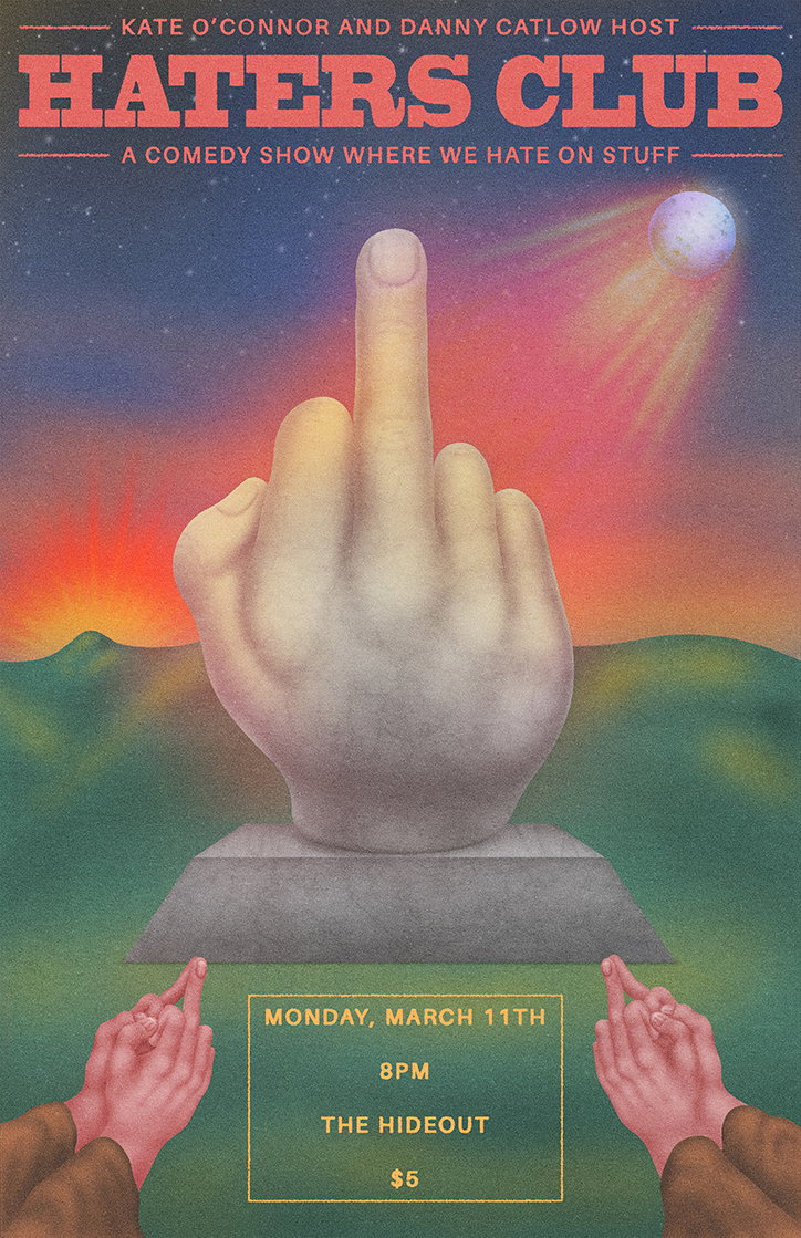
Jo Minor: Haters Club March
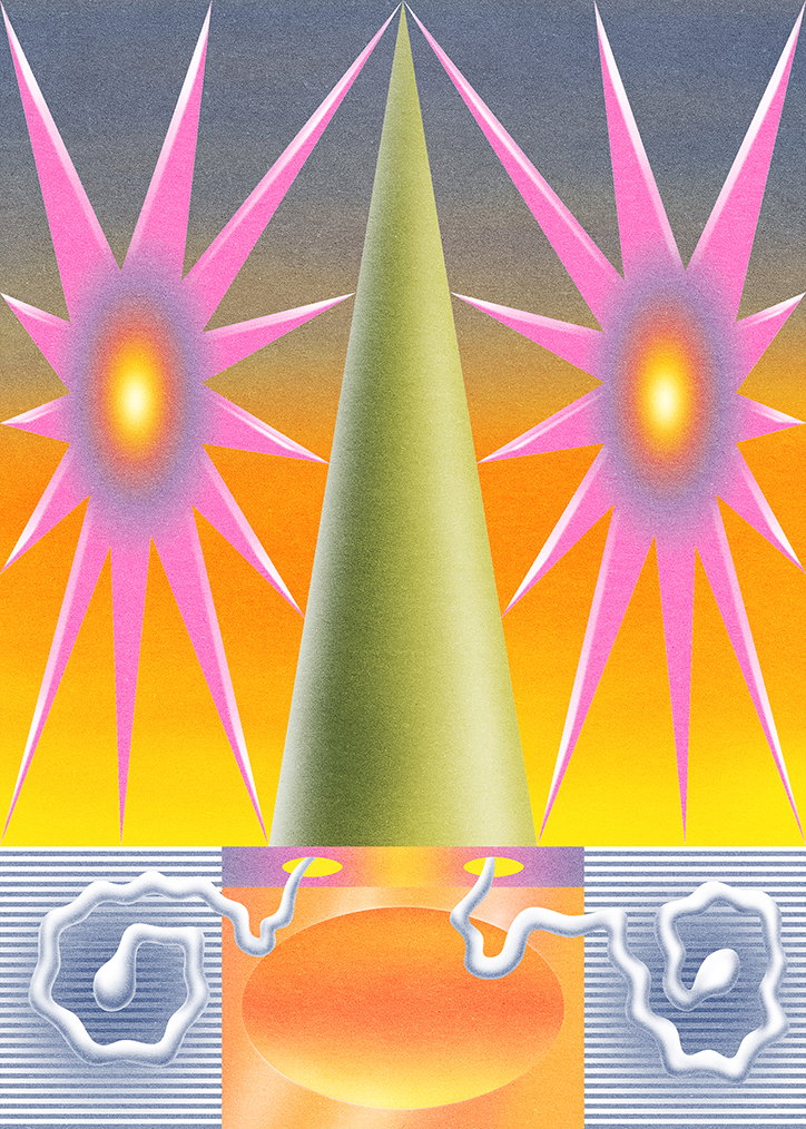
Jo Minor: Test 02
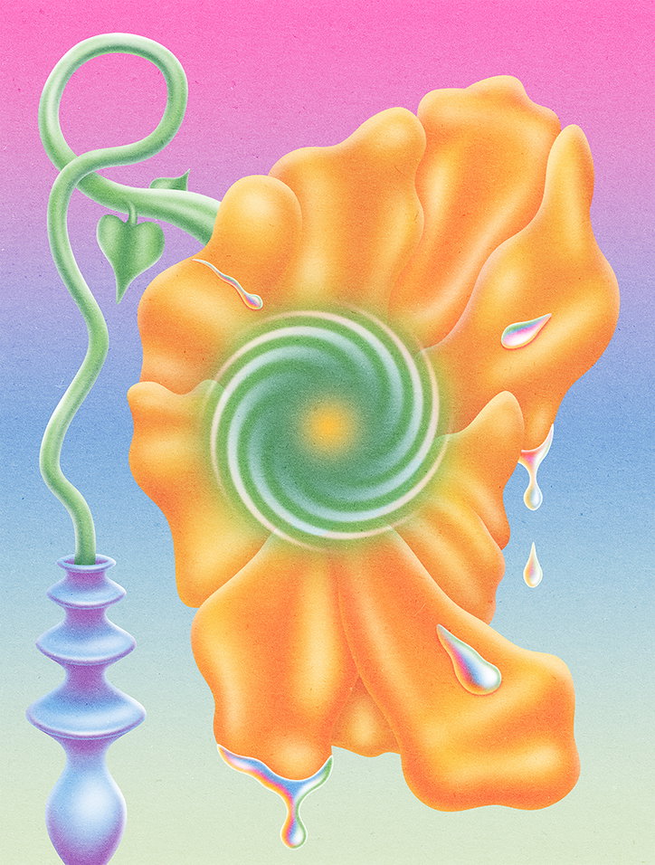
Jo Minor: New Flowers
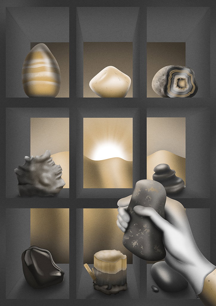
Jo Minor: My Rock Collection at Dawn
Share Article
Further Info
About the Author
—
Daniel joined It’s Nice That as an editorial assistant in February 2019 and continues to work with us on a freelance basis. He graduated from Kingston University with a degree in Journalism in 2015. He is also co-founder and editor of SWIM, an annual art and photography publication.