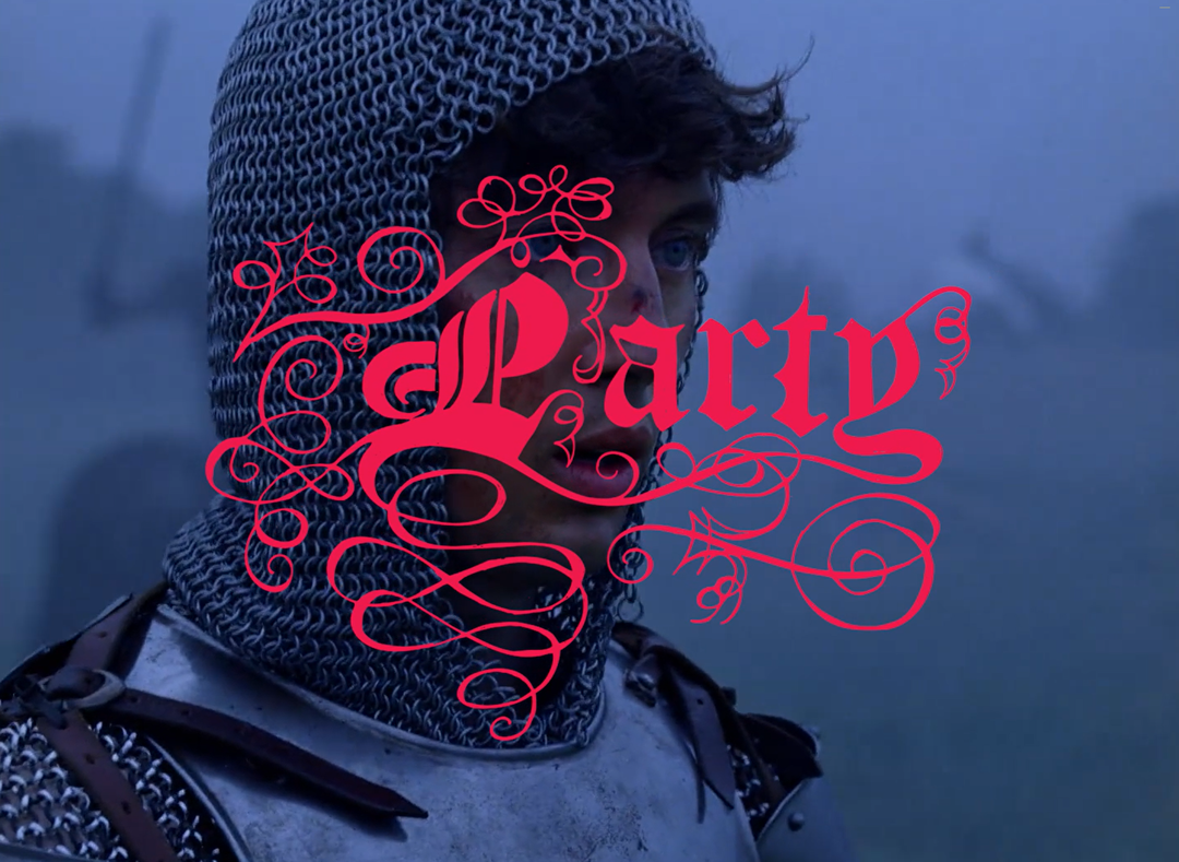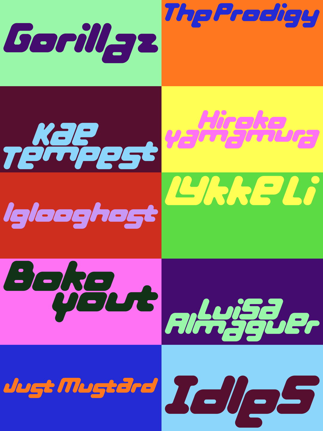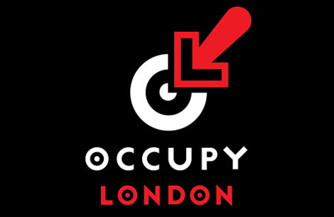
Leaving aside the whys and wherefores of whether a grassroots political campaign like Occupy London needs a logo, it’s interesting to see that an online poll has selected this one from Jonathan Barnbrook. The striking design combines the OL initials with the pertinent idea of a real sense of time and place, and Jonathan said on Twitter he was “honoured” to have been chosen. His Bastard font is also used for the Occupy London newspaper, putting him at the visual forefront of the protest.
Share Article
Further Info
About the Author
—
Rob Alderson is a freelance writer, editor and strategist. He was previously editor-in-chief of It’s Nice That and WePresent, and editor of Design Week. He publishes the newsletter Undo, which tries to make sense of how AI is changing design work, the design process and the design industry.