




Design studio Julia on a decade of turning complex ideas into graphic symbols
For the past ten years, graphic and spacial design studio Julia has been producing work for clients from the cultural and commercial sector, including everything from typefaces to books, magazines, exhibitions, posters, websites and identities. Having been formed in late 2008 by Valerio Di Lucente, Erwan Lhuissier and Hugo Timm, Valerio and Erwan (who have been running the studio since May of this year) are celebrating a decade of Julia. We caught up with the pair to find out a bit more about how their work has taken shape over this time.
Any inkling that the trio might eventually start a studio together occurred on their first day at the Royal College of Art in London. Studying on the then master’s in communication, art and design, they ended up sharing a beer. “And from there, we went on to share many more at the art bar, along with projects, pasta with pesto, and video games until our final show in 2008,” Valerio and Erwan tell It’s Nice That.
Since Valerio is from Italy, Erwan from France and Hugo from Brazil, discussions quickly became a prominent facet of their practice. “Dialogue and collaborations really shaped the way we work, preceding any aesthetic considerations. Coming from different cultures meant we had to exchange a lot to achieve something that would make sense to everyone,” they explain. Existing as much between themselves, as between them and their collaborators, it’s a skill which they employ throughout their process.
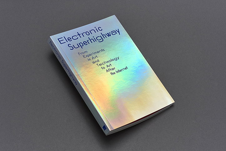
Julia: Electronic Superhighway
Visually, Julia’s work has been described as “economical”, “concept-driven” and “minimal”, descriptions which the studio “accept but reject some of the subtext often associated with those terms,” Valerio and Erwan explain. Ultimately, however, “we favour a process where an idea is synthesised in a few signs which in combination determine a specific visual language”.
One example of this process is in Julia’s identity for Curating after the Global: Roadmaps, a symposium organised by CCS Bard and the Luma Foundation in Arles. The studio began by adopting a ubiquitous graphic symbol: the barcode. “It’s a borderline cliché, but how do you re-elaborate a sign which pervades our times appearing on holiday tickets as much as on an immigrant visa application?” This visual element then became a drawing tool through which Julia could represent “volatile images of roadblocks, networks and imperialist structures”.
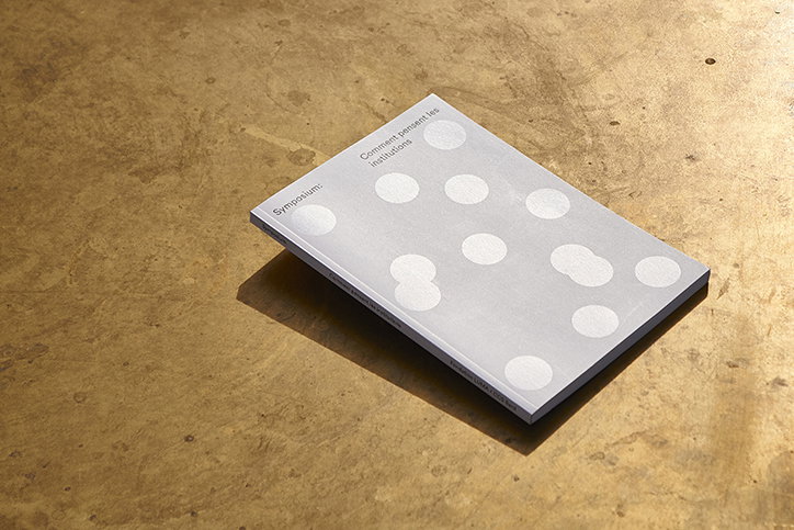
When designing another identity for one of the institution’s symposiums, these same principles applied. Titled How Institutions Think, it dealt with anthropologist Mary Douglas’ ideas. “She defined institutions as macro expressions of individuals, so we started to represent the individual by a dot and from then possible arrangements of congregations which in turn evoke different notions from chaos to order,” the duo recounts. It’s these small visual tricks, turning potentially complex ideas into bold, and visually pleasing graphic symbols which makes Julia’s work so intriguing. Often enticing aesthetically, its work always features codified systems to be discovered.
Over the years, Julia has worked with clients including the ICA, the V&A and the Hayward Gallery. Some of its favourite moments, however, occurred while travelling in relation to studio work, “in particular, teaching in Iceland and Venice and our project in Brazil”. And, when it comes to how they’ve progressed over the past decade: “Anything which wasn’t related to design but to the life of a company, we had to learn the hard way. Nobody prepares you for that.”
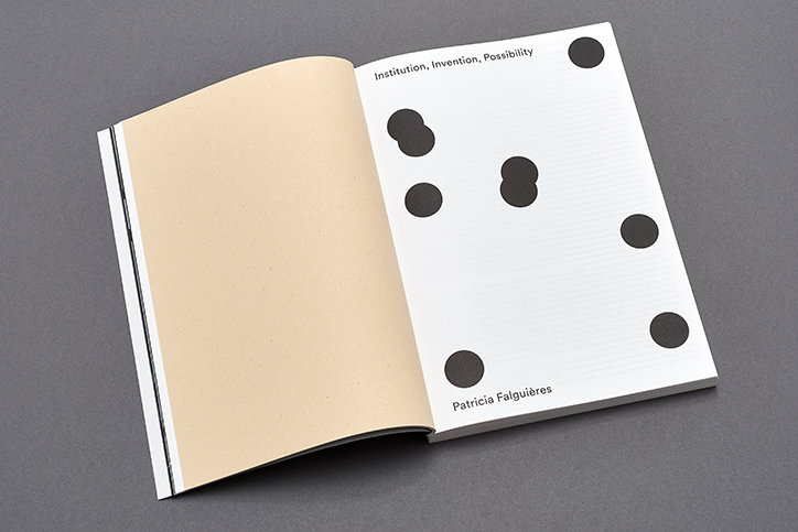
Julia: How Institutions Think
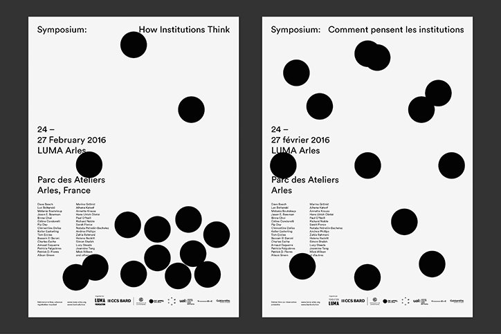
Julia: How Institutions Think
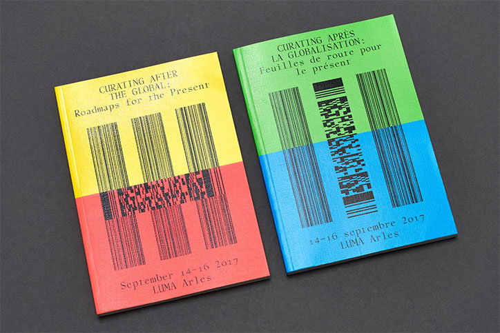
Julia: Curating after the Global: Roadmaps
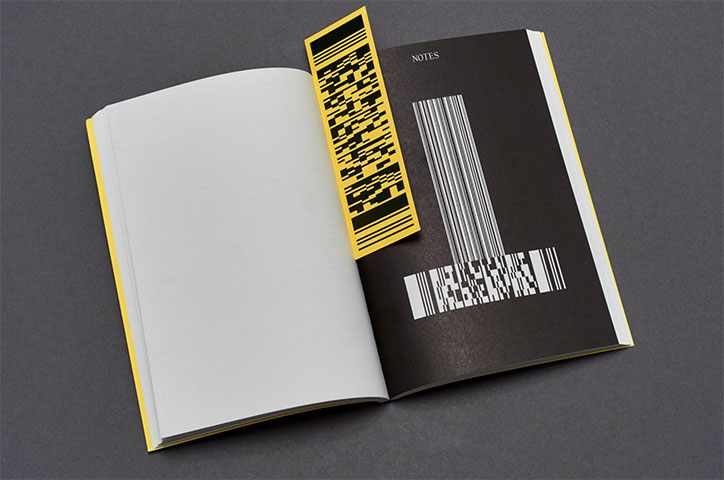
Julia: Curating after the Global: Roadmaps
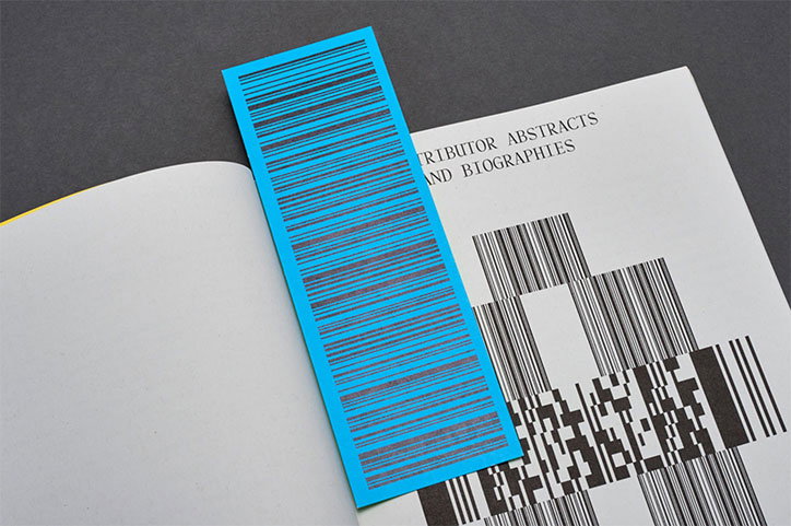
Julia: Curating after the Global: Roadmaps
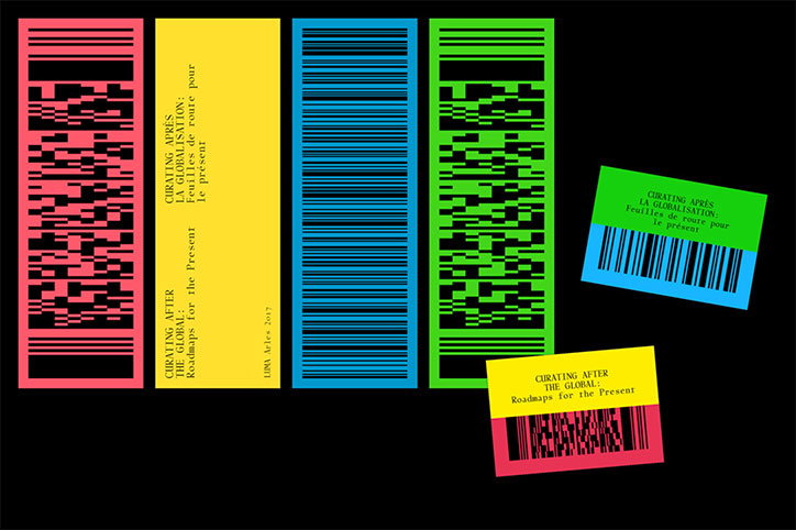
Julia: Curating after the Global: Roadmaps
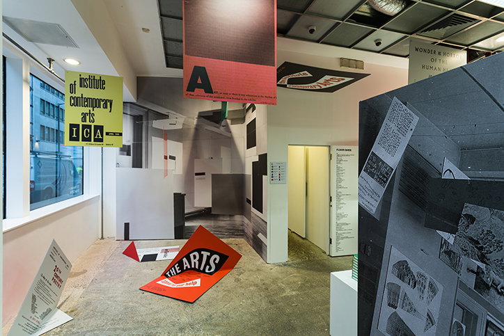
Julia: ICA Offsite
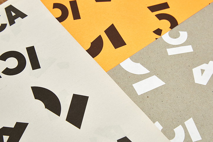
Julia: ICA Offsite
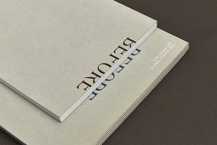
Julia: Abraaj
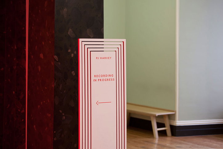
Julia: PJ Harvey
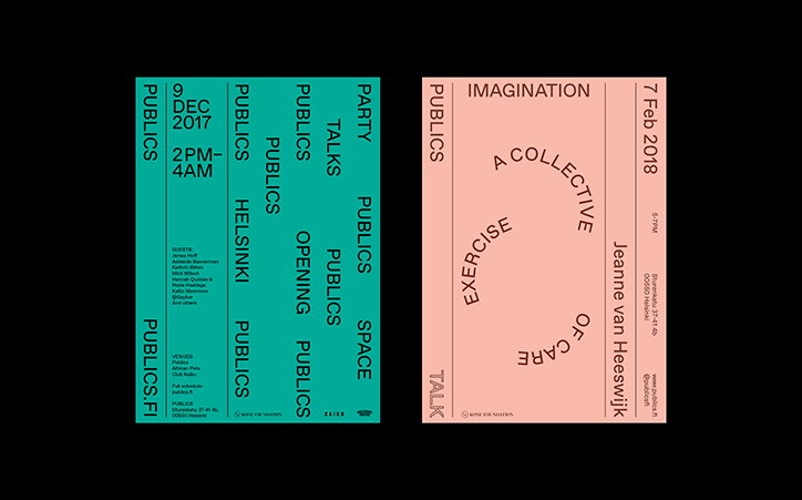
Julia: Publics Home
Share Article
Further Info
About the Author
—
Ruby is Senior Creative at It's Nice That, overseeing our visual output across platforms and projects. Before that, she was associate editor on the editorial team, after joining in September 2017 following graduation from Central Saint Martins.

