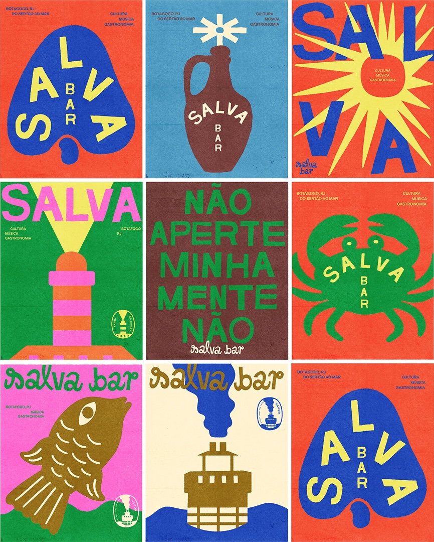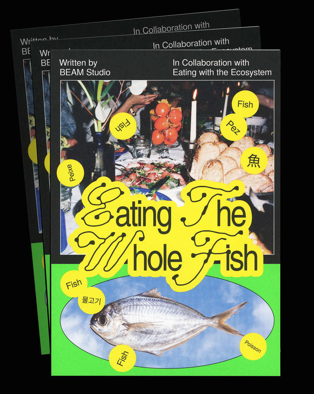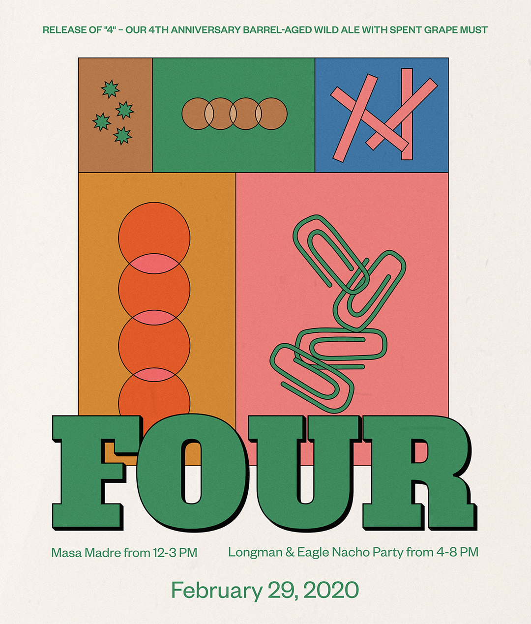
Graphic designer Leila Register combines mundane objects with wonderfully playful designs
Following a very unique pathway, it was through her job as a barista that Leila first began her journey as a graphic designer.
When discussing where she finds her inspiration, Atlanta-based designer Leila Register tells us that she’s “currently inspired by objects that are totally ordinary and non-descript”. But, despite being enamoured with objects as seemingly uninteresting as an intake form at a doctors’ office, a classified ad in a newspaper, or an old receipt, Leila’s work is far from boring. In fact, it’s quite the opposite. Full of inviting colours, playfully abstract shapes and striking type designs, her work is lively, fun and full of personality.
What most draws Leila to such mundane objects is how “there are familiar things to everyone and yet we don't spend a lot of time thinking about how they look”. Expanding on this thinking, Leila explains that “I spend most of my days thinking about and working on the visual design of things, so I think there’s something almost refreshing to me about something with no ostensible style”. A great example of this philosophy, Leila tells us, is Crystal Zapata’s (one of her favourite designers) invitation to an art opening at the MCA which used a parking ticket as the backdrop for the invitation and stylised the event details to match a parking ticket font. “I’m really into that”, Leila says, “I like the idea of forcing yourself to visually adapt to a piece of paper you find on the street.”
Adapting is also something that seems to come naturally to Leila. Studying film at undergrad, Leila often found herself working on design elements, making posters and working on title treatment for friends short films. Explaining that she “never felt entirely comfortable behind a camera” Leila says that “working on these auxiliary – albeit still important – elements of a film felt like a good way to develop my visual voice”. Absurdly, it wasn’t until Leila got a job as a barista in a restaurant that her design pathway really began.
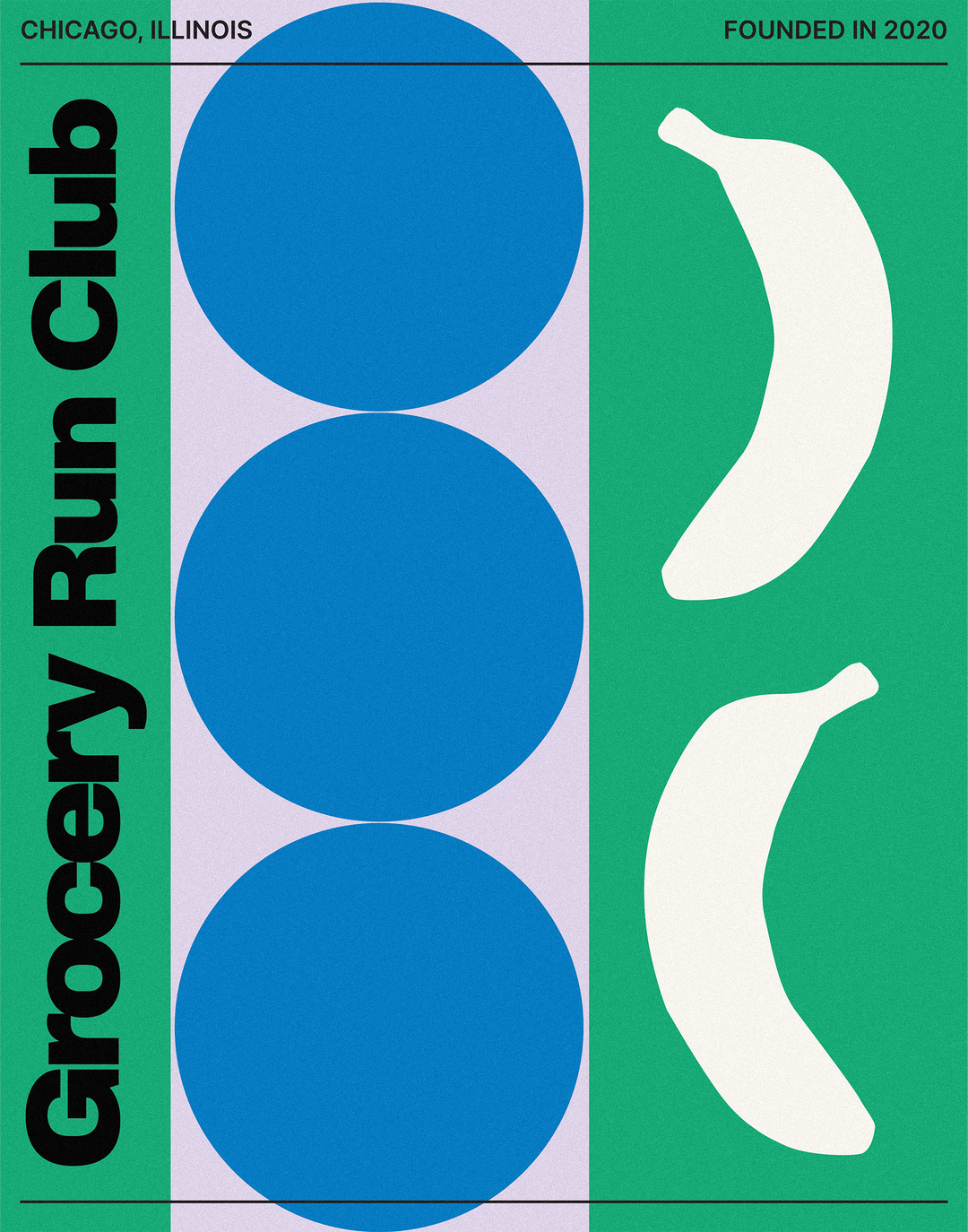
GalleryLeila Register: Grocery Run Club Poster (Copyright © Grocery Run Club, 2020)
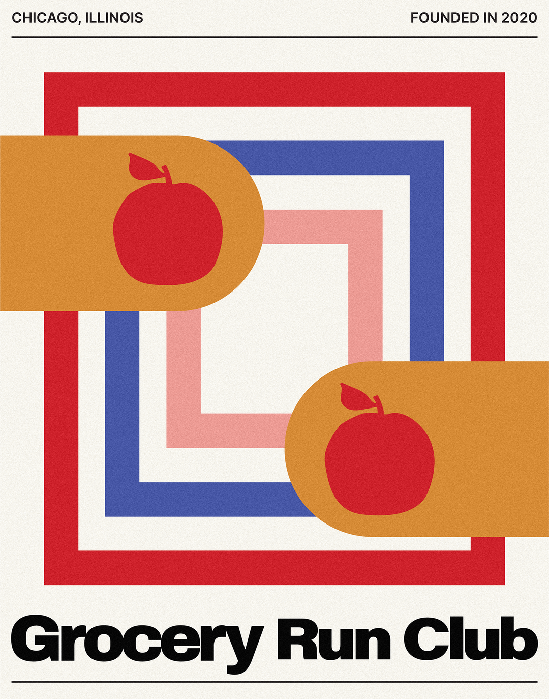
Becoming friends with the restaurant’s creative director, Leila began helping her with promotional flyers, menus and social media graphics. It wasn’t long before juggling both her positions became a bit too much, and she decided to quit her barista job and do design work for the restaurant full time. Despite feeling “a lot of insecurity around not having studied design or illustration in any formal sense”, Leila sees her first step as coming at the perfect time: “I was out of my comfort zone, but primarily I was just excited to be doing creative work”, she says. “Over time I grew more comfortable calling myself a designer and started to think of myself as someone with a strong visual sensibility.”
With her design beginnings being heavily rooted in the culinary industry, it seems natural that Leila has continued to work closely with food. A “dream project” for Leila is her work with Grocery Run Club, a Chicago-based initiative founded by Lucy Angel and Jorge Saldarriaga which works with organisations to supply fresh produce and necessities to underserved neighbourhoods in Chicago. Seeking an identity that emulated “vintage grocery ad meets bauhaus” Leila gravitated towards bold colours, textures and patterns. Also looking to incorporate illustrations of fruit and produce, Leila wanted to keep them fairly abstract – playing with the scale and rendering them in unexpected colours.
Whilst Leila’s work is so considered, well executed and consistent, the designer isn’t afraid to admit that she can sometimes be a victim of self-doubt. “I have a lot of anxiety and fear that I have no good ideas left”, she explains. But, she has sure-fire ways to combat these feelings: “I’m really afraid this is a line from Mad Men, but I remember once hearing the advice ‘think about something very hard, and then not at all’.” Leila discusses this pop-culture-inspired approach in line with her project with Goldune – an eco-conscious store whose name roughly translates to vase or vessel in Farsi. Becoming really “obsessed” with different ways to use vase and flower shapes for the identity, Leila says that “by the time I was done thinking about that, I’d already forgotten my own sense of inadequacy. I was too busy being obsessive about vases”.
Now working and growing as Goldune’s in-house designer, Leila is always eager to take on new projects. But, she’s also set high hopes on getting back to making physical things. “My dream is to design a billboard or maybe the side of a truck.”
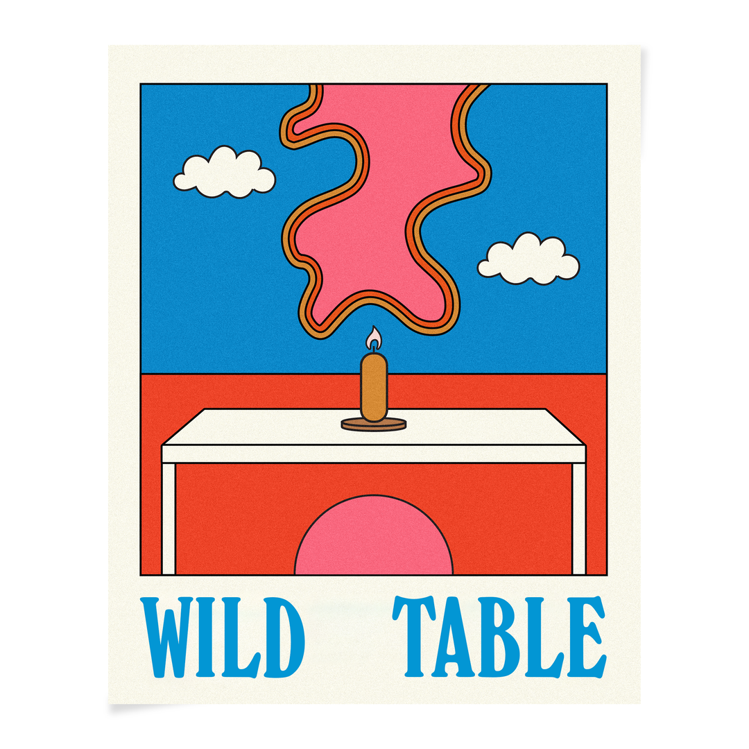
Leila Register: Hopewell Brewing Co. Poster (Copyright © Hopewell Brewing Co., 2020)
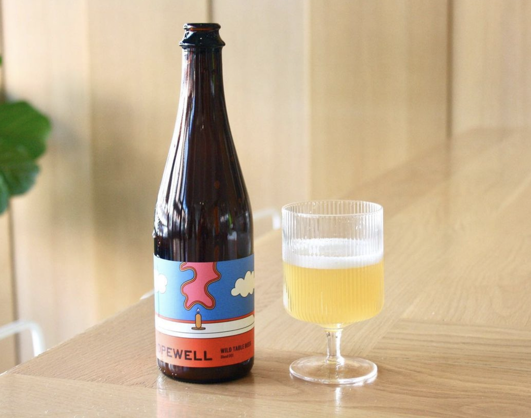
Leila Register: Hopewell Brewing Co. Label (Copyright © Hopewell Brewing Co., 2020)
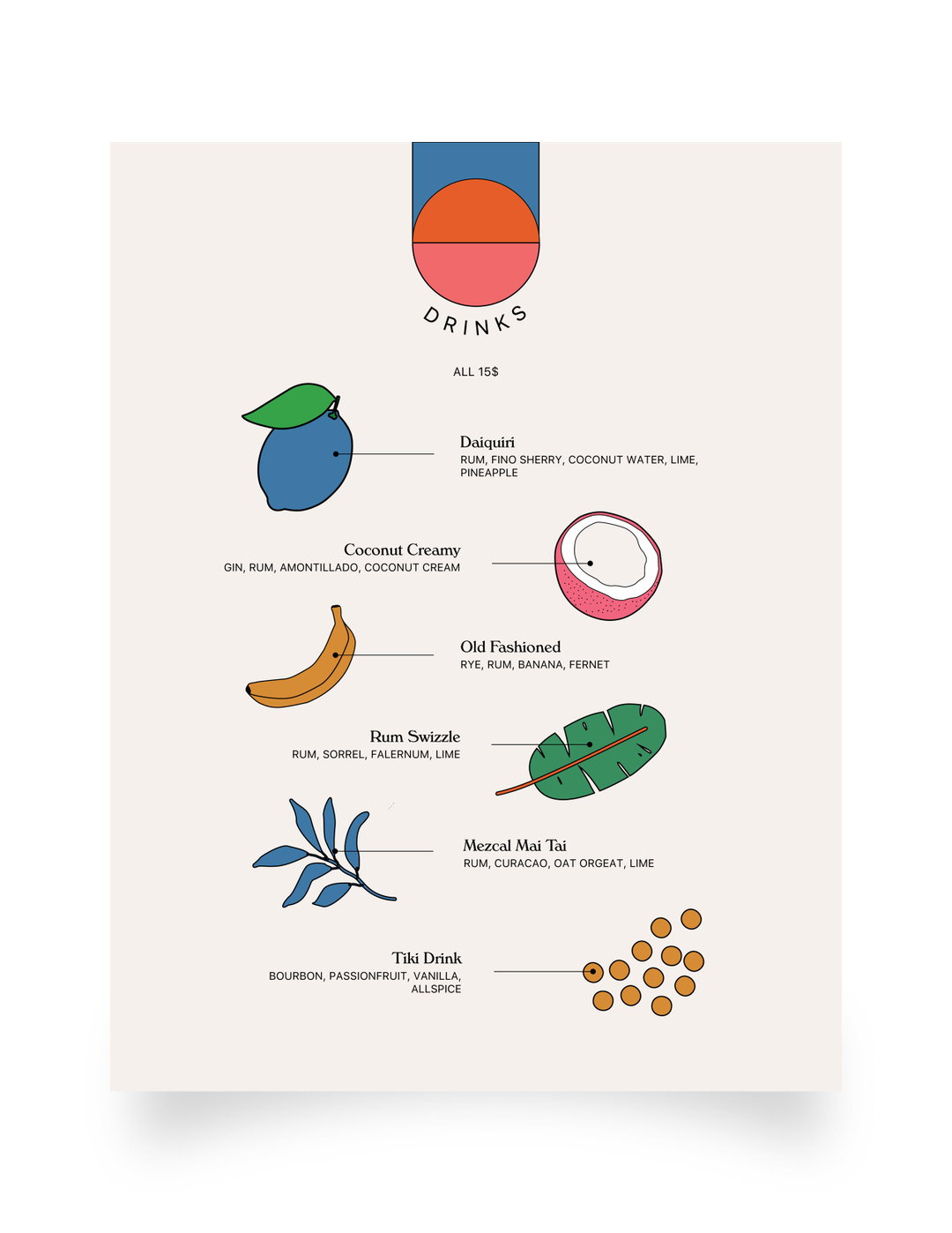
Leila Register: Secret Sound Menu Design (Copyright © Secret Sound, 2019)
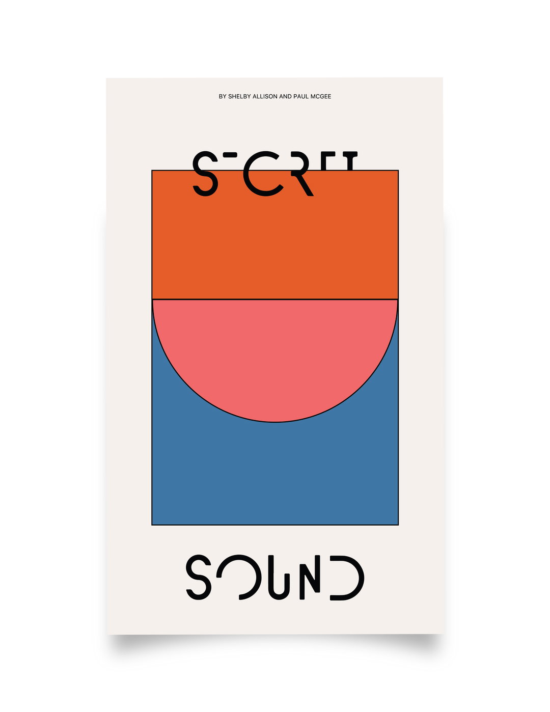
Leila Register: Secret Sound Poster (Copyright © Secret Sound, 2019)
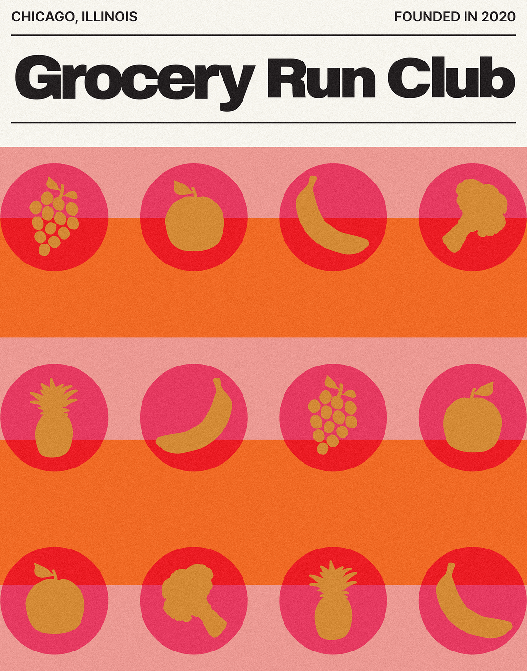
Leila Register: Grocery Run Club Poster (Copyright © Grocery Run Club, 2020)
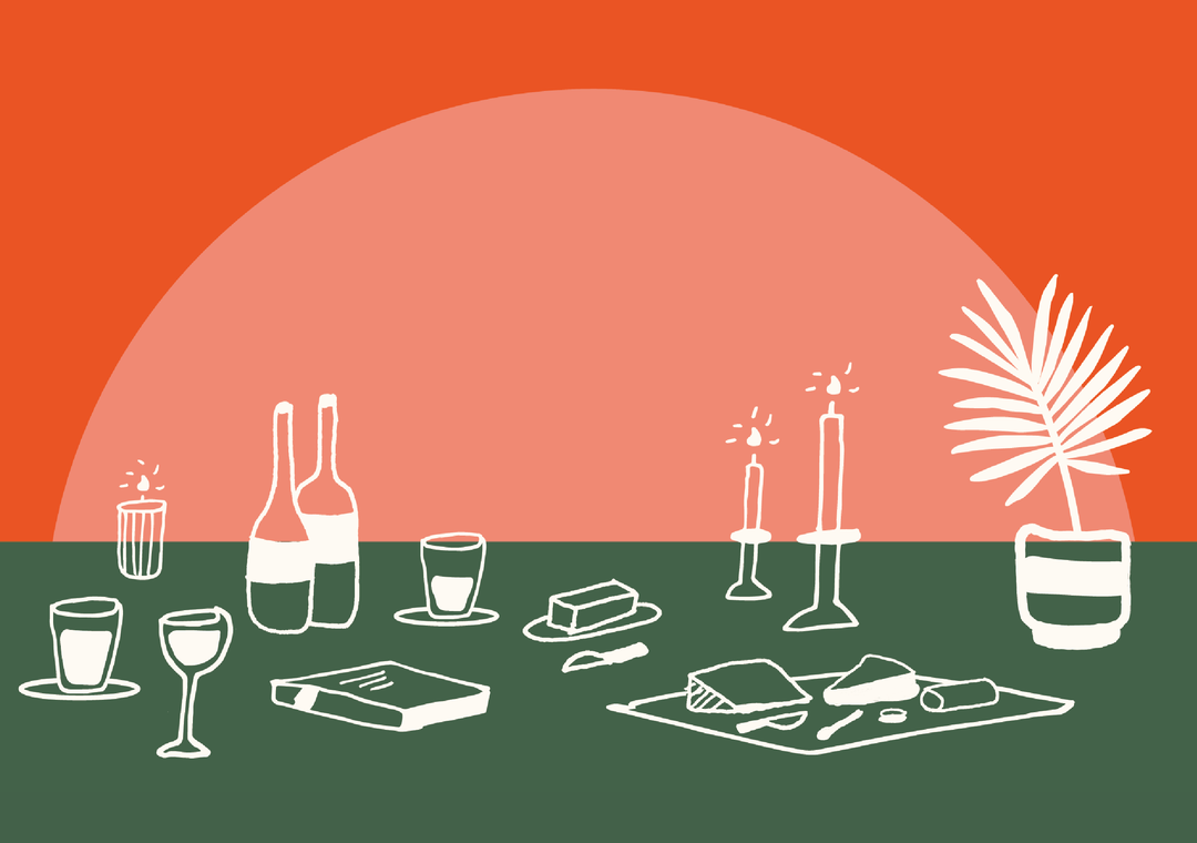
Leila Register: Happy Cabbage Postcard (Copyright © Happy Cabbage Gifts, 2020)
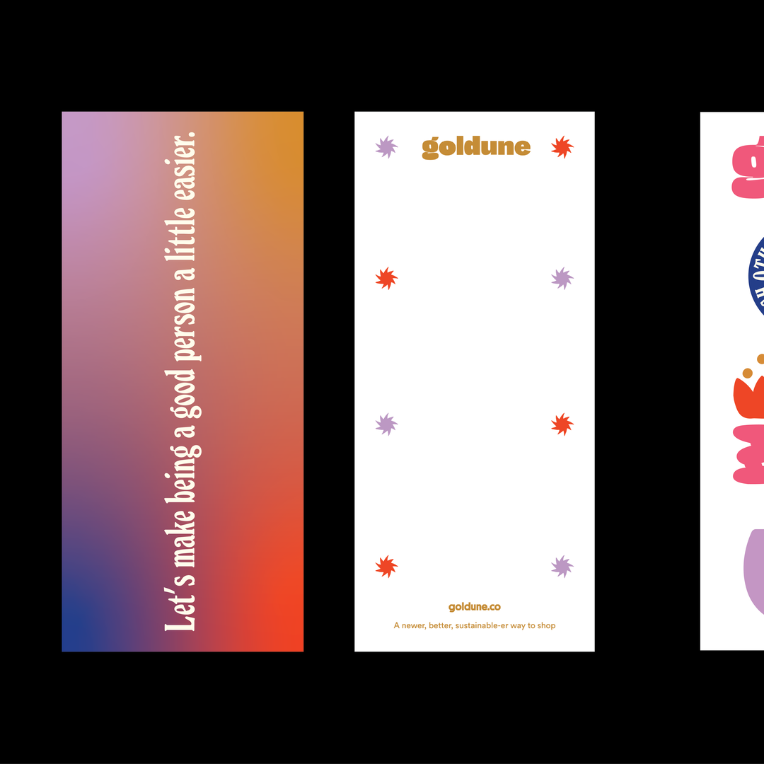
Leila Register: Goldune Buckslip (Copyright © Goldune, 2020)
Leila Register: Goldune Sticker Sheet (Copyright © Goldune, 2020)
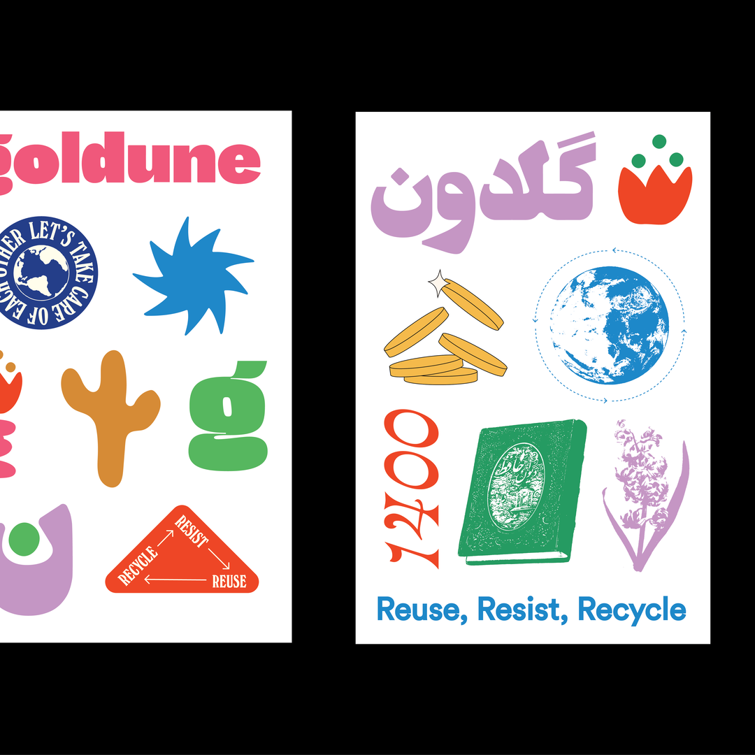
Leila Register: Goldune Sticker Sheet (Copyright © Goldune, 2020)
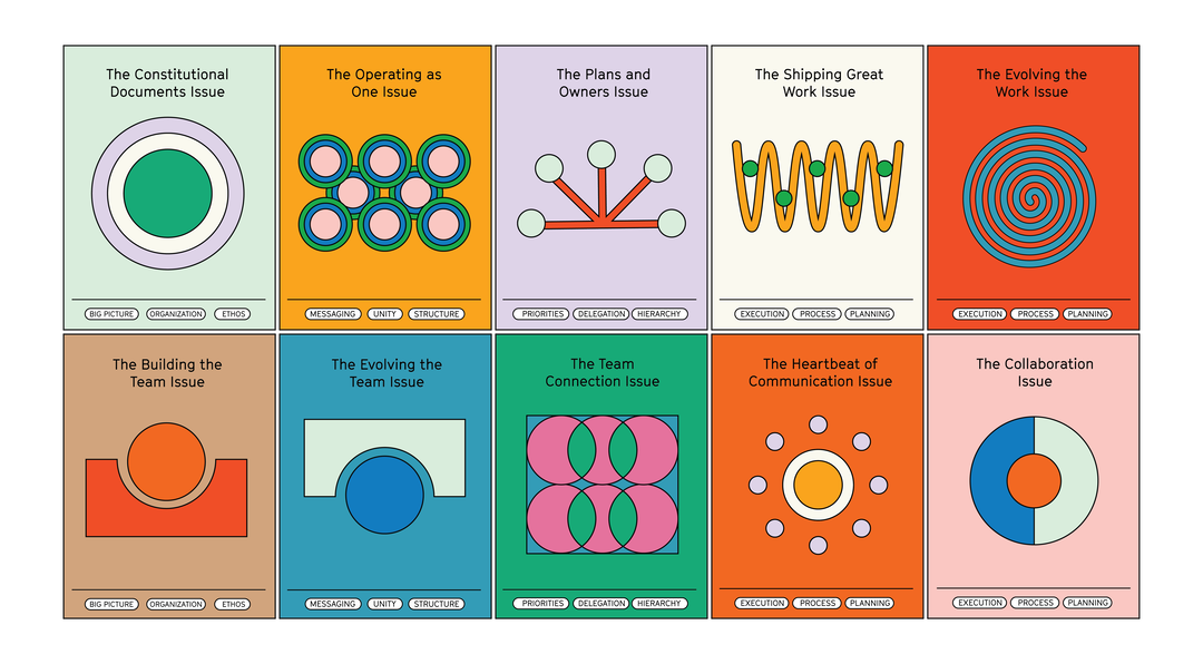
Leila Register: The Kool-Aid Factory Zine Covers (Copyright © The Kool-Aid Factory, 2021)
Share Article
Further Info
About the Author
—
Olivia (she/her) is associate editor of the website, overseeing the day-to-day editorial projects as well as Nicer Tuesdays events. She joined the It’s Nice That team in 2021. [email protected]
To submit your work to be featured on the site, see our Submissions Guide.