Slovenian design studio Ljudje on how it turned the information crisis into a visual identity
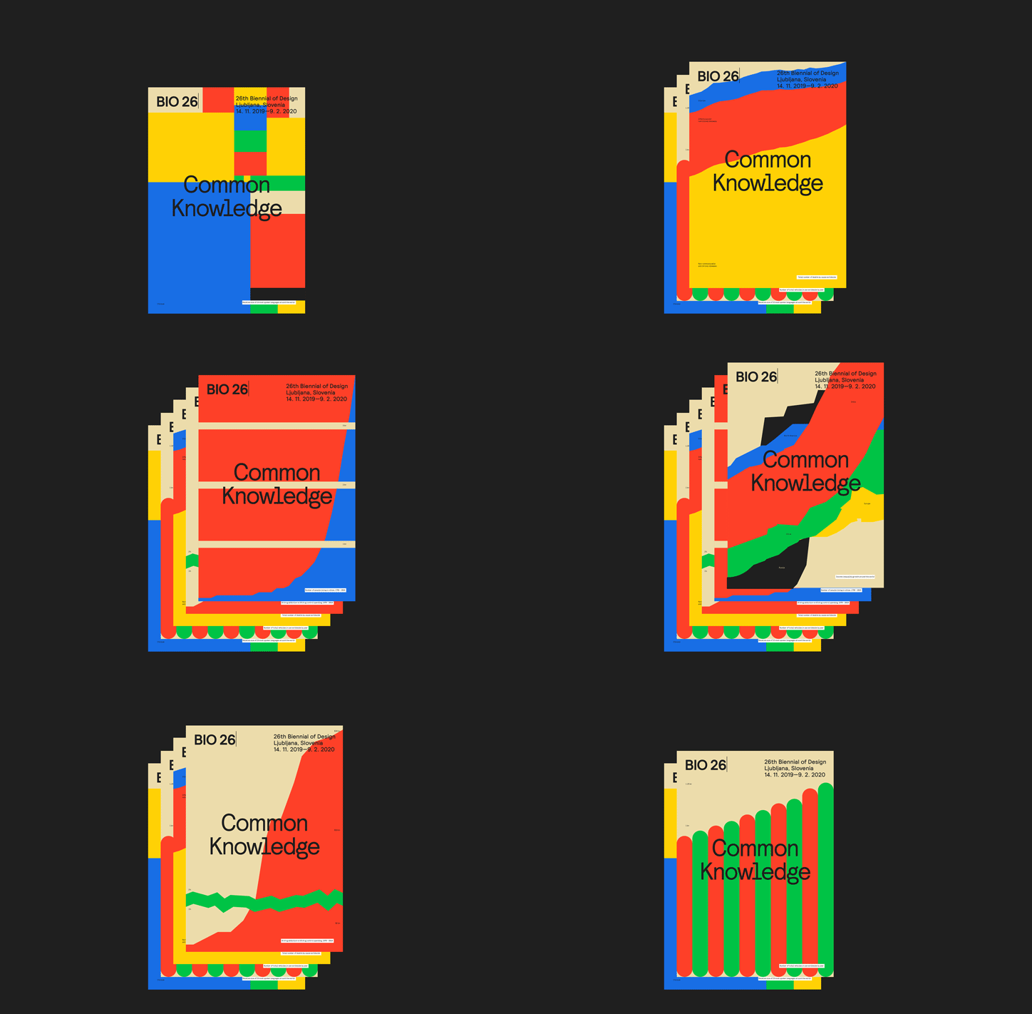
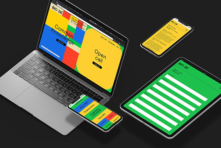
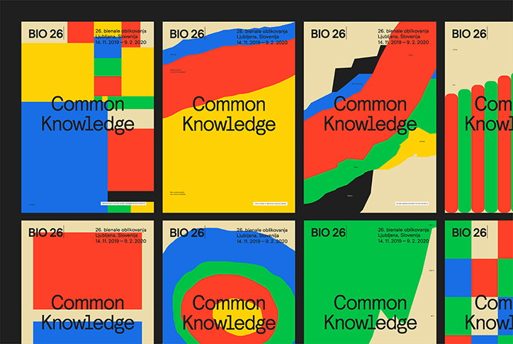
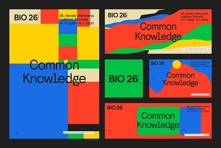
“We don’t have a specific design style we apply to every project,” says Ljubljana-based creative studio Ljudje. “We remove the clutter, focus on the essence and choose the most suitable language for the challenge that’s ahead of us.” A team of designers, artists, strategists and writers, Ljudje was tasked with designing the identity for the 26th edition of the Ljubljana Design Biennale, called BIO 26, concerned with the current crisis of information.
Organised by the Museum of Architecture and Design (MAO), the biennale (taking place between 14 November 2019 and 9 February 2020) “seeks to harvest the best ideas that explore ways to creatively take charge and react to it, as well as to propose experiments and present alternatives to the ways we currently deal with information and knowledge.”
For Ljudje, a studio which often “searches for structure of information and clarity in design,” the project provided the perfect opportunity to experiment. “We were lucky to enter the project at the very beginning of the curatorial process,” Ljudje explains. “We decided that the BIO 26 identity needs to expose the problems related with designing information.”
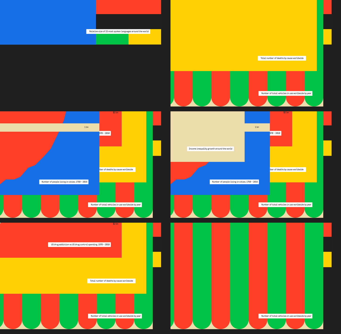
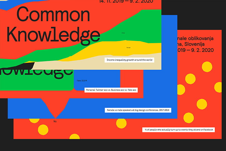
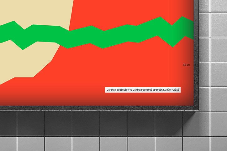
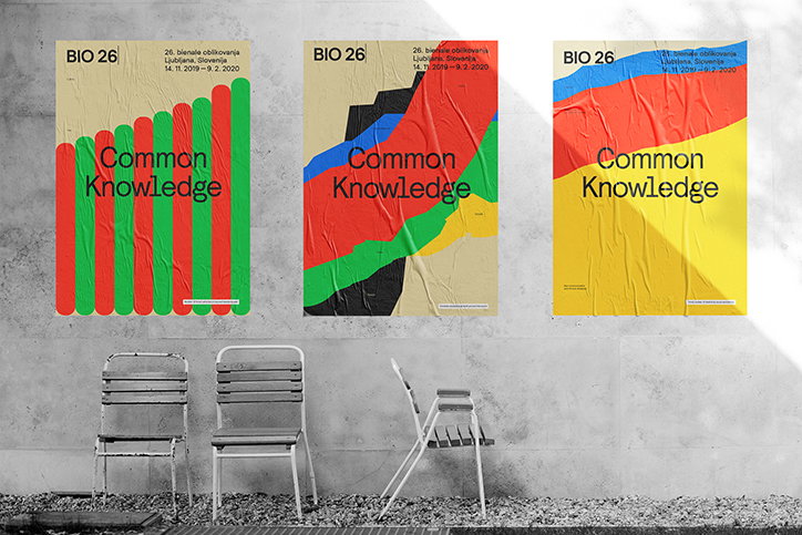
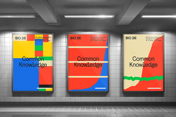
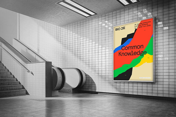
The studio, therefore, took statistics from the real world and created a series of infographics based on the sad, alarming or simply mundane data about our world. These include “global causes of death” and the “probability that people who attend a Facebook event will actually turn up”, but act as a means to expose the concepts of the biennial and put them in the context of the media where the identity appears.
Although many of the statistics are somewhat harrowing, the identity is full of colour in order the subterfuge objective facts through something visually compelling. “Our goal was not to be 100 per cent accurate, but rather to push towards the point where contemporary design departs from its foundation in the real world and starts living a life of its own,” the studio continues.
While working on projects such as BIO 26, Ljudje also places emphasis on personal practices and side projects as a team. The studio was actually formed in 2013 during “a ten-hour long, sweaty train ride from Ljubljana to Belgrade” but it was a design approach that brought them together, it was an “attitude towards work-life balance”. A studio where “[everyone] can all be human to each other”, its name means “people” in Slovenian. As a result, the team experiments with their own brands and products a lot, Ljudje explains: “We helped establish a sustainable restaurant Kucha, developed Project Seen – a font that notifies you of potential government surveillance and convinced Slovenian media that a Slovenian artist had sold a bird droppings painting for $1M.”
Ljudje: BIO 26
Ljudje: BIO 26
Ljudje: BIO 26
Ljudje: BIO 26
Ljudje: BIO 26
Ljudje: BIO 26
Ljudje: BIO 26
Ljudje: BIO 26
Ljudje: BIO 26
Share Article
Further Info
About the Author
—
Ruby is Senior Creative at It's Nice That, overseeing our visual output across platforms and projects. Before that, she was associate editor on the editorial team, after joining in September 2017 following graduation from Central Saint Martins.