




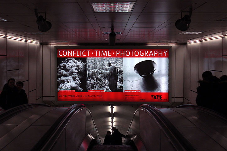
Designer Nina Jua Klein on going it alone after years as part of a studio
Graphic designer Nina Jua Klein has recently set up her own studio after many years of full-time employment at Praline, then Tate Design Studio, and – like many before her – describes her newfound independence as “exciting and terrifying”. She has hit the ground running, however, with an existing portfolio of work for Visual Editions, Alexander McQueen, Found Associates, Under/Current magazine and CSM.
“Starting out on my own is something I’d been thinking about for a while,” Nina says, “but I wanted to be sure that I had spent enough time working with others and learning from them.” The Tate Design Studio has an unusual set-up, she explains, in that it operates without a creative director, so each designer works independently with the gallery departments. “I’ve been given lots of creative freedom and always sought out my own projects, and reached a point where I was leading most projects start to finish so the transition to working for myself felt natural.”
At Praline she designed publications such as The Book of Skulls, while at Tate she worked on campaigns, environments and exhibition graphics, and says she learned “about my responsibility as a designer, listening to clients, knowing when to fight for an idea and when it’s OK to retreat” and “treating every brief, big or small, like it could be my best project yet”.
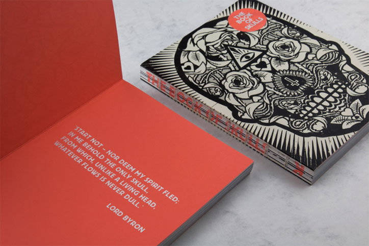
Nina Jua Klein and Praline: The Book of Skulls
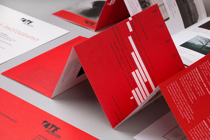
Nina Jua Klein and Tate Design Studio: Conflict Time Photography exhibition leaflet
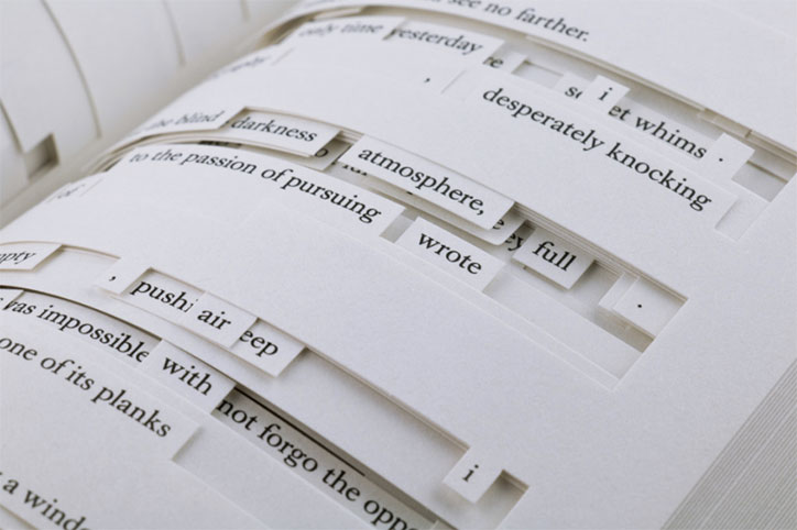
Nina Jua Klein and Sara de Bondt with Visual Editions: Tree of Codes
Nina has also worked with Visual Editions since its beginnings, on designs for business plans and contracts, “which of course had to be beautiful objects in their own right, in the spirit of the studio,” she explains, as well as the visual identity and its books. One standout project she worked with Sara de Bondt on was Tree of Codes by Jonathan Safran Foer, an intricate cut-out design that required special attention to detail for the complicated production.
The Play is Work identity is a project that she began while at Praline but took with her when she left, and Nina continues to work with the clothing brand on seasonal lookbooks and products.
At the moment she’s designing a new visual identity for an architectural practice and another for an interior designer, while also developing a more experiential exhibition piece for the Tate Modern together with design studio Hunting & Narud. “It’s an analogue leaflet dispensing machine, which sounds a little vague, I know, but I will be able to share more soon.”
“I often find myself using minimal means to convey an idea or construct a narrative, which can take many forms, but that moment when someone discovers a subtle nuance of a design and it makes them smile, that is what I strive for.”
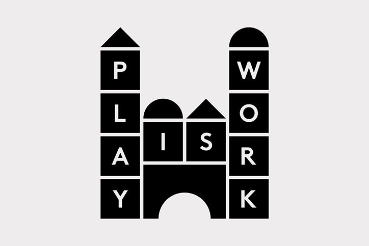
Nina Jua Klein and Praline: Play is Work
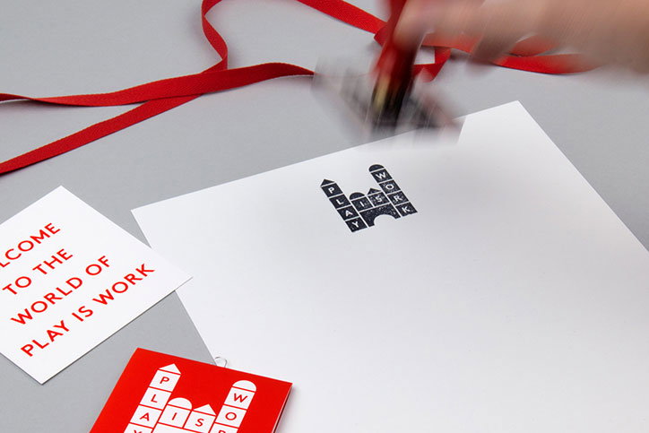
Nina Jua Klein and Praline: Play is Work
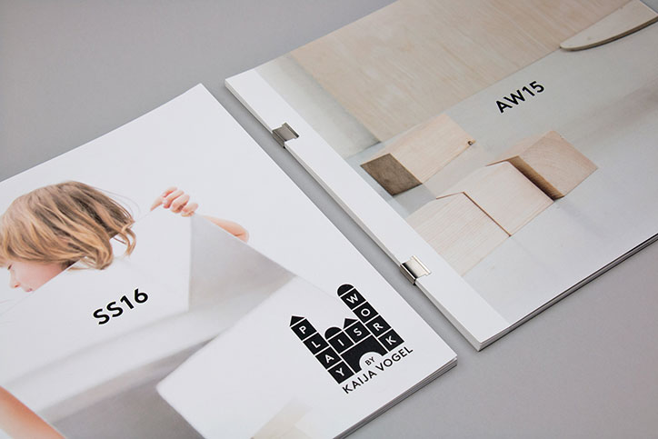
Nina Jua Klein and Praline: Play is Work
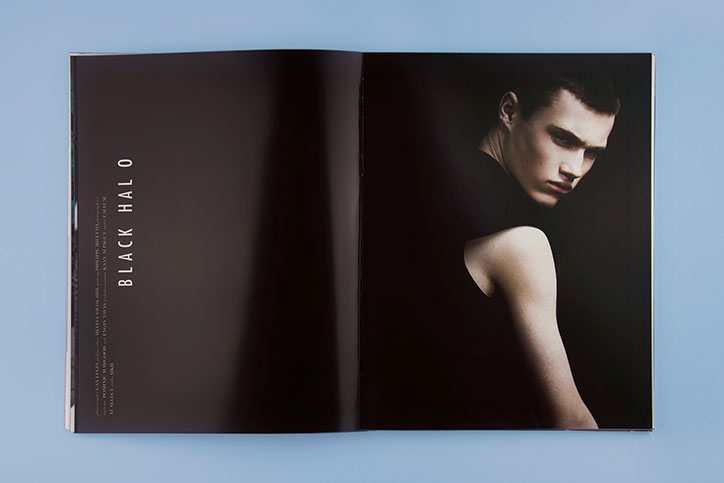
Nina Jua Klein: Under/Current magazine issue three
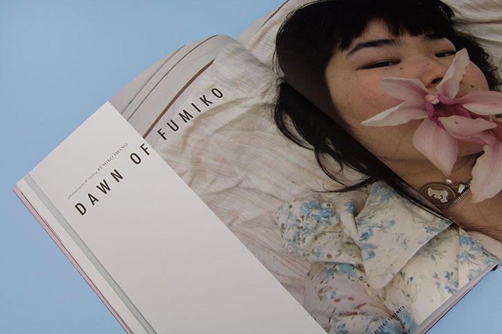
Nina Jua Klein: Under/Current magazine issue three
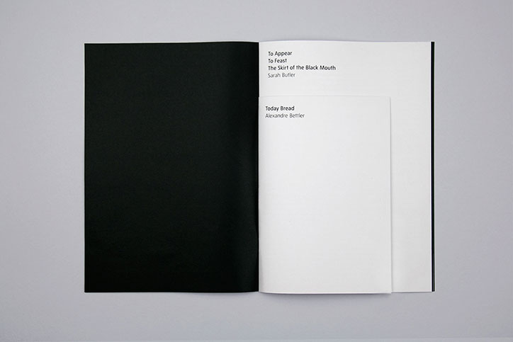
Nina Jua Klein and Tate Design Studio: The Feasting Mouth exhibition publication
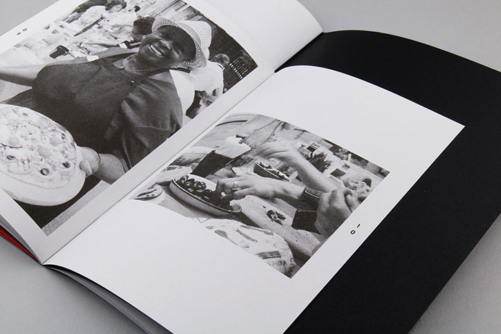
Nina Jua Klein and Tate Design Studio: The Feasting Mouth exhibition publication
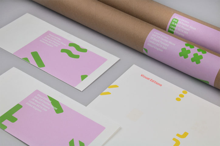
Nina Jua Klein and Visual Editions: Visual Editions branding
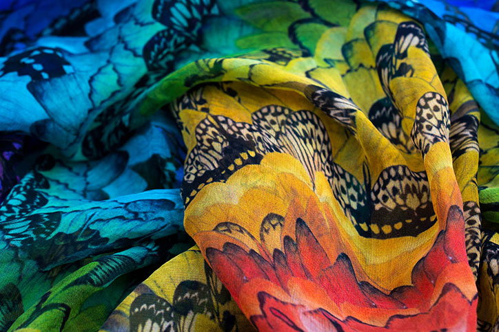
Nina Jua Klein: print for Alexander McQueen
Share Article
Further Info
About the Author
—
Jenny oversees editorial output across It’s Nice That. Get in touch with writing pitches for features or opinion pieces, big creative story tips, or questions about all things editorial. [email protected]
To submit your work to be featured on the site, please see our Submissions Guide.

