Non-Verbal Club's typography-heavy, sleek identity for Teatro Nacional de São Carlos
“We like to look at our practice as a balancing act between rationality and emotion,” states Porto-based graphic design studio, Non–Verbal Club. Comprised of Joana Sobral, Susana Almeida, João Martino and Miguel Almeida, the studio recently utilised this balancing act to create a beautifully sleek identity for Teatro Nacional de São Carlos.
Located in Lisbon, Teatro Nacional de São Carlos (TNSC), covers a programme of operas as well as classical music concerts and is the home of the National Symphonic Orchestra. When approached by TNSC, Non–Verbal Club started by analysing the theatre’s current visual communication, after which they rewrote the brief “with the key topics we believe were important to change.” This is typical of Non–Verbal Club’s practice, who create projects rooted in thorough research and collaboration. “We often rework the briefs we receive and do not shy away from looking for more than what the projects actually are, finding which new possibilities they open,” it explains.
After meeting with TNSC’s artistic director, Patrick Dickie, the studio set about developing an identity which reflected the theatre’s ambitions. Although varying in style and concept, Non–Verbal Club’s projects often feature typography-heavy designs. These are produced by anchoring projects in several key concepts that “provide the mechanics for [the project] to naturally unfold,” and this was very much the case when it came to designing TNSC’s identity.
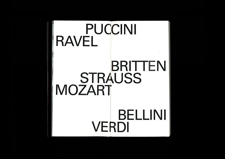
“It was fairly evident that São Carlos needed change – new and fresh visual strategies that would meet a bolder attitude in the way it communicates,” the studio recalls. Deciding to highlight the “stars” of the theatre, Non-Verbal Club developed a system with the names of composers, conductors and musicians at its centre.
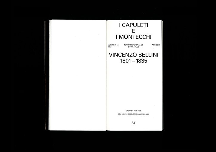
The upcoming season had two facets which needed to be communicated in a distinct yet complementary way: the lyrical season of operas and the symphonic season of classical and chamber music concerts. “That led us to create a communication matrix using simple typographic structures and an elementary principle – contrast,” Non–Verbal Club explains. Using two different typefaces and colours, the lyrical season is presented in a white-on-black, sans serif font, whereas the symphonic season appears on a black background in a serif font.
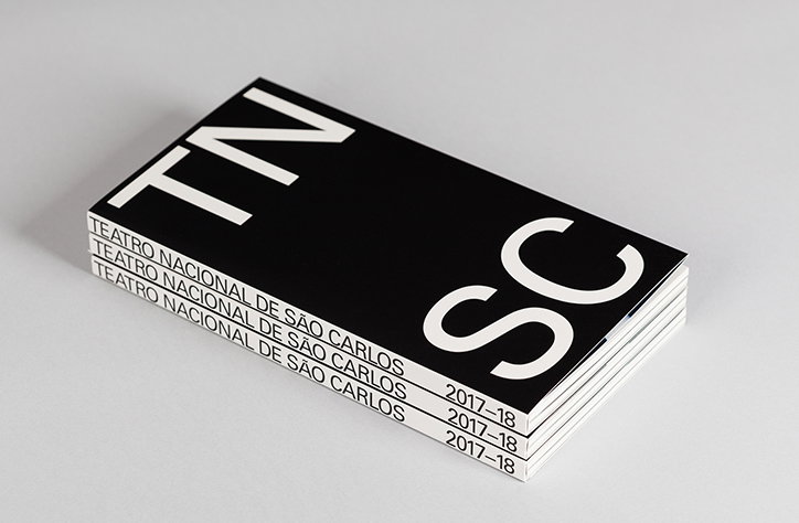
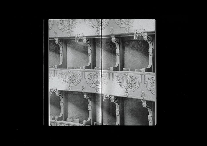
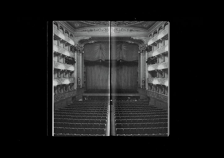
As well as producing posters, flags, leaflets and brochures, Non–Verbal Club also designed a programme book for the entire season. The book features an elegantly thin format, the letters TNSC set in a large point size on its cover. An extremely bold aesthetic for an institution of this kind, the cover then reveals a beautiful fold-out image when opened, thanks to the book’s Swiss binding. After producing the initial monochromatic poster campaign, Non–Verbal Club began to introduce new colour schemes to “create variations of the structure and added emotion.”
Stunningly simple, Non–Verbal Club’s Swiss-inspired design is visually arresting but is also supported by rationale. The studio’s “utter obsession” with typography is made clear through their bold use of lettering, producing a contemporary and exciting solution for an institution so steeped in history.
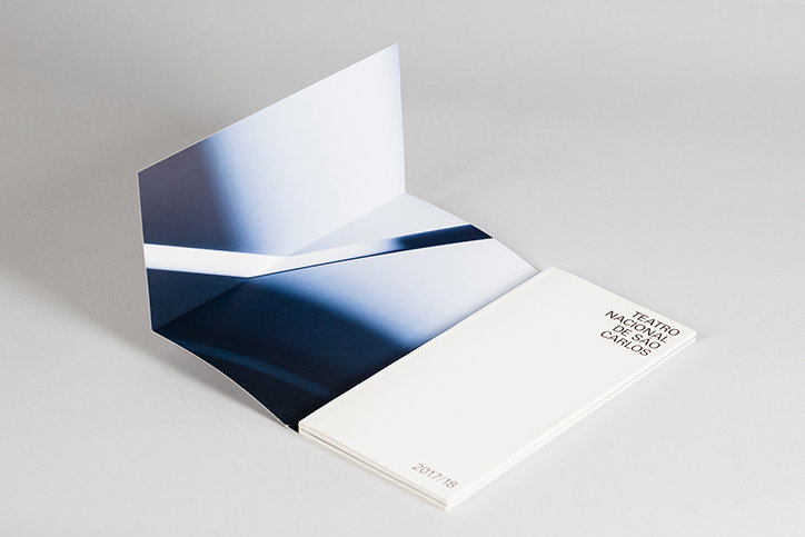
Non–Verbal Club: Teatro Nacional de São Carlos identity
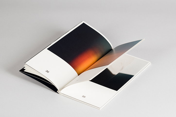
Non–Verbal Club: Teatro Nacional de São Carlos identity
Non–Verbal Club: Teatro Nacional de São Carlos identity
Non–Verbal Club: Teatro Nacional de São Carlos identity
Non–Verbal Club: Teatro Nacional de São Carlos identity
Non–Verbal Club: Teatro Nacional de São Carlos identity
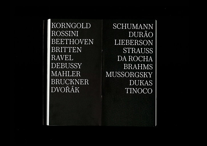
Non–Verbal Club: Teatro Nacional de São Carlos identity
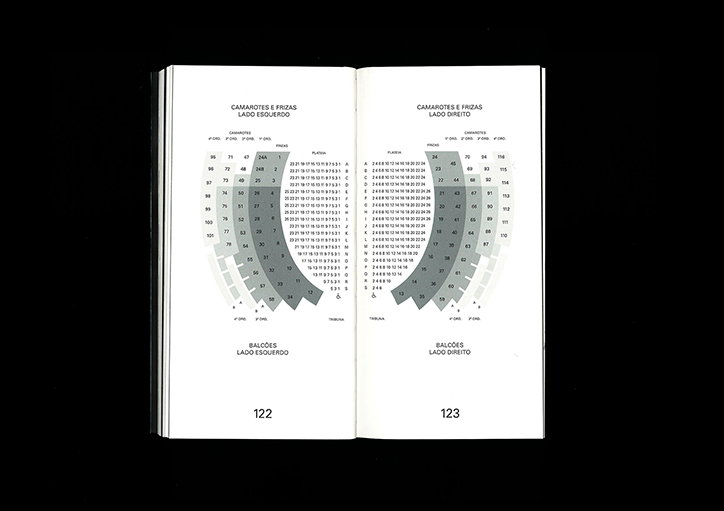
Non–Verbal Club: Teatro Nacional de São Carlos identity
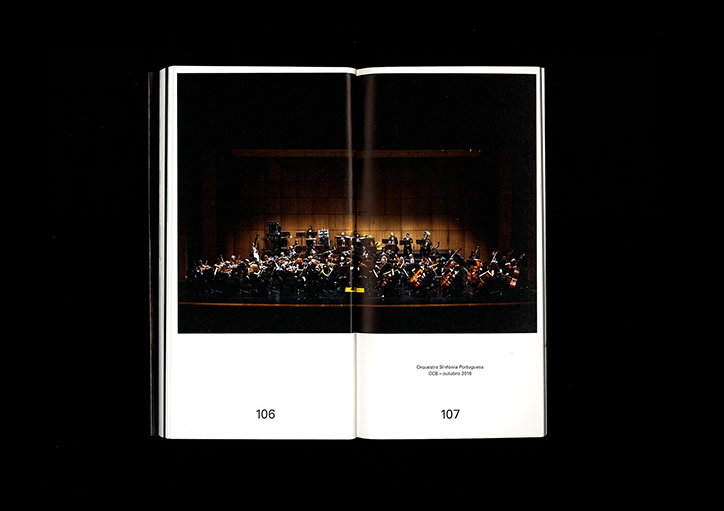
Non–Verbal Club: Teatro Nacional de São Carlos identity
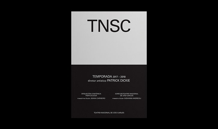
Non–Verbal Club: Teatro Nacional de São Carlos identity
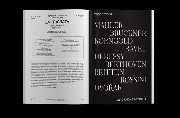
Non–Verbal Club: Teatro Nacional de São Carlos identity
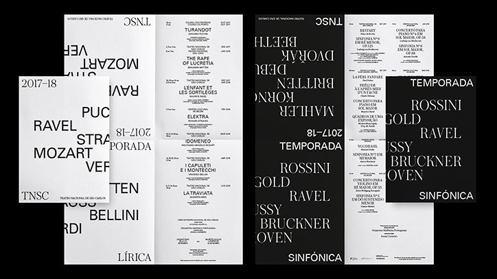
Non–Verbal Club: Teatro Nacional de São Carlos identity
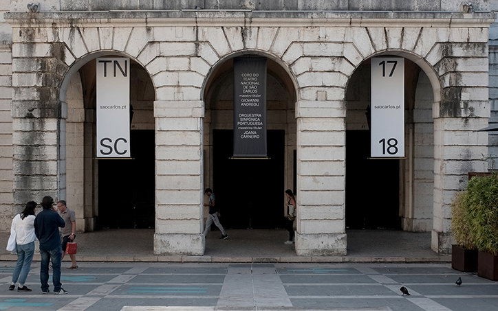
Non–Verbal Club: Teatro Nacional de São Carlos identity
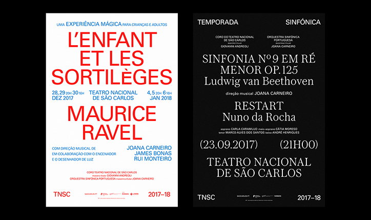
Non–Verbal Club: Teatro Nacional de São Carlos identity
Share Article
Further Info
About the Author
—
Ruby is Senior Creative at It's Nice That, overseeing our visual output across platforms and projects. Before that, she was associate editor on the editorial team, after joining in September 2017 following graduation from Central Saint Martins.