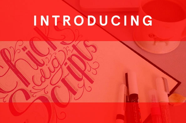
Introducing: London-based hand-letterer and typographer Oli Frape
Today’s Introducing is a tribute to the hand-letterers of the world, who are all too often tucked quietly away behind fancy designers and impressive identities. Oli Frape is a London-based typographer and illustrator who creates all of his typefaces by hand, who kindly had a chat with us to tell us about his working day. He also posts all of his developing work on his blog, which is a great insight into the process. Read on to find out more!
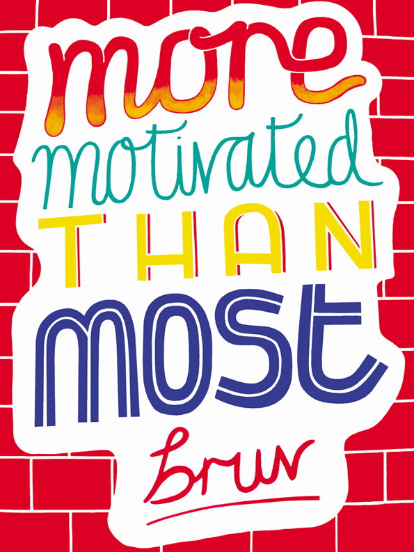
Oli Frape: More Motivated
Where do you work?
Normally from my studio in the loft of my flat in Hackney; it’s cold in the winter and too hot in the summer – but I’m in the process of moving at the moment. I’ll miss it.
How does your working day start?
Does everyone always say coffee? It’s true though, coffee then breakfast then emails then exercise then emails… Unless I have a really pressing deadline I often don’t draw anything until late afternoon.
How do you work and how has that changed?
The key for me right now is working as non-digitally as possible and that is what has changed too. When I make a new piece of work these days I scan it and then apart from a basic crop or sizing I leave it alone. I’m embracing all those little kinks and spatters that make my work hand-made. It’s loads of fun and means I get away from hours in front of the computer screen (albeit that I replace those hours with other ones staring at a sketchbook!)
Where would we find you when you’re not at work?
I’m at work a lot, but if I’m not then I’m usually somewhere in an E8 or E5 postcode. I like to run, I like to drink and I like to eat – most likely I’d be doing one of those things.
Would you intern for yourself?
Ha! Let’s say I think it would be a complicated working relationship…
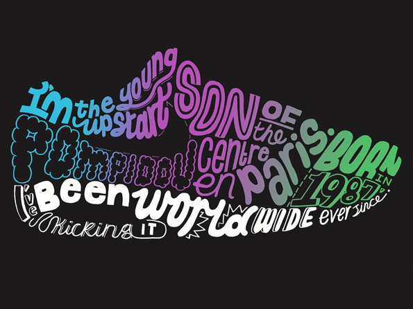
Oli Frape: Air Max
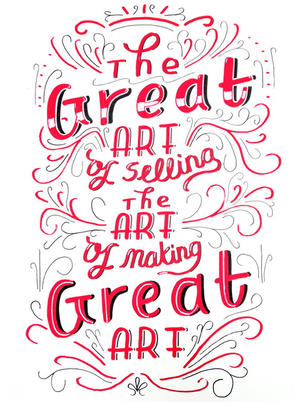
Oli Frape: Great Art
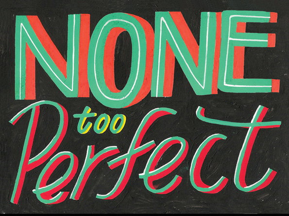
Oli Frape: None Too Perfect
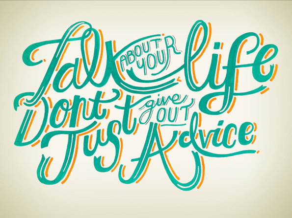
Oli Frape: Talk About
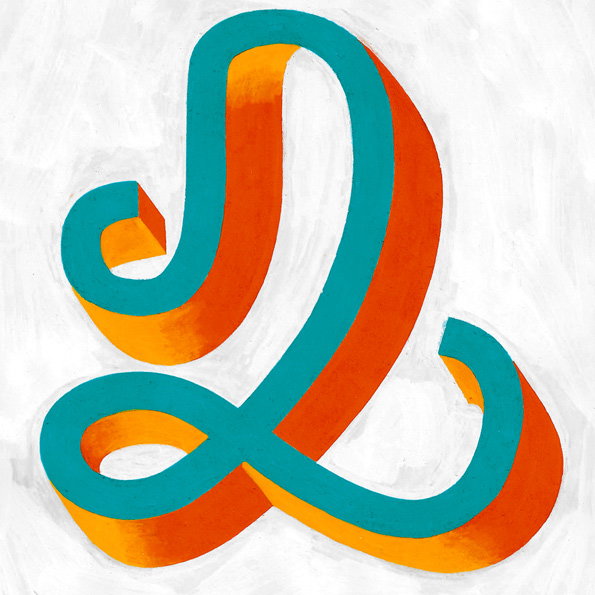
Oli Frape: Lettering
Share Article
Further Info
About the Author
—
Maisie joined It’s Nice That fresh out of university in the summer of 2013 as an intern before joining full time as an Assistant Editor. Maisie left It’s Nice That in July 2015.