Other Forms explores publishing and print as increasingly militant mediums
Working across architecture, graphic design and publishing, Other Forms describes itself as a “mobile research and design collective.” Made up of Jack Henrie Fisher and Alan Smart (joined by Jonathan Krohn when he’s not making records), the collective is based on the North and South sides of Chicago but also in Berlin.
The studio officially came into being when Jack and Alan were both living in New York around 2012. The pair were on their way to a post-Occupy talk at 16 Beaver Street when they conceptualised a studio that would produce architecture, exhibitions and writing alongside a design practice with an explicit relationship to their political commitments. From then on, the work they were creating existed under the Other Forms moniker.
This specific name was Alan’s idea as someone involved in the world of architecture: “Issues of form and formalism as being this reactionary, idealist “thing” that gets set opposite political or theoretical content was this persistent, annoying idea that I kept tripping over.” Other Forms therefore became a way to give form to or find form in the things Jack and Alan find important, with every project becoming an occasion to imagine a sense of the name.
As publishers, Jack and Alan strive for “new aesthetic and ideological forms of militant and experimental communication.” In terms of militancy, they are examining how the media and design are used, in material terms, in radical projects or tendentious ways. “I’m very interested in typography and graphic design,” explains Jack, not as a set of historically specific aesthetic forms to be fetishised but “as features of a more generalised antagonistic modality of publishing, one which can uniquely compose people together in particular struggles, or to accelerate and amplify (or camouflage) already existing ones.”
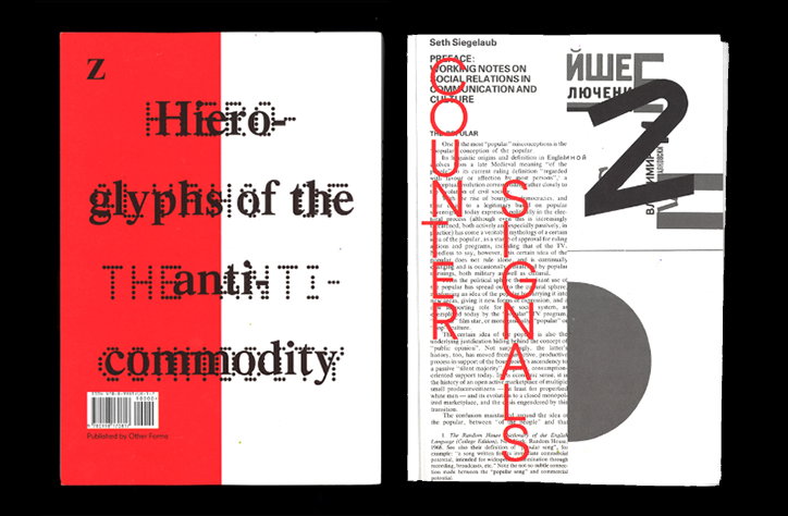
In Counter-Signals, a journal which Jack edits and designs, Others Forms propensity for militancy in design is particularly evident. As a collection of printed matter which he feels exhibit features he’s theorised as militant and communist, the included work all communicates “outside of, and in opposition to, the available given media channels”.
When it comes to experimentation, Other Forms employs the rigorous conceptualisation of the word as it appears in the world of science. “You design something that is systematic, where there is a hypothesis of how you believe things work and then you create a condition of controlled openness where you don’t know what will happen,” says Alan. The application of this process to design leads to an undetermined outcome which is “critical and not just expressionistic, personal noodling around, under cover of a layer of appliqué rhetoric.”
Process is another key feature of the collective’s ethos born out of the belief that the production, consumption or reception of a project can be synthesised. For example, in its project Making Room, the studio started by hosting a collective editing event at a meeting of the squatting research collective who initiated the project. Although the book didn’t come directly out of the event, Jack and Alan ended up with a set of issues that formed the project’s raw material.
“We try to make exhibitions part of a more complex process,” Alan tells It’s Nice That, explaining how “hanging art on the wall is something we are less interested in than staging events and making spaces where text and discourse is produced.” In practising such tactics, Other Forms is able to use design and publishing as a means to rally people around the issues it believe ins, using print as a way of “organising people and interests outside the dominance of so-called social media platforms.”
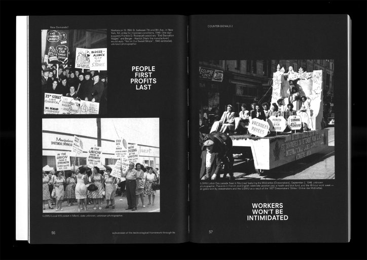
Other Forms: Counter-Signals 2
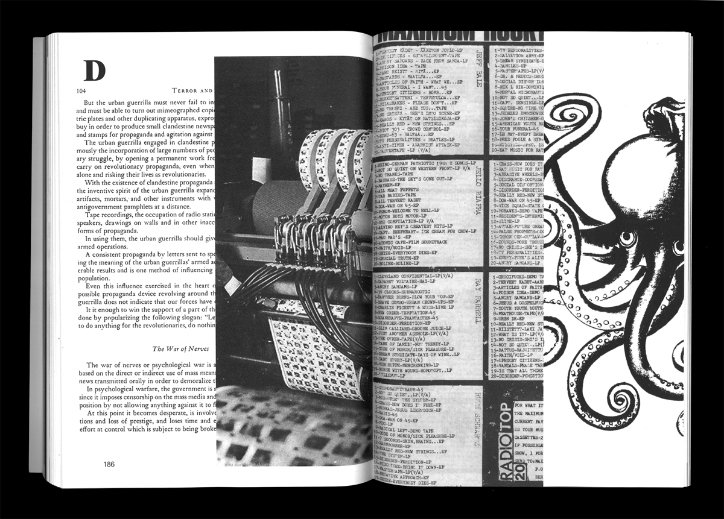
Other Forms: Counter-Signals 2
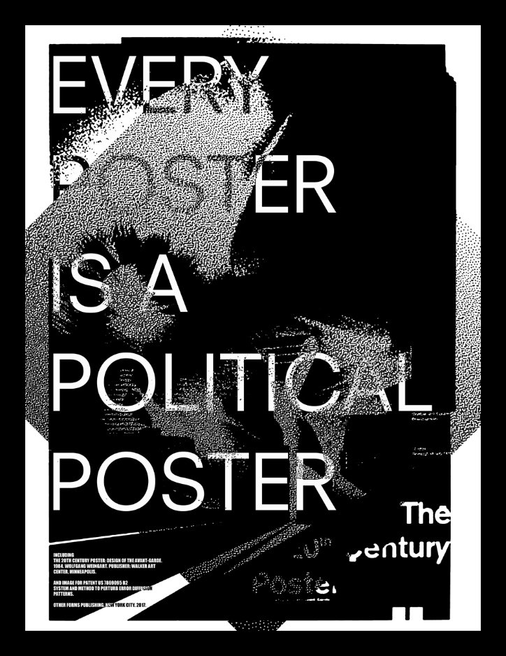
Other Forms: Every Poster is a Political Poster
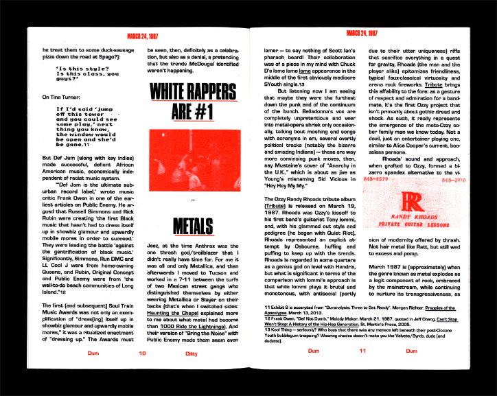
Other Forms: Dum Ditty Dum Issue 2
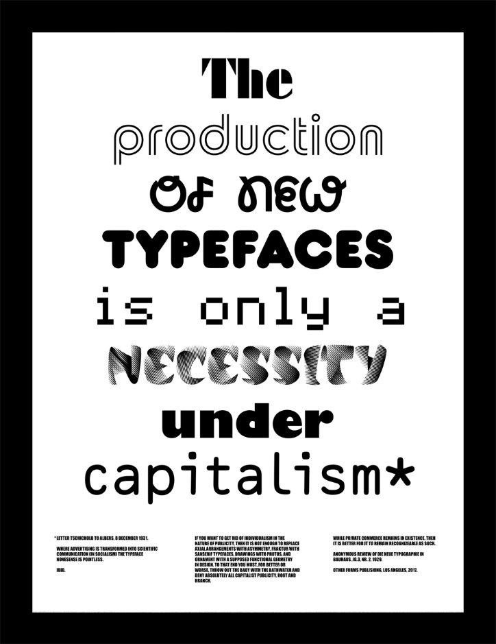
Other Forms: The production of new typefaces is only a necessity under capitalism.
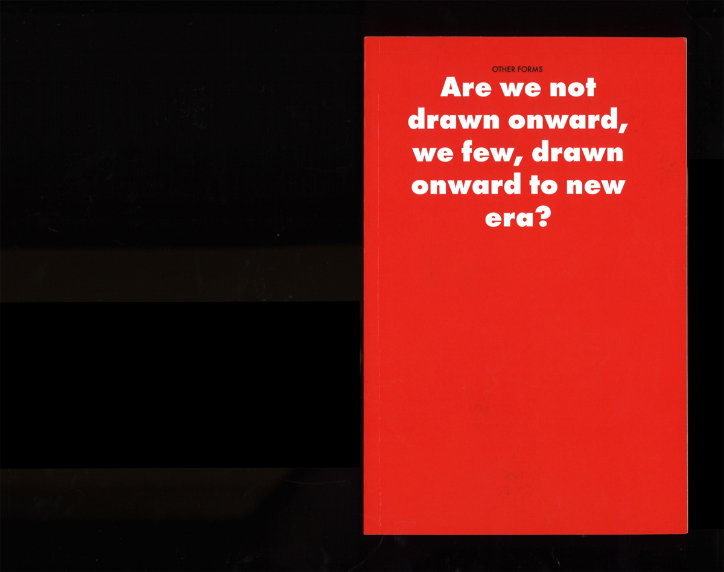
Other Forms: Last Unused Combinations
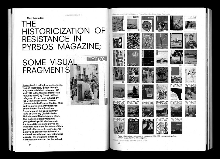
Other Forms: Counter-Signals
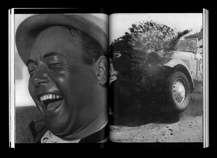
Other Forms: Counter-Signals
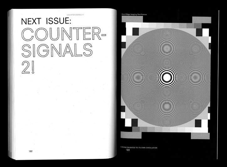
Other Forms: Counter-Signals
Share Article
Further Info
About the Author
—
Ruby is Senior Creative at It's Nice That, overseeing our visual output across platforms and projects. Before that, she was associate editor on the editorial team, after joining in September 2017 following graduation from Central Saint Martins.