



Launch Recite Me assistive technology
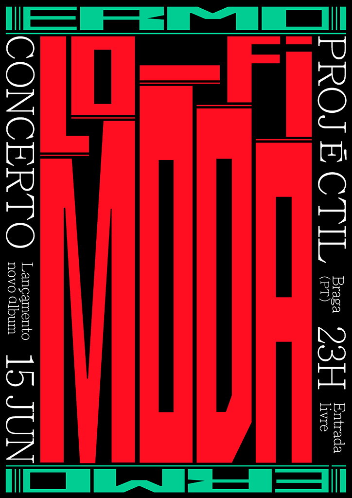
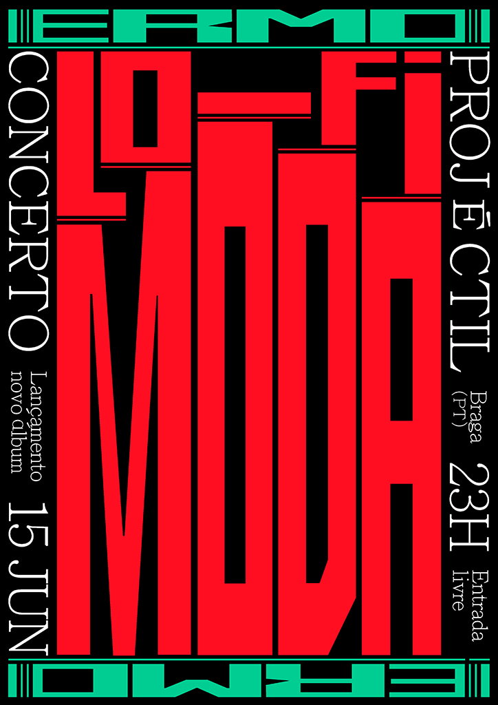
A bold typographic poster in red, black and mint green. Large red text reads “LO-FI MODA”, flanked by vertical text that reads “CONCERTO” and “PROJÉCTIL”. Smaller text lists the date “15 JUN” and the location “Braga (Pt)”.

Rita Matos attempts to bridge the gap between Lisbon's art and design circles

—
Date
31 January 2018

When Portuguese graphic designer, Rita Matos was approached by Lisbon-based curator Joana Portela to stage a solo show at the FOCO gallery, she saw it as an opportunity to explore graphic design as a medium but also to initiate cultural discourse about the capital’s creative scene.

Lisbon’s creative scene is currently growing at a rapid rate as a response to the cultural demands of its increasing numbers of visitors – in 2016, the number of tourist arrivals in Portugal exceeded 10 million for the first time ever. “When I started to work [as a graphic designer] in 2014, the climate was very pessimistic and most of my friends and colleagues left the country,” Rita tells It’s Nice That. However, she now sees a city with unexplored potential due to a new community of talented, creative and ambitious individuals who are determined to stay in Lisbon and create their own scene.

Despite this, Rita describes how the art and design circles still function as parallel worlds in comparison to many cities where the dynamics are more intertwined meaning designers and artists collaborate frequently. “In Lisbon, they still operate in very separate and traditional circles. It starts in our schools, where there’s very little exchange between people in different disciplines,” she explains.

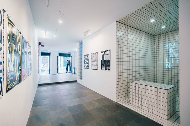
“With this exhibition, I attempted to bridge the gap by showing that firstly, it can make sense to put graphic design in a contemporary art gallery and secondly, by facilitating a moment where people from these two circuits could meet, talk and exchange ideas,” Rita says. Entitled What We Feel Like, the exhibition presented a range of Rita’s typographic and editorial work, a site-specific installation (in collaboration with Bruno Rodrigues) and an exhibition identity.

The focus of What We Feel Like was Rita’s freelance and personal work, which often incorporates her own identity. With individual work and collaborations with friends, the exhibition’s title is a subtle nod to the introspective qualities graphic design can embody.

Inside the space, Rita lined the walls with a variety of posters featuring her bold and graphic type-lead design. Her work utilises letters, words and language as a way to explore the rawest forms of communication and the exhibited posters reflected these recurrent themes. Making use of the printed page in order to research her personal motivations and interests, each poster also functioned as a typographic experiment.

This visuality was then transferred outside and off the gallery walls, informing the exhibition’s pronounced identity. With a frame created by the title What We Feel Like, Rita mirrors the space in which her work was contained, relying on her chosen statement and its communicative potential.
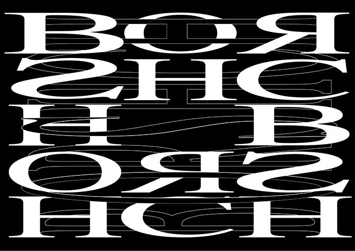
A black and white typographic composition featuring distorted, oversized serif letters. The white characters are stretched and warped into fluid, wavy shapes against a solid black background.
Above

Rita Matos: Borshch (Revista / Magazine) Magazine spreads in collaboration with Tiago Biscaia; (10 unidades / 10 units); Berlin, 2017
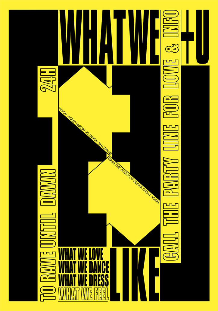
A bold yellow and black typographic poster reads “WHAT WE U” at the top and “LIKE” at the bottom. Central graphic elements form a large, abstract shape containing the repeated phrase “MAKE THE AGENT OF DESIRE GREAT AGAIN.” Vertical text along the sides reads “TO RAVE UNTIL DAWN 24H” and “CALL THE PARTY LINE FOR LOVE & INFO”. Smaller text at the bottom lists “WHAT WE LOVE”, “WHAT WE DANCE”, “WHAT WE DRESS” and “WHAT WE FEEL”.
Above

Rita Matos: Imaginary rave poster for Moullinex’s fanzine Hypersex; Lisbon, 2017
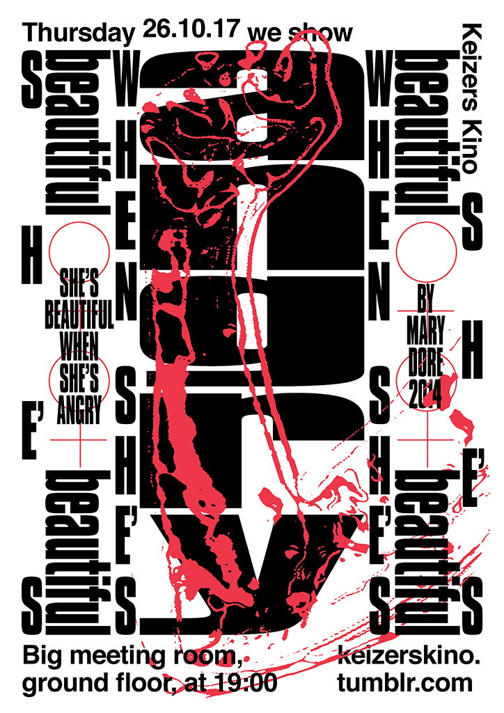
A bold typographic poster in red, black and white for a screening at Keizers Kino. Large, distorted black lettering is overlaid with red paint splatters and reads “She’s beautiful when she’s angry”. Smaller text provides the date “Thursday 26.10.17” and the location “Big meeting room, ground floor, at 19:00”.
Above

Rita Matos: Keizers Kino Poster for movie cycle; Amsterdam, 2017
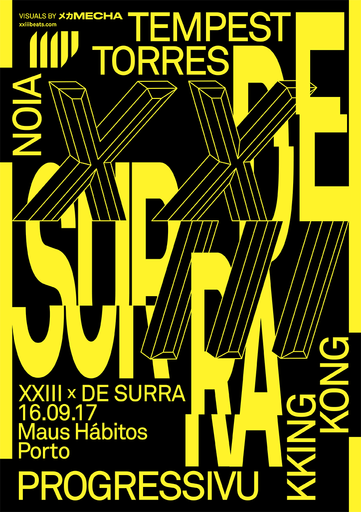
A bold yellow and black typographic poster featuring large, 3D-style letters and the words “DE SURRA”. The text lists a line-up including “Tempest”, “Torres”, “Noia” and “Kking Kong”. At the bottom, the poster reads “XXIII x DE SURRA”, dated “16.09.17” at “Maus Hábitos” in Porto. The word “Progressivu” runs across the base.
Above

Rita Matos: XXIII (Crew / Label) Party posters; Porto, 2017
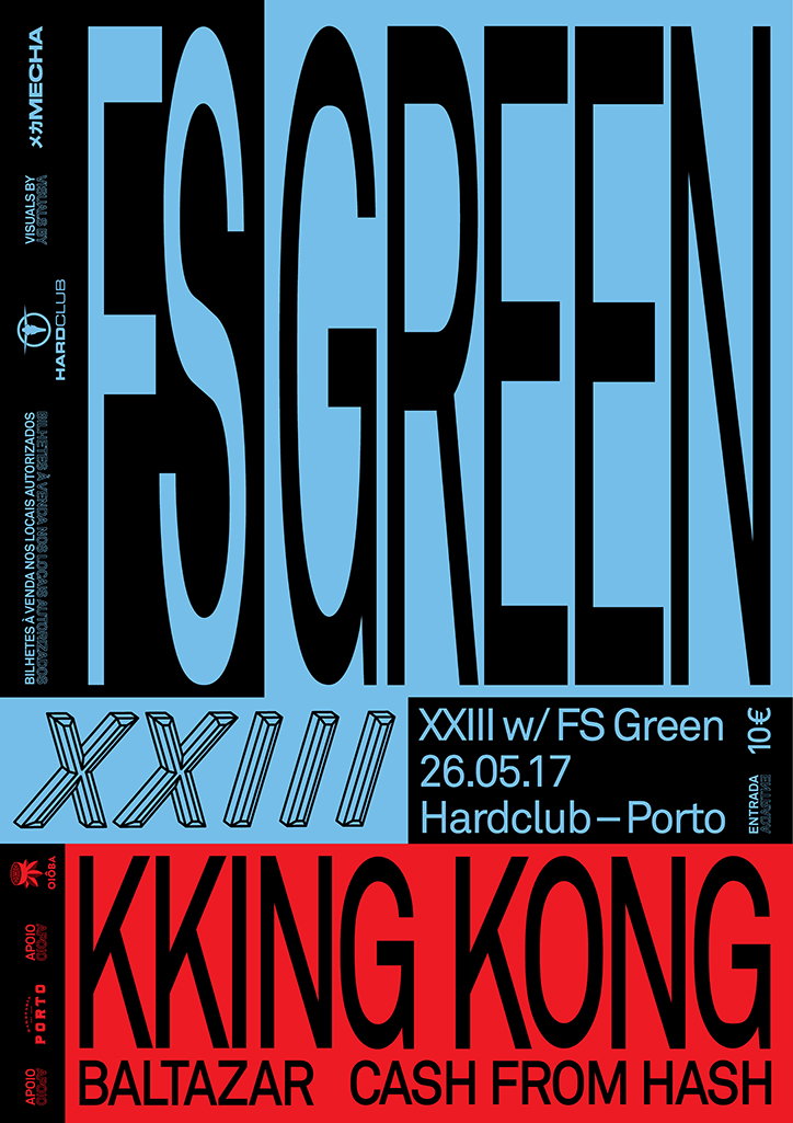
A bold typographic poster in blue, black and red. Large black lettering reads “FS GREEN” across the top, with a smaller section below stating “XXIII w/ FS Green 26.05.17 Hardclub – Porto”. The bottom red section features the words “KKING KONG” above the names “BALTAZAR” and “CASH FROM HASH”.
Above

Rita Matos: XXIII (Crew / Label) Party posters; Porto, 2017
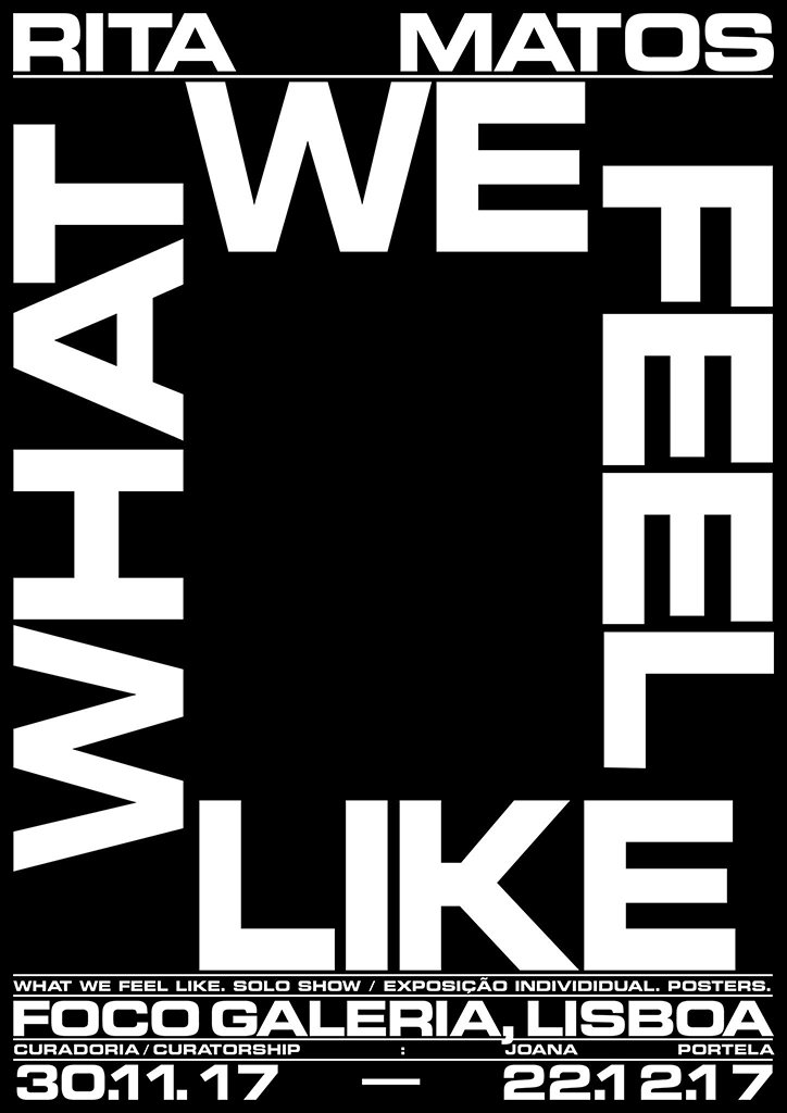
A black and white typographic poster for an exhibition by Rita Matos. Bold white text frames a central black square, reading “WHAT WE FEEL LIKE”. Smaller text at the bottom reads “Foco Galeria, Lisboa” and lists the dates “30.11.17 – 22.1.17”.
Above

Rita Matos: What We Feel Like (exhibition poster)
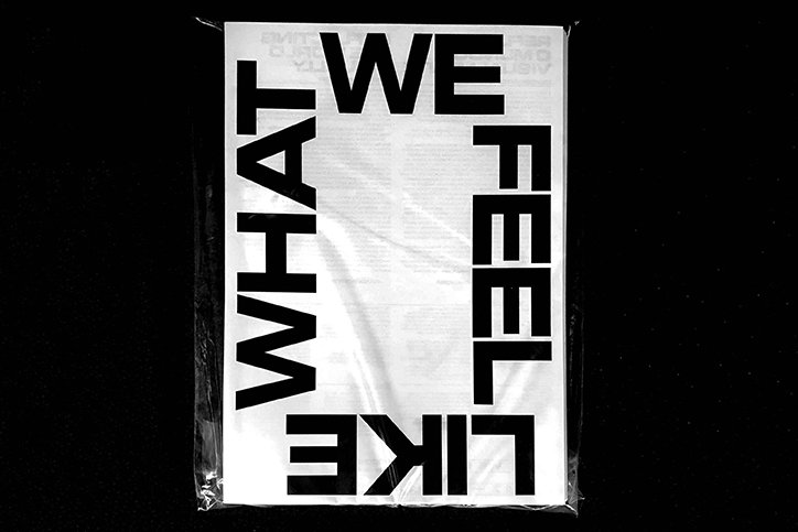
A black and white typographic poster reads “WHAT WE FEEL LIKE” in bold, sans-serif lettering. The text is arranged in a rectangular frame around a central area of blurred, illegible print.
Above

Rita Matos: What We Feel Like (exhibition flyer)
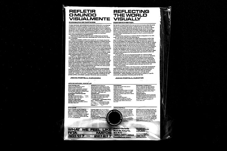
A black and white poster inside a plastic sleeve reads “Refletir o Mundo Visualmente” and “Reflecting the World Visually”. The layout features two columns of text in Portuguese and English, with a list of artists and a curator’s bio below.
Above

Rita Matos: What We Feel Like (exhibition flyer)
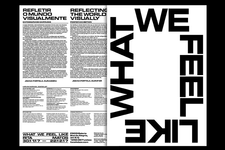
A black and white layout for a poster exhibition. The left page contains columns of text with the headlines “Refletir o Mundo Visualmente” and “Reflecting the World Visually”, while the right page features the phrase “WE FEEL LIKE WHAL” in large, bold, inverted typography.
Above

Rita Matos: What We Feel Like (exhibition flyer)
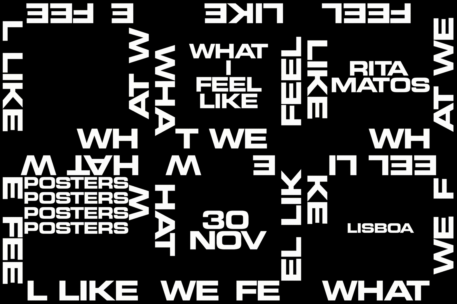
An animation in which bold white text on a black background shifts and rotates. The words “WHAT WE FEEL LIKE” form a square border and a central block, while other fragments like “SOLO SH” and “FOC” appear in the centre.
Above

Rita Matos: What We Feel Like (exhibition invite)
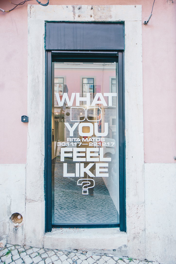
Bold white text on a glass door reads “WHAT DO YOU FEEL LIKE?”. Smaller text below reads “RITA MATOS” and the dates “30.11.17–22.12.17”.
Above
Left

Rita Matos, image courtesy of Joana Duarte
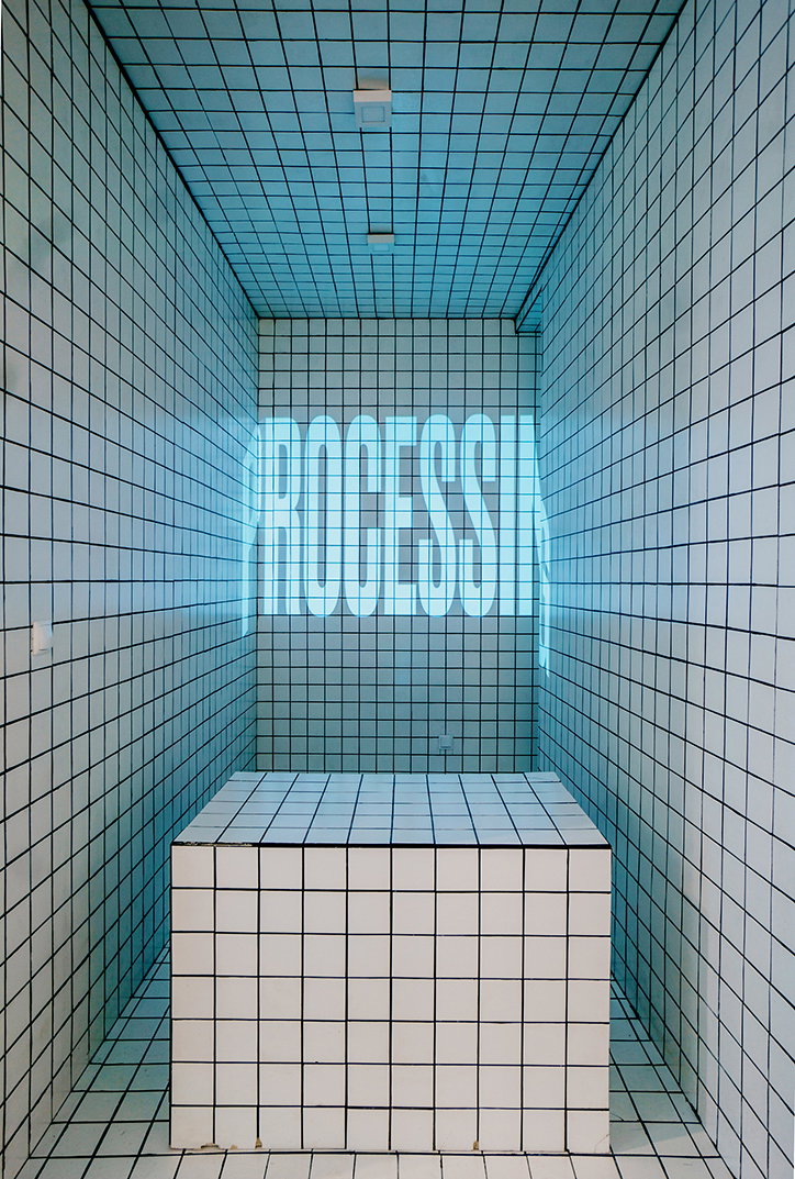
Right

Rita Matos, image courtesy of Joana Duarte
A small room with white tiled walls, floor and ceiling. A glowing blue neon sign on the back wall reads “PROCESSING”, positioned above a large tiled cube.
Above

Rita Matos, image courtesy of Joana Duarte

A bright, minimalist gallery space with grey tiled floors and white walls. To the right, a recessed area is lined with white square tiles, containing a matching tiled plinth.
Above

Rita Matos, image courtesy of Joana Duarte

Share Article

Further Info

About the Author

Ruby Boddington

—

Ruby is Senior Creative at It's Nice That, overseeing our visual output across platforms and projects. Before that, she was associate editor on the editorial team, after joining in September 2017 following graduation from Central Saint Martins.


It's Nice That Newsletters

Fancy a bit of It's Nice That in your inbox? Sign up to our newsletters and we'll keep you in the loop with everything good going on in the creative world.
