




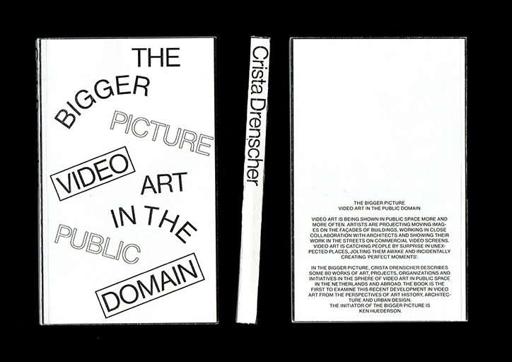
Sean van den Steenhoven’s projects utilise voice as a design tool to make statements
Amsterdam born and raised, Sean van den Steenhoven stumbled into graphic design during his time playing bass guitar in several bands. “It was, and I’m sure still is, very common to create your own visuals for upcoming shows,” he recalls. After falling in love with this DIY approach, he decided to apply for the University of the Arts Utrecht where he is now in his final year studying graphic design.
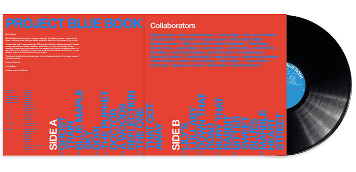
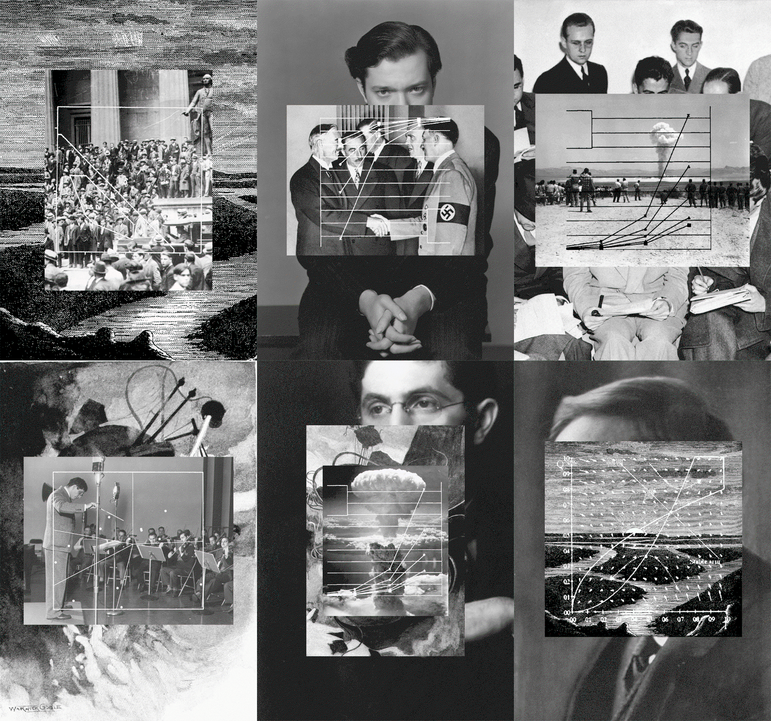
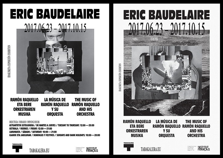
When initially starting the course, Sean was “hoping to continue creating posters for the next four years.” However, his understanding of the discipline massively changed and so his “interests really shifted from ‘making things that look cool’ to creating content that triggers.” Ranging from album covers to exhibition identities, Sean has developed a largely monochromatic aesthetic that places an emphasis on the hierarchy of typography to clearly communicate information.
“I am always really excited to see people who use their voice as a design tool,” he explains, “our voice is the most primary tool we possess to make a statement or send a message and I think it fits perfectly with the idea of the designer as auteur.” Recently, this has manifested in a series of projects taking inspiration from the non-designed aesthetic of cheap paper, stapled or folded booklets. “There’s something pure about these small independent publications that attract my attention,” he tells It’s Nice That.
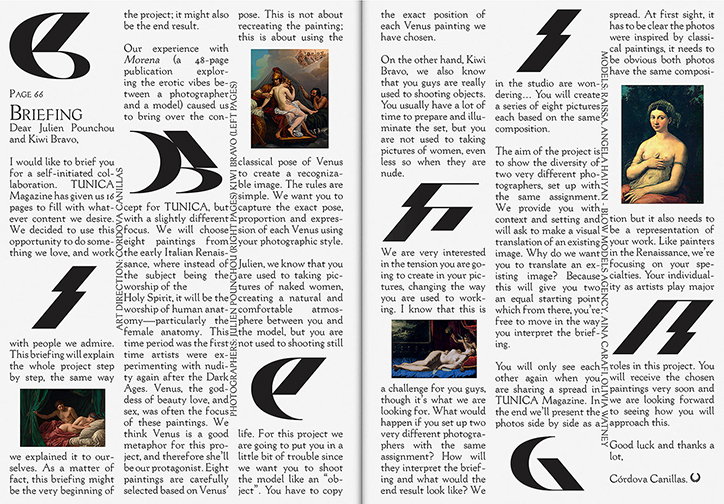
Sean’s approach to graphic design was largely shaped by an internship at Barcelona-based studio, Córdova Canillas. “I was amazed by how they messed with typographical rules I was so familiar with and were still able to create beautiful designs that were authentic and true,” he explains. During his time there, Sean was able to work on the art direction for a shoot featured in Tunica magazine’s sixth issue.
The project was inspired by Morena, a magazine Córdova Canillas works on which focusses on the relationship between the model and photographer. For Tunica, they took this concept and commissioned two Barcelona-based photographers – Julien Punchou and Kiwi Bravo – and provided them both with the same brief. The outcome is a series of diptychs which replicate eight paintings of Venus in the photographers’ own styles. “This was the first time that I played the role of art director and designed absolutely nothing. I think that was an amazing experience and I’m super grateful Córdova Canillas gave me that opportunity,” he explains.
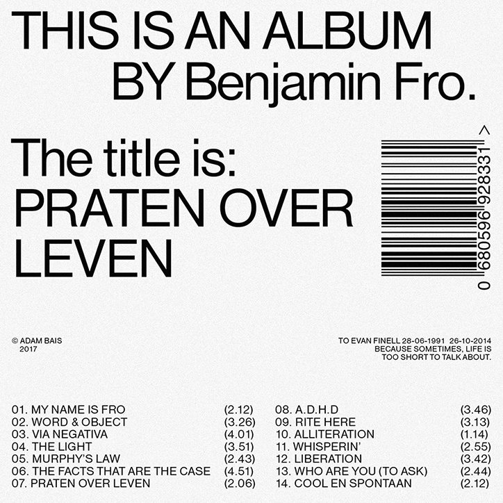
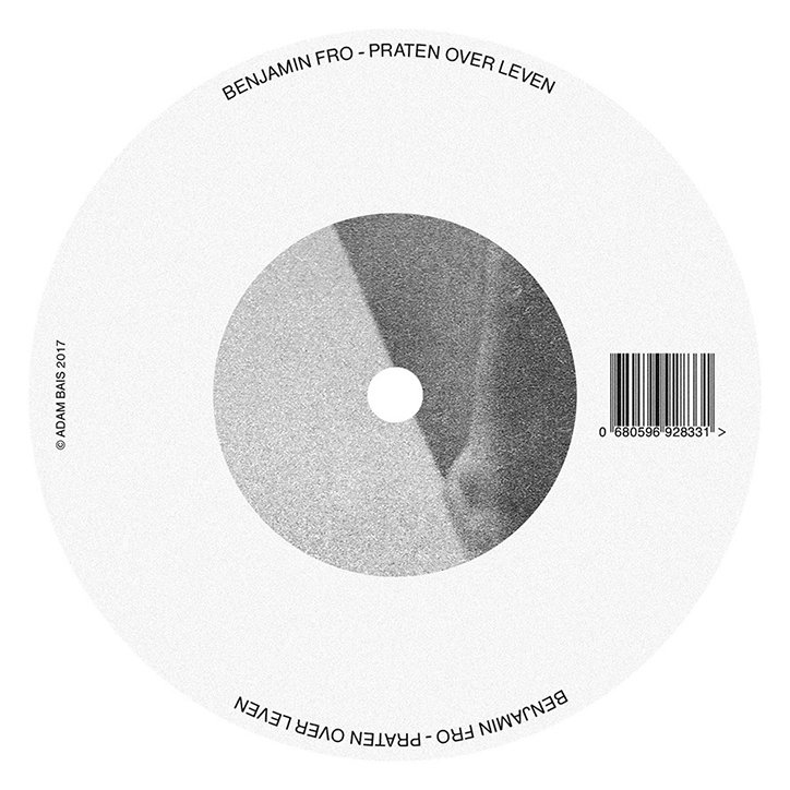
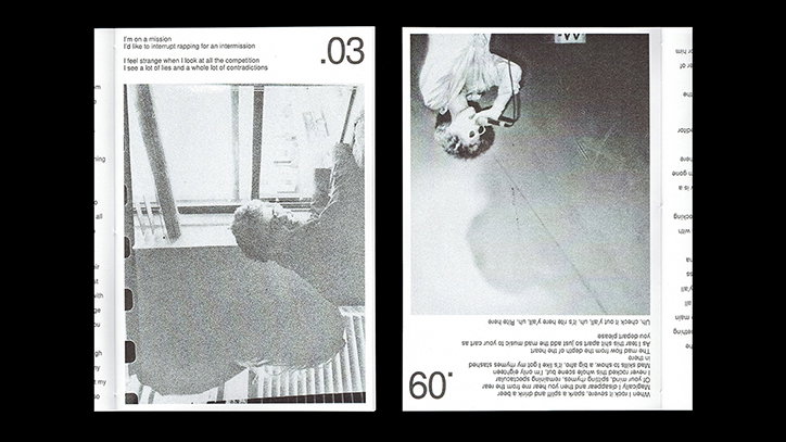
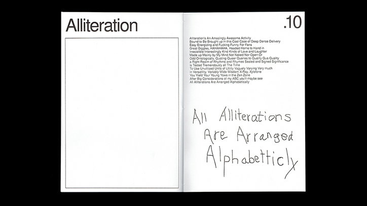
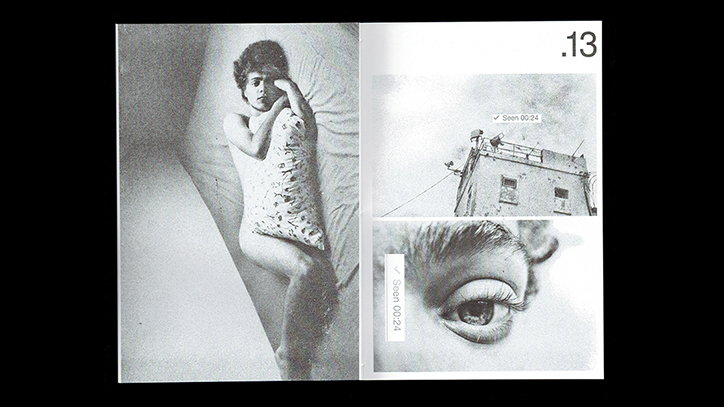
With his background in music, it’s only natural that Sean applies his design skills to this world. In a project that showcases Sean’s black-and-white aesthetic that values language and articulation, he designed the album artwork for Benjamin Fro. When the “philosophical rapper” approached him to design his first solo record, he initially asked Sean to design just the cover of the CD. “I told him barely anyone has a CD player anymore and that his lyrics are way more suitable for reading,” Sean explains. As a result, they decided to release the entire album in book form where “all the attention is focussed on the lyrics and the design is very simplistic.”
This form of collaboration typifies Sean’s working practice: “In traditional cases, the designer has always been at the end of the process, while I find it so much more interesting to see what happens if you put the designer at the very beginning of it.” To get the best results, Sean tries to be as engaged as he can with every project from the outset, merging the content and visuals creating projects that practically design themselves.
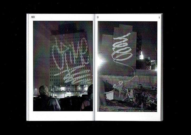
Sean van den Steenhoven
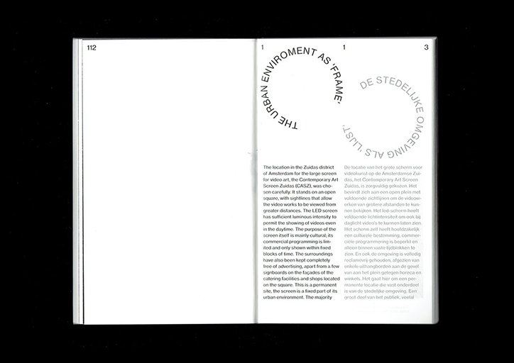
Sean van den Steenhoven
Sean van den Steenhoven
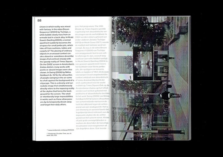
Sean van den Steenhoven
Sean van den Steenhoven
Sean van den Steenhoven, art direction by Marco Balesteros
Sean van den Steenhoven, art direction by Marco Balesteros
Sean van den Steenhoven
Sean van den Steenhoven
Sean van den Steenhoven
Sean van den Steenhoven
Sean van den Steenhoven
Sean van den Steenhoven
Sean van den Steenhoven
Share Article
Further Info
About the Author
—
Ruby is Senior Creative at It's Nice That, overseeing our visual output across platforms and projects. Before that, she was associate editor on the editorial team, after joining in September 2017 following graduation from Central Saint Martins.

