Standards Manual’s new book documents 20th Century graphic design through park brochures
We first wrote about Hamish Smyth and Jesse Reed, the duo behind independent publishing imprint Standards Manual, back in 2014. That piece focused on their first title, New York City Transit Authority: Graphics Standards Manual, a graphic design aficionado’s dream containing hundreds of scans of Massimo Vignelli and Bob Noorda’s modernist masterpiece.
Shortly after that book, Hamish and Jesse left their jobs at Pentagram and struck out on their own, setting up Order and Standards Manual, a publisher with a mission to “archive and preserve artefacts of design history and make them available to future generations”. In the intervening years, that imprint has published half a dozen books, documenting the design histories of various organisations, from Nasa to the Environmental Protection Agency (EPA).
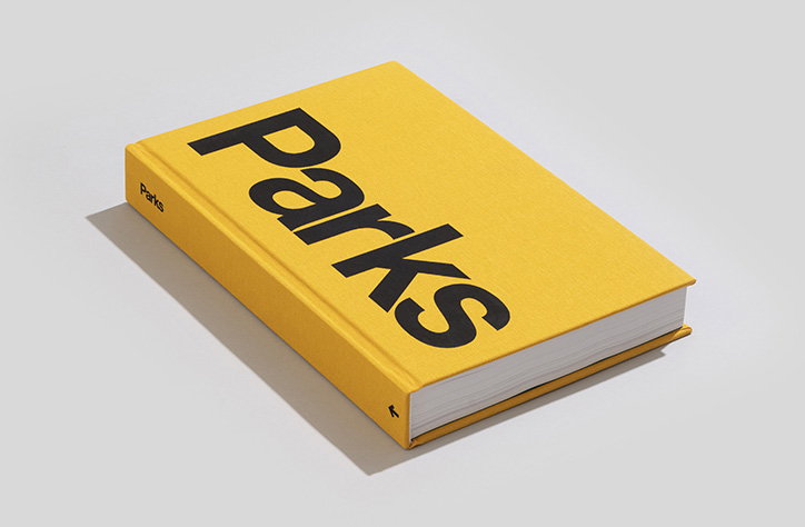
Now, the duo is back with another tome that will get any graphic designer worth their salt salivating. For the second time, they’ve worked with photographer and collector Brian Kelley, this time to document his collection of US national parks brochures, maps and ephemera.
“About a year ago, Brian and I went to a bar a few blocks down from our office and he pulled out his phone to show me some images of his brochure collection,” says Jesse. “He started with the ones from the 60s and 70s, which were very juicy and modernist, with Helvetica type and all that. They were right up our alley and we said we’d love to see more. He showed us more and every time he did, the collection got better and better.”
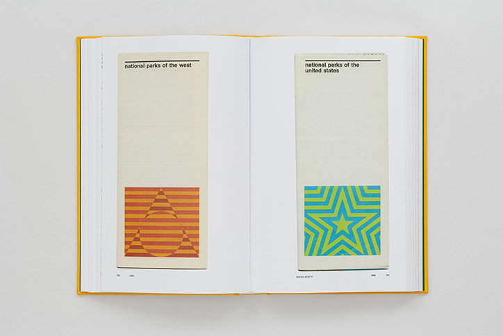
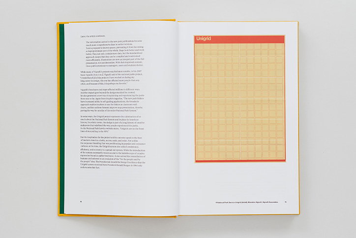
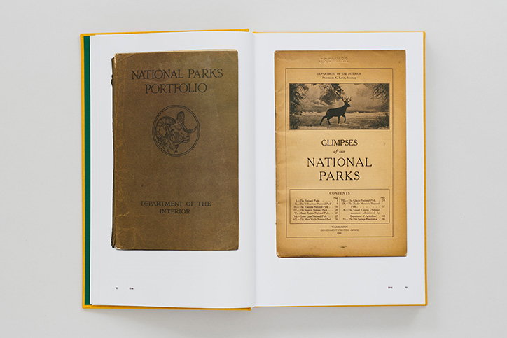
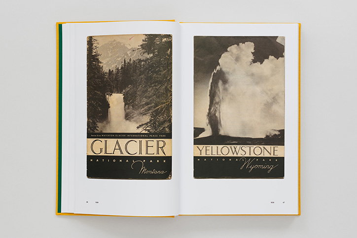
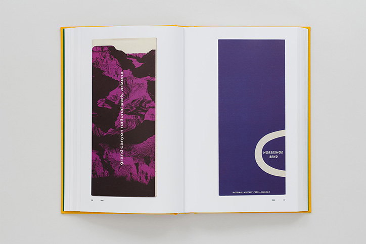
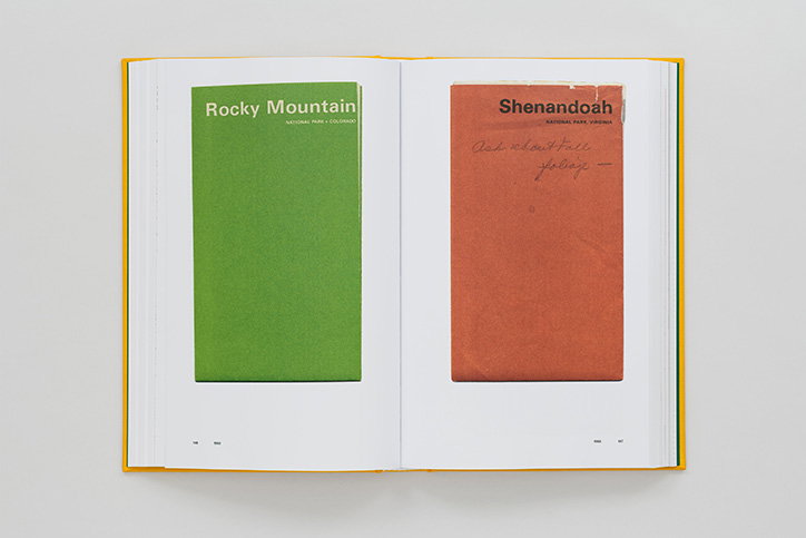
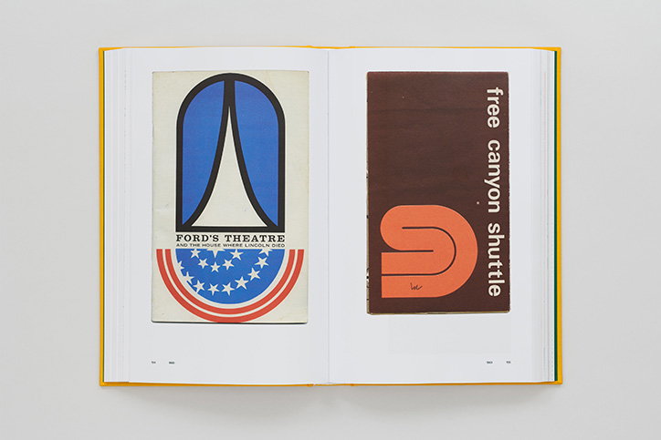
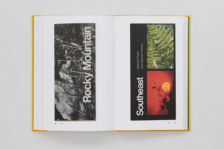
The book, entitled simply Parks, presents a selection of over 300 brochures, maps and leaflets. They are laid out chronologically, starting with the first in 1916, not long after the first national parks were established, and continuing right through to contemporary examples. Laid out this way, it’s really clear to see the progression of design trends throughout the 20th Century.
“The early ones are beautiful – they have this serif typography, everything is centred and it’s what they would have called ‘modern’ but now feels very traditional,” says Hamish. “Then in the 1960s and 70s, for instance, you get some really cool stuff. It’s a lot more minimal and you can see the influence of post-war European graphic design coming to the States. The 70s was probably the most inventive time.”
Standards Manual: Parks
Standards Manual: Parks
But the pair haven’t simply chosen the most beautiful pieces of design. They’ve also decided to publish some brochures from the 1940s and 50s, when what Hamish describes as “wedding typography” predominates, and the 1980s, when we witness a deterioration of the famous Unimark system. “Brian really challenged us to include everything,” explains Jesse. “Also the less beautiful stuff. He wanted a fair representation of each period.”
In this way, Parks really provides a broad overview of recent American design history. Hamish and Jesse believe it’s the first time this work has been seen all together in one place. “It’s literally a timeline of graphic design history over the past 100 years in one single subject, done in 400 different ways,” says Jesse. “You could probably do the same with film posters or album covers, but this provides such a thorough overview.”
For something so historical and archival in nature, the subject matter is also oddly timely, Hamish points out. “I’ve noticed recently that the national parks in the US are really in the zeitgeist,” he says. “People are wanting to reconnect with nature. But there’s also this sense that the parks are under threat with the current administration we have over here. There’s been a resurgence in people’s interest in the national parks, because they’re realising they need to be protected.”
Since taking office, Donald Trump has made the EPA almost completely toothless, implementing multiple policies that will have a huge detrimental impact America’s national parks. “One quote really stuck in our minds, when we were making this book: ‘The national parks are America’s greatest invention,’” says Hamish. “It’s a reminder that they don’t just happen naturally; they need to be enacted by politicians and protected.”
Standards Manual: Parks
Standards Manual: Parks
Standards Manual: Parks
Standards Manual: Parks
Standards Manual: Parks
Standards Manual: Parks
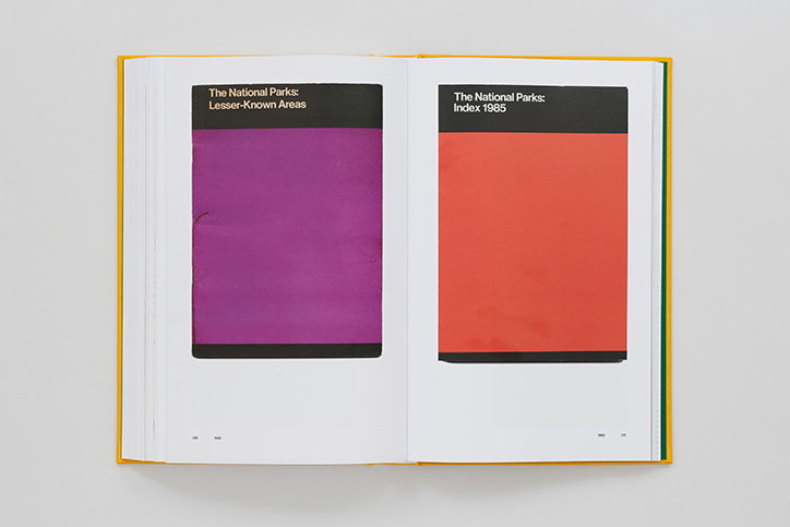
Standards Manual: Parks
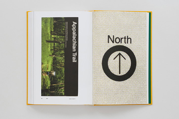
Standards Manual: Parks
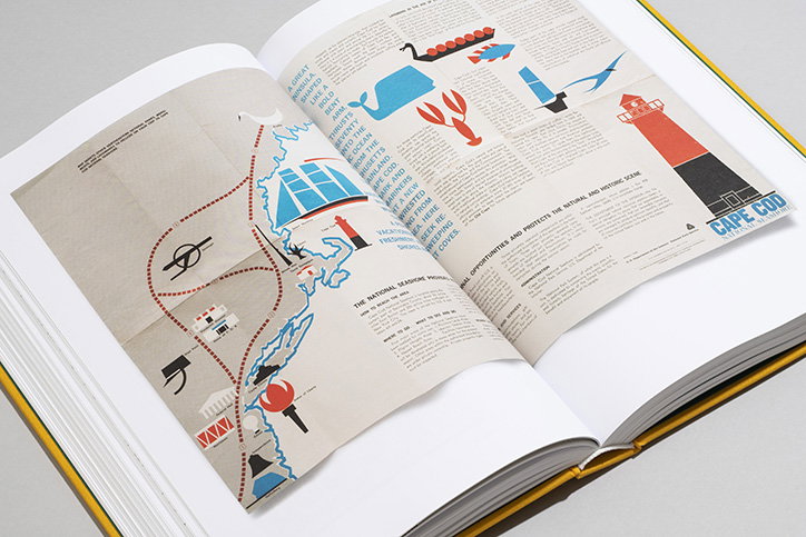
Standards Manual: Parks
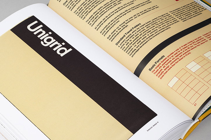
Standards Manual: Parks
Share Article
Further Info
About the Author
—
Matt joined It’s Nice That as editor in October 2018 and was editor-in-chief in September 2020–2024. He was previously executive editor at Monocle magazine. He is now a freelance writer and editor.