Launch Recite Me assistive technology
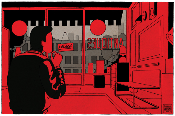
An illustration of a person looking through a shop window at a grey city skyline. A small sign hanging in the window reads “closed”, while the word “ANTIDOTES” is visible in reverse on the glass.

Stefan Glerum's brilliant 20th Century inspired illustrations pack a punch

—
Date
9 May 2012

Now I don’t often use this phrase, but Stefan Glerum’s illustrations are “the bomb.” That’s right, the bomb. Featured back in 2010, he’s so good we had to revisit his site and see what he’s been up to since, and we weren’t disappointed with everything being a little more slick and even better than we remembered.

Still inspired by early 20th Century movements such as Art Deco, Bauhaus, Italian Futurism and Russian Constructivism, this rich knowledge of graphic design history evident in his work is what I really enjoy. Combined with modern elements, the pieces become more than just a pastiche of these movements, cementing his own distinctive style.
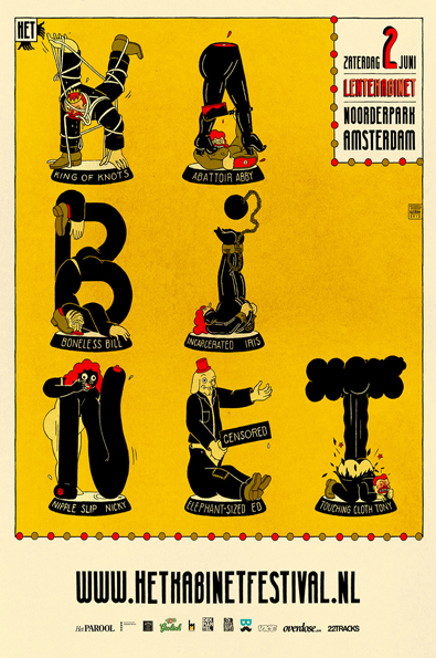
An illustration for a festival poster on a yellow background. The word “HABINET” is spelled out using figures in distorted poses, each with a name below them such as “King of Knots” and “Boneless Bill”. Red text in the top right reads “Zaterdag 2 Juni Leitenaginet Noorderpark Amsterdam”.
Above

Stefan Glerum: Lentekabinet ’12

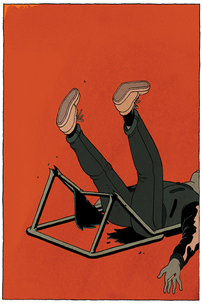
An illustration of a person lying on their back against a solid red background. They have fallen backwards in a chair, with their legs kicked up in the air.
Above

Stefan Glerum: Antique Antics

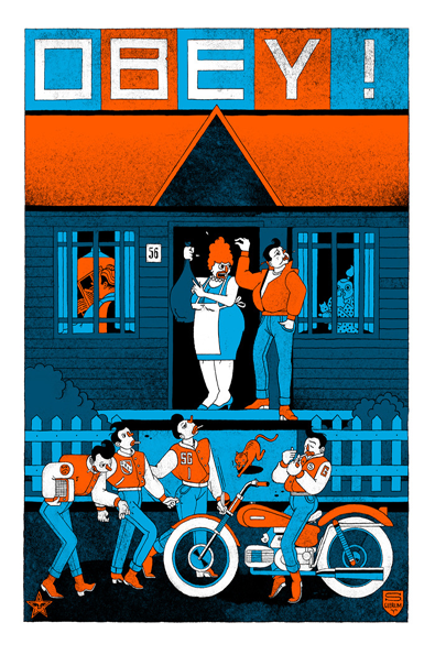
An illustration in blue, orange and white. At the top, bold text reads “OBEY!”. Below, a person in a blue apron and a person in an orange jacket argue in the doorway of a house. In the foreground, four people in orange vests stand by a motorcycle.
Above

Stefan Glerum: Obey Artist Series

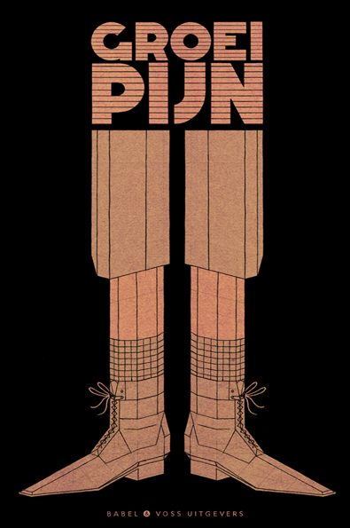
An illustration of a pair of legs and pointed boots against a black background. Above them, bold, striped typography reads “GROEI PIJN”.
Above

Stefan Glerum: Babel & Voss

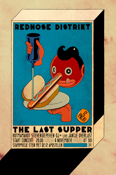
An illustration on a 3D box depicts a red-faced figure holding a hot dog and pouring a blue sauce over it. The image is topped with the text “REDNOSE DISTRIKT”. Below the figure, a banner reads “THE LAST SUPPER”. Further text lists a line-up including “HOTMAMAHOT” and “STEVEN DEPEVEN”, with the date “4 NOVEMBER” and the location “OT 301”.
Above

Stefan Glerum: Rednose Last Supper

Share Article

About the Author

Rebecca Fulleylove

—

Rebecca Fulleylove is a freelance writer and editor specialising in art, design and culture. She is also senior writer at Creative Review, having previously worked at Elephant, Google Arts & Culture, and It’s Nice That.
It's Nice That Newsletters

Fancy a bit of It's Nice That in your inbox? Sign up to our newsletters and we'll keep you in the loop with everything good going on in the creative world.