Studio Ard on the dialogues inherent to artist’s publishing and not falling back on style
Guillaume Chuard and Daniel Kang Yoon Nørregaard founded Studio Ard after graduating from the Royal College of Art, where they’d already collaborated on a few projects, and with the knowledge that neither of them wanted to work for an established design studio. “We both wanted to continue working independently, so we started talking about setting something up together. After graduating we got offered a couple of projects, and it just went from there", Daniel tells It’s Nice That.
Since then, they’ve designed books for artists including Paul Nash, Miles Aldridge and Asger Harbou Gjerdevik, continued to work with the RCA on catalogues and newsletters, and redesigned Tate Etc, among many other projects. Working so often with artists, other designers, and cultural institutions, there’s a wealth of material and references, and there’s bound to be a lot of opinions in the room too: “Artists and creatives generally have a good understanding of where they’d like to take a project, and when we have the chance to work with them directly, there’s a natural dialogue," explains the studio of this process. "It’s about getting to know the thinking behind the work, and showing it the same care we would give to our own work. An artist’s book can work as an extension of their practice, like in our books with Asger Harbou Gjerdevik.”
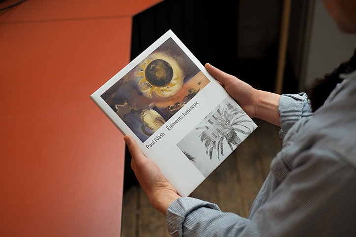
In the case of the Paul Nash catalogue, the studio “had his whole story to work with and could really develop something that reflected on specific parts of his practice.” They built the design of the catalogue around the tension between his painting and photography, which “had rarely been seen alongside each other”, says Daniel. “Typographically, there are some nice details which refer to the work of Eric Gill. The main font is a re-cooking of Gill Sans by our friend Robert Huber, who managed to give the typeface the right contemporary edge. We also used a more calligraphic font by Gill, which creates a nice contrast with Robert’s font and references the early British modernist era Nash was part of.”
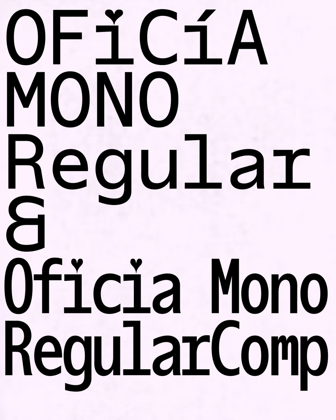
Studio Ard approaches each project with the same intention, to “never aim for a certain style unless it makes sense in relation to the work”. The studio doesn’t doubt the role of style in design, but “believe that these things will be expressed and developed over time – or not – and we don’t like the idea of being put in a box or defined by a precise aesthetic”. Although they don’t doubt the difficulty of getting original ideas through, “particularly in London, where there’s constant economic pressure, which allows for little risk and experimentation on a visual communication level”, Studio Ard has a natural ability for not conforming. “We’re both from countries – Switzerland, Denmark/The Netherlands – where graphic design is given a central role in the culture, and designers also wear the hat of editor” says Daniel. “I guess we’re trying to get a bit of that multi-disciplinary, content-focused point of view in our work; sometimes resulting in a schizophrenic approach to typography!”
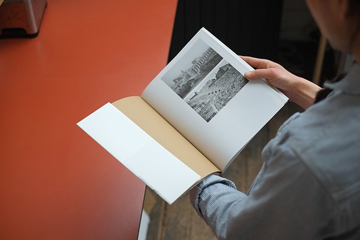
Studio Ard: Paul Nash
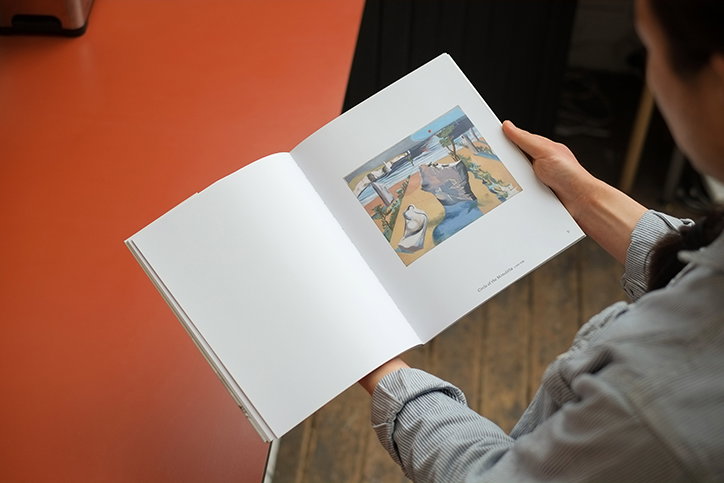
Studio Ard: Paul Nash
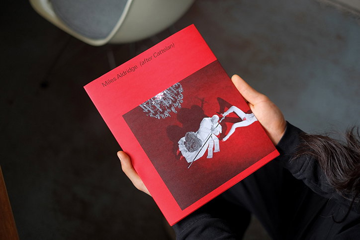
Studio Ard: Miles Aldridge
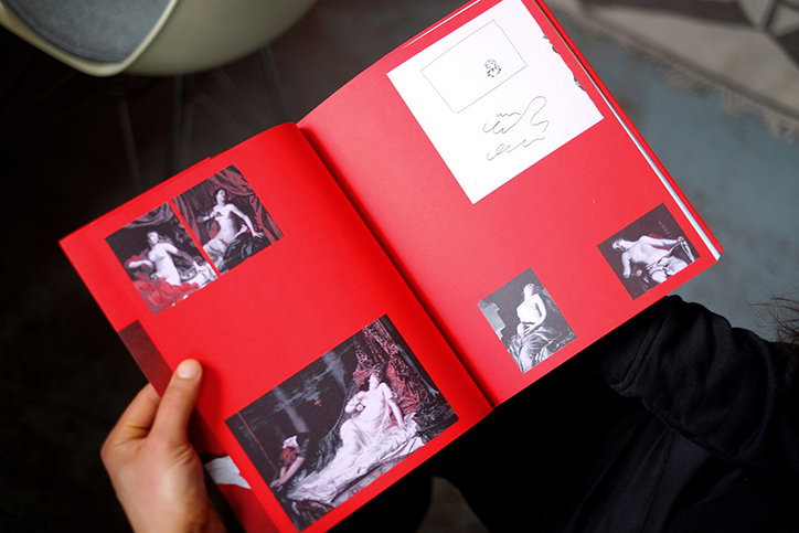
Studio Ard: Miles Aldridge
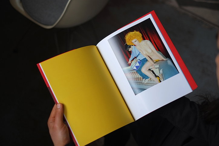
Studio Ard: Miles Aldridge
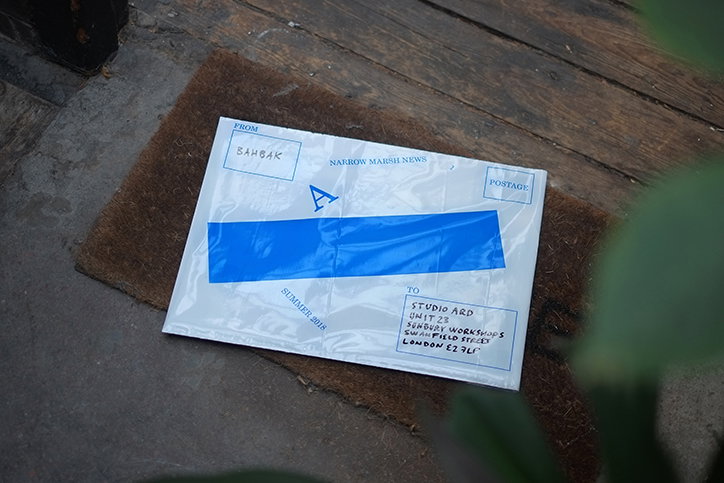
Studio Ard: Narrow Marsh
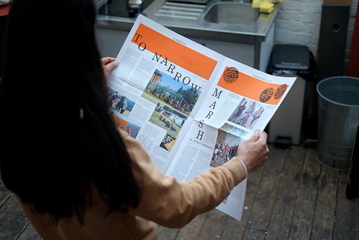
Studio Ard: Narrow Marsh
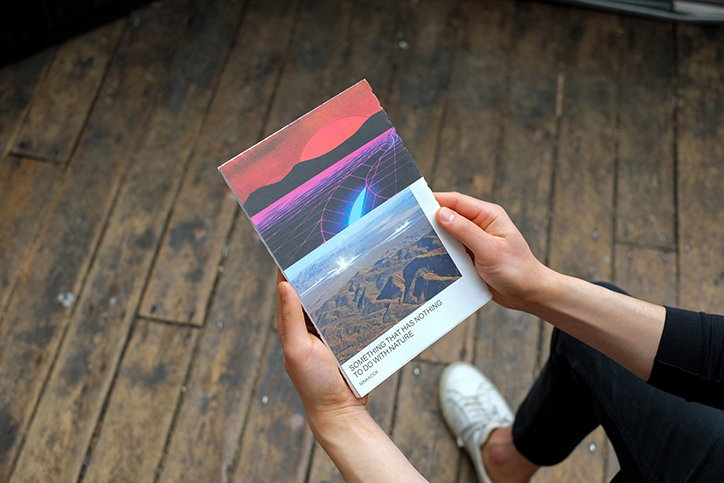
Studio Ard: Nina Kock
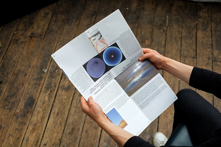
Studio Ard: Nina Kock
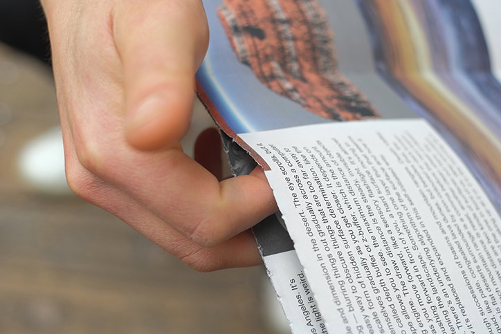
Studio Ard: Nina Kock
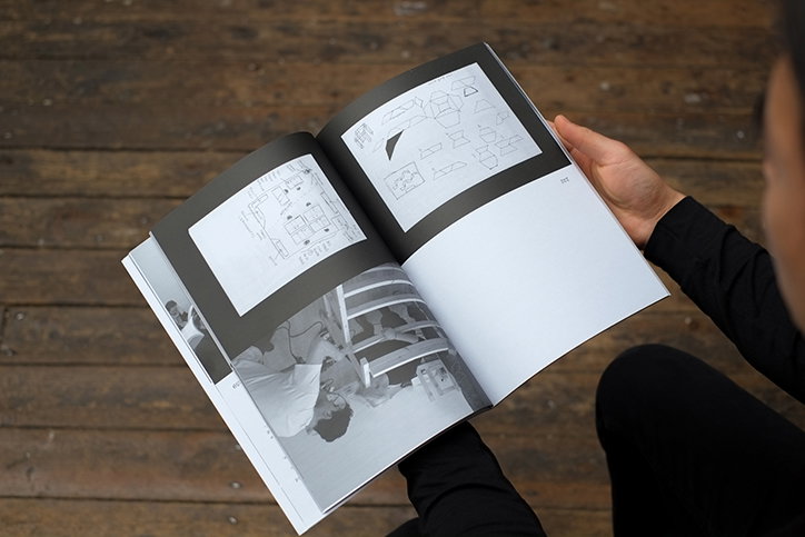
Studio Ard: Reflecting by Making
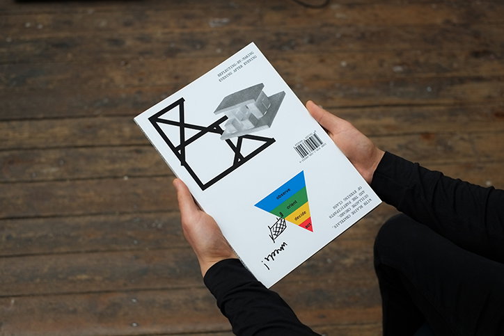
Studio Ard: Reflecting by Making
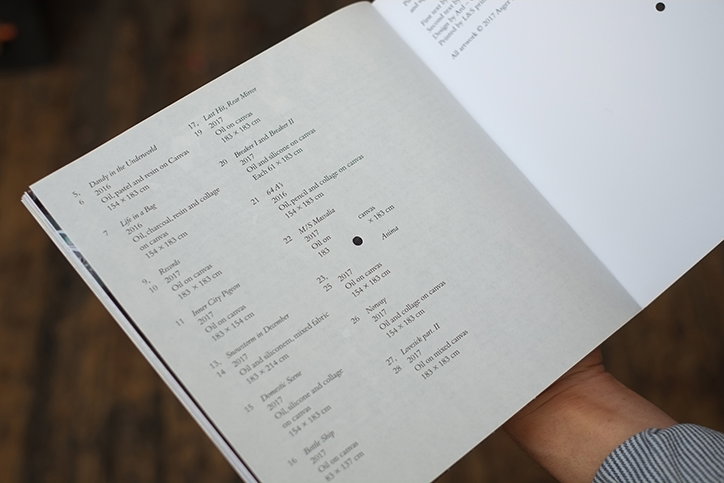
Studio Ard: Unplayable Piano
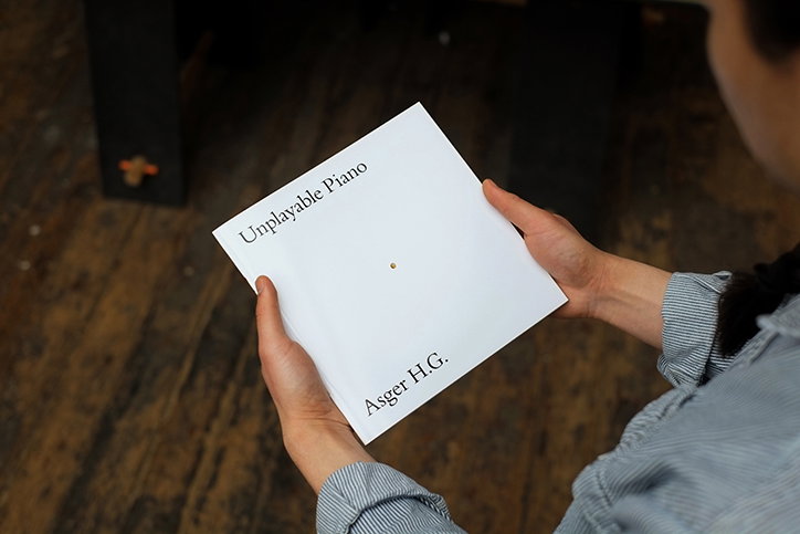
Studio Ard: Unplayable Piano
Share Article
Further Info
About the Author
—
Billie studied illustration at Camberwell College of Art before completing an MA in Visual Communication at the Royal College of Art. She joined It’s Nice That as a Freelance Editorial Assistant back in January 2015 and continues to work with us on a freelance basis.