Timo Durst's designs latch onto interesting topics to exploit unique and unexpected contexts
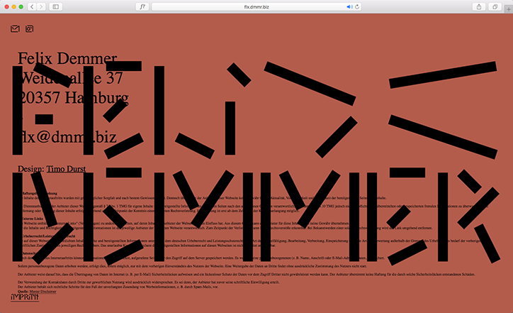
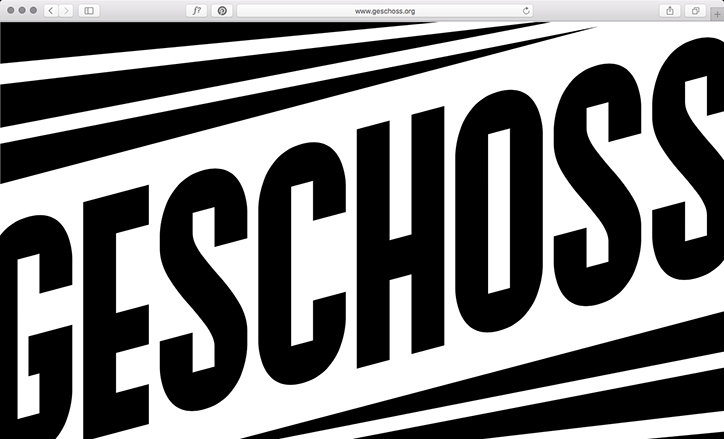
German graphic designer Timo Durst has well-built convictions when it comes to how design is produced, and what design can be. “My work practice is built on the strong belief that form evolves out of content and contexts,” reads the bio of his website. “Therefore, I focus on developing holistic design concepts and a unique visual language based on a client’s profile,” it continues. Working across all aspects of graphic design, Timo is the co-founder of Riesling Type and a member of studio community, Geschoss.
“I started getting into creating visual content pretty early in my life, as an adolescent using the emerging possibilities of communicating through the internet, trying to break out of the sometimes-limited horizon of my hometown,” he tells It’s Nice That. Originally from Rhineland Palatinate – a south-western area of Germany near the French border where “one drinks wine instead of beer, in contrast to most of Germany”, a fact that inspired the name of his foundry – Timo moved to Hamburg to study design where he is now based.
During his teenage years, it was platforms like MySpace, as well as gaming and music forums which “challenged me to confront with design as a form of communication,” Timo explains, “and I noticed it was easier for me to communicate through images and illustrations rather than words.” Ultimately, however, it was the possibility of creating work in collaboration with those from other disciplines, such as art and music, which drew Timo to design over other creative outlets.
Now, in his professional practice, Timo’s early interactions with the medium via DIY pieces and user-uploaded imagery are clear. “As I see design as a universal form of visual communication, every form of visual output can be seen as a seriously-designed piece of work, may it be a signature, an outfit, or a dance,” he explains. “I find it interesting when such pieces arise unintentionally, maybe even naively as I think those are the moments where truly authentic design is born.”
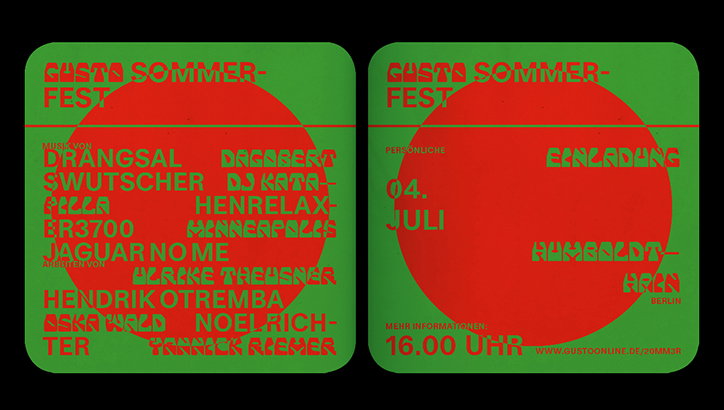
In one of his most recent projects, it was the design of “cheesy pseudo-authentic Italian restaurants” that provided a visual starting point. Consisting of a website and identity, the project was produced for Gusto – Ablass für Massenkultur (loosely translating to “outlet for mass culture”), a newly self-initiated platform for pop culture. “They approached me with a very strange name and an even stranger concept for their interviews,” Timo recalls. It was this name which first his unusual visual references: “It seemed to create a nice contrast to their artificially stressed sophisticated talks and framed the intentionally amateurish video aesthetics quite well.”
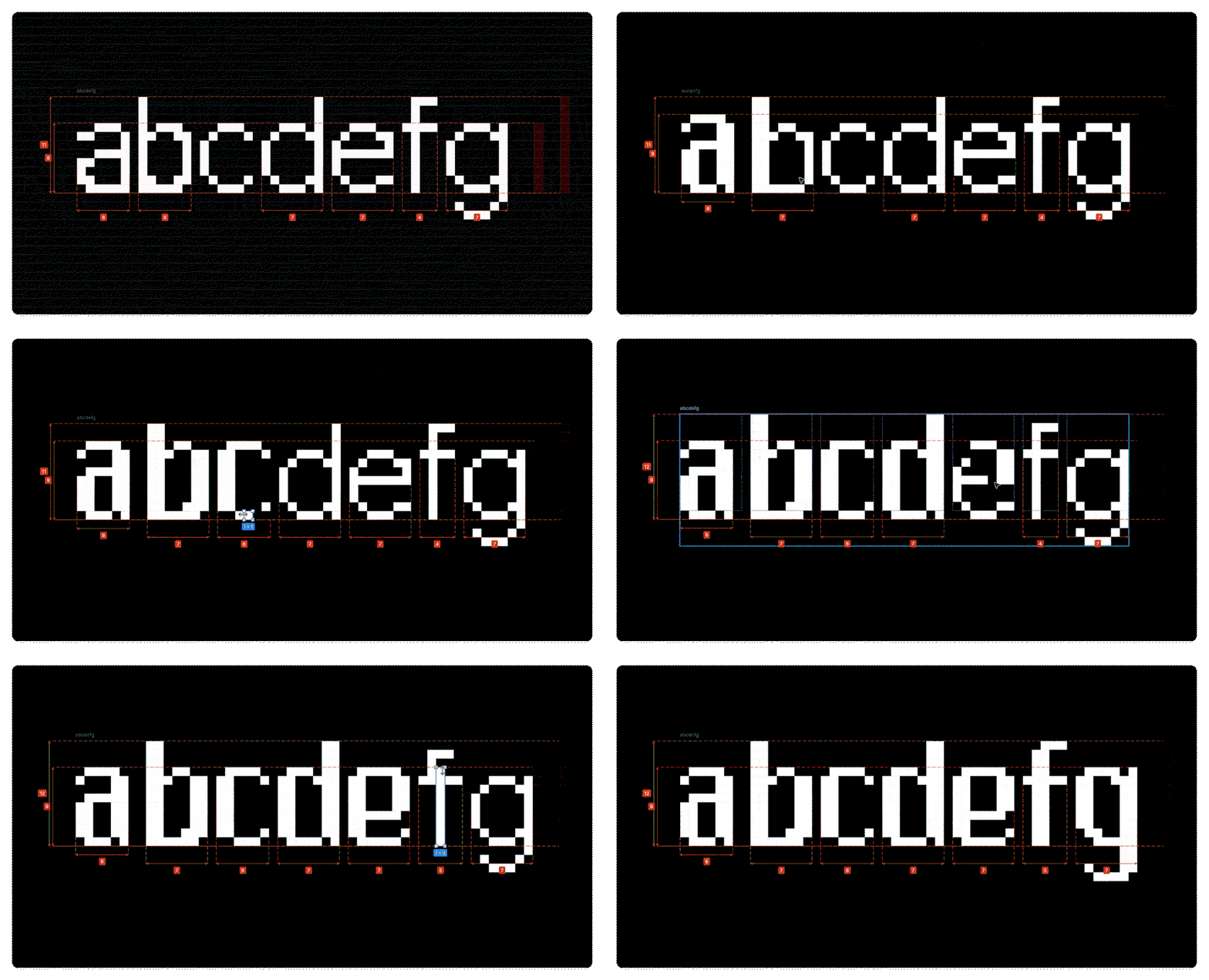
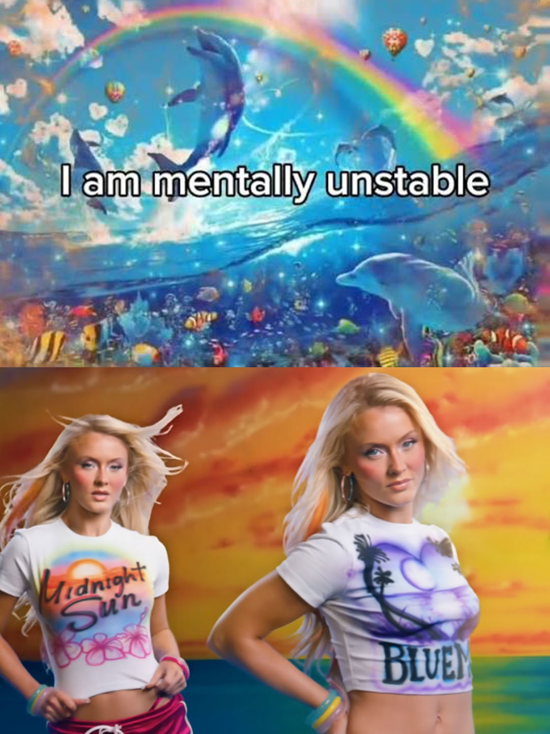
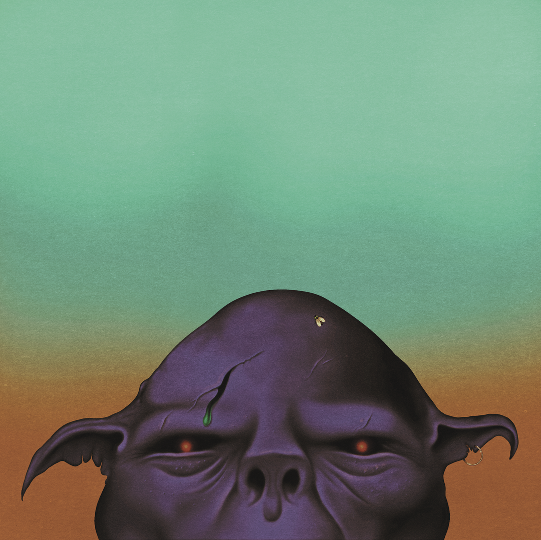
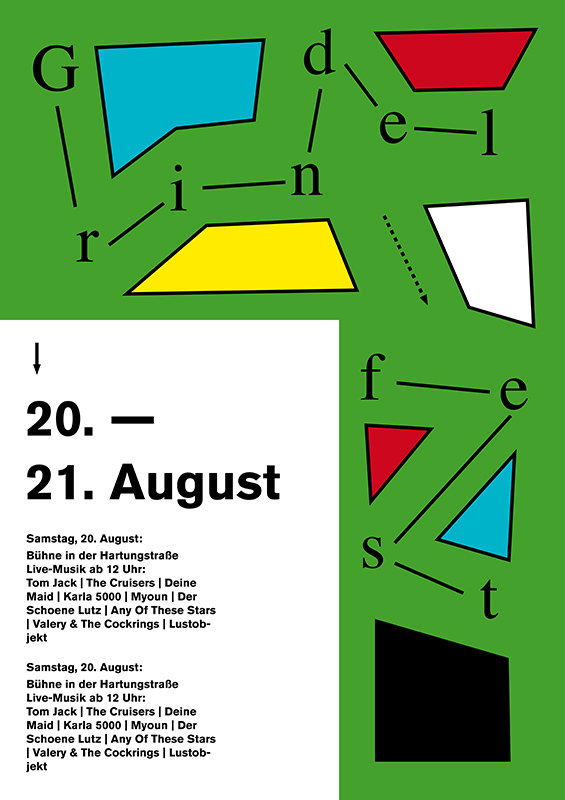
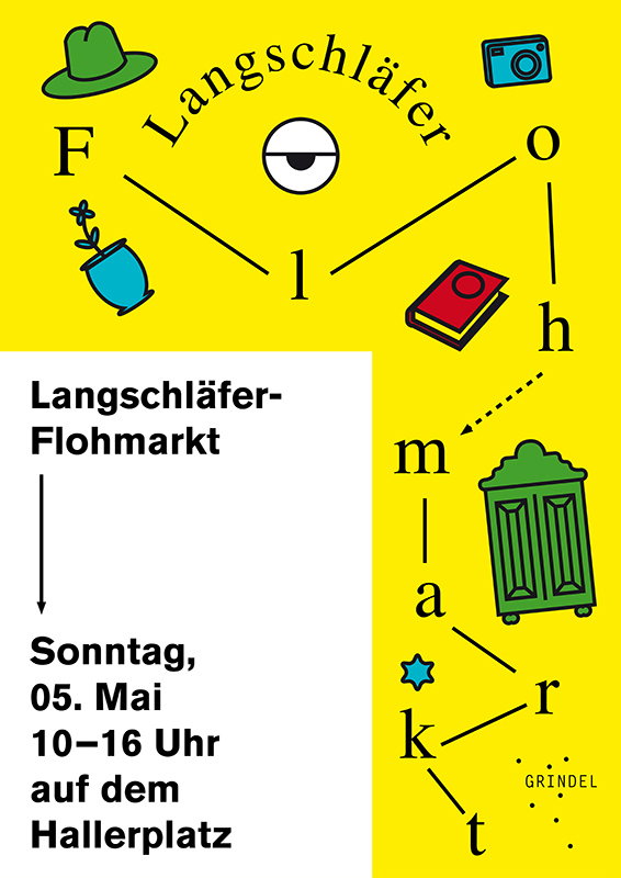
It’s this lateral thinking which produces such interesting results across Timo’s portfolio. Often using typography as the foundation for a design concept, the basis of his work is always extensive research. Whether designing posters, publications or websites, Timo finds what’s most interesting about a topic and latches onto this, building visual systems which exploit unique and unexpected contexts. No matter what the project, “I try to be open-minded,” he concludes, “empathy plays a major role in my practice – listening to people, trying to understand their positions and motivations as a foundation for collaboration.”
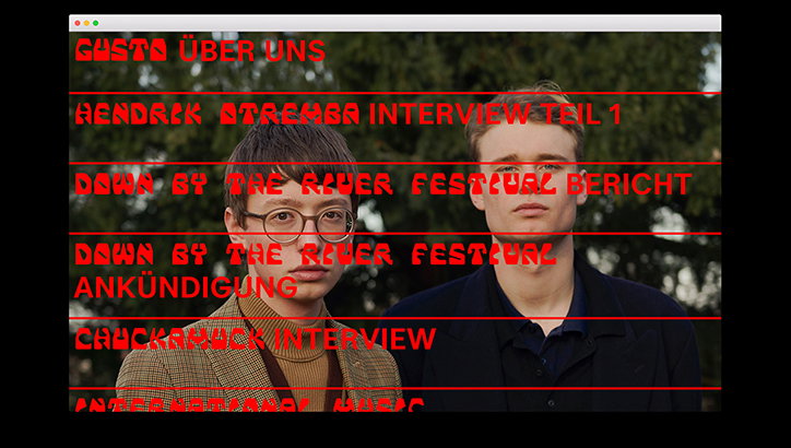
Timo Durst: Gusto. Photography by Noel Richter
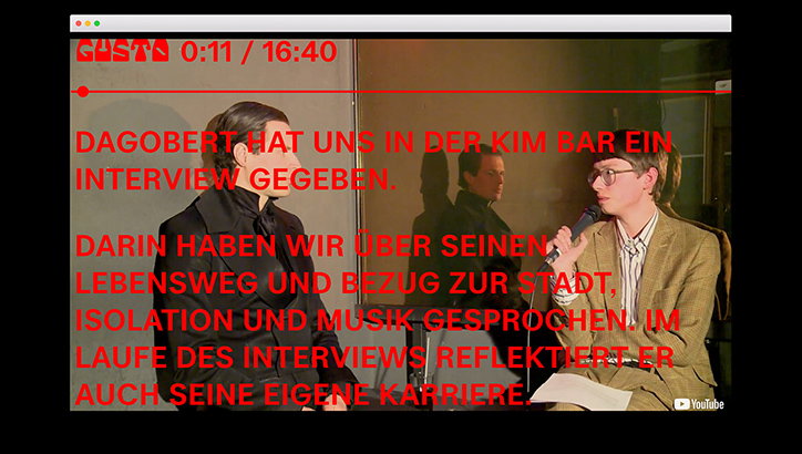
Timo Durst: Gusto. Photography by Noel Richter
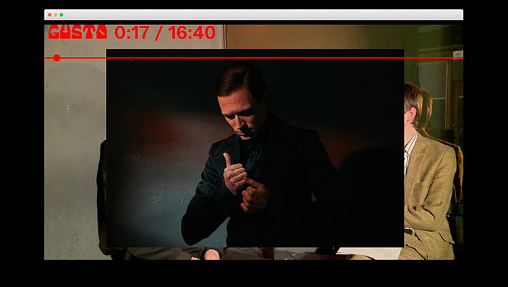
Timo Durst: Gusto. Photography by Noel Richter
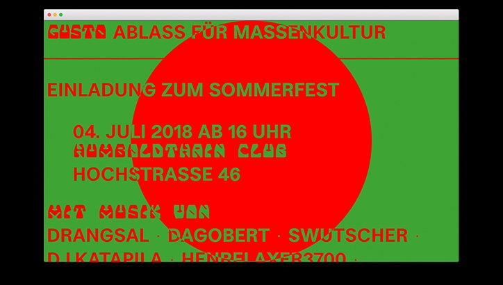
Timo Durst: Gusto
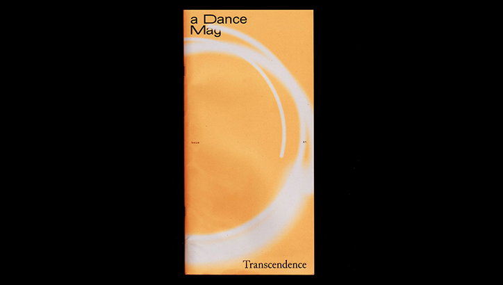
Timo Durst and Max Weinland: aDanceMag
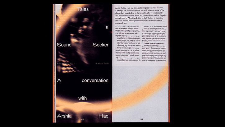
Timo Durst and Max Weinland: aDanceMag
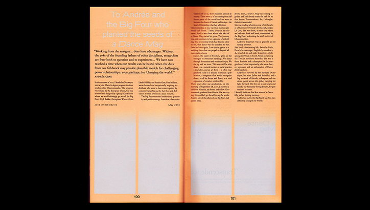
Timo Durst and Max Weinland: aDanceMag
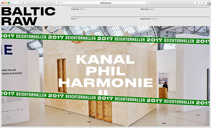
Timo Durst
Timo Durst
Timo Durst
Timo Durst
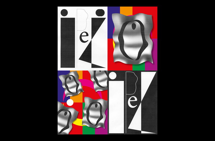
Timo Durst
Share Article
Further Info
About the Author
—
Ruby is Senior Creative at It's Nice That, overseeing our visual output across platforms and projects. Before that, she was associate editor on the editorial team, after joining in September 2017 following graduation from Central Saint Martins.