Praxis XL celebrates the 40th anniversary of Factory Records
Curated by former Factory designer Trevor Johnson, the exhibition shows a reconfigured archive of work, accompanied by some limited edition new releases.
Believe it or not it’s been 40 years since Factory Records’ first release. The famed Mancunian independent record label, known almost as much for its design as its music, has been showcasing a selection of its archives at The Modernist Society in Manchester to celebrate.
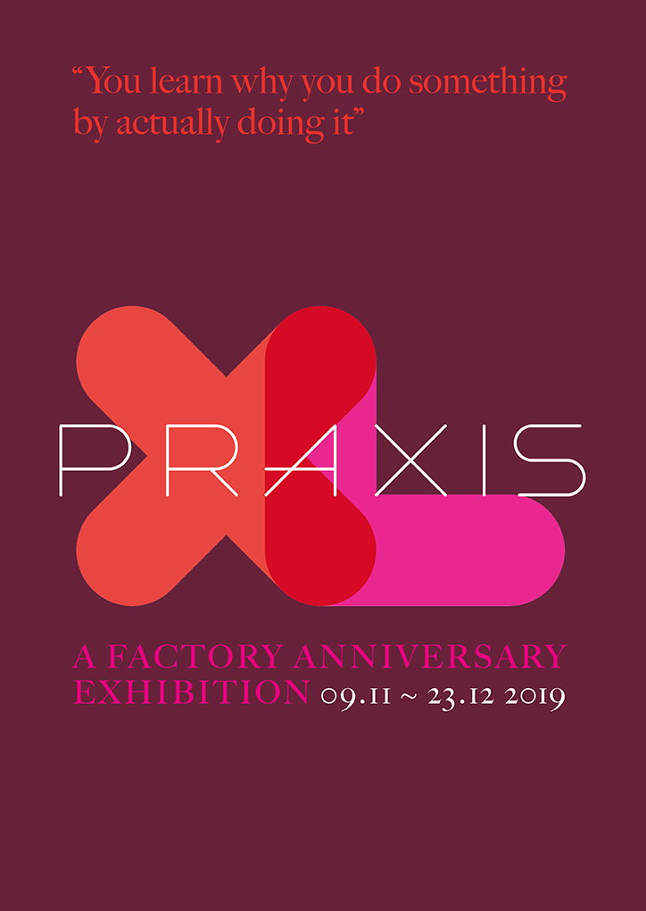
The exhibition, called Praxis XL, is curated by Trevor Johnson, a stalwart of the Factory Design team during the 1980’s, and his brother Craig. To coincide with the anniversary they have released a selection of limited edition postcards of Trevor’s Hacienda and Factory posters, as well as a badge designed for the exhibition in line with Factory principles.
“I worked on sleeve designs and promotion for Factory and the Hacienda almost continuously for about seven years, from 1984 to 91, and have been revisiting, reconfiguring and reformatting some of those designs for a variety of projects in the last few years,” Trevor tells It’s Nice That.
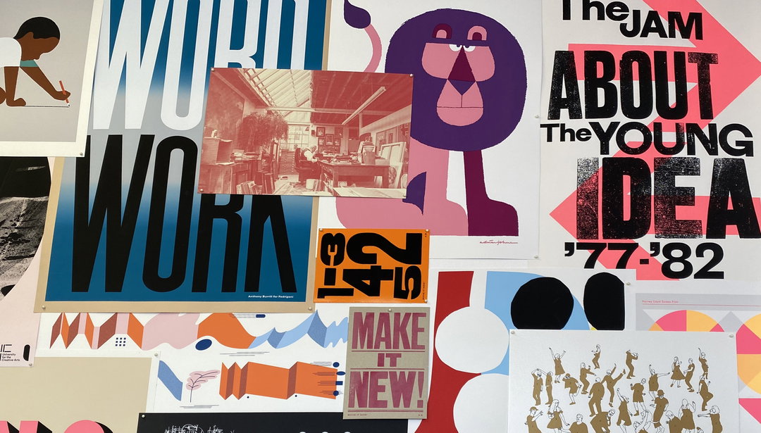
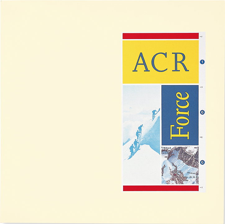
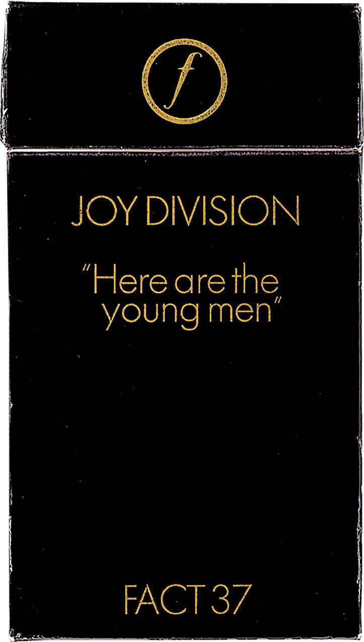
The exhibition itself consists of a range of archived pieces, from festival posters to album covers to photographs – including some great images of a young Madonna performing at the Hacienda.
The project actually came about in reaction to the fact there were anniversary celebrations in the capital, but nothing in the city where it all happened. “In a conversation with The Modernist partner Eddy Rhead about my archive, amongst other things we talked about Factory and the principles of praxis,” says Trevor, who is currently design director at Havas Lynx Group. “We were aware of an exhibition happening in London, but felt there was a need for an appropriate acknowledgement and celebration in Manchester in the anniversary year, and both wanted to make that happen. The decision on the final representative visual content was a collaborative exercise between several parties.”
Praxis XL exhibition. Design by Martyn Atkins, images courtesy of Trevor Johnson
Despite much of the exhibition being archived content, there was also an urge to create something new to accompany it. “Eddy wanted the exhibition to have its own Factory-esque identity rather than a literal revival look, so we looked at it as we would a branding exercise for a band or club night,” explains Trevor. “I like typographic details – logos, monograms and ligatures and we felt there was an opportunity for some sort of interplay between the X’s in the word Praxis and of the roman numeral for 40 (XL), and it evolved from there, working to the scale and limitations of the production process. The rest of the letterforms were created to align with the geometric x.”
“The actual main colour way intended was ruby – for the 40th anniversary – with a couple of complimentary tones,” he says. “My brother Craig was part of the Johnson/Panas team back in the day and responsible for most of the artwork output, so it’s been good to hook up again and collaborate with someone who understands the crafting in the detail.”
Despite only being around for 14 years, Factory produced such a large portfolio of innovative design, a success that Trevor attributes to their carefree approach to working: “I can’t speak for all their designers, but other than fulfilling main objectives there were no restrictions imposed from anyone on us, and we were encouraged to be as creative and inventive as possible in every instance. We were mindful of the standards set by Peter Saville and Ben Kelly, and wanted to respect that unique opportunity.”
As time passes the question of how Factory has influenced designers down the years is often asked. In response to this, Trevor again cites how it proved the benefits of having space to be creative, but also feels that the way things fell into place may never happen again: “I think that independent maverick spirit of the label and the freedom to explore and experiment at the time comes across in the personality of the design output. Extremes coexisted probably in a way that won’t happen again, resulting in some unique and iconic designs.”
GalleryPraxis XL exhibition, images courtesy of Trevor Johnson
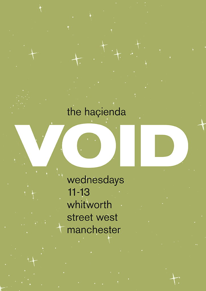
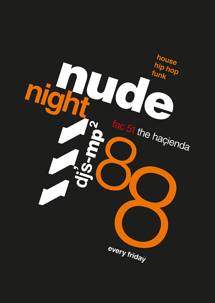

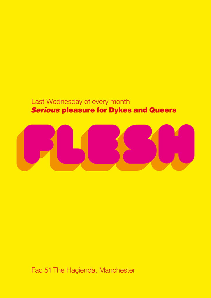
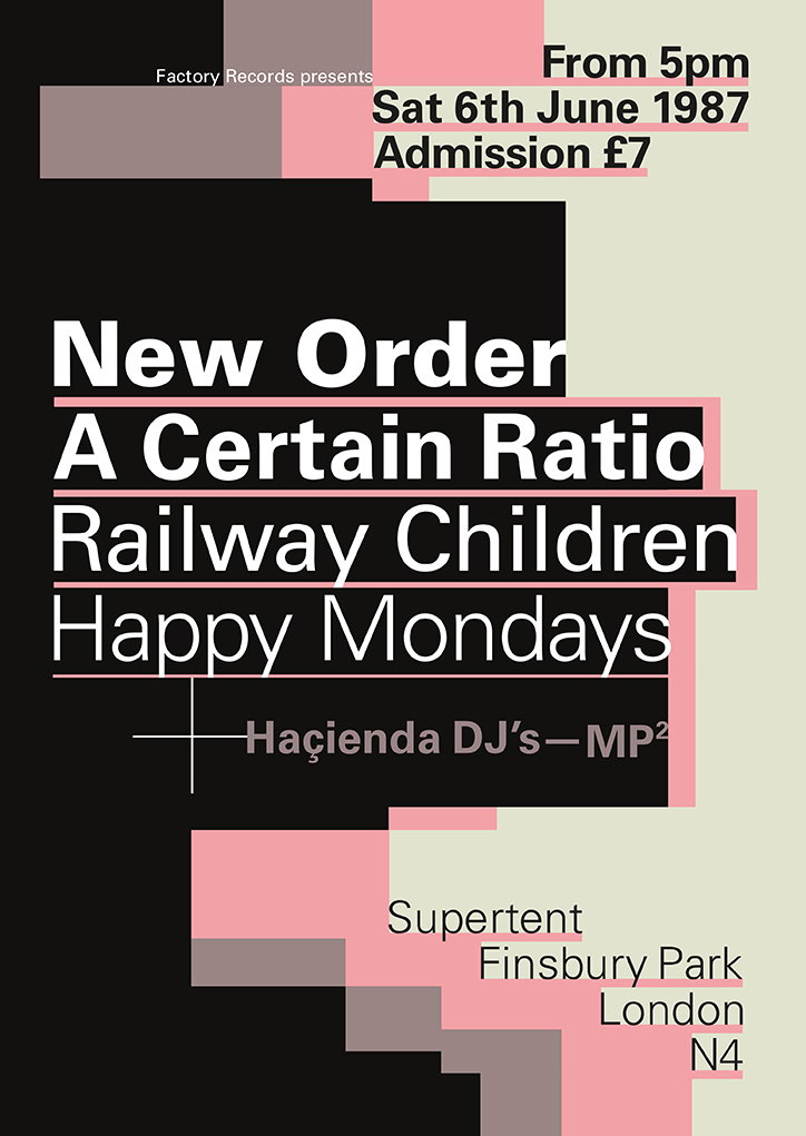
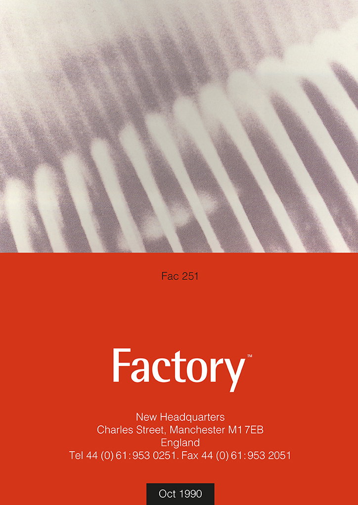
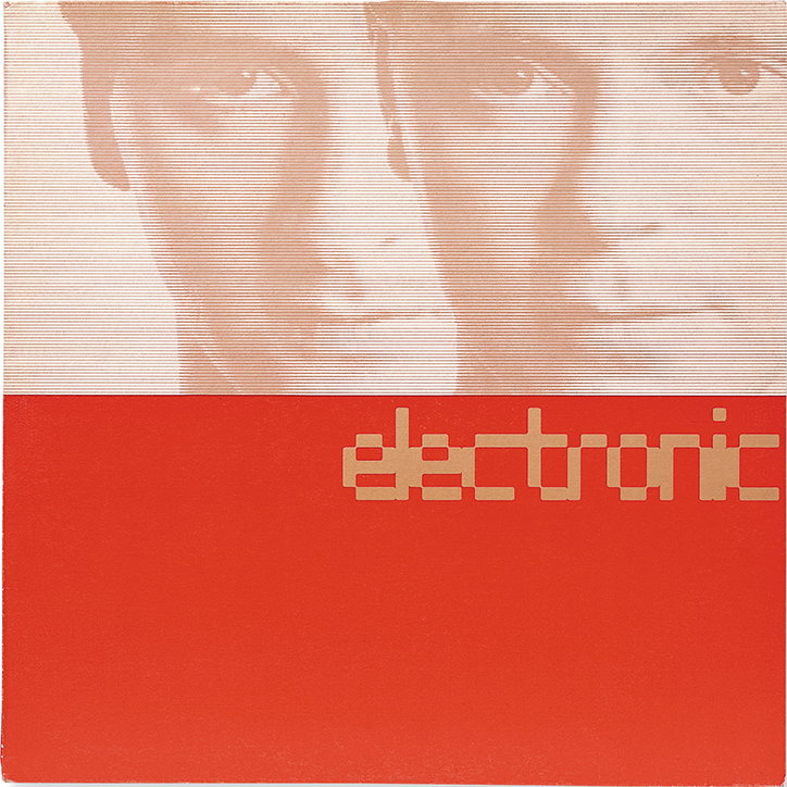
Design by Johnson Panas
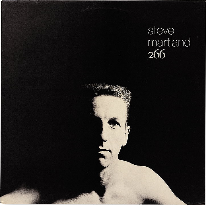
Design by PSA/Neville Brody
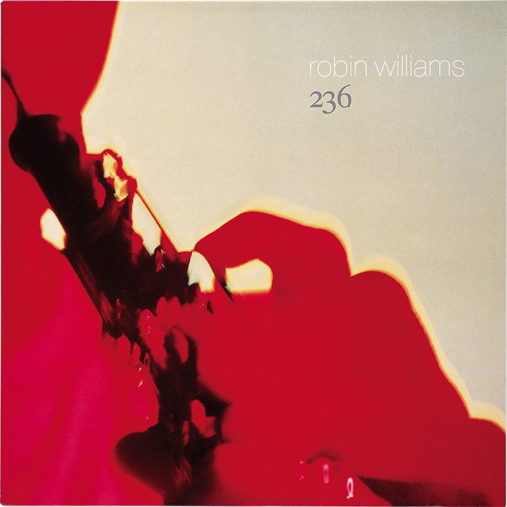
Design by PSA/Johnson Panas
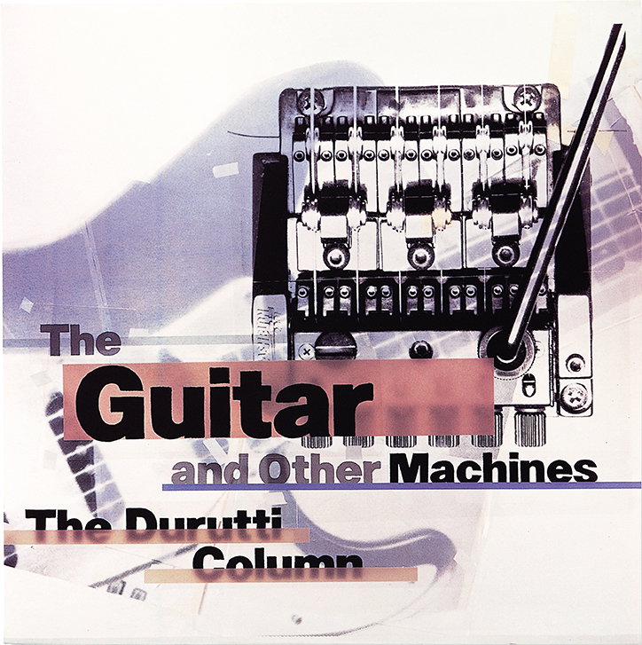
Design by 8vo
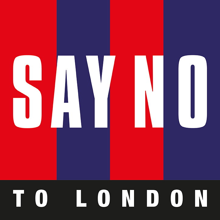
Design by Bailey Bros
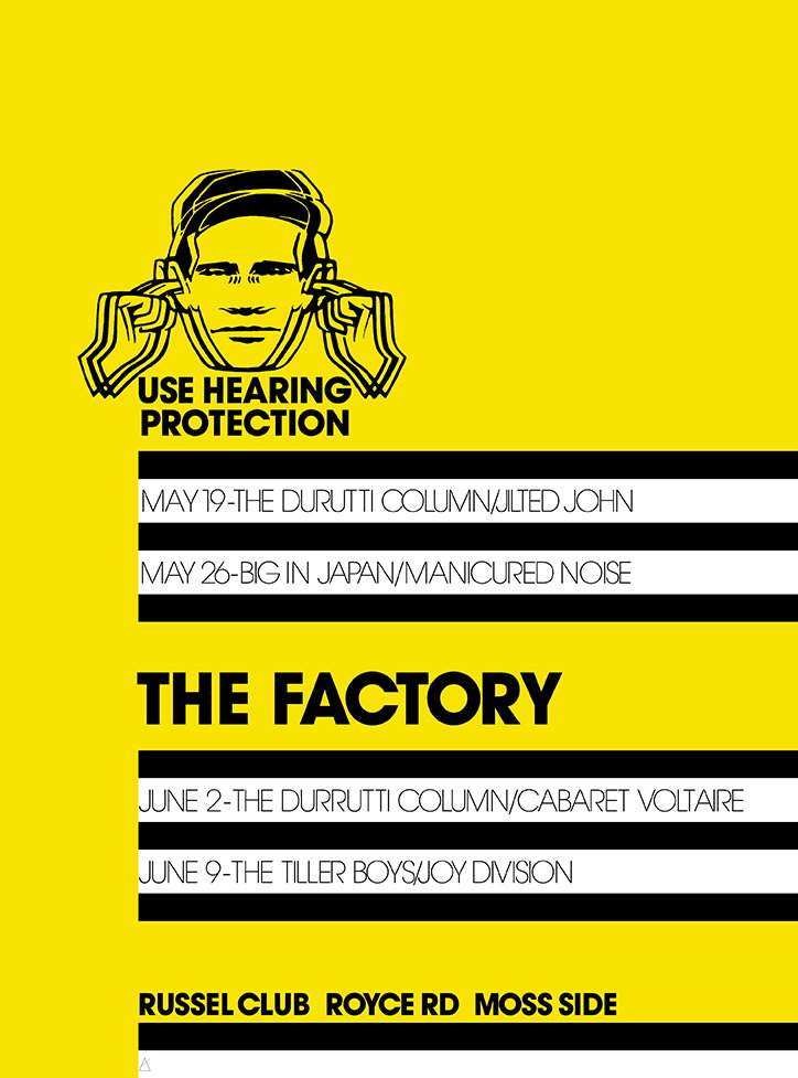
Design by Peter Saville
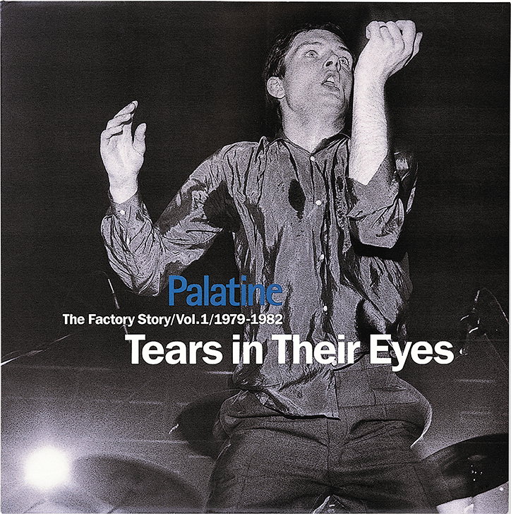
Design by John Macklin
Share Article
Further Info
About the Author
—
Charlie joined It’s Nice That as an editorial assistant in December 2019. He has previously worked at Monocle 24, and The Times following an MA in International Journalism at City University. If you have any ideas for stories and work to be featured then get in touch.