




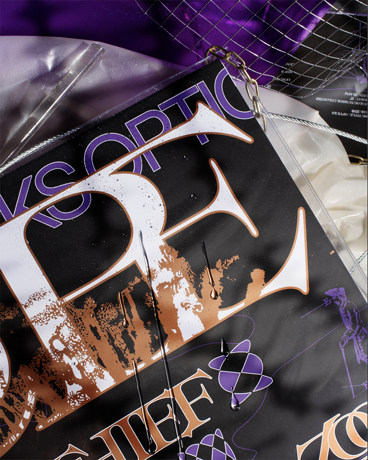
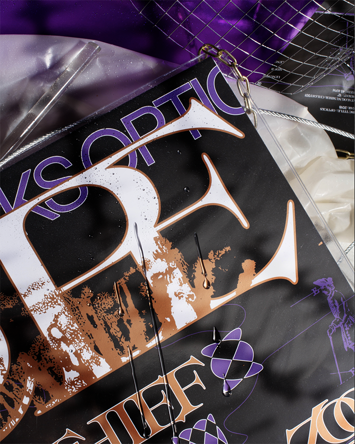
Syncope by Virgile Flores explores the duality between graphic design and music
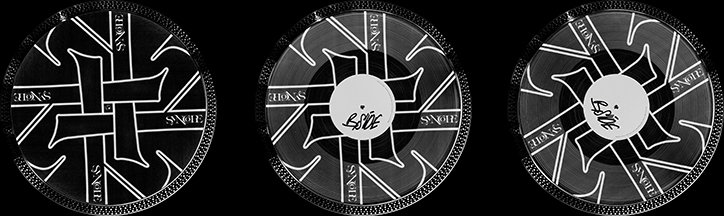
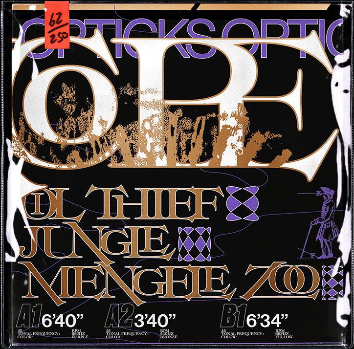
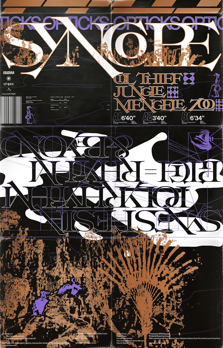
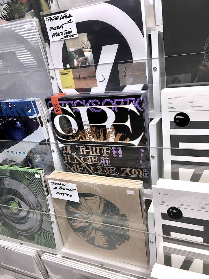
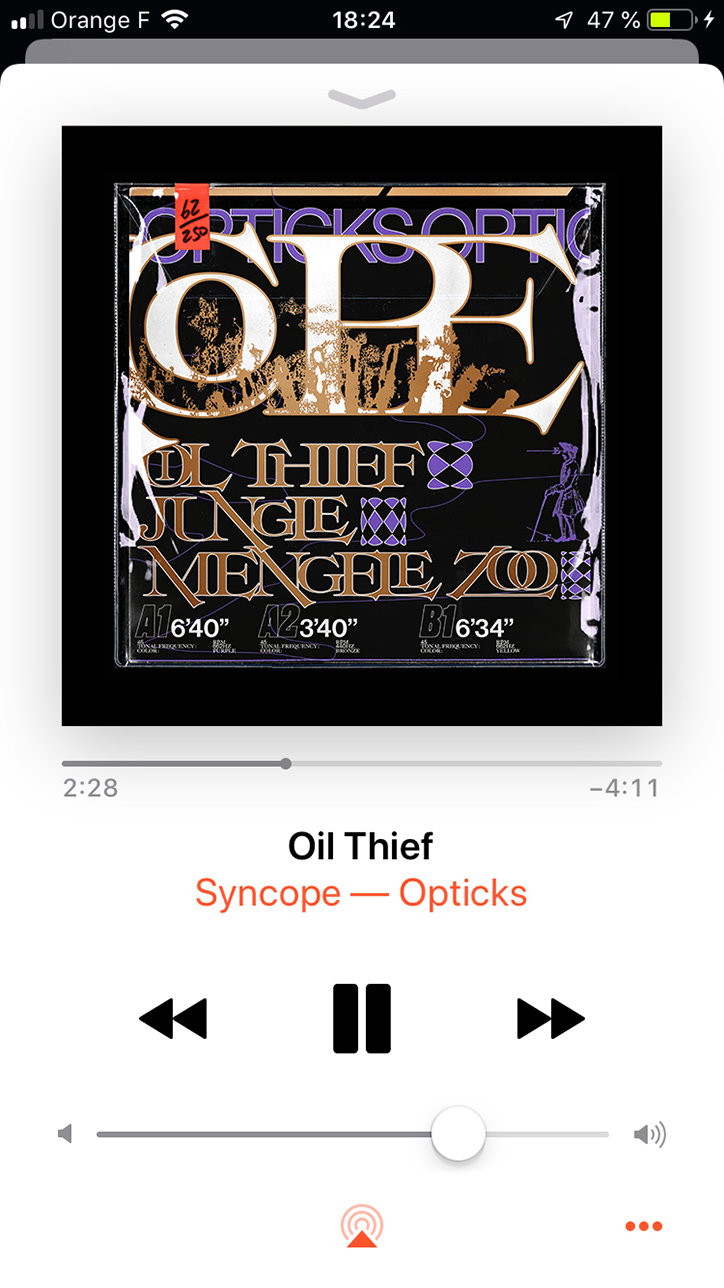
While studying for his diploma, graphic designer Virgile Flores started to notice similarities between how he approached his design work and the music he was making. “I always had in mind, like most graphic designers, to explore the relationship between sound and visuals, between music and graphic design,” he tells It’s Nice That. After spending a lot of time figuring out exactly how a project on this topic could come together, Virgile landed on Syncope, a vinyl and designed jacket which explores the relationship between the visual and the audible, inspired by Isaac Newton’s Opticks.
It was during his research into synesthesia at the beginning of the project that Virgile stumbled upon the treatise, which was the first of its kind to address the relationship between colour and sound. It dictates a theory by which every sound has its own colour. This discovery proved to be the starting point for the project, prompting an investigation into how he could use scientific and technological elements combined with visuals, gravitating around a musical piece, all channelled through a graphic approach.
In order to fully explore the topic, Virgile produced the music component of the project himself. A key concept throughout the work is duality – how two or more things exist alongside each other – something which is explored in the visuals through a contrast of colours, forms and typefaces. In the music, however, Virgile “explored the diversity of distinct yet related phenomena such as frequencies, colours, pitch and polyrhythms (off-grid beats).”
Virgile explains how his research into Opticks influenced the design of Syncope: “Each track has a tone, so each track has a note associated to it and each track of the EP has its own colour. Of course the point is not to have the most accurate colour possible, it is a scientific explanation yes, but still an interpretation. I also took elements from scientific illustrations, graphical elements gravitating around the project and drawings in the Opticks treatise. I’m not designing a solution but a proposal of a meta cover.” Once folded out, this “cover” becomes a poster, only furthering the concept of duality.
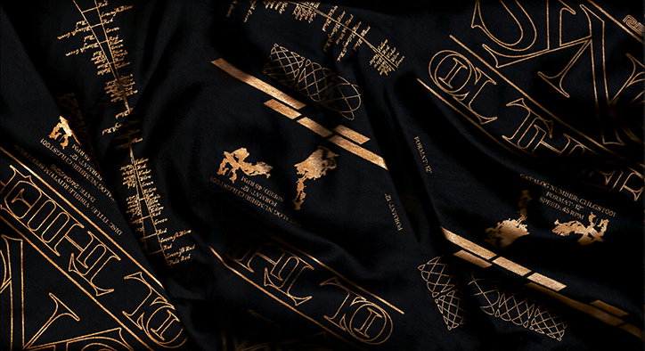
Ultimately, Syncope houses both a sonic and visual narrative and it’s through these two narratives that the relationship between the audio and the visual become clear. In every instance – the production of the music, Virgile’s design choices but also the format of the printed component and the several printing techniques used – the project embodies duality. Elements are interwoven and one thing cannot exist without the other.
Now that he’s finished his studies and is working full time, Virgile intends to continue working on Syncope and explains that it’s not a singular work but the name for “every project between music and graphic design I will be doing in the future”.

Virgile Flores: Syncope
Virgile Flores: Syncope
Virgile Flores: Syncope
Virgile Flores: Syncope
Virgile Flores: Syncope
Virgile Flores: Syncope
Virgile Flores: Syncope

Virgile Flores: Syncope
Share Article
Further Info
About the Author
—
Ruby is Senior Creative at It's Nice That, overseeing our visual output across platforms and projects. Before that, she was associate editor on the editorial team, after joining in September 2017 following graduation from Central Saint Martins.