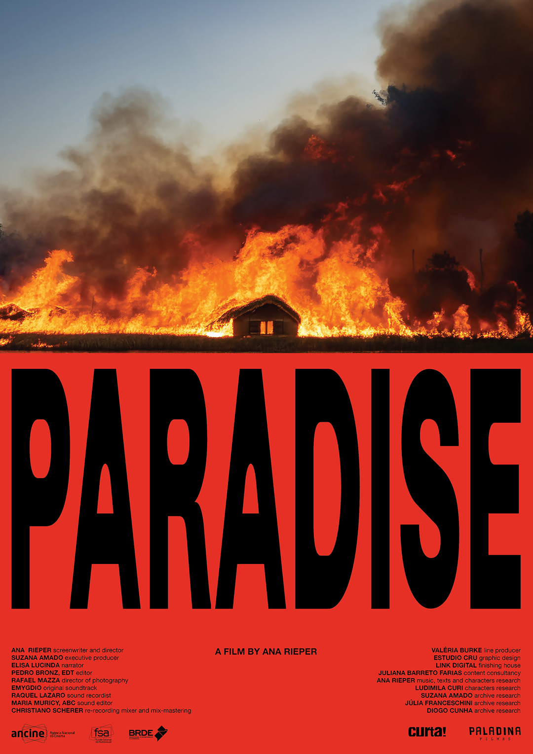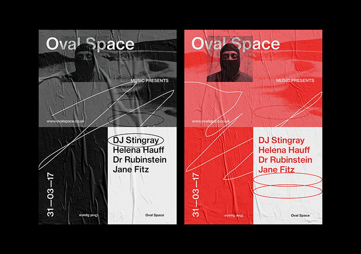
"People, places and feelings”: Yasseen Faik's design practice is inspired by the real world
“Art is somewhere I take a lot of inspiration from. My grandmother was a painter,” explains London-based designer Yasseen Faik. “Before I went to university, I was reading books about various periods of contemporary art, from which I found a lot of inspiration visually and in the way of creative thinking.” With movements such as modernism, post-modernism, abstract expressionism, surrealism, minimalism, pop art and hyperrealism emerging as firm interests from his childhood of painting, it was upon starting his foundation course at Camberwell College of Arts that Yasseen began to focus on graphic design.
“I’ve always been interested in art and design growing up but didn’t quite understand the application of art in a commercial context,” he recalls, “it wasn’t until I attended Camberwell College of Arts in 2010 that I fell in love with typography, the form of the letter and the fundamental underlying structure of a grid; all the pieces started coming together.”
Yasseen’s body of work now largely consists of printed material, its content informed by the middle ground between abstract art and clean, functional design. This connection was particularly clear in the exhibition he organised KK Outlet last April (2017). Titled For Iraq and Syria, it asked designers to create a poster to raise awareness about countries in crisis. In turn, demonstrating how the medium of graphic design can be used to communicate the kinds of messages the art world does on a regular basis.
Yasseen has also garnered a set of impressive skills from his more commercial work. Initially from his position at Crack Magazine as lead designer alongside its creative director Alfie Allen in Bristol and, later, from his role as a full-time freelance designer at Tate Design Studio in London. “This opportunity was nothing short of fantastic,” he describes of the two placements, “I quickly learned how to work under strict brand guidelines and deal with multiple opinions.” Now, with a greater understanding of both ends of the cultural spectrum, Yasseen is working as a freelance designer of a variety of “exciting print-based projects from my South London studio.”
With a client list including Boiler Room, Oval Space and a host of independent musicians and DJs, Yasseen’s portfolio demonstrates his love of music, a medium which “has always gone hand-in-hand with design” for him. Visually, his designs experiment with organic and analogue textures, as well as expressive forms, shapes and colour; with typography often taking centre stage.
“I find it imperative to take inspiration from all around you, real-world situations, people, places and feelings,” he explains of what influences his raw and sometimes gritty aesthetic. “It’s so easy to go on the internet and look at design blogs but this approach to finding inspiration is quite insular. Inspiration needs to come from beyond the world of graphic design.”
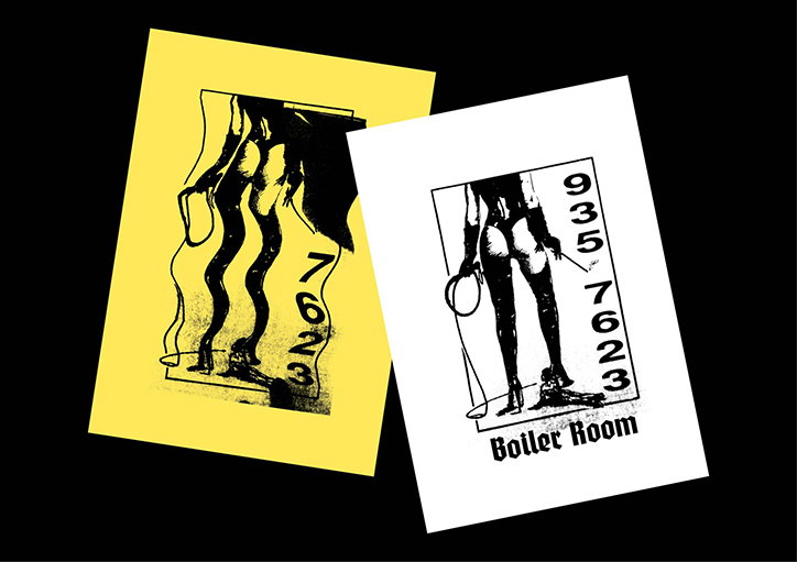
Yasseen Faik: Boiler Room
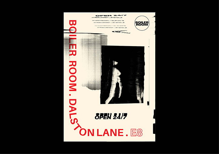
Yasseen Faik: Boiler Room
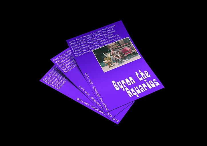
Yasseen Faik: Byron the Aquarius
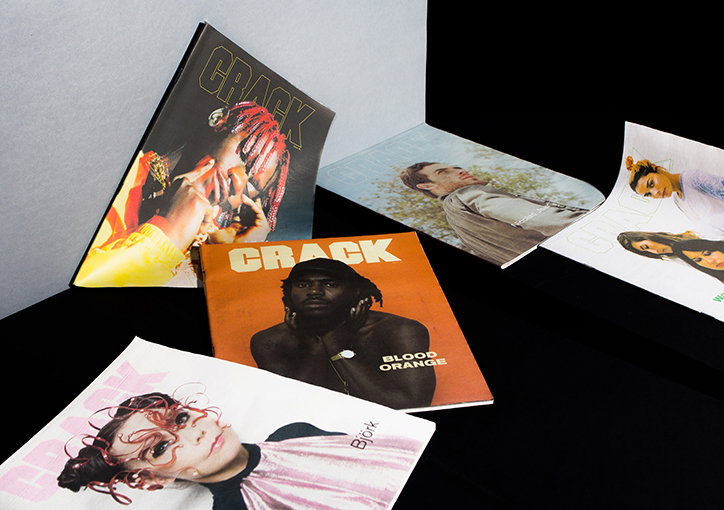
Yasseen Faik: Crack Magazine
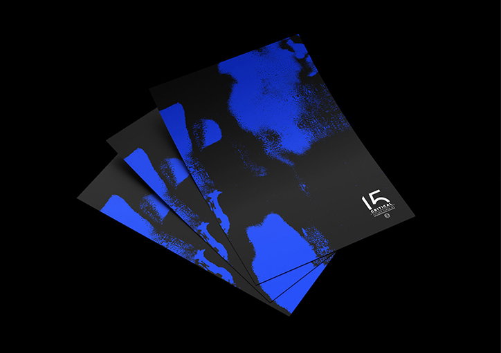
Yasseen Faik: Critical Records

Yasseen Faik: DJ Bone
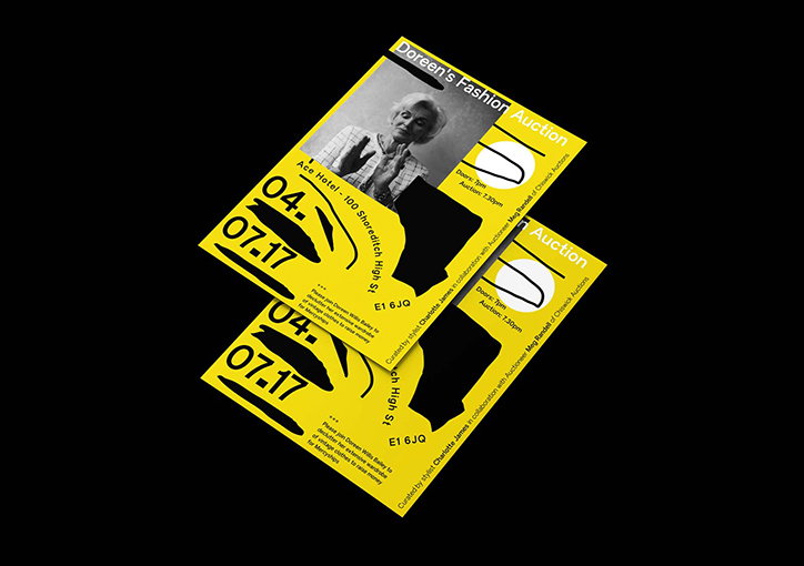
Yasseen Faik: Doreen’s Fashion Auction
Yasseen Faik: For Iraq and Syria
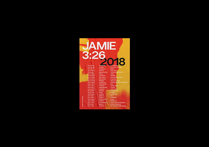
Yasseen Faik: Jamie 326
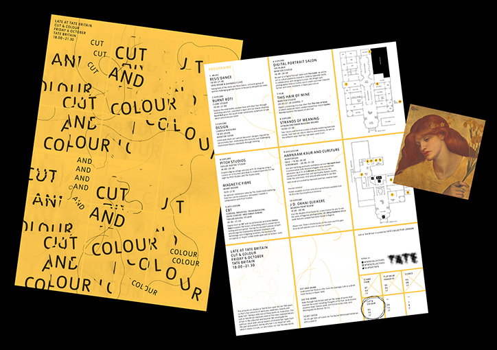
Yasseen Faik: Late at Tate
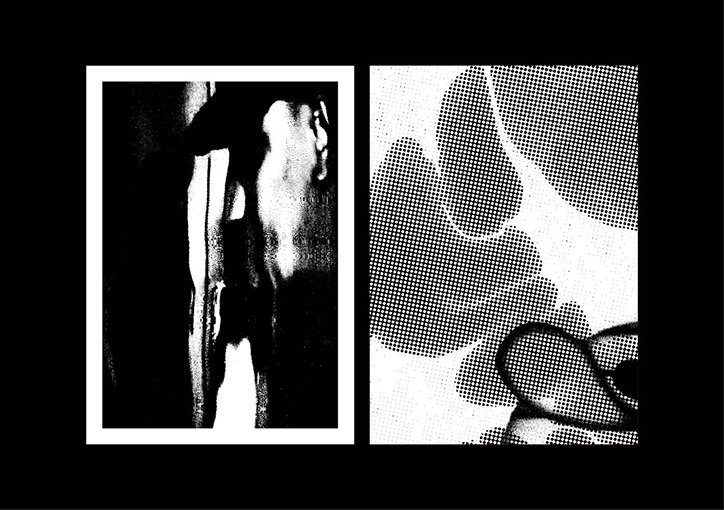
Yasseen Faik
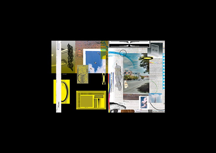
Yasseen Faik
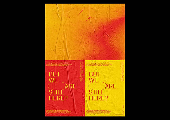
Yasseen Faik: Tate Exchange
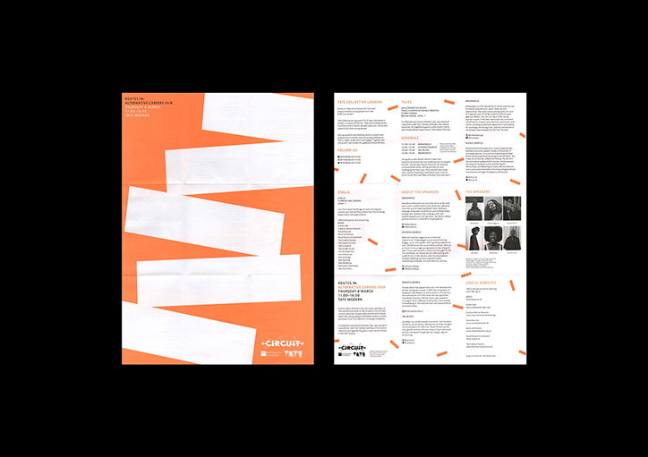
Yasseen Faik: Tate
Share Article
Further Info
About the Author
—
Ruby is Senior Creative at It's Nice That, overseeing our visual output across platforms and projects. Before that, she was associate editor on the editorial team, after joining in September 2017 following graduation from Central Saint Martins.