- Words
- It's Nice That
- —
- Date
- 20 February 2018
- Tags
Bráulio Amado and Jordy van den Nieuwendijk co-design a Carnival-inspired Dropbox poster
Share
Share
In partnership with

Dropbox Paper is a collaborative workspace that eliminates distractions that get in the way of creativity.
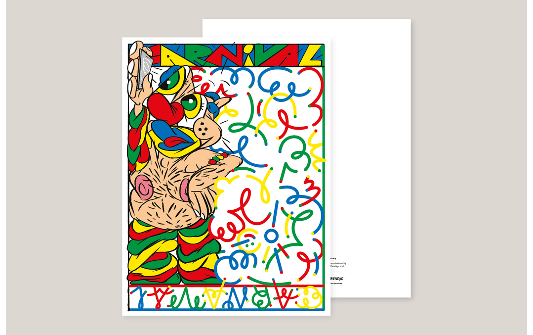
This month, two overtly distinctive and equally respected creatives worked together – for the first time – on our Dropbox collaborative poster, and the results are as fizzing with energy as you might expect. Given the simple brief to depict February, illustrators Bráulio Amado and Jordy van den Nieuwendijk chose to focus on Carnival, with each creative bringing their own signature style together in a clever way that means each Nicer Tuesdays attendee will get two posters in one. The final print will be given away to every Nicer Tuesdays attendee on 20 February.
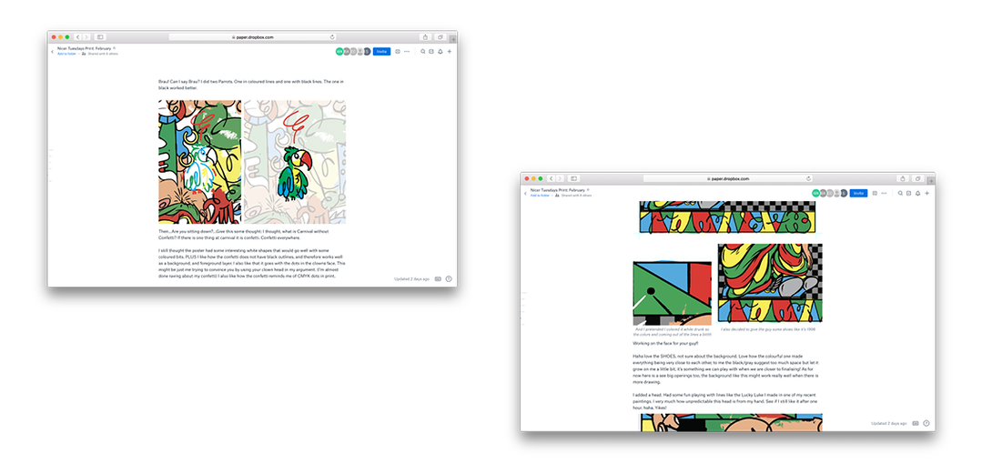
Working collaboratively via Dropbox Paper, the two quickly agreed on the Carnival theme and its inherent potential. “Shall we go nuts on compositions and colour palettes?” asked Jordy. You can guess the answer to that question. “It would be fun to do a bunch of people in weird costumes, some by me, some by you, the end product being a Carnival mosh pit,” said Bráulio.
The duo then explored how people in their home countries of Portugal and the Netherlands celebrate Carnival. Bráulio referred to the oversized heads of Cabeçudos and the Caretos characters, masked young men dressed in suits made of yellow, red, black, blue and green fringe wool quilts, wearing brass, leather or wooden masks and rattles in their belts. “They appear in groups from every corner of the village running and shouting excitedly, frightening the people and “robbing” all the wineries,” Bráulio explained.
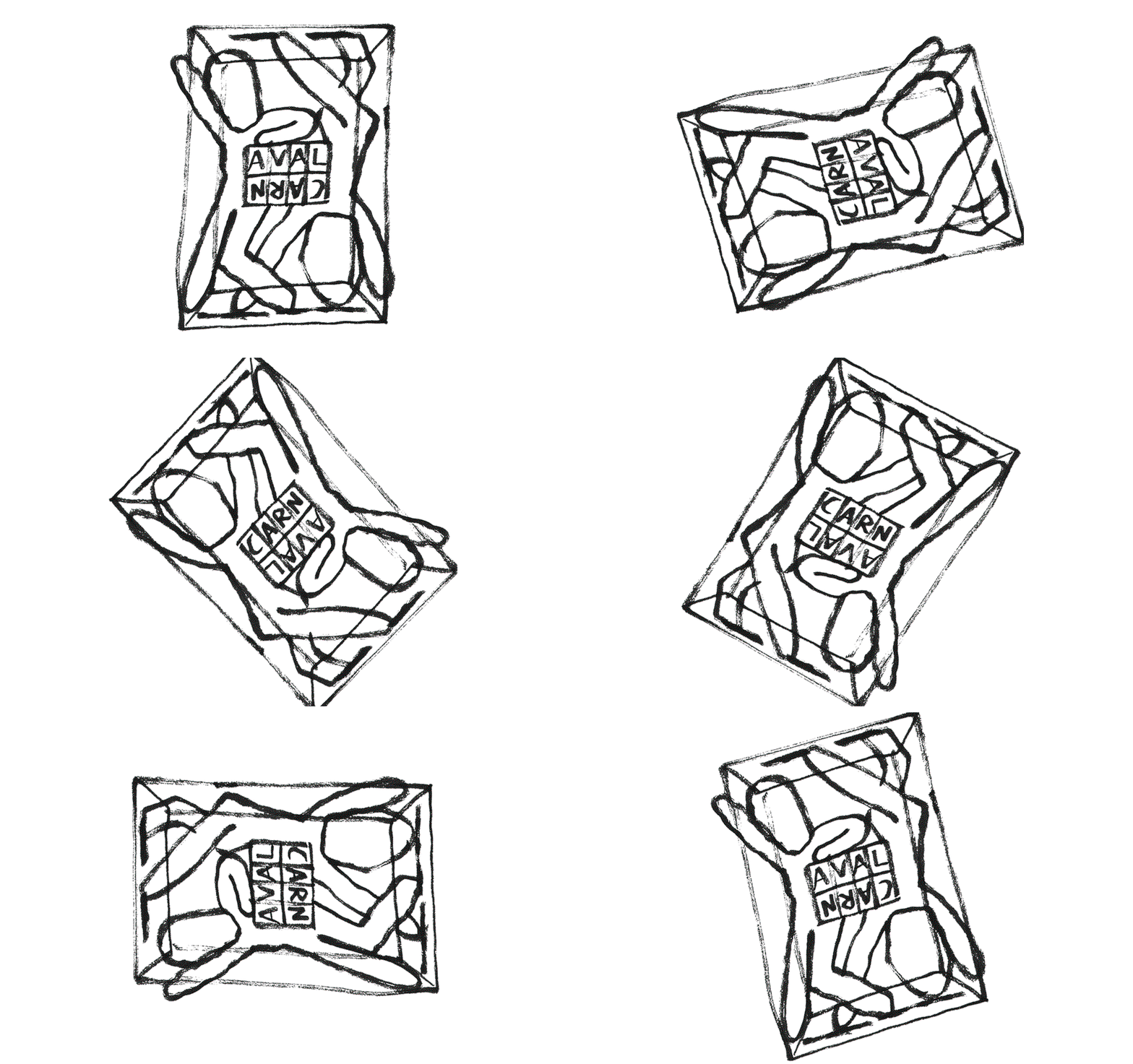
Meanwhile Jordy’s research focused on masks, already a point of inspiration for his work. “As a kid it was incredible to see Bruce Wayne putting on his mask, changing him into Batman. Also, Jim Carrey in The Mask! Nowadays, as I guess I grew up, I am more into traditional African masks, the Bauhaus, the works of Walter Van Beirendonck and the Parade drawings by David Hockney.”
Looking for an approach that could combine their two different aesthetic styles, Bráulio and Jordy discussed the idea of a kind-of illustration chess game, where each would draw a head of a character and the other would complete its body. “So in a way it’s us, with each-others’ masks, celebrating, performing, having great fun, collaborating. We celebrate the way we draw, working together,” said Jordy.
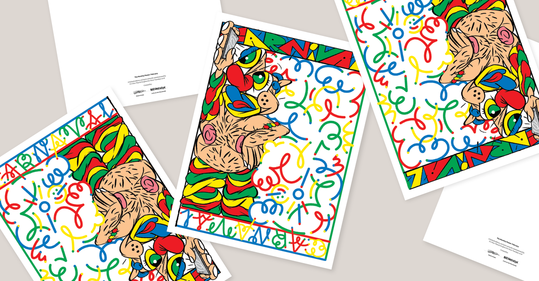
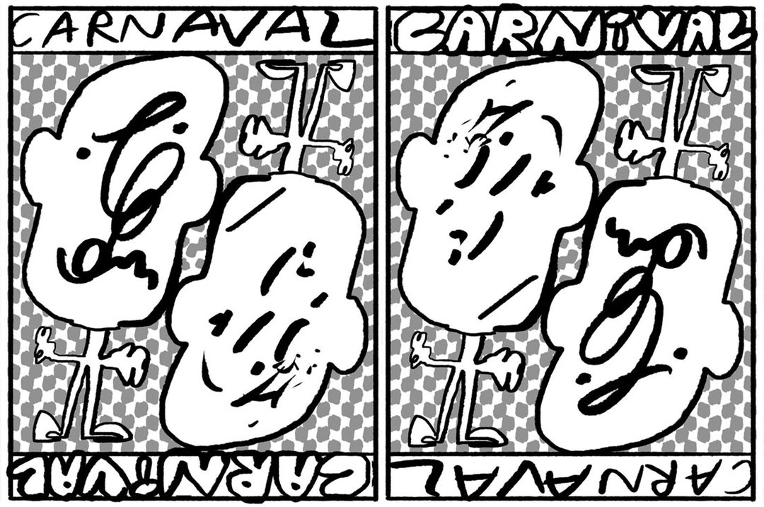
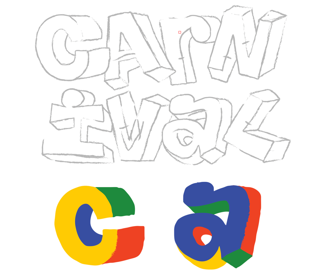
“What if we push the concept of the duo/collaboration to the way people will look at the poster itself,” asked Bráulio, “like two posters in one.” Hence the idea of a two-way poster was born. Like a playing card, each of Bráulio and Jordy’s characters would inhabit the same frame but vertically opposite one another. This is announced by a double-ended typographic border, with “Carnival” heading up Bráulio’s side, and “Carnaval” (the alternative spelling) topping Jordy’s side. Each creative has created their own typography too, in tune with their own illustration style.
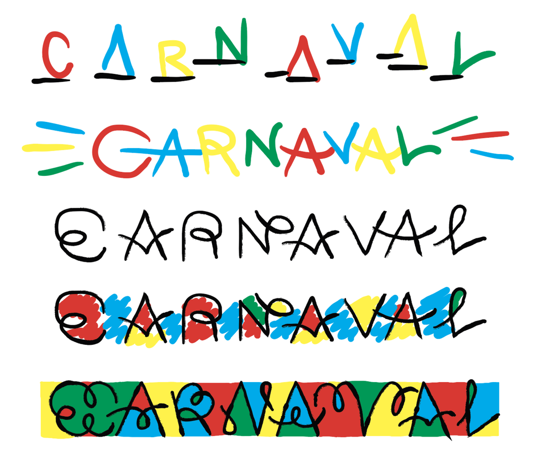
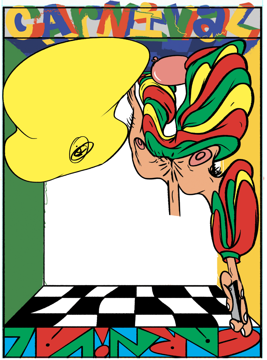
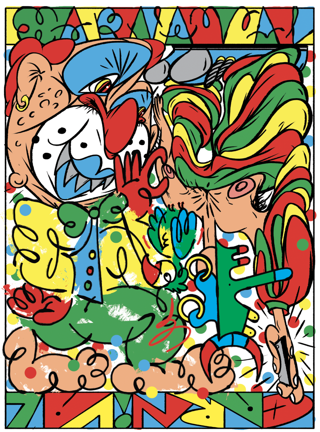
As promised, the colours are vivid as vivid can be. In fact, the two designers appeared to be besting each other in the colour stakes at one point of the discussion. “The colours you are using are Poppin’!” said Jordy. “To be fair they made the colours I used look a bit under-saturated. Like my colours are washed with brand X and yours with some fancy soap.” So Jordy upped his game and the final piece is vibrant from both perspectives.
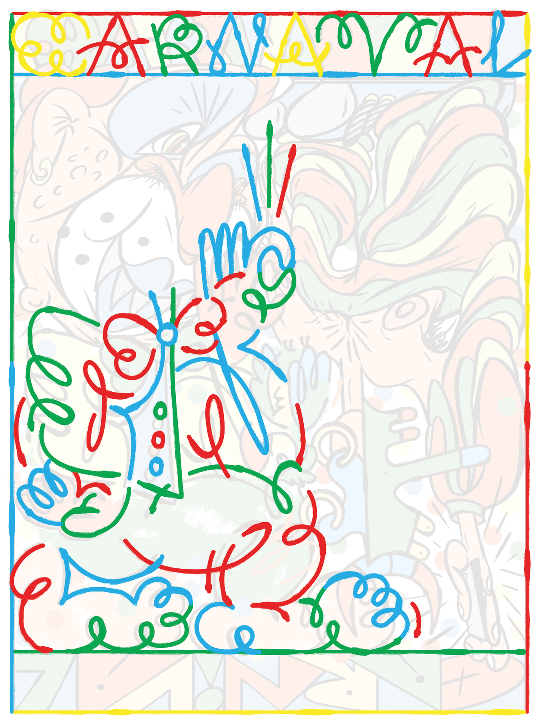
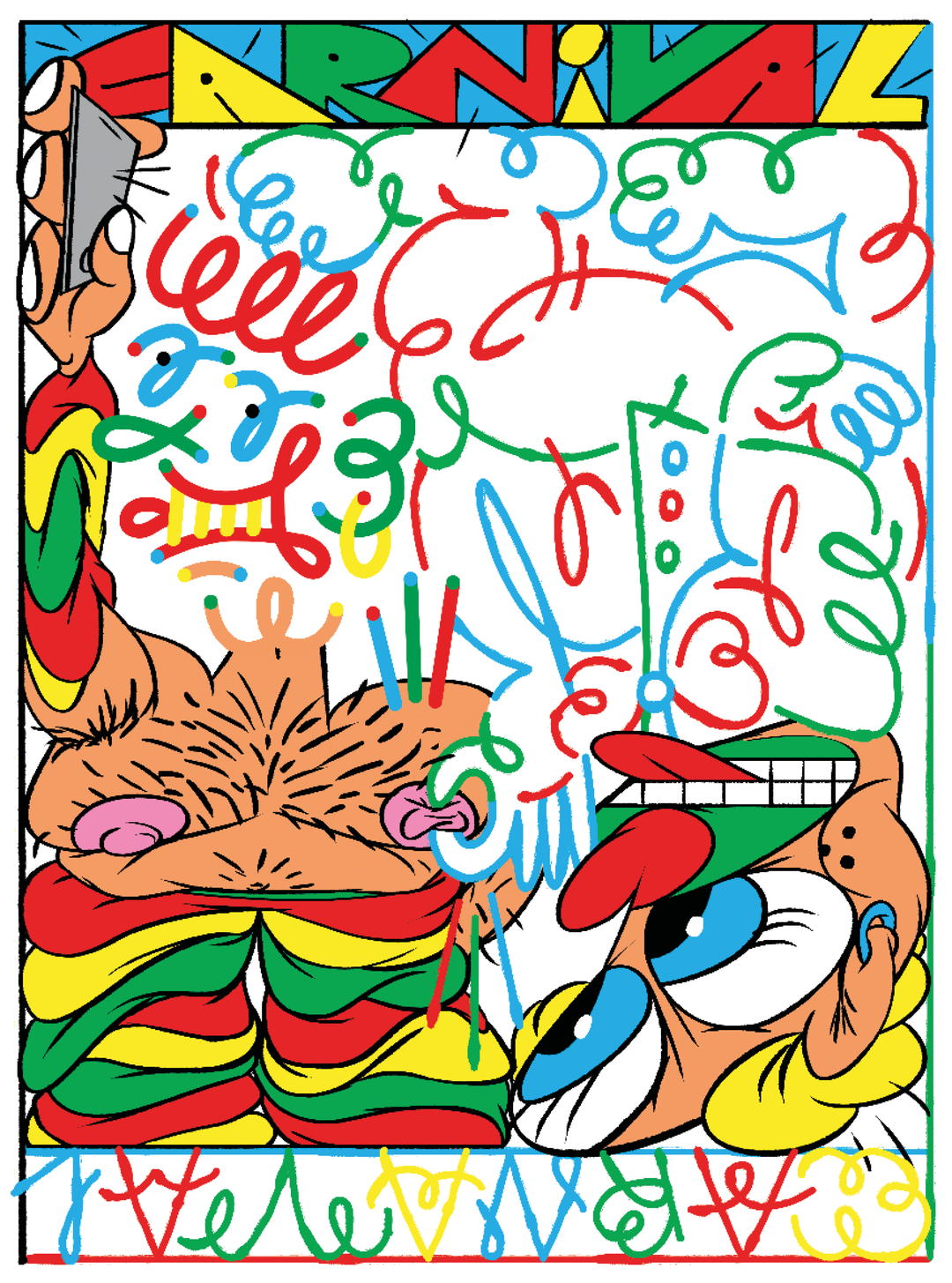
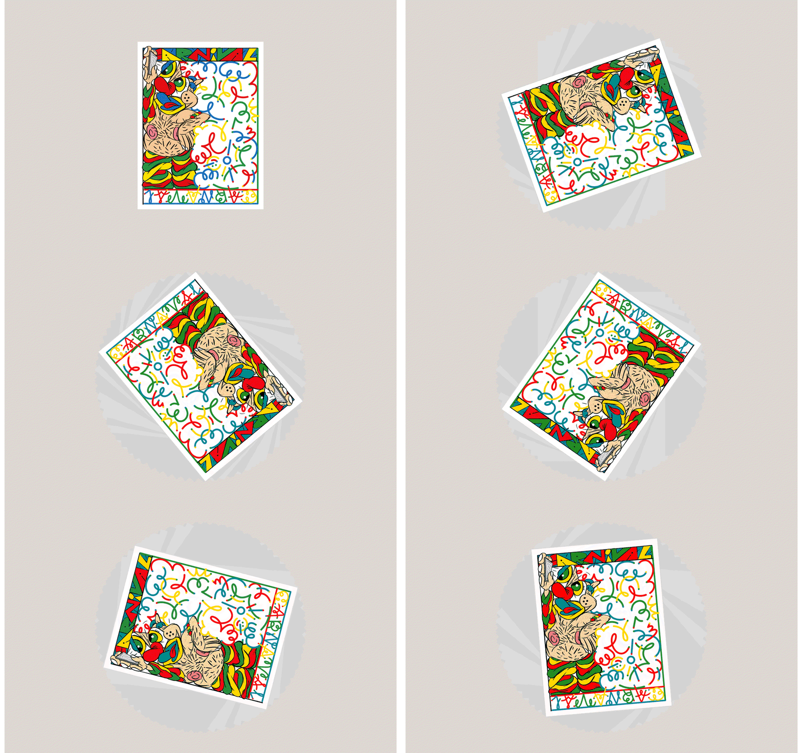
On Bráulio’s half of the composition lies a topless, hairy-chested clown, wearing baggy trousers and beads in red, green and yellow, eyes bulging towards his phone. On Jordy’s side is a more abstract, smiley-faced character, illustrated in the artist’s idiosyncratic, primary coloured, line-drawn style. The two squash together filling every crevice of the composition, as if bursting from the page. In their highly individual way, Bráulio and Jordy have brought the spirit of Carnival to print.
Dropbox Paper is a collaborative workspace that eliminates distractions that get in the way of creativity. Because you can work with all types of content – from video, to sound to code – in Paper, you and your collaborators can easily edit and discuss all aspects of your project in one centralised place.
Share Article
Further Info
About the Author
—
This article was written by the It’s Nice That team. To find our editors and writers, please head over to our Contact page.