- Words
- It's Nice That
- —
- Date
- 27 March 2018
- Tags
Anna Kövecses and Marion Deuchars depict springtime and women's solidarity for our Dropbox poster
Share
Share
In partnership with

Dropbox Paper is a collaborative workspace that eliminates distractions that get in the way of creativity.
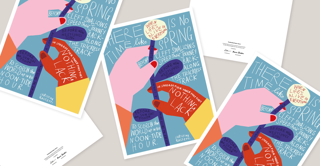
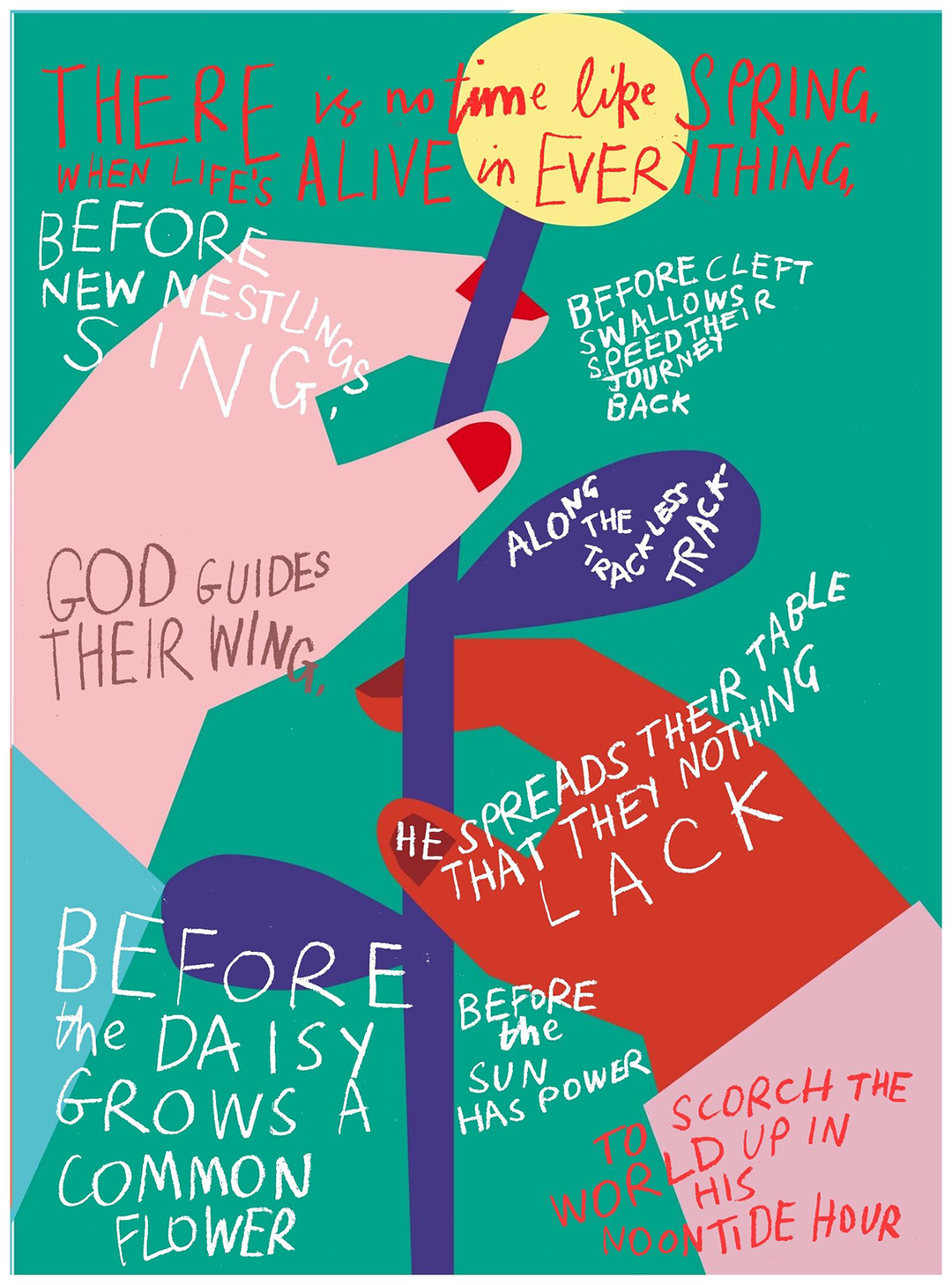
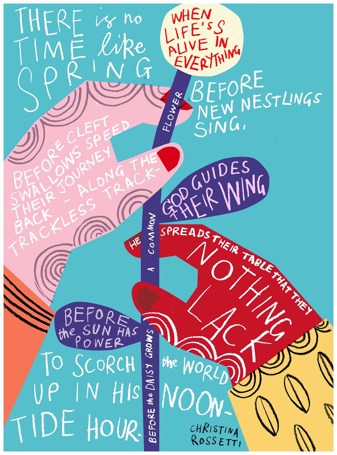
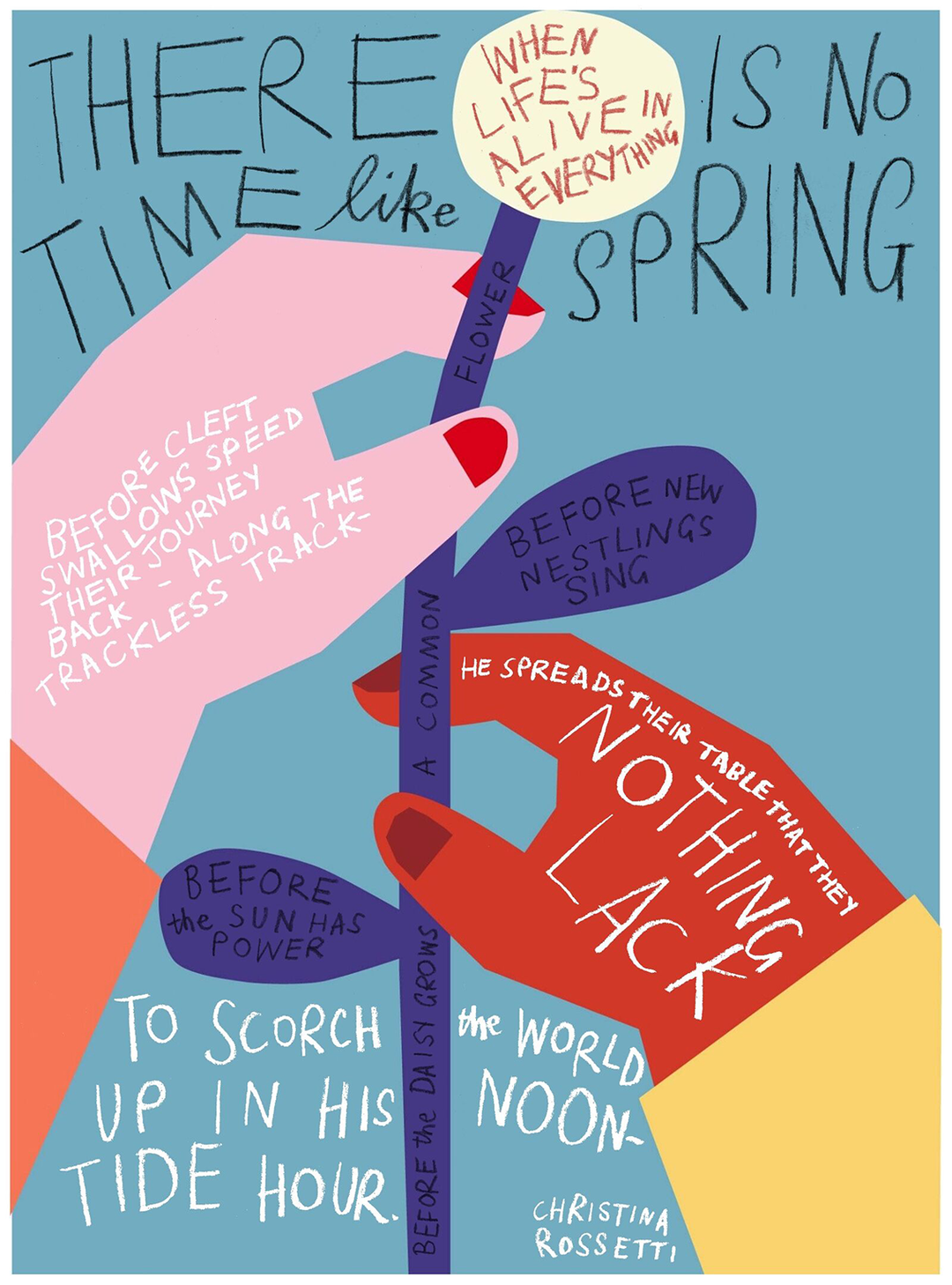
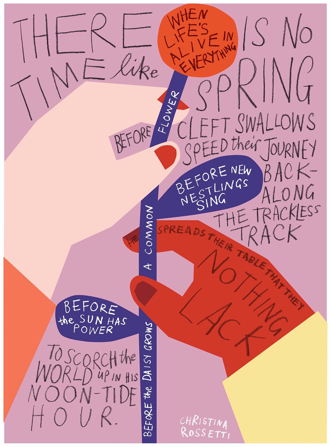
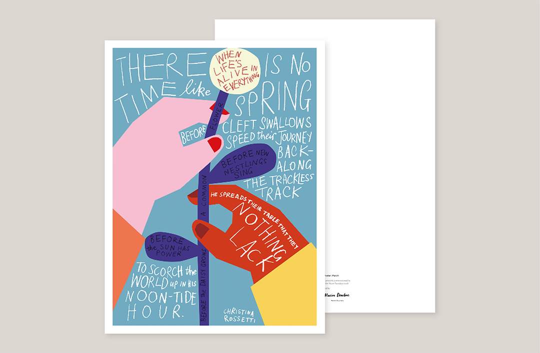
For illustrators Marion Deuchars and Anna Kövecses, the month of March marks two significant events: the arrival of spring, and International Women’s Day. So for their collaborative poster, commissioned by Dropbox and It’s Nice That, the pair elected to channel both themes in one vibrant and poignant image. The collaboration evolved entirely over the platform of Dropbox Paper, and will be printed and given out at Nicer Tuesdays in March.
From the themes of women’s day and spring, Anna describes the words that immediately came to mind – "motherhood, sisterhood, nurturing, birth, growth, new life, metamorphosis". From the outset, it was important to both illustrators that the poster wasn’t “just pretty to look at,” Anna says, but also carried a story, “like a page torn out of a book” featuring a poem or haiku. Marion concurred, and the two began to hash out the idea, sharing sketches, reference imagery, and colour studies. Marion shared some photos of women’s march posters from around the world, commenting: “I like all the hand drawn posters in different languages,” and again linking the themes of hope and optimism with the feeling of springtime.
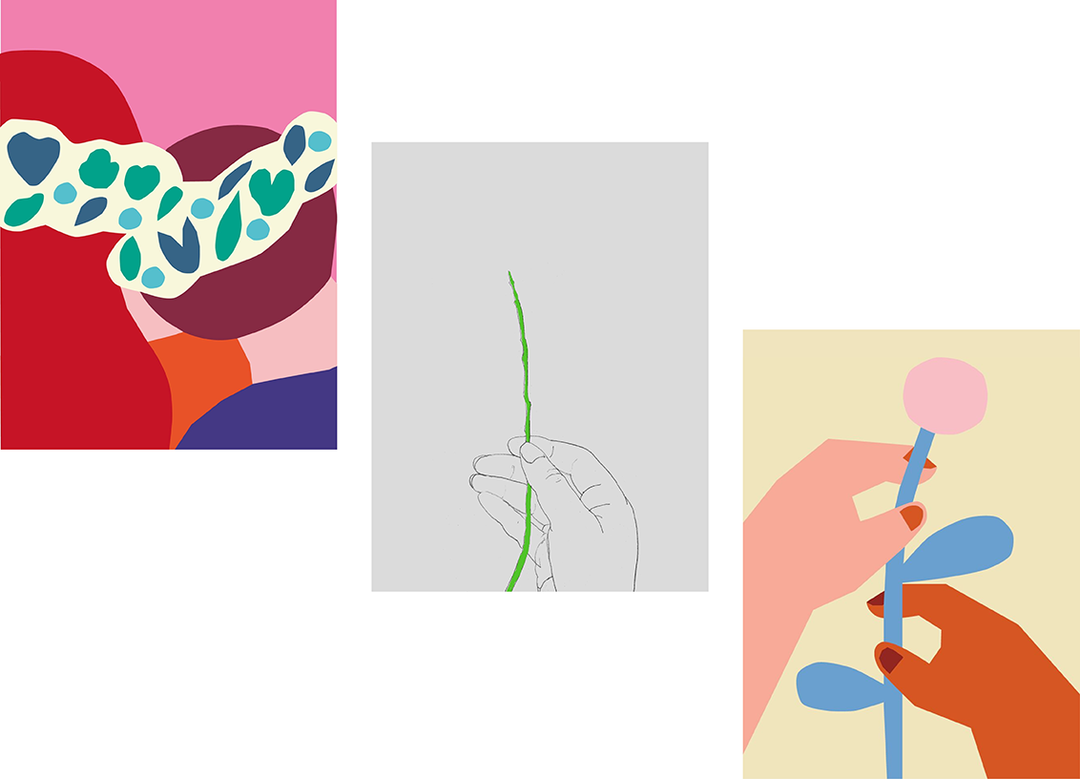
Though based in different countries, Hungarian-born Anna in Cyprus and Scottish-born Marion in London, the two creatives found common ground in nature. “I feel like I’ve connected with nature more recently as we have a new addition to our family, a dog called Pip,” shared Marion. “I’ve been going on long country walks with him and can’t believe how much I’ve been missing in terms of how the landscape, colour and plants change with the seasons. Pretty unsurprising maybe! But living in London can be all consuming you barely notice those changes. So for me spring is about change, optimism, colour, new growth, new beginnings, hope.”
“I think it’s so interesting that even though we (humans) are a product of nature, recently we’ve become very much detached from it,” echoed Anna. “I grew up in a tiny secluded mountain village in Hungary where people were completely dependent on nature. Animals, plants and humans lived together in perfect harmony for hundreds of years. I find myself longing back to that place.” In her research, Anna came across spring celebrations around the world, many of which she found centred around flowers and the concept of reconnecting with nature at a time of change. She also found inspiration in Marion’s images of women’s protests that showed solidarity, unity and strength in numbers. After much discussion and thought-sharing on the Paper platform, Anna landed on a potential visual link: hands holding flowers in a community of women.
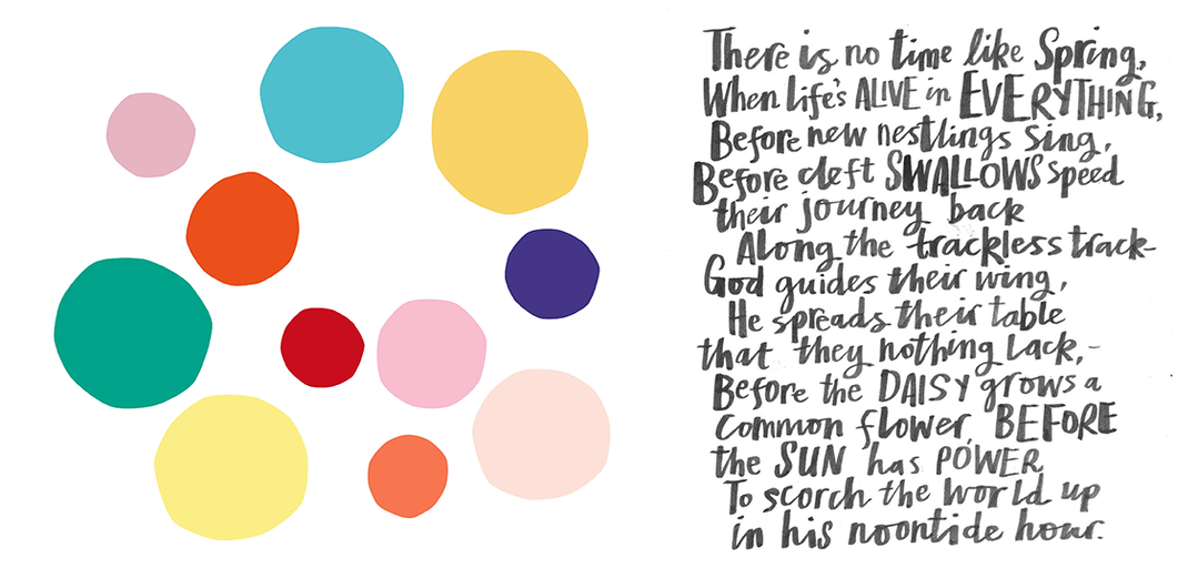
From this epiphany came the first iteration of the final poster, an image of two hands holding a single flower, illustrated by Anna in her signature style using bold block colours and cut-out shapes. Marion then responded “I feel that image is just asking for some lettering” and shared her latest research into literature for the piece, a poem by English writer Christina Rossetti. Transcribing the poem in full, the verse that emerged most prominent for Marion reads: “There is no time like Spring, Like Spring that passes by; There is no life like Spring-life born to die, Piercing the sod, Clothing the uncouth clod, Hatched in the nest, Fledged on the windy bough, Strong on the wing: There is no time like Spring that passes by, Now newly born, and now, Hastening to die.”
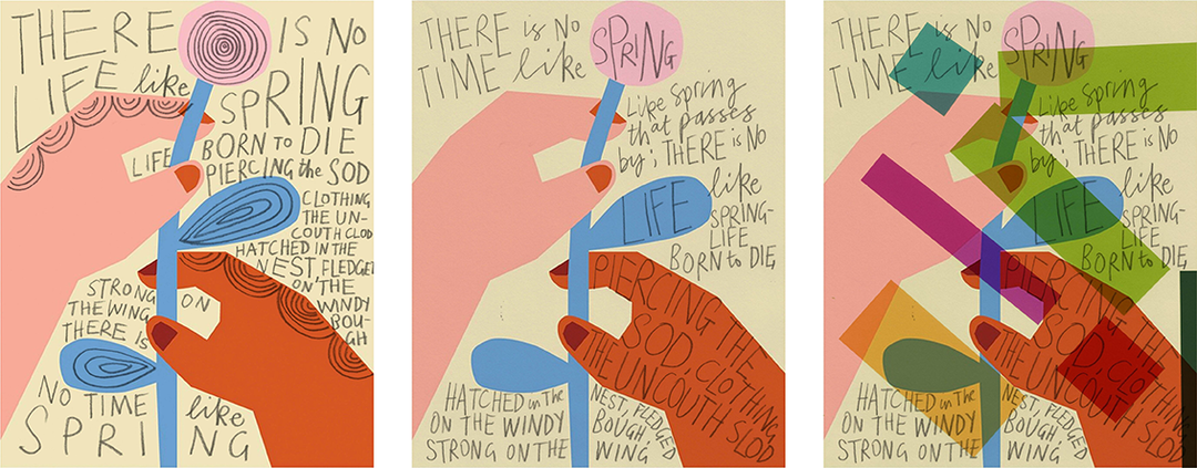
Marion also shared observational drawings by the Spanish sculptor Eduardo Chillida, which she believed could influence their approach to the “delicate holding of nature” and began overlaying her recognisable hand-drawn type on Anna’s clean, graphical illustrations, to which Anna responded “Marion, you should draw on all of my work!” Marion also tried deconstructing the original image to “add an edge or unpredictability, so it’s not too ‘spring pretty,’” she described. “Spring is more of a positive time than negative, but it can also show the cruelty of life, in the living/dying cycle.” She therefore used graphite, thinking painted lettering looked “too sweet” and suggested bolder colours. Anna responded with colours inspired by crisp clear skies, blossoming trees, “fresh pale colours with a touch of cold”.
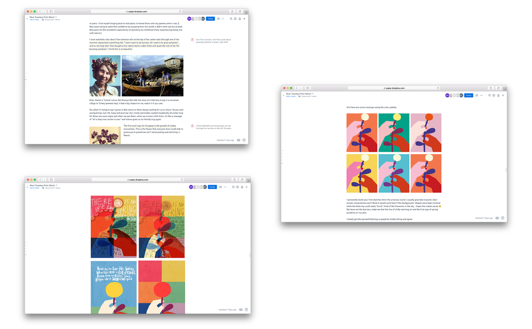
From there, the development of the poster snowballed. The two agreed the background should remain minimal, and the text should “burst” from the page, using larger letters that fill the negative space. After many iterations, they landed on their favourite palette of colours and composition of letters and imagery.
Looking back on the project, Anna says she feels the piece “perfectly encompasses everything we wanted to tell about March – the beginning of spring, the appreciation of new life after winter, as well as the celebration of women, our rights, our community, our dreams and our common goals. I think that the harmonious merging of our different artistic styles echoes these messages perfectly.”
On collaborating with Marion, she also comments that the initial research phase was her highlight, where the two shared thoughts, references and ideas. “I loved this back and forth patterned conversation, it was such a refreshing creative experience compared to my usual routine of solitary work.”
Marion says that collaborating over the Dropbox Paper platform “encouraged a nice playfulness of dropping in random thoughts and images to stimulate ideas… and a great way to keep a record of a project.” On working with Anna, she says the initial image was so well balanced, "I didn’t want to really change any of it… and made it an inviting image for me to work on.
“I felt our two styles complemented each other nicely,” Marion concludes. “The final piece is a celebration of spring, womanhood, connections, solidarity and bonding. I like its strong political poster on a what may be considered ‘soft’ subject matter. The delicate holding and supporting of the flower has such an immediate emotional response.”
Dropbox Paper is a collaborative workspace that eliminates distractions that get in the way of creativity. Because you can work with all types of content – from video, to sound to code – in Paper, you and your collaborators can easily edit and discuss all aspects of your project in one centralised place.
Share Article
Further Info
About the Author
—
This article was written by the It’s Nice That team. To find our editors and writers, please head over to our Contact page.