- Words
- It's Nice That
- —
- Date
- 29 May 2018
- Tags
Nadia Hernández and Carlín Díaz fuse their characters, forms and colours in a poster celebrating workers
Share
Share
In partnership with

Dropbox Paper is a collaborative workspace that eliminates distractions that get in the way of creativity.
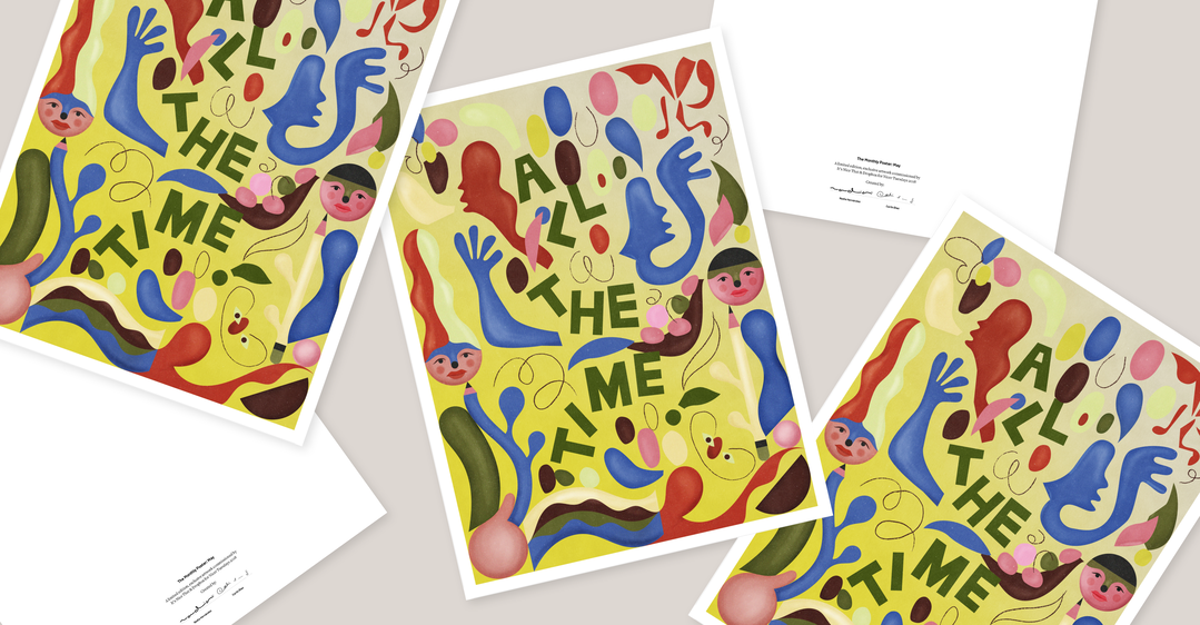
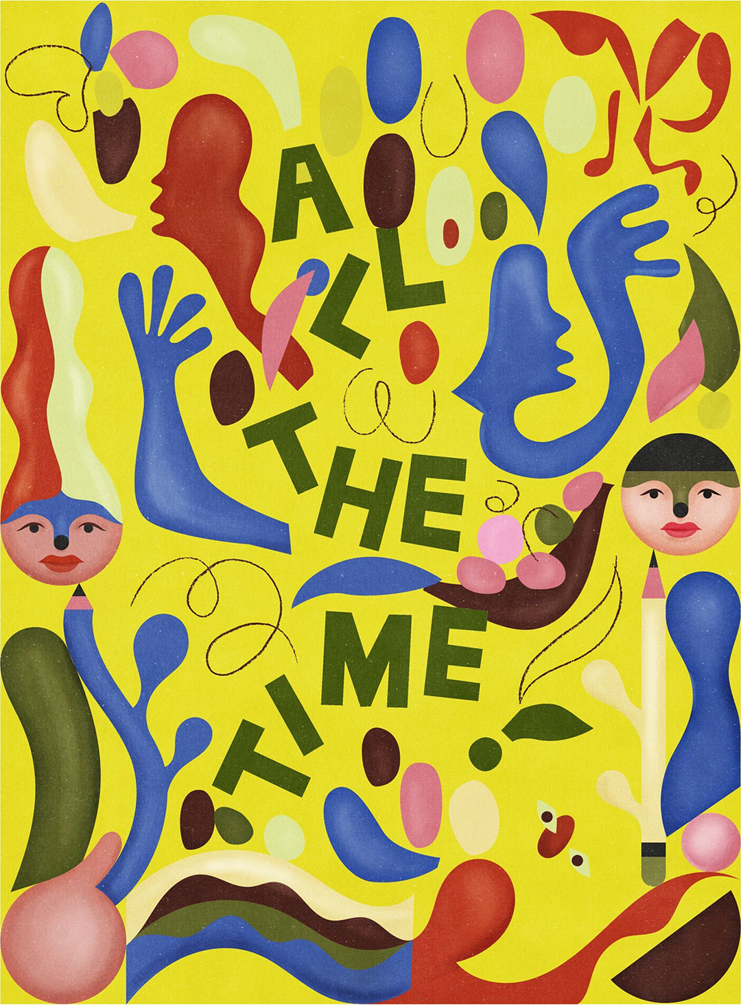
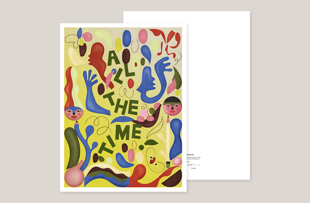
Two Venezuelans, one in Paris, one in Melbourne, met across Dropbox Paper this month to co-create an exuberant poster, fusing their complementary creative techniques. Nadia Hernández brought along her paper-cut, folklore-inspired shapes and type; Carlín Díaz brought his charming, textural characters and forms. The final poster will be given out to every Nicer Tuesdays attendee on 29 May, and here, we share a behind-the-scenes look at their collaborative process.
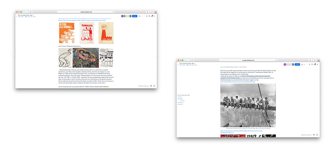
Given the simple brief to focus on May, the two designers settled on visually celebrating International Workers’ Day, to “pay homage to creatives like us that are thinking about ideas all the time, working, even when we’re at the beach!” said Carlín. Nadia looked into the day’s origins and liked “its focus on social justice, protest, fairness, peace and recognition of the working classes,” referencing the typography of protest banners and “the graphic genius of Atetlier Populaire… and of course, El Maestro Diego Rivera.”
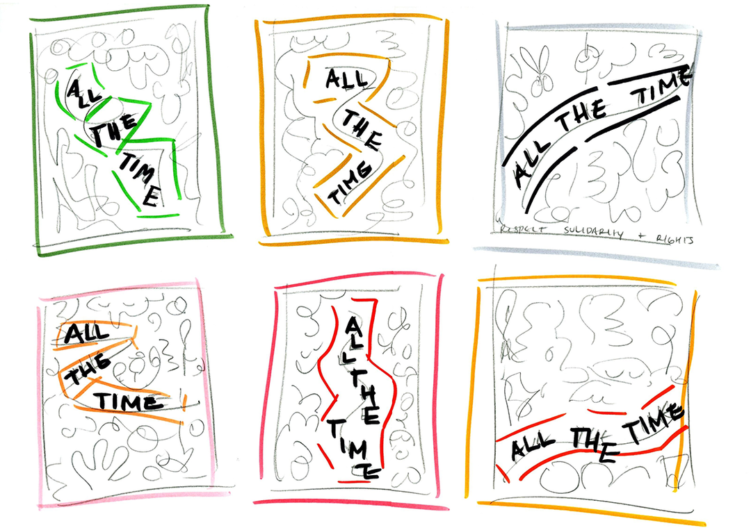
From this, an idea took root: to explore the legacy of workers, but also in a more personal slant for the illustrators, to depict the omnipresent work ethic of a creative. “I keep thinking about what you said about how hard it is to switch off as a creative practitioner,” Nadia continued, “your ideas and thoughts constantly orbiting. Maybe our collaboration can be a beautiful homage to this, a composition of multiple human forms, anthropomorphised ‘tools of the trade’, banding together over dancing text that says something like ‘All the time’. It can also be seen as a call to action demanding respect, solidarity and rights for all workers all the time.”
Nadia then shared rough sketches of how their styles might come together, imagining her typography and bold colours “arriving on your planet and having a party with your shapes and characters”. Carlín loved the idea, and added: “It could be a poetic poster to celebrate IWD and how work should be, happy, colourful and dreamy, with freedom, justice, fairness and equality. I think with all that, people could see work as a passion, like almost all creatives do.”
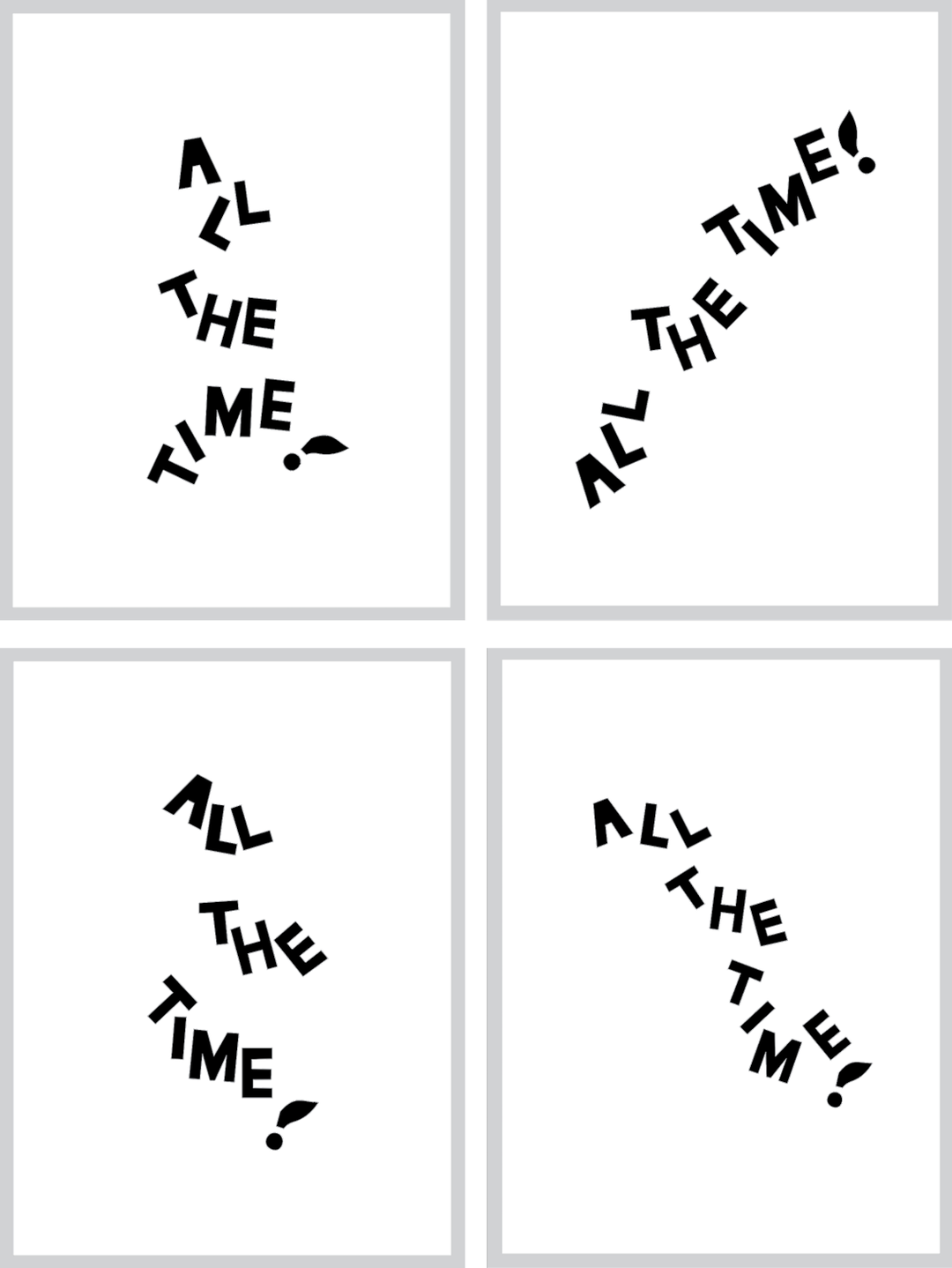
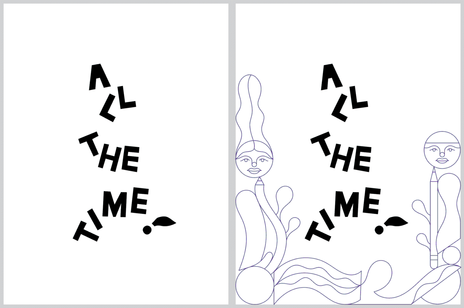
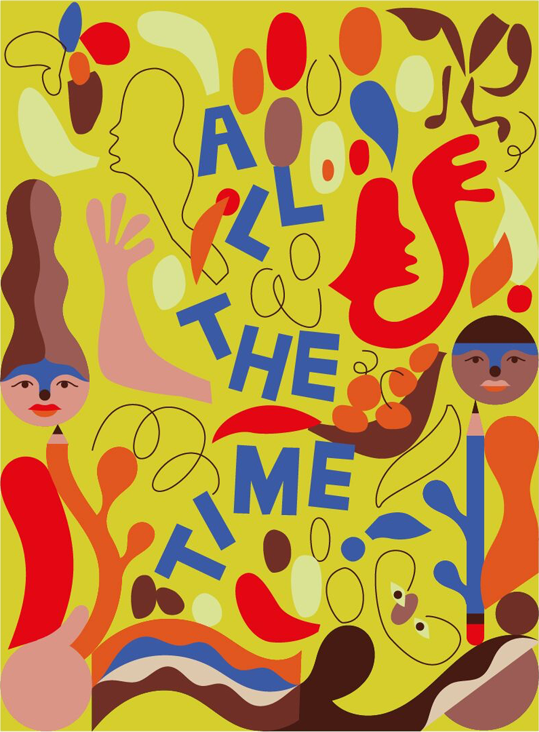
The two set about blending their artistic approaches, sharing sketches and tests via a shared Dropbox Paper doc, in which each illustrator would give feedback and notes. Carlín uploaded a sketch, trying to imitate Nadia’s “universe” as a place where their styles could both live, in which Nadia’s type would run through the centre surrounded by rainbow-hued, sinuous forms and faces.
The next steps saw them nailing down the specifics – the layout of text from Nadia, and more refined shapes from Carlín. “Focused on geometric forms, I tried to give them a curvier look, so they can melt with your forms like Venezuelan chocolate, haha!” Carlín joked. He began to develop these images, aiming to represent the feelings of creative workers, “being menaced by the pressure we put on ourselves, but at the same time truly enjoying to create. Like a sharp ‘pencil plant’ that point at us while at the same time blooms!”
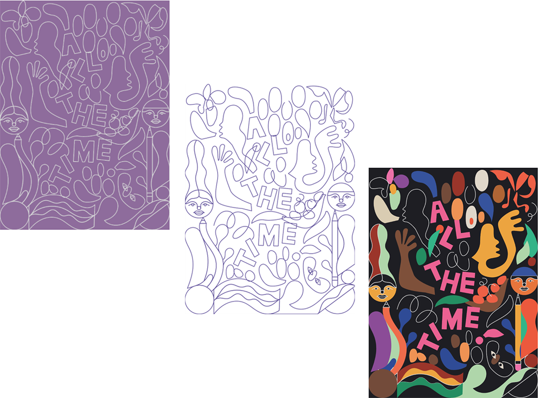
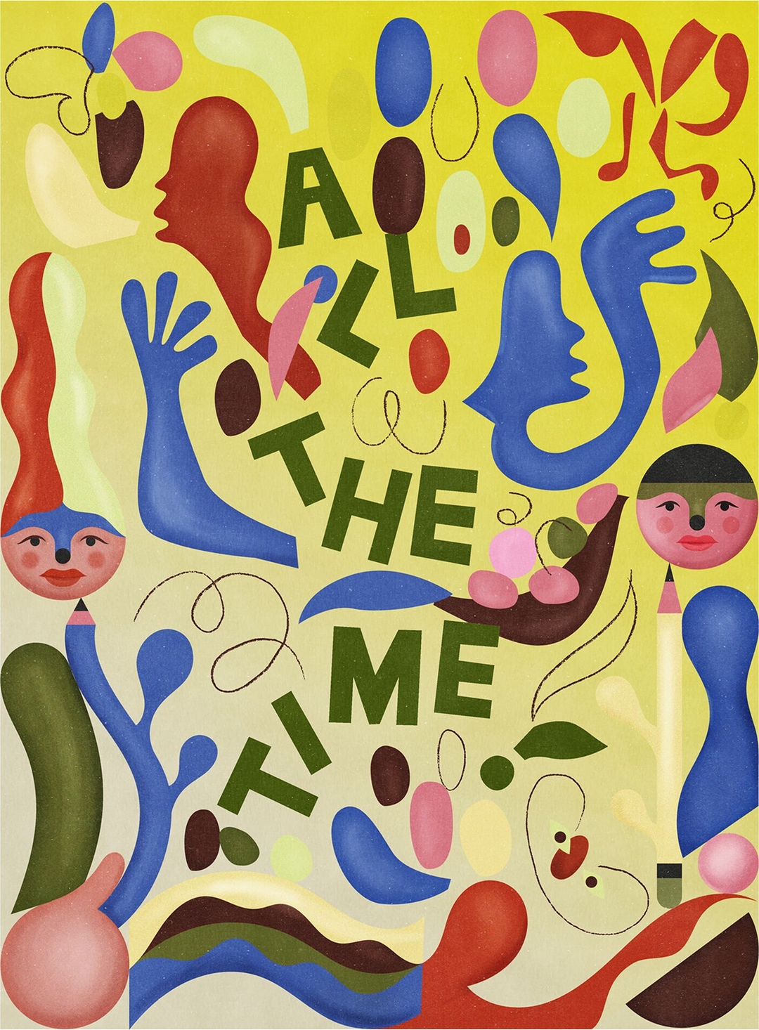
Nadia added more elements in her flat, paper-cut style, and added colour, suggesting Carlín might add some of his signature texture “like that of a coloured pencil”. Carlín agreed, and suggested muting the tones of the colour scheme Nadia had shown, to be “more happy/sad” he explained, sharing visual references and tests for his concept. And quickly, the poster assembled and sprung to life, a seamless visual coalescence of their individual design aesthetics.
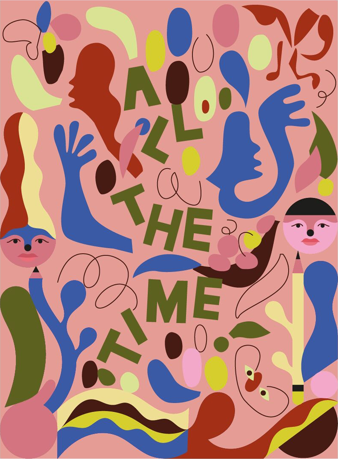
After a few final tweaks, the finished poster was decided. “I love Carlín’s style so much that I felt from the beginning it would be a really natural collaboration,” Nadia comments, looking back at the project. “The result has totally blown my mind as I feel our two styles really come together but the added dimension and textures really take it to the next level. It’s two planets merging to celebrate our inability to turn the light off in our minds while at the same time paying homage to hard working people all around the world.”
“When I finally saw the first piece with all our elements living together I was amazed at how it all clicked, as we were sketching it together, at the same time,” Carlín says, describing the final poster as depicting “a playful joy where sometimes you have to play longer to win.”
On collaborating via Dropbox Paper, Nadia says she found it “easy and intuitive”. “Seeing the process all at once, as well as being able to chat, comment, insert docs and emojis in the same super well laid out document allowed me to focus on the collaboration.” Carlín echoed the sentiment, and appreciated the minimalist layout of the app, “where you have all you need to communicate your ideas and collectivity create”. He also enjoyed watching the creation process happen on one page, “made in a natural way, as the project went along. Like following the candies one by one until arriving at the candy shop”.
Dropbox Paper is a collaborative workspace that eliminates distractions that get in the way of creativity. Because you can work with all types of content – from video, to sound to code – in Paper, you and your collaborators can easily edit and discuss all aspects of your project in one centralised place.
Share Article
About the Author
—
This article was written by the It’s Nice That team. To find our editors and writers, please head over to our Contact page.