




- Words
- It's Nice That
- —
- Date
- 31 October 2018
- Tags
Creativity never has to settle in just one box and other learnings from October's Nicer Tuesdays
Share
Share
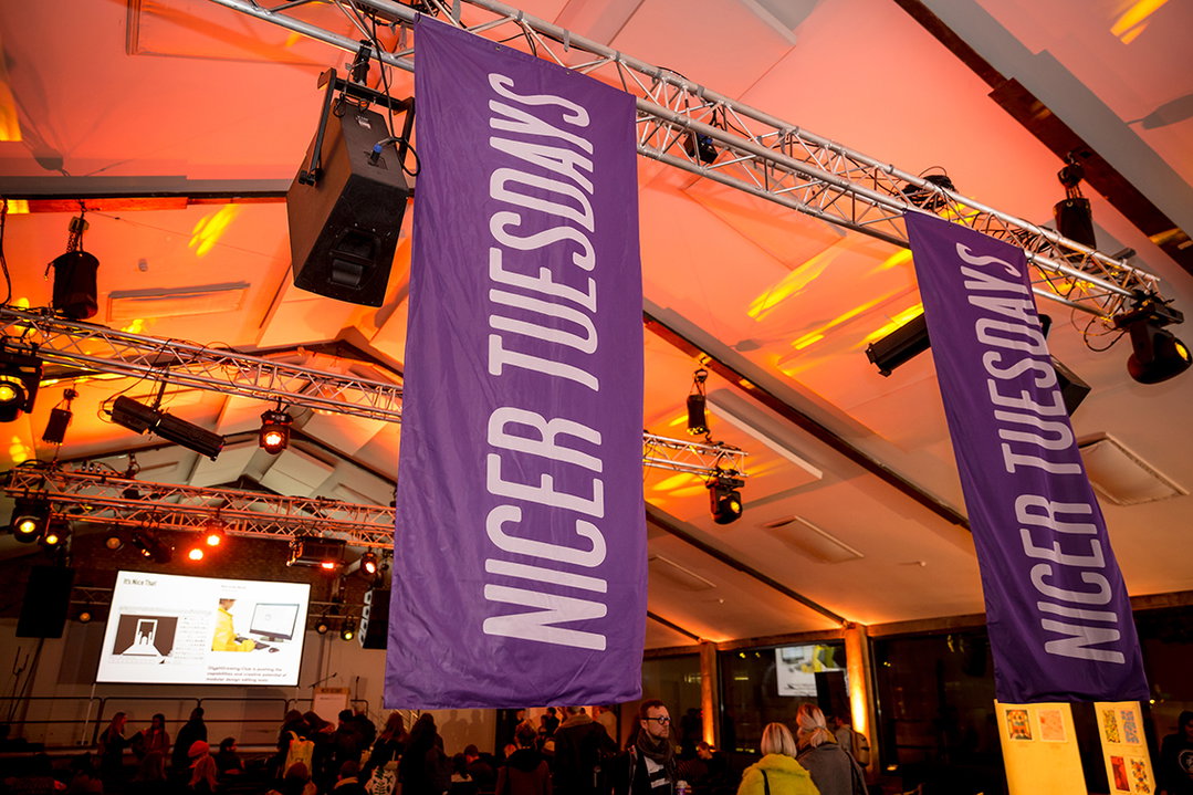
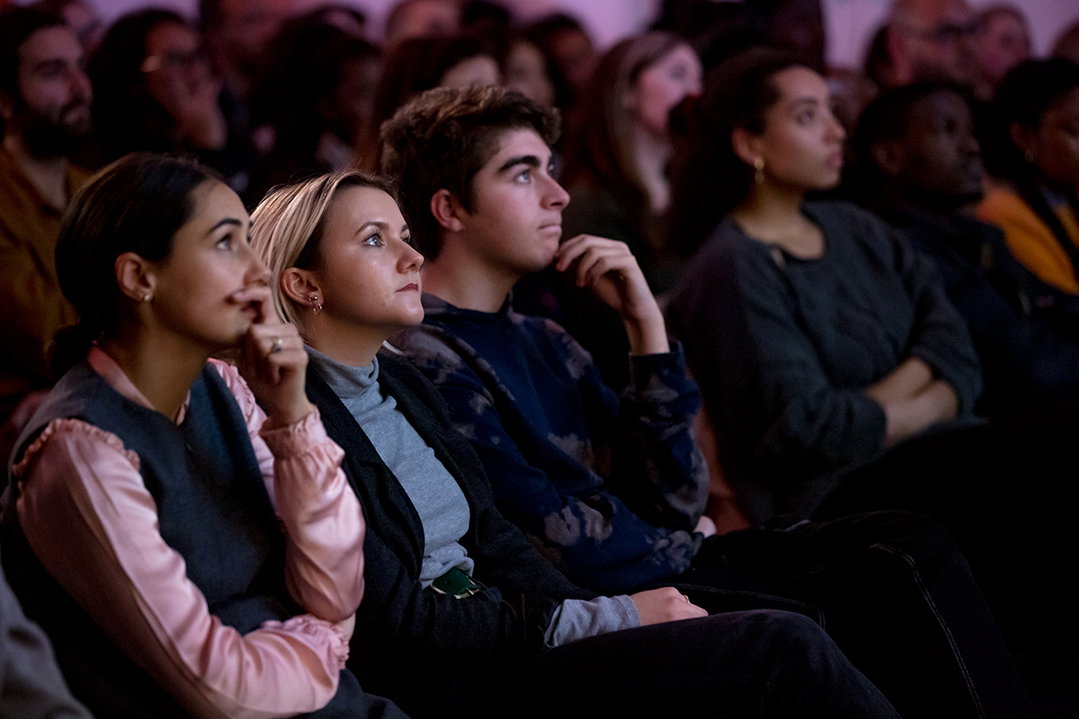
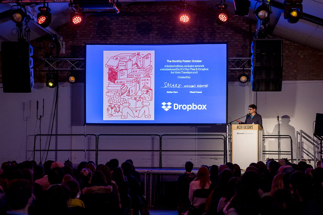
Across creative disciplines from art direction to managing musicians, motion graphics and illustration, October’s Nicer Tuesdays displayed how creativity never tends to settle on just one path.
While Grace Helmer told us about finding her feet in illustration through drawing personal experiences, David Lane explained his collaboration with Robyn on her recent album campaign. Mahaneela walked us through her average day which switches from producing to photographing to filmmaking in an afternoon and Studio Dumbar’s Liza Enebeis showed us how experimenting with technology collaboratively can lead to impactful graphic design. It was an evening that proved creativity is always changing.
Below, we share some of the key learnings from each talk.
Remember to be a person, as well as a creative
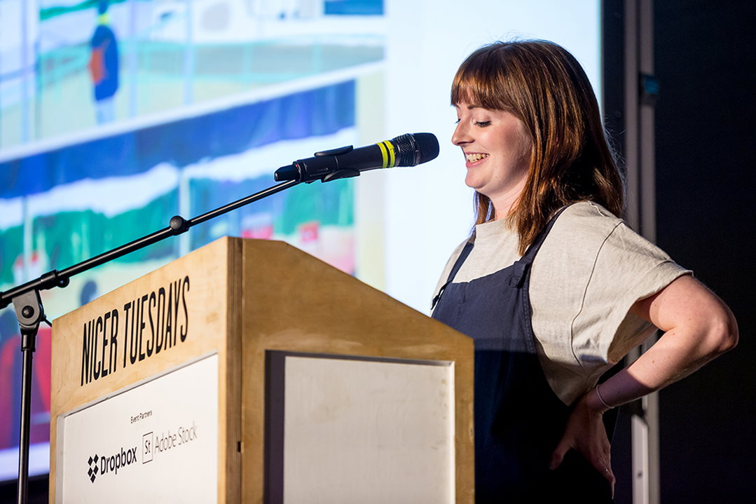
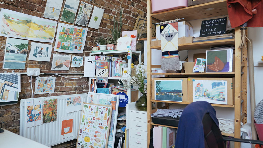
London-based illustrator Grace Helmer is a creative we’ve watched grow from graduate to fully fledged illustrator extraordinaire from our desks in the It’s Nice That studio. A graduate of ours in 2012, Grace finally did a talk at Nicer Tuesdays yesterday evening, taking the audience through her career to date.
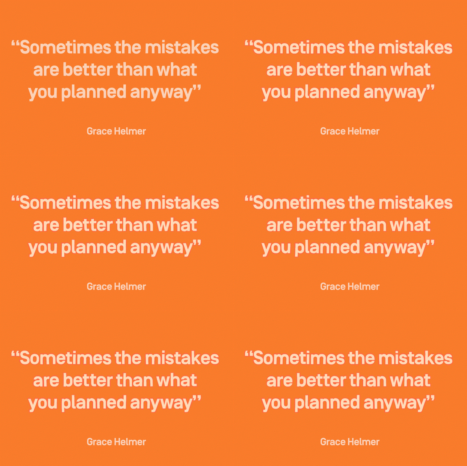
A sentimental talk, Grace spoke honestly of the difficulties of life as a freelance creative, a particular piece of sound advice Grace gave was that, for her, it’s important to remember she is “a person as well as an illustrator”. As simple as this sounds, taking time out for yourself as a creative is key to improve not only your personal life, but the work itself with Grace noting the benefits of travelling – solo or with her illustrator friends in Dayjob collective – to the likes of Japan, Hong Kong and Oslo too and further commercial work developing from these personal experiences and explorations.
Collaboration can allow you to make work you could never dream of
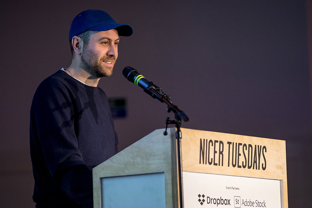
Next to take to the stage was David Lane, founder of design studio Lane & Associates, art director of Freize magazine and co-founder of food and culture bible, The Gourmand.
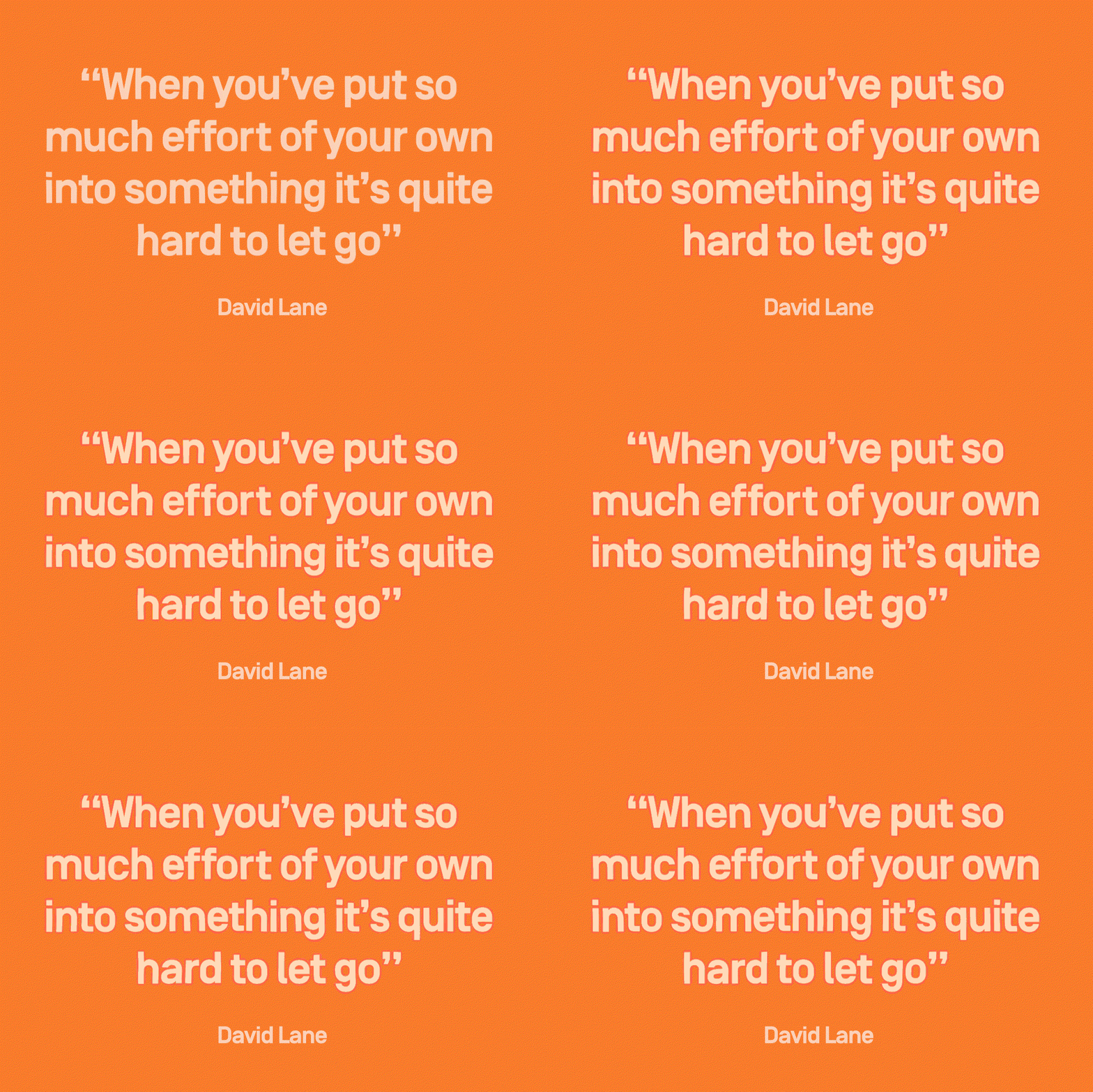
As an art director, “which is a pretty broad term,” David explained how he comes up “with things and those things become films, publications, still images or events”. On each and every one of these projects, collaboration is key with David jumping from creative colleague to colleague depending on the brief.
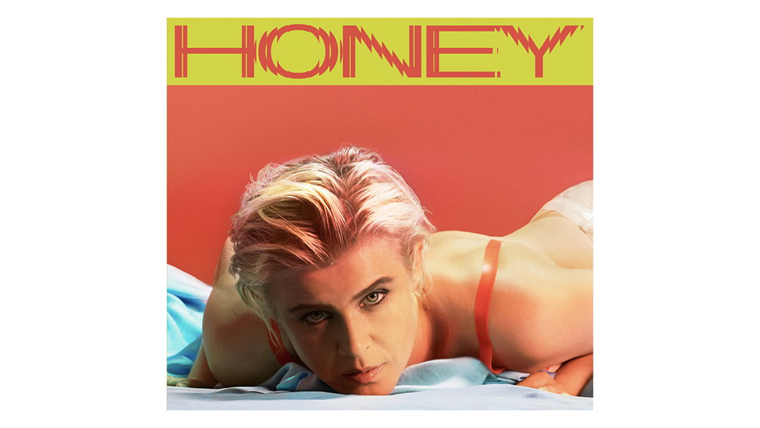
To display an example of David’s working process he took us through his recent work with singer Robyn, creating all the visual material from press shots to a specially designed typeface to evoke club culture, all to represent her comeback record after eight years. Robyn’s music, as David describes, is “great club music which is quite emotive”. David, on the other hand, is “a practical person who’s into logic,” he explained. “I guess that’s why I’m a designer and she’s a singer”. The meeting of minds between David and Robyn created a campaign that looks like no other in music today. Once they met in the middle, an amazing experience (and piece of album artwork) ensued.
Don’t put yourself in one career box, break down the box instead
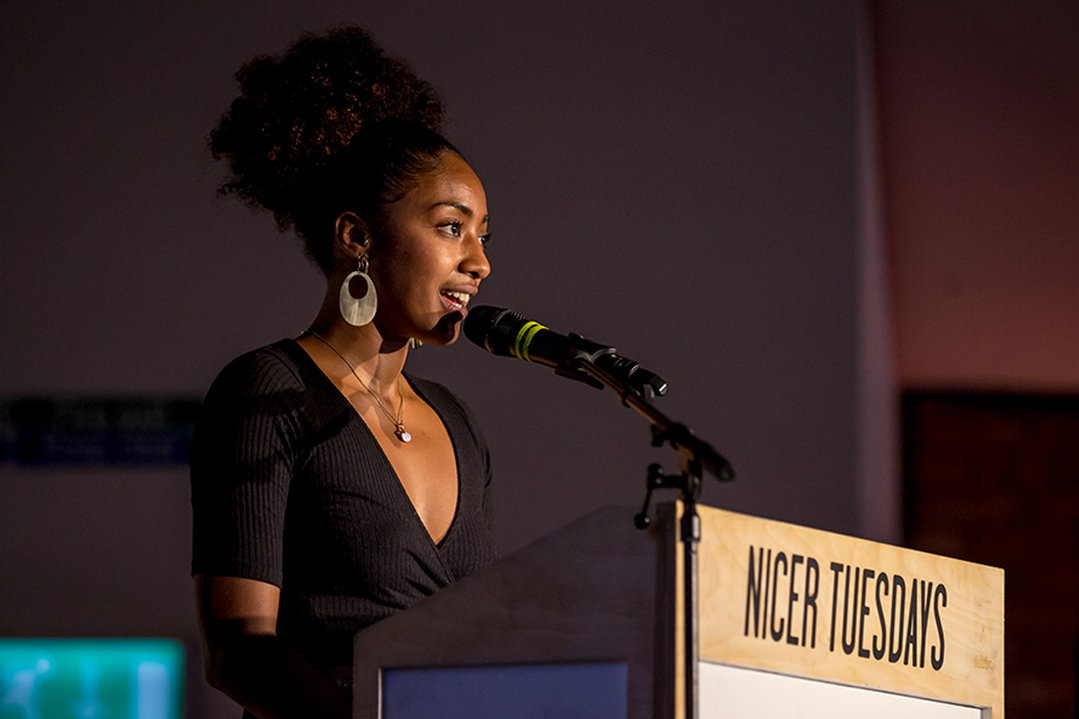
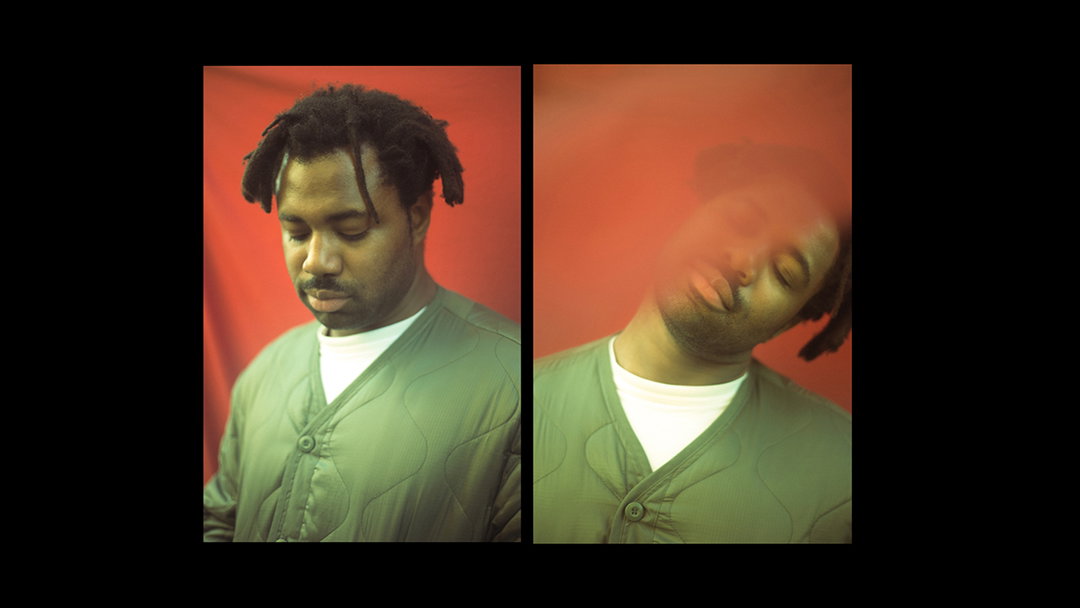
The term multidisciplinary creative feels like it was created for someone like Mahaneela, a photographer, director, music manager, DJ, storyteller, and the third speaker at October’s Nicer Tuesdays. In an empowering talk, Mahaneela talked us through her personal heritage, explaining how really “I am not supposed to be here,” as her “very existence is the product of years of political unrest” considering her Ghanian, Indian and Ugandan background.
Growing up in South London however, “which was predominately white and middle class” Mahaneela had little connection to her south Asian community or her black side of the family and in turn, “whenever someone asked me where I was from they’d get a different answer because I just didn’t know.”
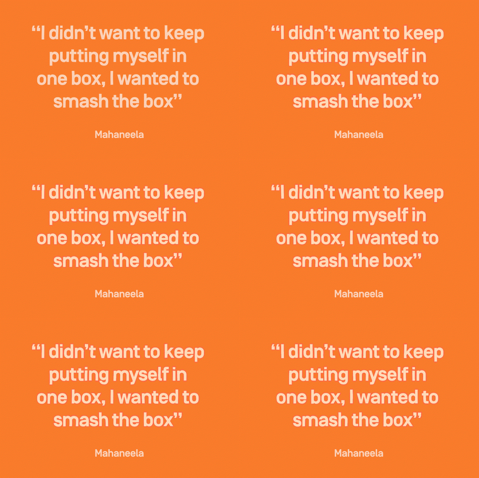
As a result, Mahaneela always had a feeling of wanting to put herself in one box career-wise. In time, however, she saw the benefits of being a jack of all trades: “I wear a lot of hats and that’s okay, and it makes a lot of sense in the world we’re living in”. Finally Mahaneela left us with some encouraging words, urging the room not to place themselves in one box but instead professing that “smashing the box is something that we all need to do”.
Experimental collaboration is key
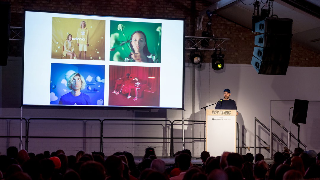
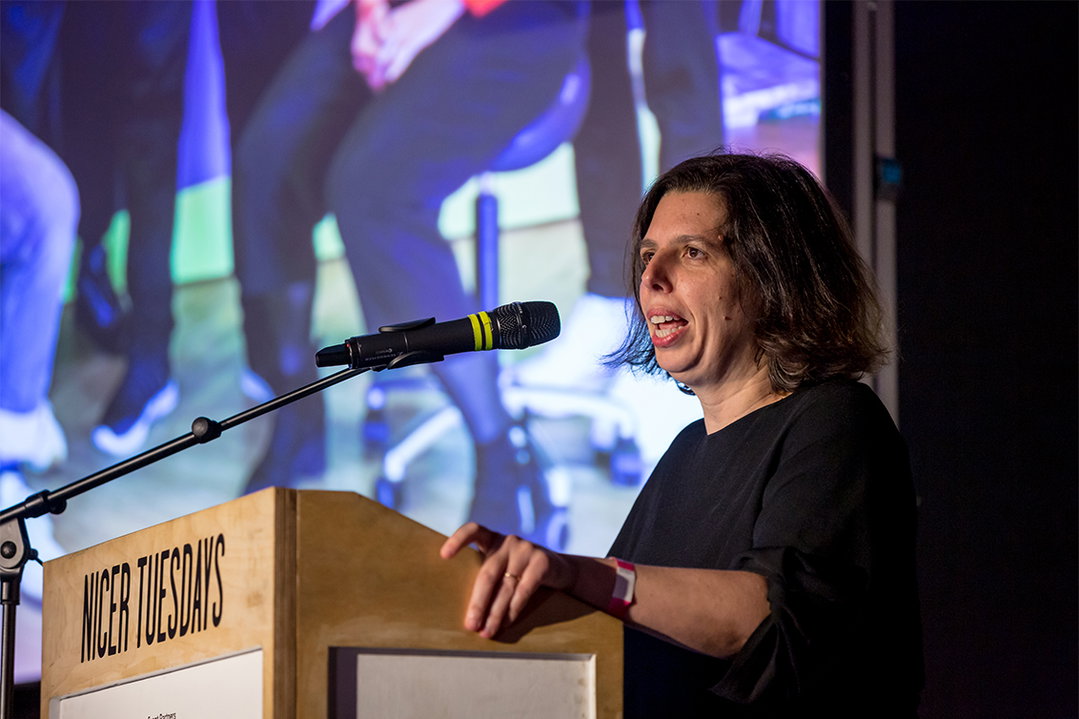
The last speaker to take to the stage was Liza Enebeis, the creative director of Rotterdam-based Studio Dumbar, a front leader in shaping contemporary graphic design. Liza’s fast-paced talk, with one of the best showreels we’ve ever seen, took us from the studio’s beginnings in 1977 through to today.
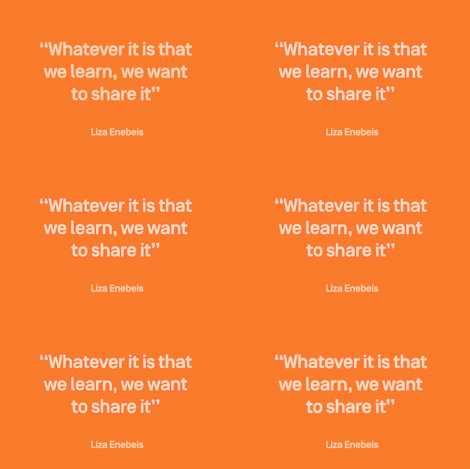
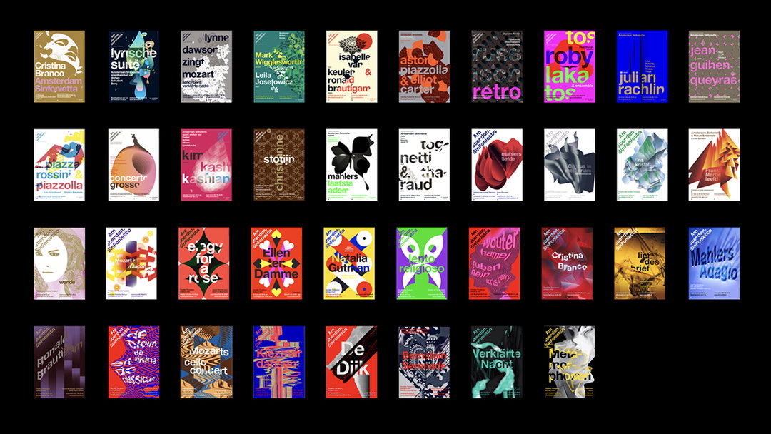
Through its work with motion graphics experiments, particularly through its in-house project The Group, Liza spoke through Studio Dumbar’s collaborative ethos, wanting to experiment with new technologies and share its learnings to a wider network of designers. An example of this she took us through is the studio’s work with the Amsterdam Sinfonietta spanning 14 years.
From designing the Sinfonietta’s logo to designing posters each year by alternate creatives in-house, “these posters really give way to freedom and expression as a designer,” she explained. In working so experimentally and collaboratively previously, this year the studio took its learnings so-far and created motion graphics in reaction to the sounds of the orchestra. An inspiring way to approach graphic design, Liza proved how by playing around with new ways of working can grow to create an impactful campaign down the line.
Dropbox Paper is a collaborative workspace that eliminates distractions that get in the way of creativity. Because you can work with all types of content – from video, to sound to code – in Paper, you and your collaborators can easily edit and discuss all aspects of your project in one centralised place.
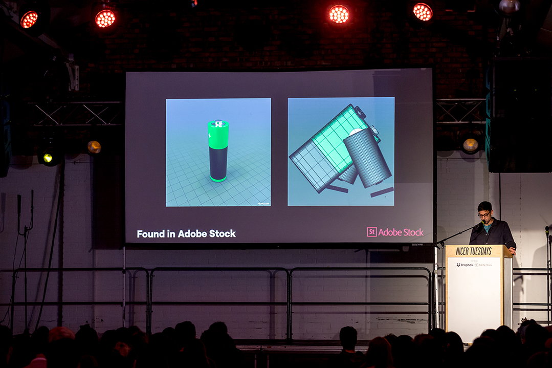
Keep your work fresh with Adobe Stock. No matter what project you’re working on, you can always find the perfect asset in the library of over 90 million high-quality images, graphics, videos, templates, and 3D assets plus our Premium and Editorial. Join them at Nicer Tuesdays to see what amazing things you can create with Adobe Stock. Click here

Dropbox Paper is a collaborative workspace that eliminates distractions that get in the way of creativity. Because you can work with all types of content – from video, to sound to code – in Paper, you and your collaborators can easily edit and discuss all aspects of your project in one centralised place.
Keep your work fresh with Adobe Stock. No matter what project you’re working on, you can always find the perfect asset in the library of over 90 million high-quality images, graphics, videos, templates, and 3D assets plus our Premium and Editorial. Join them at Nicer Tuesdays to see what amazing things you can create with Adobe Stock. Click here
Keep your work fresh with Adobe Stock. No matter what project you’re working on, you can always find the perfect asset in the library of over 90 million high-quality images, graphics, videos, templates, and 3D assets plus our Premium and Editorial. Join them at Nicer Tuesdays to see what amazing things you can create with Adobe Stock. Click here
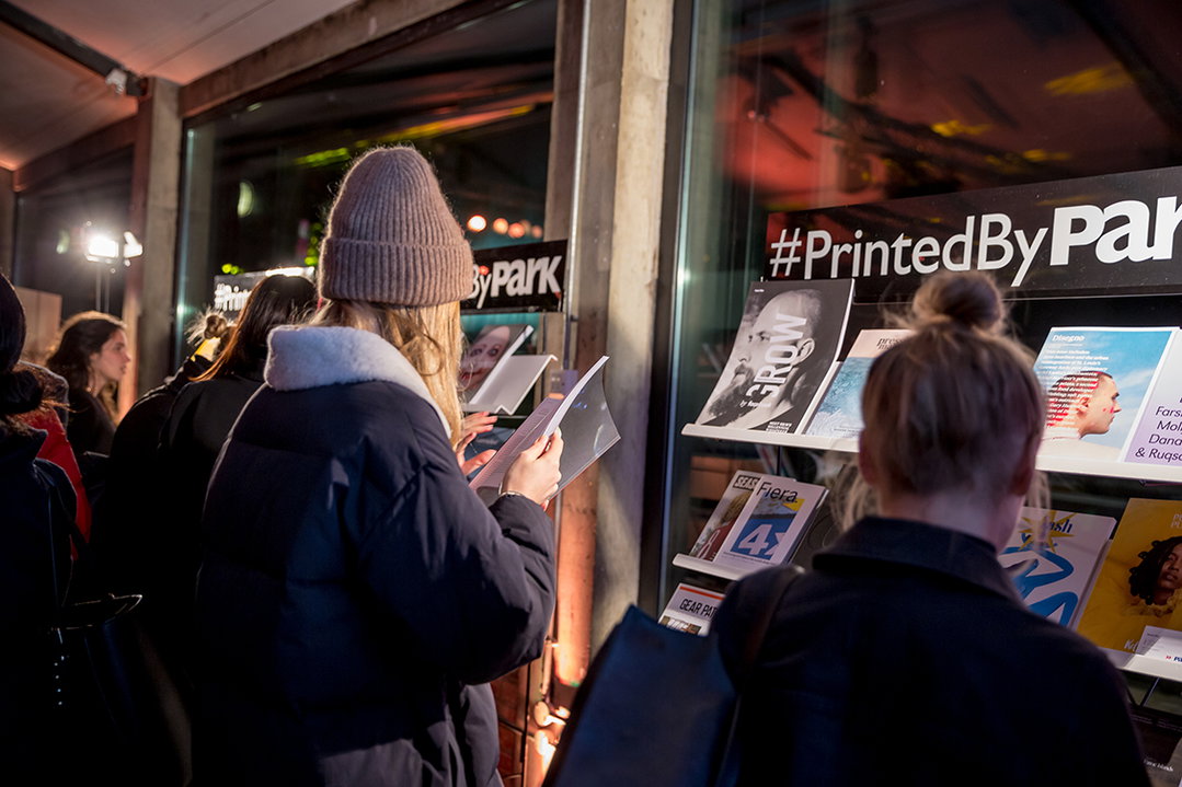
As one of London’s most respected printers, Park Communications is known for its care, attention to detail and high quality, which is why we choose Park for Printed Pages.
The Five Points Brewing Company
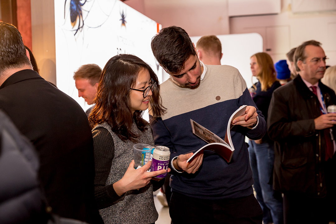
The Five Points Brewing Company is an independent brewery based in Hackney, London, brewing with a commitment to provenance, quality, consistency and the community since 2013.

As one of London’s most respected printers, Park Communications is known for its care, attention to detail and high quality, which is why we choose Park for Printed Pages.
The Five Points Brewing Company
The Five Points Brewing Company is an independent brewery based in Hackney, London, brewing with a commitment to provenance, quality, consistency and the community since 2013.

The Five Points Brewing Company
The Five Points Brewing Company is an independent brewery based in Hackney, London, brewing with a commitment to provenance, quality, consistency and the community since 2013.
Share Article
Further Info
About the Author
—
This article was written by the It’s Nice That team. To find our editors and writers, please head over to our Contact page.