Breathing Room launches a design-focused toolkit that aims to address police violence in the US
Uniting art, design, tech and activism, Breathing Room has launched The Necessary Trouble Toolkit– an app and initiative that provides a simple way for people to take a stance against police brutality.
Share
Uniting art, design, tech and activism, The Necessary Trouble Toolkit has launched Breathing Room – an app and initiative that provides a simple way for people to take a stance against police brutality.
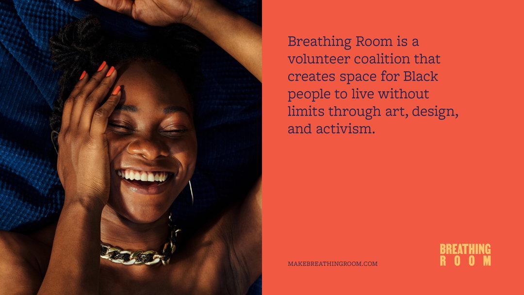
The arrival of Breathing Room – which is Black-led and launched via a coalition of volunteers – comes as a response to America’s history of racism and police brutality, particularly after the death of George Floyd in 2020 and the subsequent rise in protests and activism across the globe. Its main purpose is to design a space for Black people and to bring the Black community together, banding allies and providing solutions through art, design and activism.
The core team behind Breathing Room consists of Sola Biu, founder and strategy lead; Kemi Lawore, policy and curriculum research lead; Jing Jian, product design lead; Jason Mamaril, brand lead; Ashley Truxon, communications lead; Mos Okediji, learning lead; Emery Lieberman, civic engagement lead; Salih Abdul-Karim, animation lead; Jeduan Cornejo, engineering lead; Jai Mankoo, engineer; Janaye Ingram, activism partnerships lead; Leon Tambue, brand social writer; Julie Wenah, legal lead; Sarah Goezern, digital producer; and Sena Cadmus, social media coordinator.
Comprising coders, storytellers, learning coaches and creatives, the initiative aims to educate through its identity system. “Viral videos of Black people in America being brutalised and dehumanised have become the norm in policing news coverage and on social media,” says Sola of the identity’s ethos. “This is a reflection of public outcry to the disproportionate impact of police brutality on the Black community. This footage ignites collective outrage and has created accountability and reform in some situations. The painful side effect is that it can also normalise Black trauma which isn’t healthy for society either.”
“Our creative challenge was to find a way to acknowledge the current reality, which we do through the curriculum, and pair it with inspiring visuals that represent a broader definition of the Black experience. Our identity system and campaign were intentionally designed to magnify what’s on the other side of that trauma: Black joy and limitlessness.”
GalleryBreathing Room (Copyright © Breathing Room, 2021)
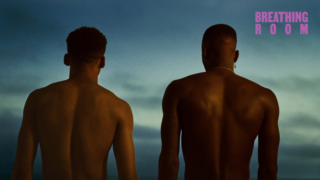
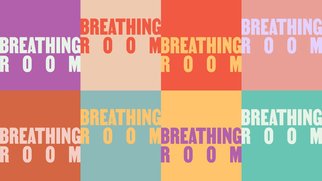
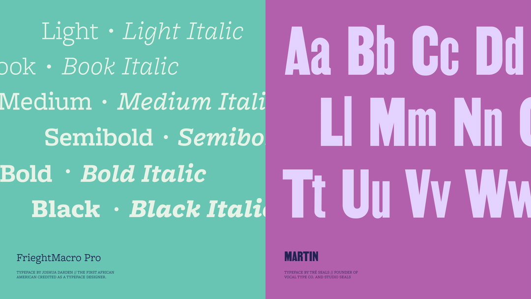
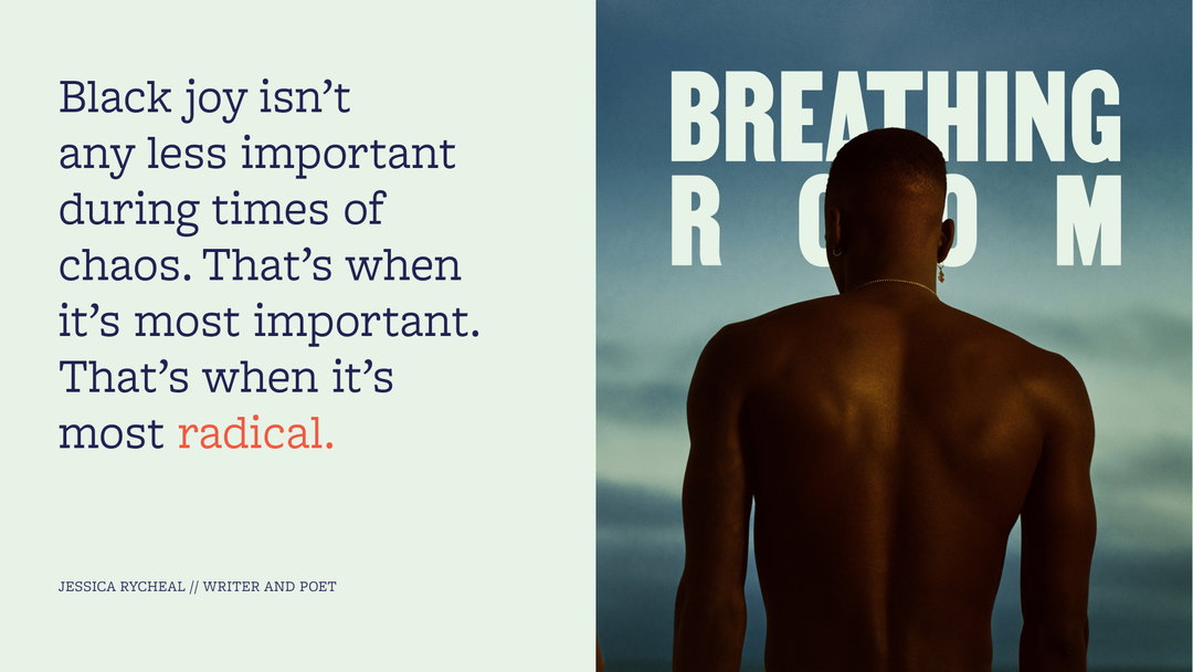
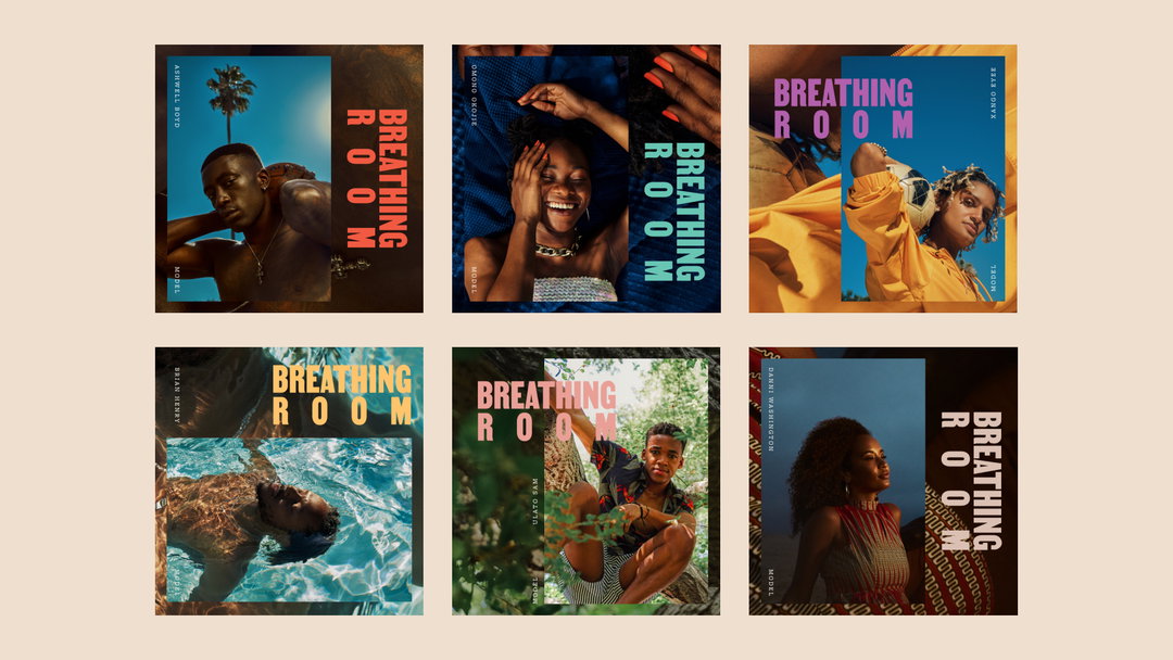
The identity presents a selection of fonts designed by Black typographers – Tré Seals and Joshua Darden – plus poetry from Jessica Rycheal, a diverse cast of Black models, portrait photography by Joshua Kissi, animation by Salih Abdul-Karim, and an impactful logotype. “Our goal was to honour the Black community through this work,” Sola continues to tell It’s Nice that. “We also want to keep advocates inspired and motivated by our humanity as they use the learning tool.”
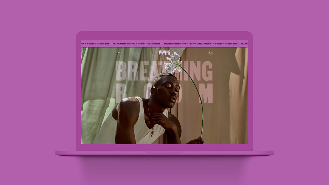
On the site, there are two key pillars that divide the content into actionable insights. This includes the Learn section, that introduces its “learners”, as Sola says, to key decision-makers, providing knowledge on how to create change. The Act section provides advocates with the tools to take their advocacy offline. “Our learning coach, Mos Okediji, provided rich guidance on making the holistic journey as personally reflective and actionable as possible.” Designed by Jing, the content is mobile-first in order for it to be digestible and accessible on the go.
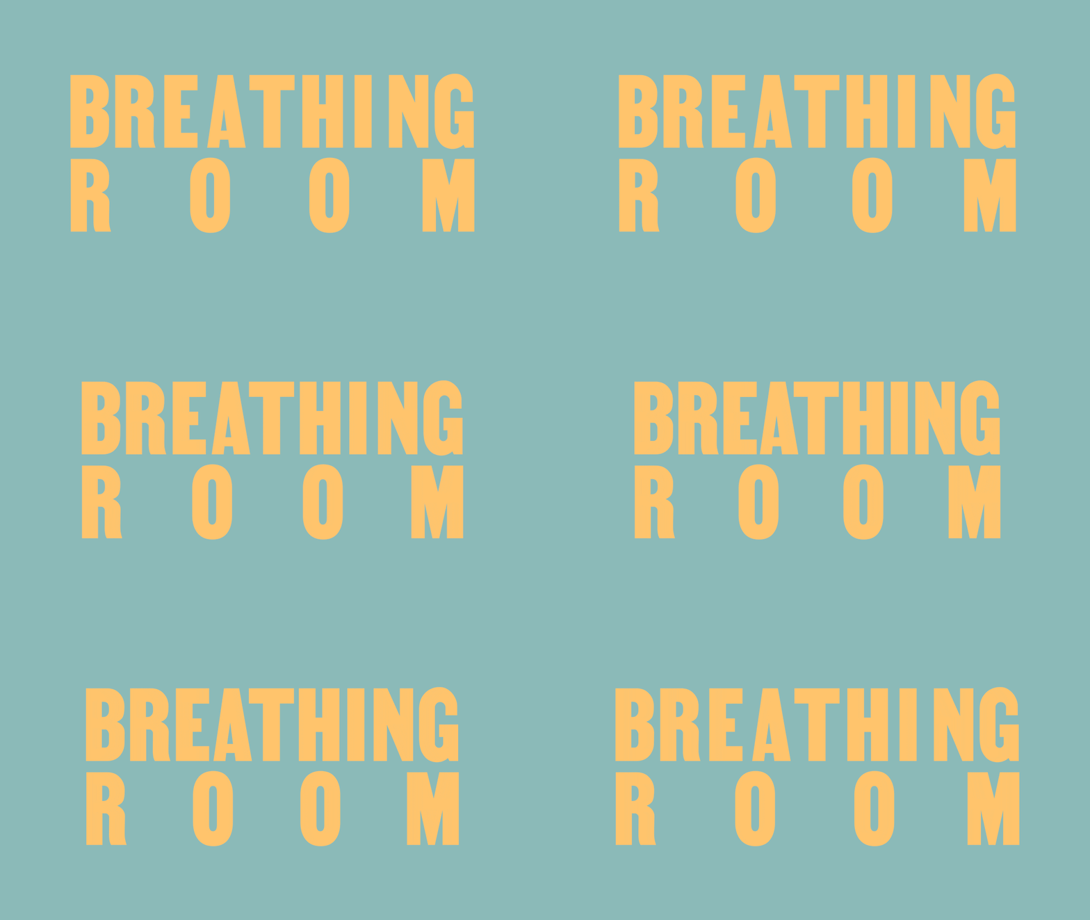
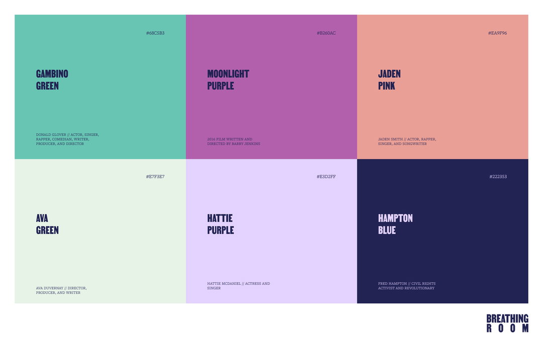
Additionally, the identity is inspired by the celebration of Black life: “We wanted the logotype to evoke the act of breathing by tracking out the word ‘Room’ with space for the letters to breath," says Jason. All aspects of the design system were created and inspired by Black creatives, all the while pairing photography with film and motion graphics, plus a brand colour palette inspired by and named after Black artists, activists and organisations.
Through Breathing Room, Sola says they hope their audience will “understand how they can make a difference in their city” while giving them the knowledge, skills and time to contribute to the movement for Black equality. “Creatives are culture carriers and have the potential to catapult social change. The fabric of America has been unravelling for a long time; this is the perfect moment for creatives to work with other changemakers to weave together a better version of the country.”
GalleryBreathing Room (Copyright © Breathing Room, 2021)
Hero Header
Breathing Room (Copyright © Breathing Room, 2021)
Share Article
About the Author
—
Ayla is a London-based freelance writer, editor and consultant specialising in art, photography, design and culture. After joining It’s Nice That in 2017 as editorial assistant, she was interim online editor in 2022/2023 and continues to work with us on a freelance basis. She has written for i-D, Dazed, AnOther, WePresent, Port, Elephant and more, and she is also the managing editor of design magazine Anima.