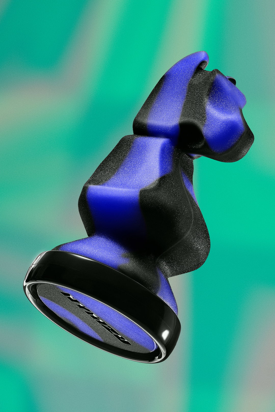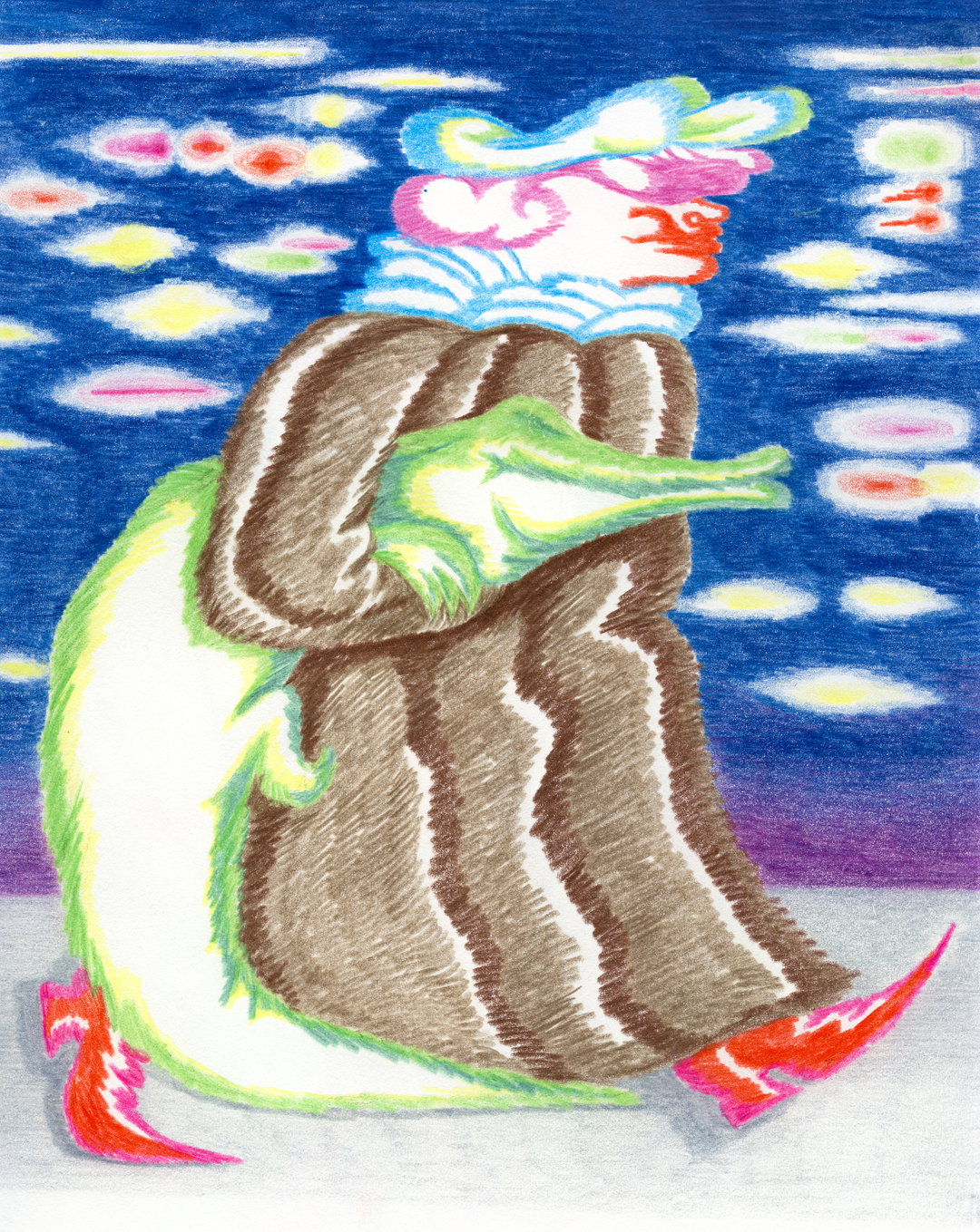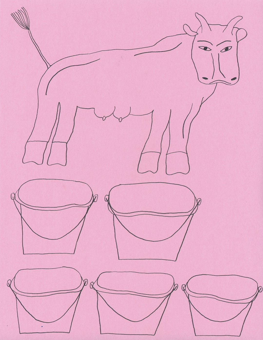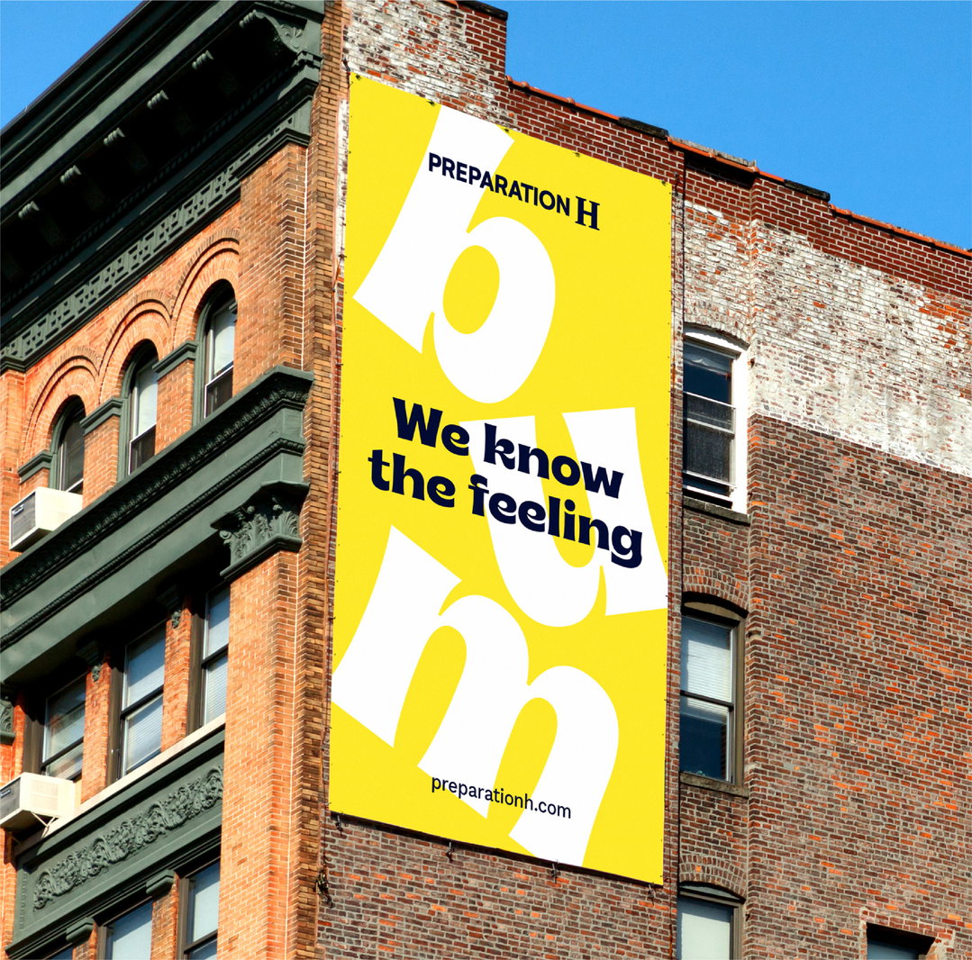
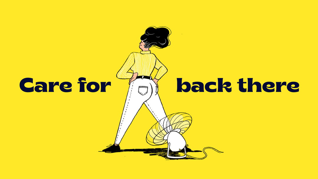
You may not have ever paid too much attention to what brand of haemorrhoid cream you pick up off the shelf on a dash of shame to the self-checkout machine, but Elmwood’s new brand expression for Preparation H is going to change that. The design consultancy is also hoping to change that dash of shame into a stride of pride, with designs that leverage humour to tackle embarrassment around butt health.
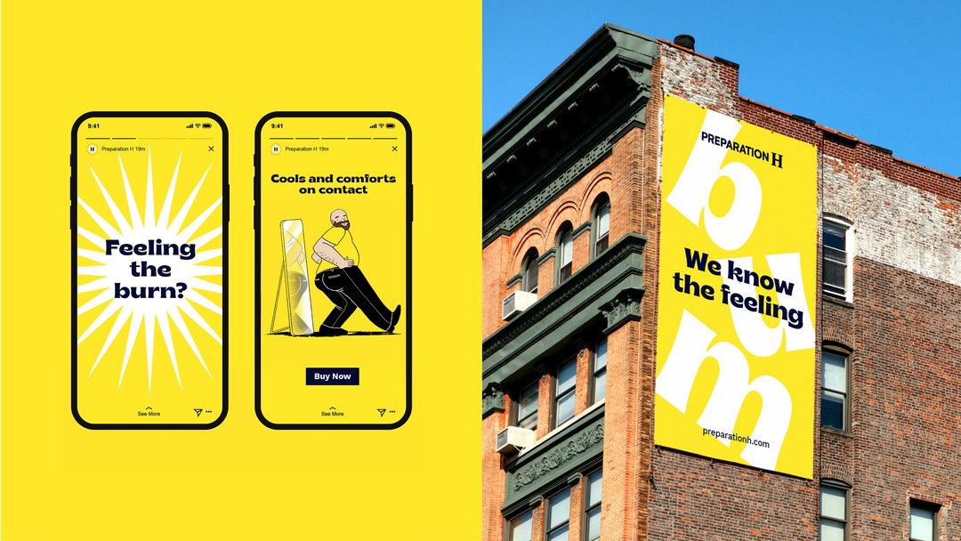
“From the start, the tension facing Preparation H was clear,” explains a release from Elmwood. “Most people will experience haemorrhoids at some point, but there’s a shame attached to talking about it openly.” The consultancy saw an opportunity to tackle the taboo head-on, opting for funny, relatable designs. “Highly shareable” illustrations and animations from Elmwood form the basis for Preparation H’s wider brand comms, helping to appeal to a wider range of customers.
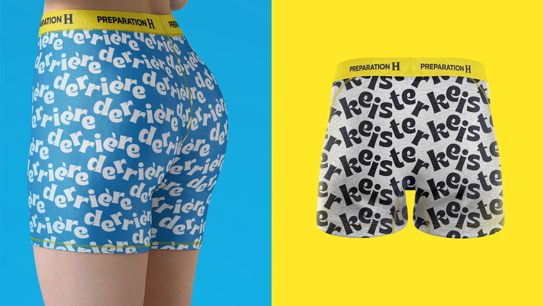
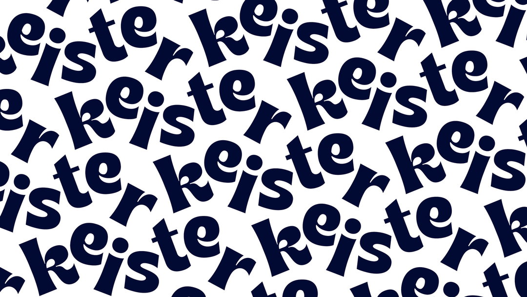
Avoiding cold medical language, colloquialisms like “derriere”, and the delightfully rarer “keister”, appear throughout the copy, alongside captions such as: “Your butt is behind you no matter what”. The release explains this sense of “playful confidence” also translates into a quirky typeface for the brand.
Bizarrely, in addition to the hilarious new brand expression, ad agency Grey Group has built a microsite for Preparation H that allows customers to create personalised butt-related Valentine’s Day cards for their loved ones. Visitors to the site will be met with the tag lines: “Let your butt do the talking” and “Get to the bottom of your relationship.”
Krista Oraa, Elmwood’s creative director adds: “Preparation H has a unique place in the market. We knew there was an opportunity to enhance this by creating a brand expression that is built on humour to challenge the stigma associated with this area of health. With the new assets we created, Preparation H now has a reinvigorated brand that builds awareness across a broader demographic and signals change to the consumer.”
GalleryElmwood: Preparation H brand expression (Copyright © Preparation H, 2022)

Hero Header
Elmwood: Preparation H brand expression (Copyright © Preparation H, 2022)
Share Article
Further Info
About the Author
—
Liz (she/they) is the senior editor at Insights, a research-driven department within It’s Nice That. They previously ran the news section of the website. Get in contact with them for potential Insights collaborations or to discuss Insights’ public-facing reports.