Foilco’s 30x30 offers you advice from leading creatives, including Jean Jullien and Malika Favre
StudioDBD: Foilco 30×30
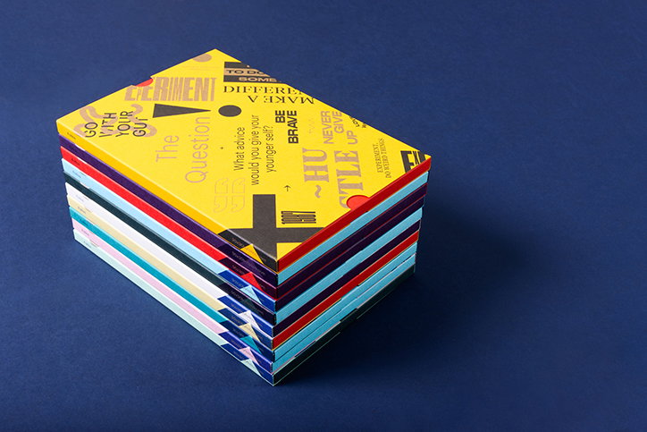
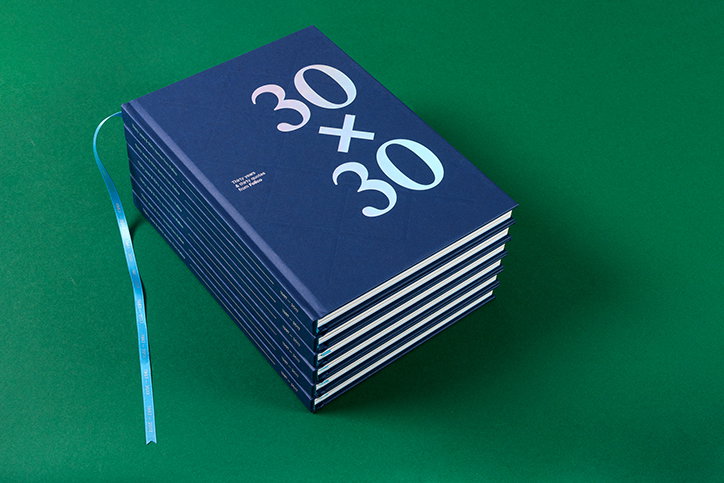
To mark its 30th anniversary, Foilco have released 30×30 – a celebration of the host of creative talent they have worked with over the years asking them to answer the question “if you could go back to the start of your career, what advice would you give your younger self?”
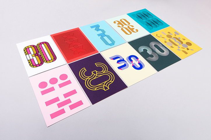
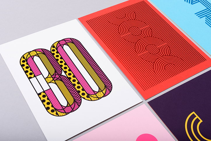
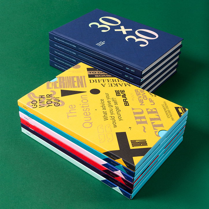
A nostalgic look back at what they have learned, the book was designed by StudioDBD and includes pearls of wisdom from the likes of Astrid Stavro, Anthony Burrill, Malika Favre and Jean Jullien among many others. 30×30 is limited edition and features examples of Foilco’s range of foils and a collection of different techniques as well as a set of beautifully produced postcards. “We knew that turning 30 this year was a great opportunity for us to take stock and produce something different and interesting for designers and creatives,” says Matt Hornby, one of the company’s directors. “We discussed a number of ideas with StudioDBD and they suggested the idea of the 30×30 book.”
“Foilco wanted something a bit special to celebrate turning 30. I called upon my powers of persuasion to gather together some contacts and friends within the creative industry and set about producing this wonderful book,” Dave Sedgwick from StudioDBD told us. “It’s been a real labour of love to pull the whole thing together. Not only the excellent quotes. But all the foiled number 30s which act as divider pages.” The project also has a website to enable the considerate, informative and powerful messages to reach a wider audience. “We knew halfway through the project that it would be something special, so set about printing the postcards as well and of course the website which features all the quotes from all the contributors.”
There is little imagery throughout the book, placing emphasis on the quotes. The typography in the book is bold and carefully treated in order to allow these words to speak for themselves. To read what these designers, illustrators and creatives had to say, visit the 30×30 website here.
StudioDBD: Foilco 30×30
StudioDBD: Foilco 30×30
StudioDBD: Foilco 30×30
StudioDBD: Foilco 30×30
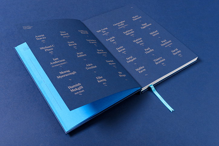
StudioDBD: Foilco 30×30
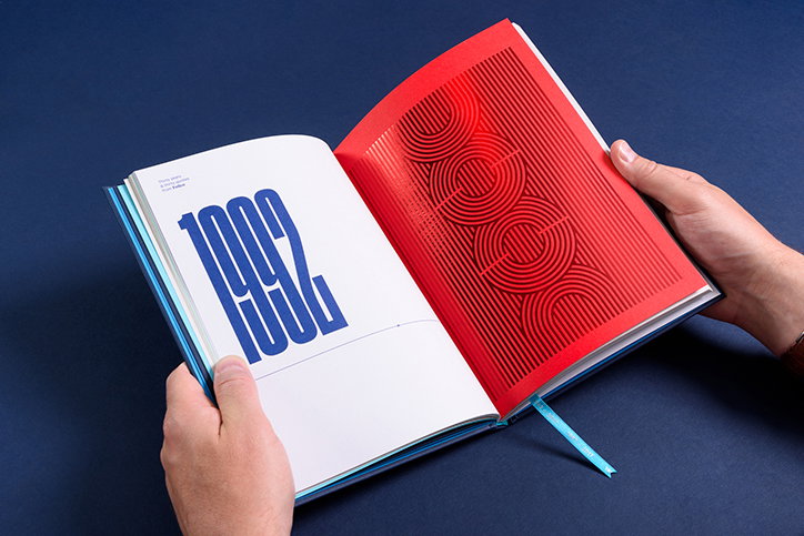
StudioDBD: Foilco 30×30
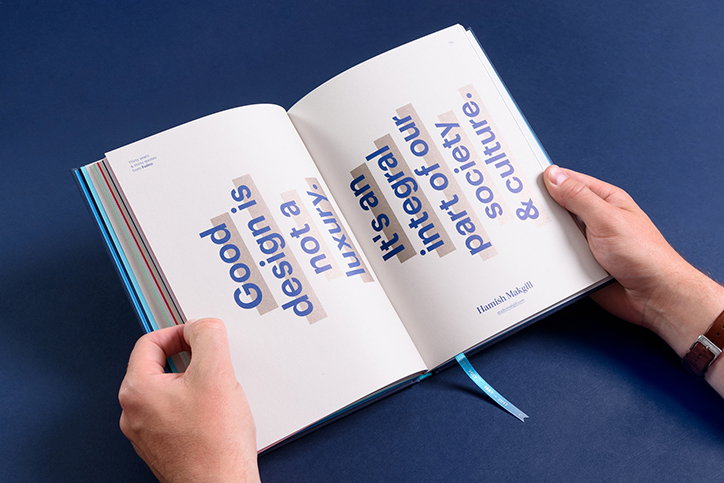
StudioDBD: Foilco 30×30, quote from Hamish Makgill
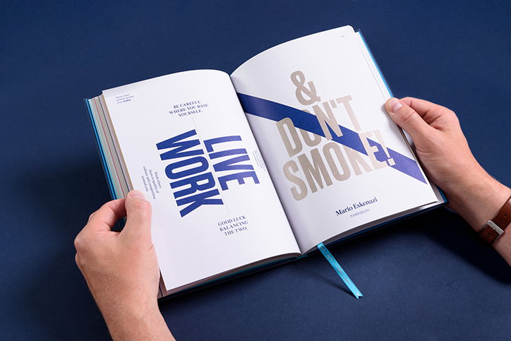
StudioDBD: Foilco 30×30, quote from Mario Eskenazi
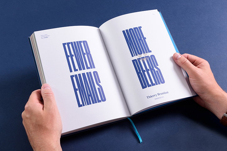
StudioDBD: Foilco 30×30, quote from Thierry Brunfaut
Share Article
Further Info
About the Author
—
Ruby is Senior Creative at It's Nice That, overseeing our visual output across platforms and projects. Before that, she was associate editor on the editorial team, after joining in September 2017 following graduation from Central Saint Martins.