Hold on to your hat -- Mailchimp gets a purposeful, playful, surreal redesign
Mailchimp/Collins
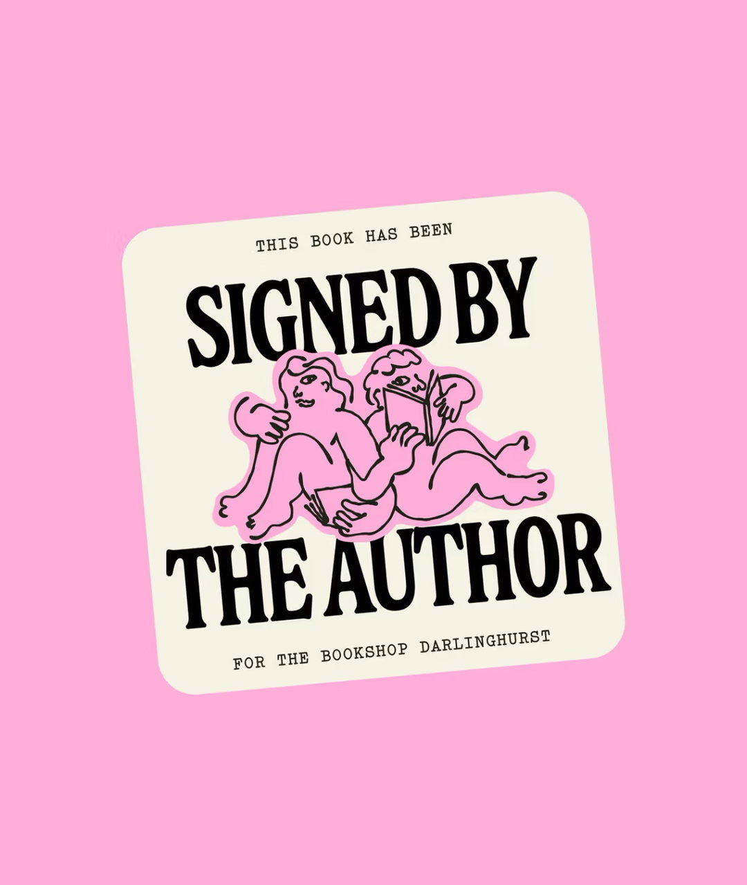
In news that’ll likely have prolific emailers across the world hot under the collar with excitement, Mailchimp has unveiled the results of its recent work with brand experience company Collins. The direction they’ve gone in? “Purposeful, playful surrealism."
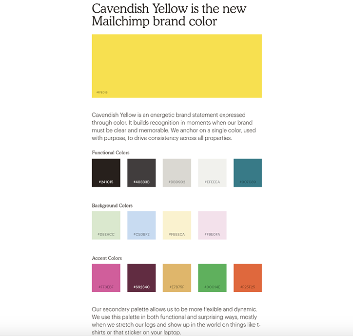
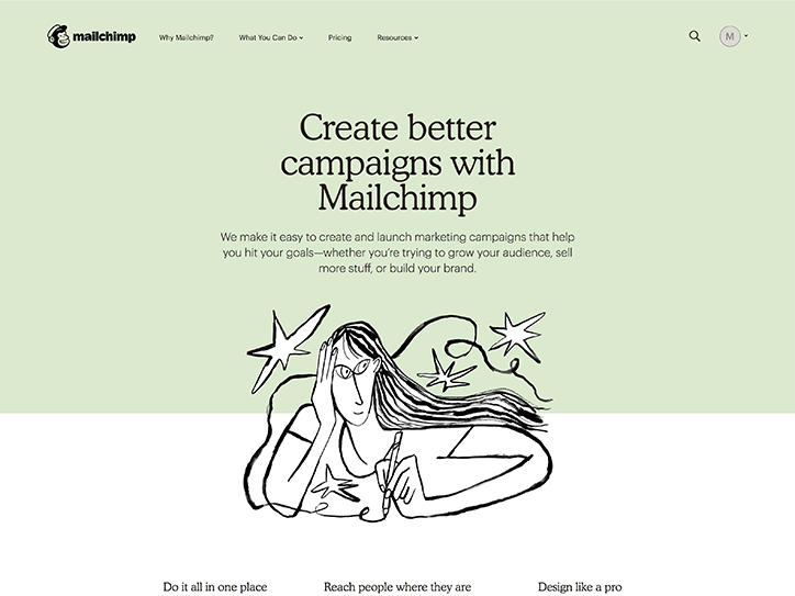
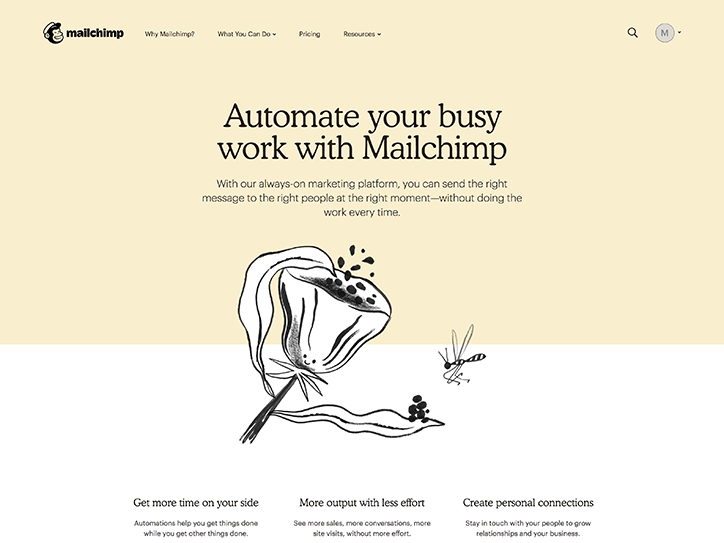
What, then, does the redesign entail? Well, Mailchimp has a new official brand colour: cavendish yellow. That isn’t all. Obviously.
Mailchimp’s mascot Freddie — and isn’t it great to finally put a name to a grinning simian face? — has had a little visual update. They’ve also brought in a new brand typeface, Cooper Light, which uses the ever-popular Cooper Black as it’s starting point. On an additional typographical tip, Collins have replaced the “previous script logotype with a new, chunky, slightly off-kilter wordmark that’s designed to better connect with a more simplified Freddie.”
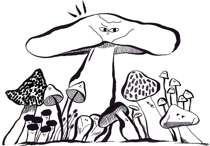
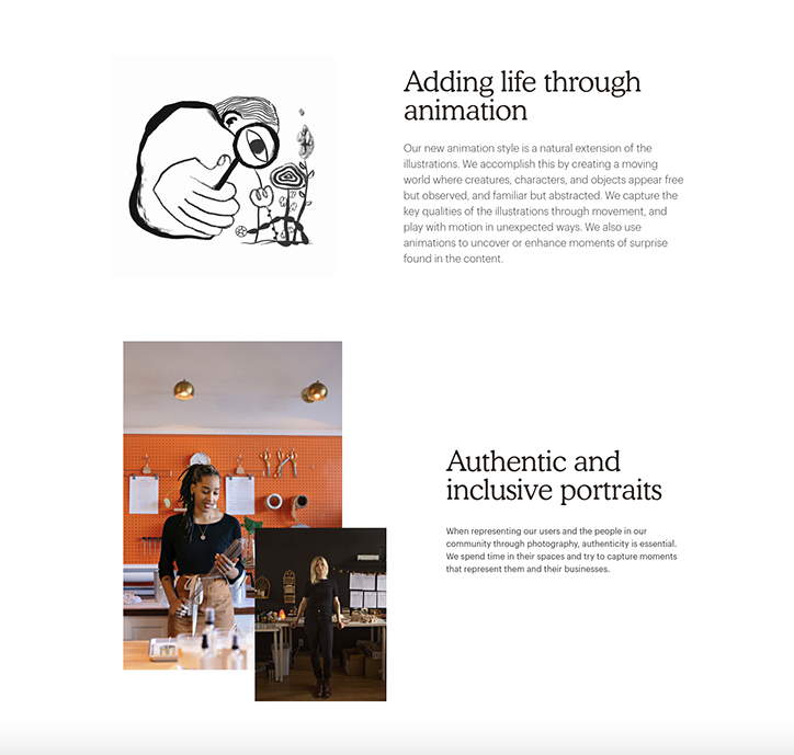
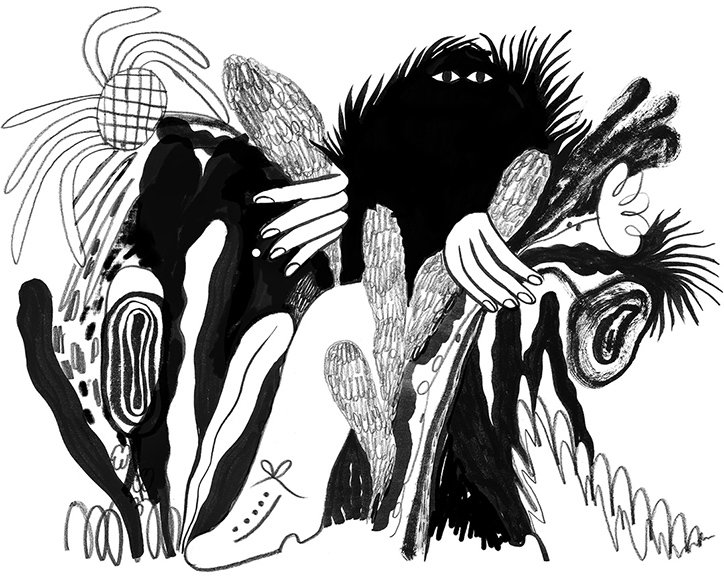
If that wasn’t enough, they’ve also introduced a new illustrative style that “personal expression over realistic accuracy,” a move which the company say sees them “nodding to Mailchimp’s support for businesses looking to build their brands by maintaining their unique voices in the world.”
They have also announced a “first foray offline” in the form of Postcards, which as the name suggests lets Mailchimp fans — and more importantly, brands looking for new ways to connect with audiences — send postcards across the globe. They describe it as “another major step towards becoming a full-service, multi-channel marketing platform.”
Have a gander at some of the redesign elements below.
Mailchimp/Collins
Mailchimp/Collins
Mailchimp/Collins
Mailchimp/Collins
Mailchimp/Collins
Share Article
Further Info
About the Author
—
Josh Baines joined It's Nice That from July 2018 to July 2019 as News Editor, covering new high-profile projects, awards announcements, and everything else in between.