New Internationalist gets a striking redesign by TCO London
New Internationalist
Launched in 1973, Oxford-based publication New Internationalist is a magazine dedicated to socially conscious journalism. As the world changes, so the way our magazines look, and the NI team recently decided to enlist the help of independent content agency TCO London – the brains behind Huck and Little White Lies – to give the magazine a visual overhaul.
Vanessa Baird, co-editor of New Internationalist tells us that, “the redesign is about making space for a more thoughtful, reflective kind of journalism, sorely needed in an era of churnalism and clickbait.”
From September onwards, New Internationalist will come out six times a year, with each issue doubling in size to 84 pages, and the inaugural issue of the redesigned era – which includes features on assassinated Congolese politician Patrice Lumumba and an examination of the merits of meritocracy – comes wrapped in a striking cover that shows off the new look to startling effect.
“The design is stylish, airy, beautiful even – for those who love a good, informative read and appreciate the joy of print,” Vanessa says. “Needless to say, like many readers of books and magazines today, we believe that rumours of the death of print have been exaggerated. But print has to change – and with this relaunch edition we are definitely part of that change.”
TCO London’s head of book publishing, Clive Wilson, tells us that, “the design brief was to make the magazine much more contemporary, accessible and engaging – appealing to a new, younger audience without alienating long-standing readers. The aim was to present a re-invigorated ‘new’ New Internationalist that would also enhance the journalistic authority of its 40-year legacy of reporting on global injustices and providing radical, progressive solutions.”
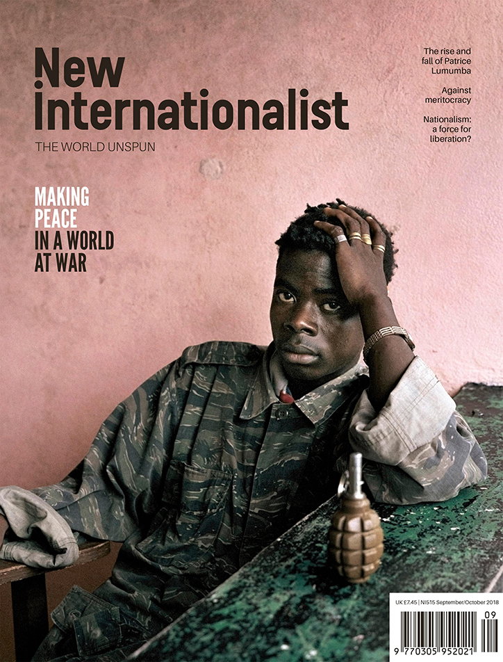
New Internationalist/TCO London
Clive’s colleague Simon Hayes, who worked on the project with Oliver Stafford, was keen to produce a product that didn’t dilute the messages conveyed in the magazine. “Our intention was to break up the content so it was more digestible, but not to overpower it. Illustration in the magazine had to subtly complement the narrative of the stories. We set a precedent to use sophisticated illustrators with a contemporary edge such as Kate Copeland and Emma Peer,” says Simon.
Another of the NI’s co-editors, Yohann Koshy, explains that both the relaunch and the redesign was made financially possible after the magazine sought investment from readers, with fans of the publication buying shares in the New Internationalist Co-operative in 2017. “So it’s partly a testament to the success of that project, which is an ongoing experiment in different forms of media ownership,” he says.
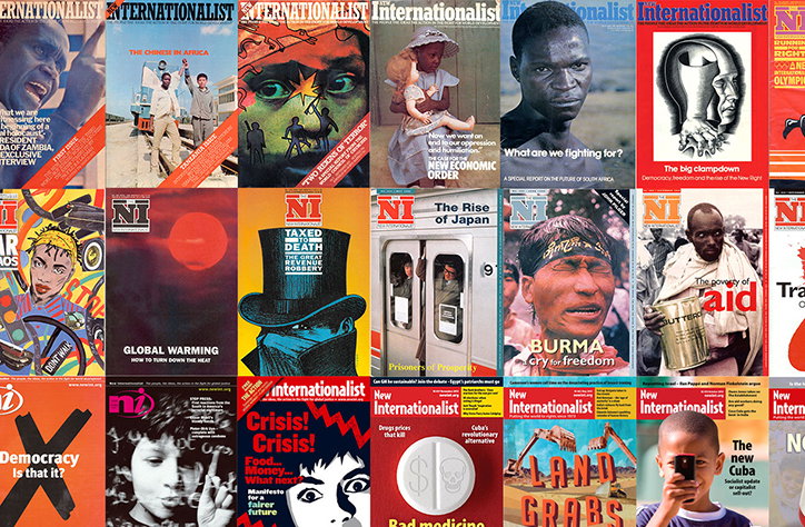
A fan of TCO’s work on the NI, Yohann describes it as “a declarative, bold style that puts me in mind of New Internationalist covers from the 1970s, when the magazine was founded – long before I was around!” Yohann notes that “was a period of great transition, as the world moved from an era of liberation movements in the Global South and a post-sixties radicalism to the neoliberal consensus that followed it,” he believes that we currently find ourselves in a similar period of historical realignment.
“I hope,” he says, “that the new magazine – which synthesises old and new styles – represents something of a return to those radical political traditions, this time updated for the 21st Century, for all the new challenges and problems that the left faces.”
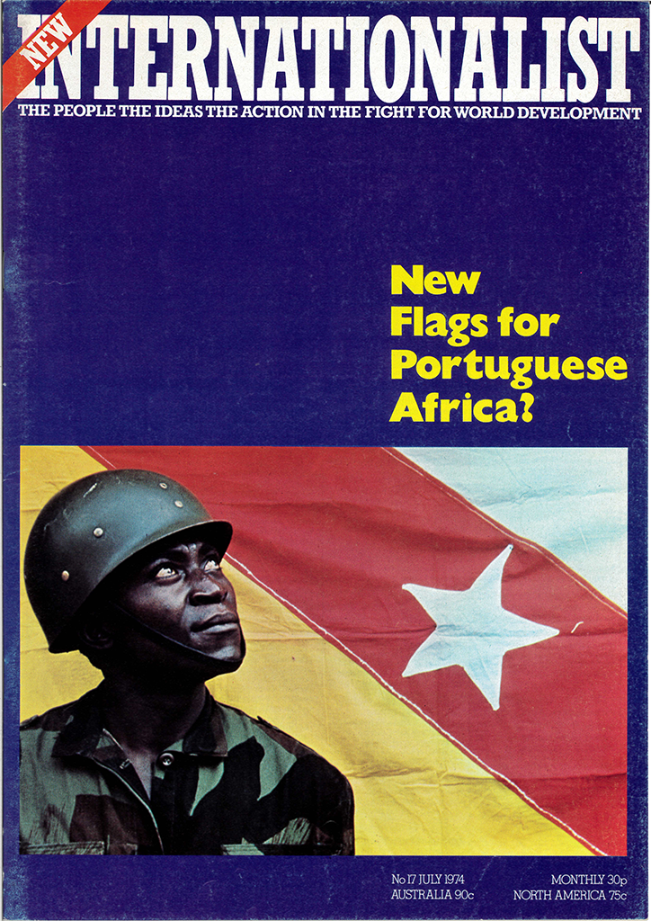
New Internationalist, July 1974
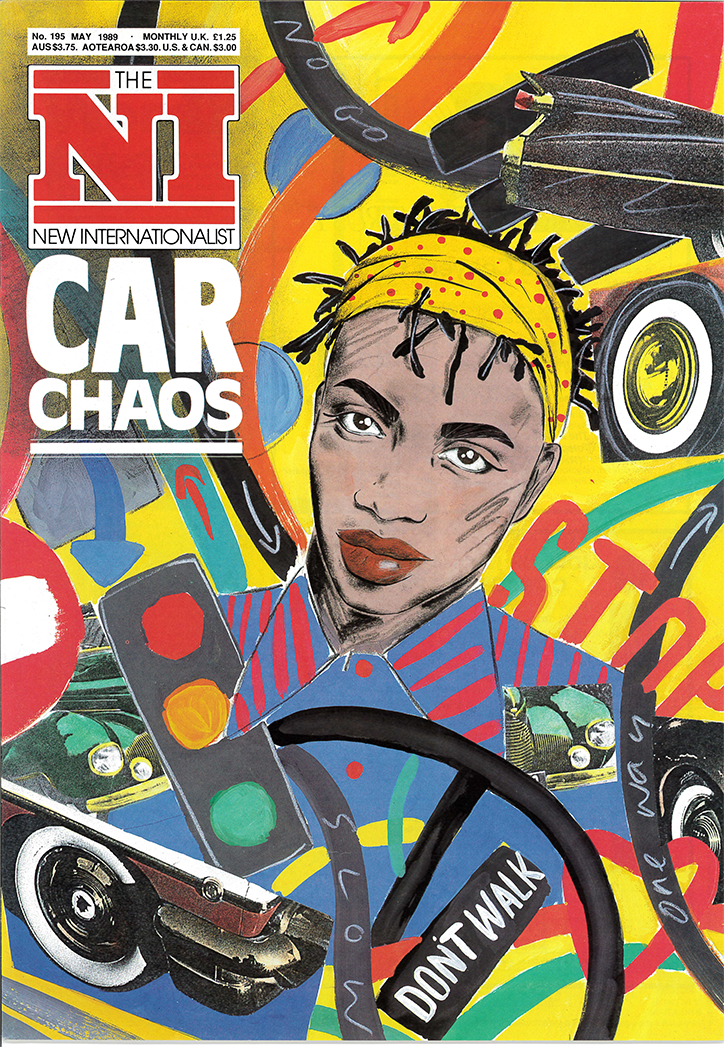
New Internationalist, May 1989
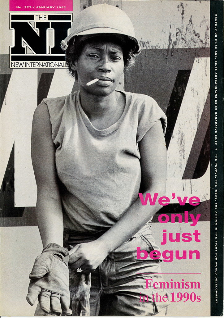
New Internationalist, January 1992
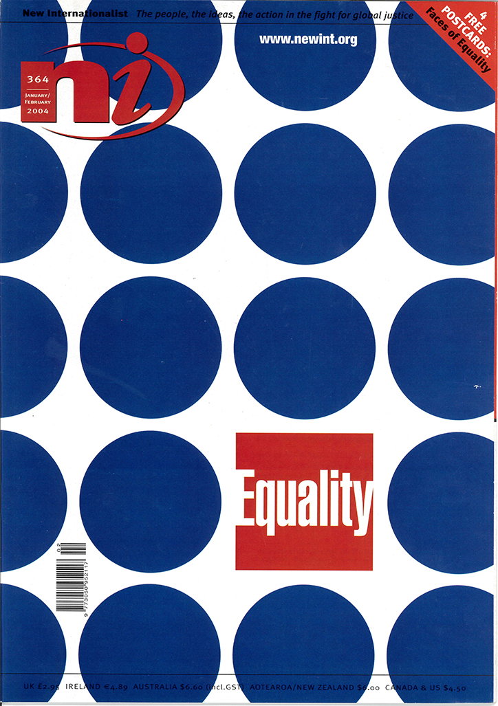
New Internationalist, February 2004
Share Article
Further Info
About the Author
—
Josh Baines joined It's Nice That from July 2018 to July 2019 as News Editor, covering new high-profile projects, awards announcements, and everything else in between.