Smörgåsbord launches a “standardised” marque for any brand committed to achieving zero-emissions
The design studio wants its new marque to be as “unified” as the globally recognised symbol for Wifi.
Share
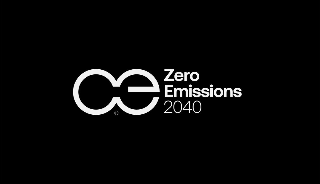
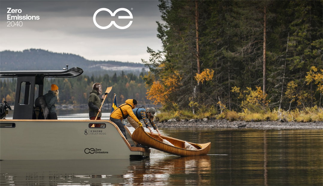
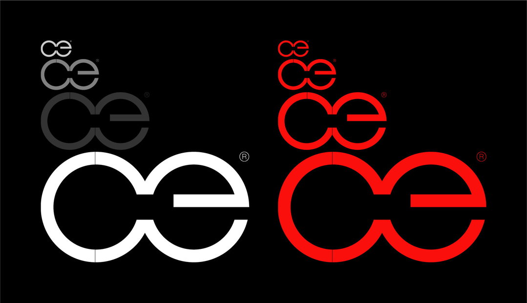
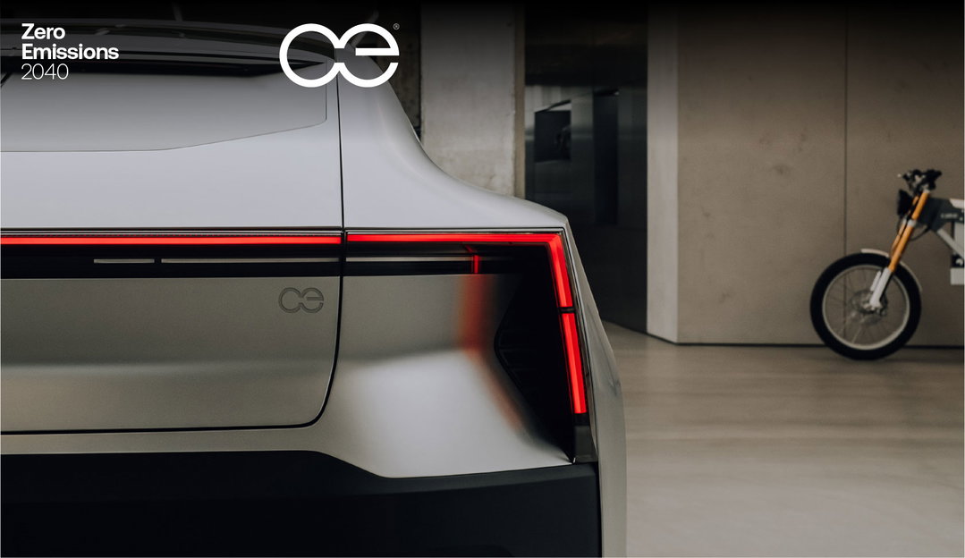
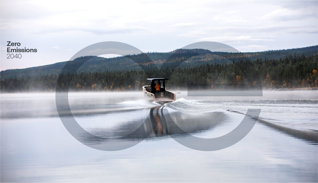
After Cop26 delivered on a somewhat compromised – read: weakened – set of commitments, Amsterdam and Wales-based design studio Smörgåsbord wants to “help build toward a critical mass”. Understanding the importance of consistency in branding, the studio is launching an open-source, “ready-to-go” zero-emissions marque, which brands can adopt to show that they align with the zero-emissions quest. In doing so, it hopes to place the issue front and centre in people’s minds.
Across the transport industry particularly, Smörgåsbord says many brands are creating zero-emission logos that, in the team’s opinion, “just don’t cut it”. To avoid the industry becoming oversaturated and brands having to commission or design “yet another zero-emissions logo”, Smörgåsbord aims for its alternative to be easy to adopt for business leaders and organisations alike.
“Credible, memorable, and consistent” were among Smörgåsbord’s aims for the in-house project, with the design studio offering the marque for Wifi as a good example. “When Wifi began becoming available there were a myriad of different graphical executions,” explains the studio. “By now as we know, a wedge of three concentric circles emanating from a sphere is generally accepted as the industry standard. This unified aesthetic is what we’d like to see achieved in the zero emissions sector.”
In creating the marque, Smörgåsbord also wanted to move away from the design characteristics often associated with environmental branding. “It’s no secret that many designers have a default kit of parts to communicate ‘sustainability’,” creative director Dylan Griffith tells It’s Nice That, “we wanted to run in the opposite direction. We’ve created a stripped back typographic marque that communicates a clear and direct message.”
Griffith continues that following Cop: “It’s really a case of now or never. Our aim is to combat the visual pollution before the (real) environmental pollution takes charge.”
GallerySmörgåsbord: Zero-emissions marque (Copyright © Smörgåsbord, 2021)
Hero Header
Smörgåsbord: Zero-emissions marque (Copyright © Smörgåsbord, 2021)
Share Article
Further Info
www.smorgasbordstudio.com
For more information contact: [email protected]
About the Author
—
Liz (she/they) is the senior editor at Insights, a research-driven department within It’s Nice That. They previously ran the news section of the website. Get in contact with them for potential Insights collaborations or to discuss Insights’ public-facing reports.