Climate activism has a branding problem and this logo generator is here to help
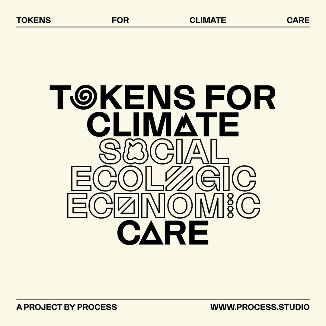
Austrian design studio Process has created the AI project Tokens for Climate Care, which creates original (and free-to-use) graphic symbols based on an organisation’s core mission.
It’s Nice That is the official media partner of the London Design Biennale 2021, taking place at Somerset House from 1–27 June 2021.
Artificial intelligence is a technology most commonly used by big companies and corporations, says Martin Grödl, one half of Viennese design studio Process. But the studio’s project Tokens for Climate Care hopes to upend that notion, providing a lower barrier to entry to AI systems, demystifying them and offering their benefits to smaller organisations – specifically grassroots climate change movements and activists. And what are they offering? An original, free-to-use logo generated by the AI, based on the three key terms – input by the activist themselves – that sum up their mission. The project, Martin says, is about “inversion of control” by giving small-scale groups the power of visual impact.
“Climate activism is something that obviously helps and affects all of us, so it’s important to be visible to as many people as possible,” says Process’ other co-founder Moritz Resl. Grassroots groups and activists have a “branding problem,” he says, in that they are competing for attention against huge corporations with equally huge marketing budgets, so Tokens for Climate Care offers an affordable starting point for their brand, and a chance to grab the public’s attention.
“We certainly don't want to insinuate that grassroots movements need professional branding agencies,” Moritz adds. “To the contrary, graphic designers and agencies alike have been influenced by DIY aesthetics for quite some time now. In quite the same DIY spirit of grassroots movements, we want to explore and encourage the use of cutting-edge tech like AI for the benefit of all.” The system was developed by Process in response to a commission by Marlies Wirth, curator of digital culture and design collection at the Mak Museum of Applied Arts in Vienna, for the Austrian pavilion at London Design Biennale. The Mak is known for its projects applying design and technology innovations in tackling climate change.
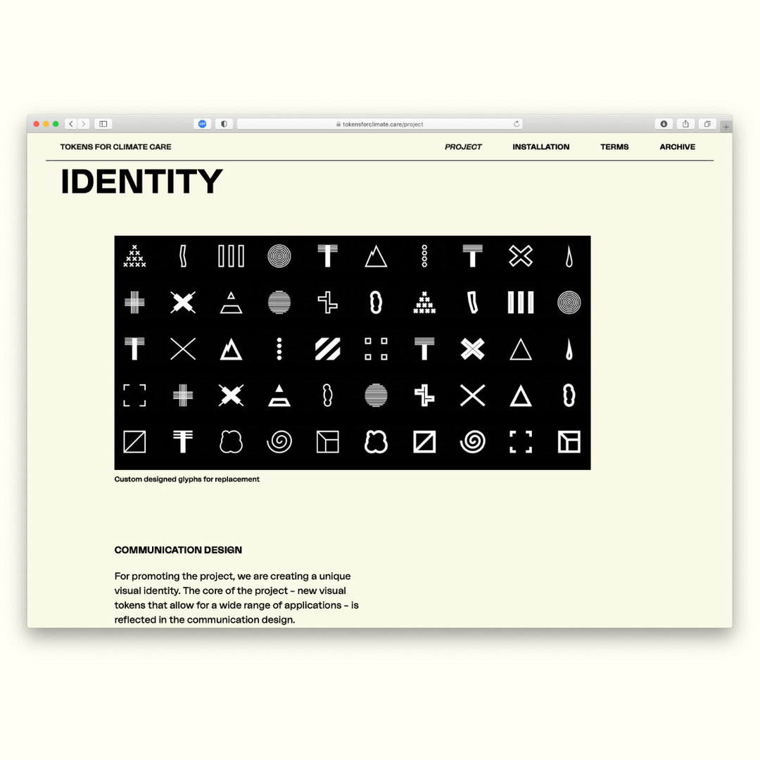
The duo trained the AI, starting by hand-picking symbols from a database of open source symbols and logo libraries. Together they decided the symbols they chose should be simple, graphic (using strong shapes) and as neutral or open for interpretation as possible. In the end they selected 10,000 symbols from over 100,000. “Many symbols and especially icons can be incredibly specific and complex, and we threw most of them out, both for technical and aesthetic reasons,” says Martin. “We intuitively restricted ourselves to simplicity, symmetry and openness.” Interestingly, the most common aesthetic pattern turned out to be a circle, “so the AI has picked up on this and encircles things,” he adds. “This culminates in a pattern it keeps producing: A smaller circle inside a bigger one, which we now call ‘sunny side up’.”
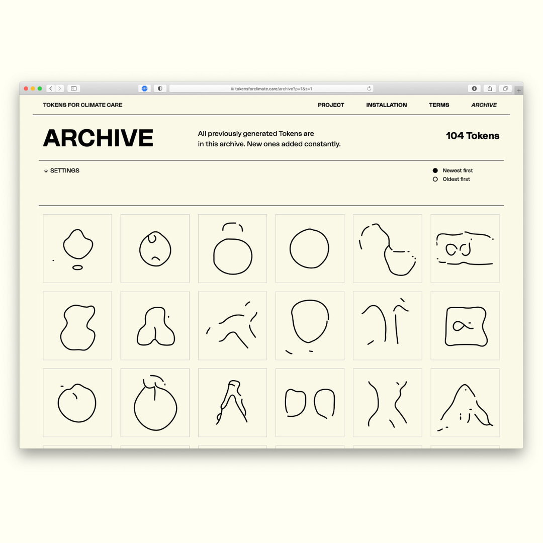
Process: Tokens for Climate Care (Copyright © Process and Mak Museum of Applied Arts, 2021)
Then, Martin and Moritz came up with the list of 40 different terms that could be attributed to each of these symbols, such as “inclusive,” “education,” “waste,” “forest,” “responsibility,” “consumption,” or “sea,” and the team – the duo, plus their wider project team, including Marlies and others at the Mak – set about labelling every single symbol. This gave each symbol meaning, and related their aesthetic to what they were communicating on a visual level. “Apart from the choice of symbols, providing labels is the key human contribution to the machine learning system,” explains Moritz. “Then it's the algorithm’s job to find the patterns that connect input symbols with the meanings we assigned to them through labels. And ultimately reverse the process and generate a new symbol from one or more labels alone. So you might say the AI learns our aesthetics: what we think symbols for certain meanings should look like.”
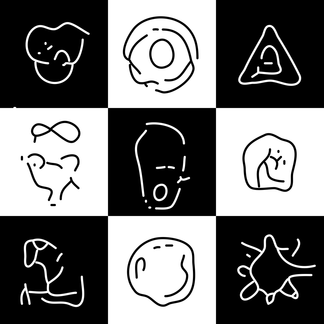
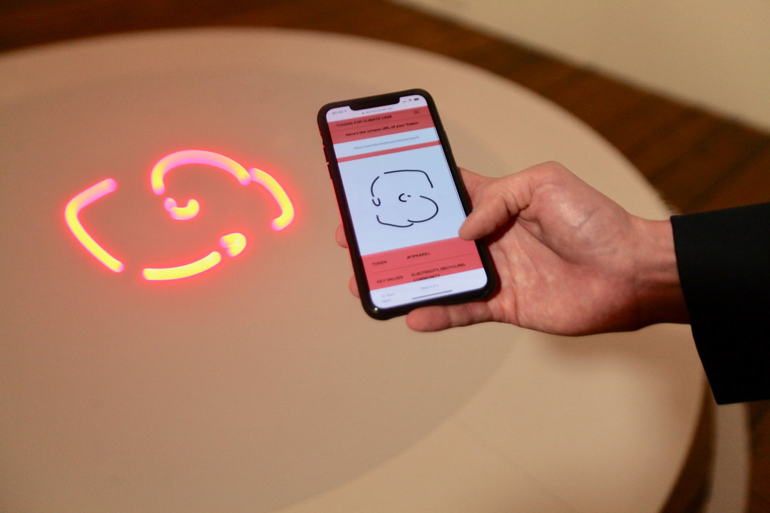
The result is an app, wherein users can choose three terms from the list of 40, to build a little sentence expressing their cause. Then, the AI generates a completely new symbol, incorporating elements it has learnt from all the symbols in its dataset. So far, some of Moritz and Martin’s favourites are “the ones bearing an unfamiliar visual aesthetic while still being imaginable to be used as a starting point for a logo. Such as this one generated with the input “culture, inclusive and education” and this, created when the terms “nature, sustainable and river” were chosen. All the tokens can be downloaded from the website’s archive.
The only stipulation is that users sign a Terms of Care agreement – not a traditional Terms of Use. This, instead, is much shorter and should serve as a guideline, the designers state. It runs as follows: “Use the tokens to make our planet better, not worse. Tokens can be adapted, re-mixed and even sold – as long as the same conditions for their use are imposed. Once generated, the tokens are added to the archive where they can be downloaded and shared as vector-based files. Part of being a designer – or part of any responsible person really – is to use one’s possibilities to make things better.”
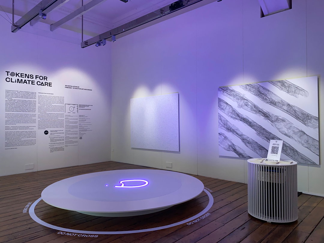
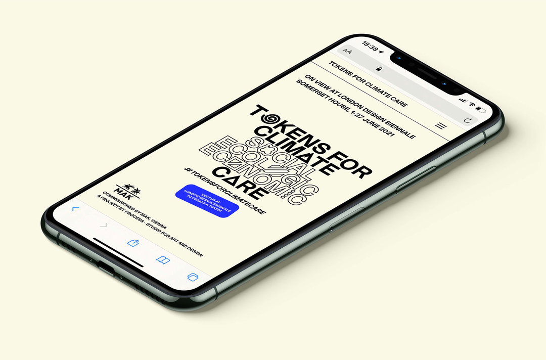
Tokens for Climate Care is on view at the London Design Biennale until 27 June. At the moment the generator is just accessible at the exhibition, but everyone can explore the archive online and the designers hope to soon make the creation process public.
GalleryProcess: Tokens for Climate Care (Copyright © Process and Mak Museum of Applied Arts, 2021)





Hero Header
Process: Tokens for Climate Care (Copyright © Process and Mak Museum of Applied Arts, 2021)
Share Article
About the Author
—
Jenny oversees editorial output across It’s Nice That. Get in touch with writing pitches for features or opinion pieces, big creative story tips, or questions about all things editorial. jb@itsnicethat.com
To submit your work to be featured on the site, please see our Submissions Guide.