




Hotel search engine Trivago rebrands with new logo and identity
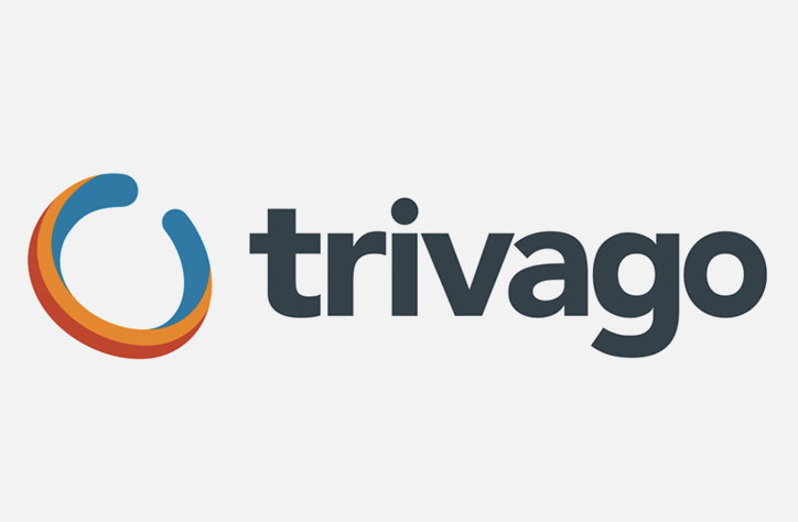
Global hotel search engine Trivago has rebranded with a new logo and identity.
Trivago was established in 2005 and now helps 120 million users find hotels suited to their needs. “Our team of over 1300 creative and focused minds from all corners of the globe, wake up every day to build a hotel search that is straight forward, simple-to-use and unbiased,” Trivago say.
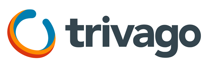
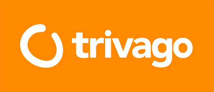
The new logo references Trivago’s original blue, orange and blue logo, replacing the multi-coloured type of the logo with a more refined single colour and transferring the three colours to a symbol described as a “Wabi”. Created in-house, the lower case sans serif logo features an imperfect tri-colour ring called “Wabi” for it’s corporate channels and tools which the company consider to be the “digital embodiment” of the company’s culture.
“Wabi seeks to capture and represent our spirit as a company – fluid and ever-evolving, yet simple, authentic, and imperfect,” explains Trivago. “A modern representation of the trust that unifies us and makes us strong, and the authenticity and diversity of opinions that broaden our horizons. A visualisation of the imperfect detail of raw ideas and the way we evaluate empirical data to find proof and therefore, focus. A way to show that we never stand still. Capturing how we are driven forward by our entrepreneurial passion and continuous learning, from our own experiences and the experience of others – this is Wabi.”
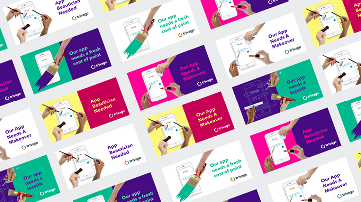
Trivago
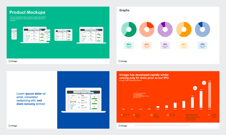
Trivago
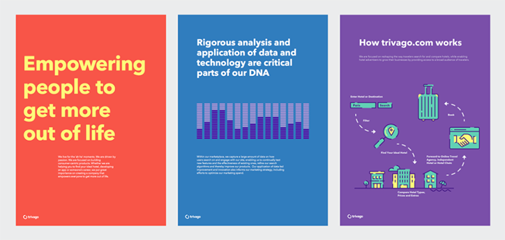
Trivago
Trivago
Trivago
Share Article
Further Info
About the Author
—
Bryony joined It's Nice That as Deputy Editor in August 2016, following roles at Mother, Secret Cinema, LAW, Rollacoaster and Wonderland. She later became Acting Editor at It's Nice That, before leaving in late 2018.

