




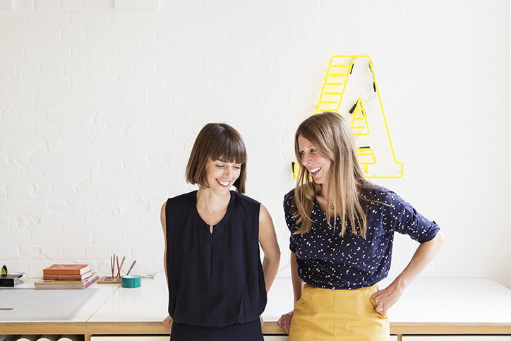
A Practice for Everyday Life celebrates its 15th birthday and is better than ever
Founded 15 years ago by Kirsty Carter and Emma Thomas, the London-based graphic design studio, A Practice for Everyday Life, has carved an international reputation for its outstanding, collaborative work with conceptual rigour. Each project is executed with meaningful and original design, working with the art world’s giants from David Hockney and the Tate, to custom identities for individuals. It’s Nice That spoke to A Practice for Everyday Life’s founders, Kirsty and Emma on a commemorative celebration of their thriving practice, discussing their rise in becoming one of the UK’s most influential design studios.
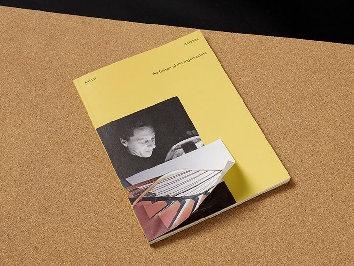
A Practice for Everyday Life: Leonor Antunes, the frisson of the togetherness, Whitechapel Gallery
It’s Nice That: 15 years ago, the design industry must have been very different. When you first started out, were you ever undermined for being two female graphic designers? In your experience, how has the industry changed for the better regarding gender equality?
Kirsty Carter and Emma Thomas: We always wanted to be judged first and foremost by our work, and we find it interesting that male designers and male-led studios aren’t asked about the impact their gender has on their practice. However, we do have to acknowledge that in some cases people have reacted differently to us upon first impression, especially when we were younger, and every day we do experience the effects of gender inequality in the industry in some way. It just means we have had to work that bit harder to prove ourselves, which somehow makes the fact APFEL is turning 15 feel like even more of a celebration. Women have tended to be underrepresented within graphic design history and we feel a responsibility to ensure that our work and our practice is visible for this very reason.
One encouraging change we’ve noticed in recent years is that the conversation about gender equality within the industry has gained momentum. There was a period during the 2000s when discussing your experience as a woman in design was almost taboo – the creative industry was supposed to be very much above that sort of discrimination, and it was very uncool to talk about it. If you made too much noise about it then there was a feeling that you were defining yourself as a feminist designer, which might impact upon the kinds of projects people thought you would be interested in, or risk politicising your practice when you really just wanted to be judged on the merits of your work. Thankfully, there has been a bit of a rehabilitation of the word “feminist” in recent years, and more conversation around the subject in relation to our industry, which can only help redress the balance.
INT: What are two of your favourite projects and why were they meaningful to you?
KC and ET: We were commissioned to work with artist Leonor Antunes on the frisson of togetherness in 2017, creating a publication to coincide with her site-specific commission at the Whitechapel Gallery. Antunes’ work frequently incorporates references to overlooked figures within 20th Century architecture, art and design, often focusing on women. The way we worked on this project is typical of the type of collaborative practice we particularly enjoy; it was borne out of a close personal connection we formed with Antunes over the course of the project. The project is an example of the kind of true collaboration between artist and designer that we strive for in much of our work.
Our ongoing work with Kettle’s Yard is another project that continues to be meaningful to us. We designed a new visual identity for the institution in 2014, and have been working with them since on publications, exhibitions and more recently on their reopening campaign after an extensive renovation. Kettle’s Yard is a modern and contemporary art gallery in Cambridge, founded by former Tate curator H. S. “Jim” Ede, who purchased a ramshackle set of cottages in the city with his wife in 1956, and renovated them into a home in which he housed his remarkable collection of artworks and found objects. With Kettle’s Yard, Ede is trying to defy conventional ideas about how art is viewed and experienced, aiming to bring art out of the intimidating institutional environment of galleries and museums and introduce it into the domestic setting of the home. His work in creating Kettle’s Yard emphasised the importance of personal connections with art and how place and atmosphere can affect the way in which it is experienced. This is why the commission was so interesting to us – it’s an approach and a way of thinking that really resonates with us.
INT: In your 15 years of experience, what has been the most important lesson or mantra for projects to run smoothly?
KC and ET: Work collaboratively, encourage open dialogue between everyone involved, and be prepared to work very hard to bring your ideas to life. The projects that we’re most proud of in our portfolio are often those with an ambitious central idea, which has taken a lot of perseverance to bring to life. To a certain extent, you have to be unwilling to take no for an answer – to be confident in your ideas, be persuasive, inspire trust, and be experimental within your own practice.
INT: What do you see for the future of APFEL? Is there anything that you’re itching to do?
KC and ET: We want to keep growing as designers, exploring new ground for our practice and challenging ourselves – we’d love to work on something completely unexpected like a wallpaper or furniture design collaboration or even a public installation. We’re also keen to explore the different ways we might create outlets for our shared research interests and graphic investigations in the future, and we’ve got more self-initiated work in the pipeline!
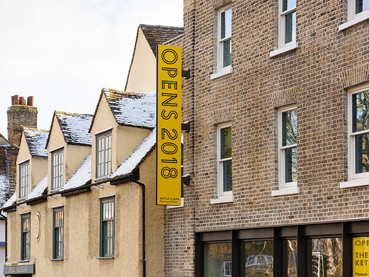
A Practice for Everyday Life: 2 Kettles Yard
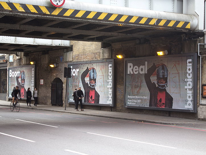
A Practice for Everyday Life: Basquiat Boom for Real
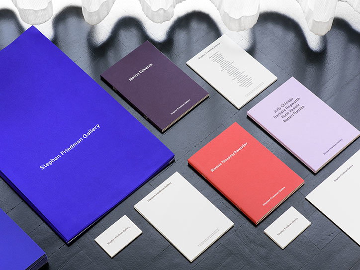
A Practice for Everyday Life: Friedman Gallery
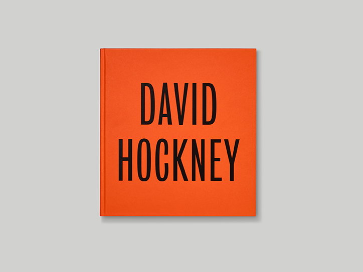
A Practice for Everyday Life: David Hockney, Tate Publishing
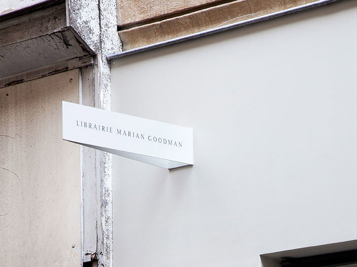
A Practice for Everyday Life: Librairie Marian Goodman
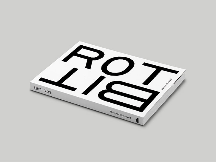
A Practice for Everyday Life: Bit Rot, Douglas Coupland
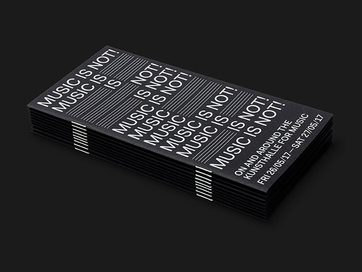
A Practice for Everyday Life: Kunsthalle for Music
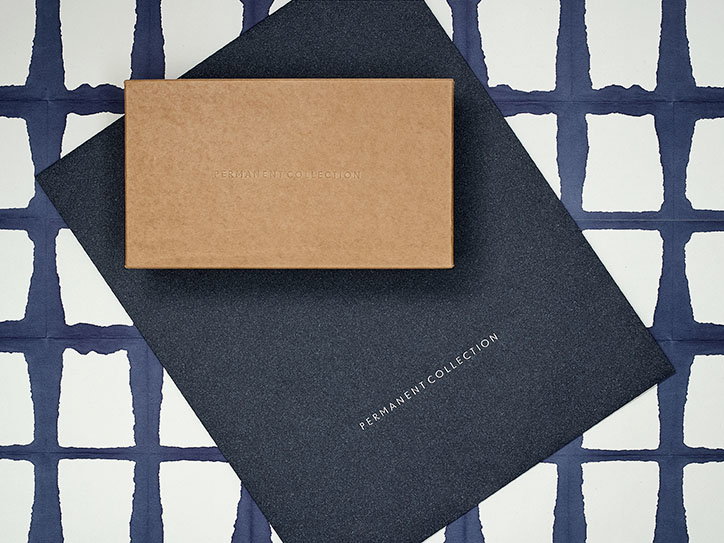
A Practice for Everyday Life: Permanent Collection
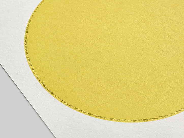
A Practice for Everyday Life: Print set folder
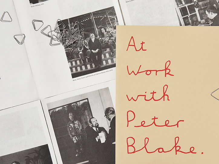
A Practice for Everyday Life: Waddington Custot, At Work with Peter Blake, Frieze Masters
Share Article
Further Info
About the Author
—
Jynann joined It’s Nice That as an editorial assistant in August 2018 after graduating from The Glasgow School of Art’s Communication Design degree. In March 2019 she became a staff writer and in June 2021, she was made associate editor. She went freelance in 2022.
